Updated August 24, 2023
Organization Chart in Excel
In this article, we will learn about organization chart in Excel. An organizational chart displays any company or organization’s management structure/team structure.
Every organization has a management hierarchy represented by a row of boxes. The hierarchy level is represented by one on top of the others, which will look like a pyramid.
Lines are used to add these levels, showing the relationship between the individual hierarchy boxes.
How to Create an Organizational Chart in Excel?
Creating an organizational chart in Excel is very simple and easy. Let’s use examples to create an organizational chart in Excel.
Excel Organization Chart – Example #1
We have a small manufacturing company XYZ and have a total of 20 employees in the organization. The hierarchy of the organization is as follows:
Now we must prepare an Excel organization chart per the hierarchy mentioned above.
Follow the below steps for this:
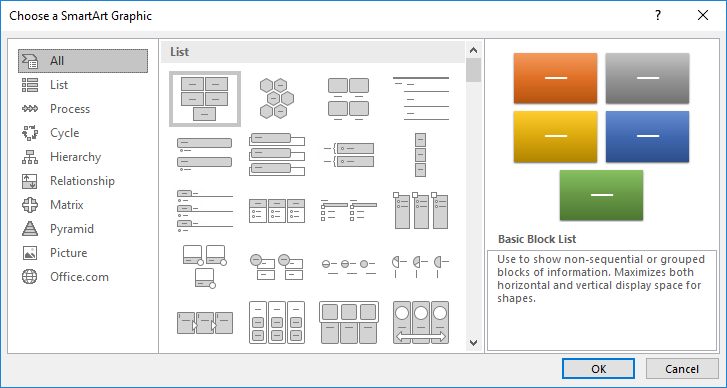
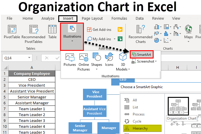
Step 1 – Go to the INSERT tab. Click on SmartArt options under the Illustrations section as per the below screenshot.
It will open a SmartArt Graphic dialog box for various options, as shown below:
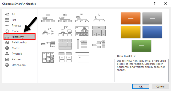
Step 2 – Now click on the Hierarchy option in the left pane, and it will display the various types of templates in the right side window. Refer to the below screenshot.
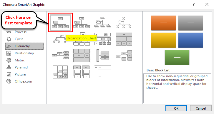
Step 3 – Select the template which you would require to use. We are clicking here on the very first template, as shown below:
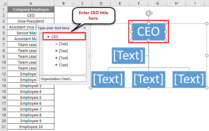
After clicking on the shape, it will display a SmartArt shape in an Excel sheet, which looks like the below screenshot.
The first text box shows the head, which drives the whole chart and manages the whole organization. As per the given example, the CEO is the head of the organization.
Step 4 – Enter the CEO title under the first text box. Refer to the below screenshot.
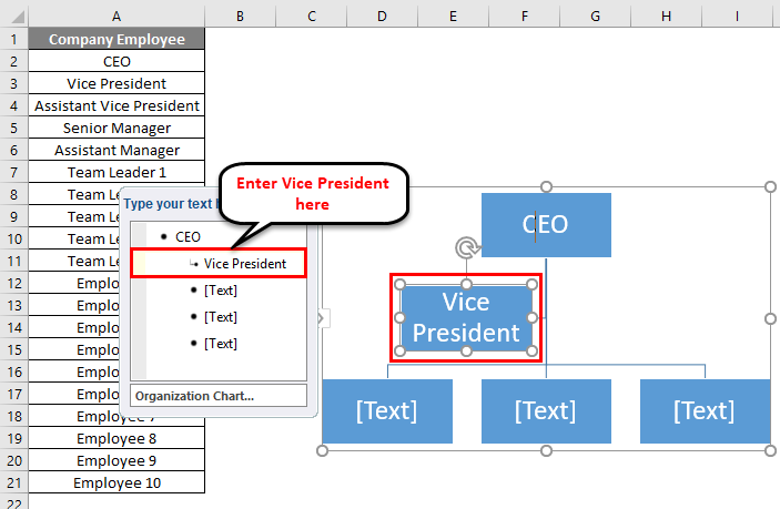
Step 5 – Write the Vice President under the second text box.
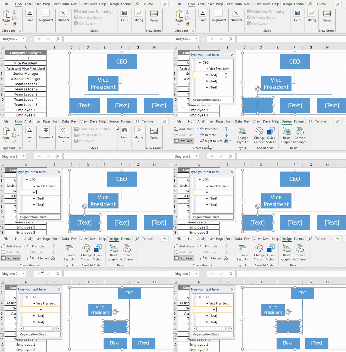
Step 6 – As assistant President falls under Vice President, choose the 3rd text box and click on Demote option under Create Graphic section, as shown in the below screenshot.
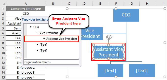
Step 7 – Now write Assistant Vice President in the box.
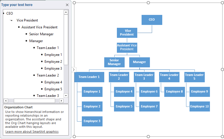
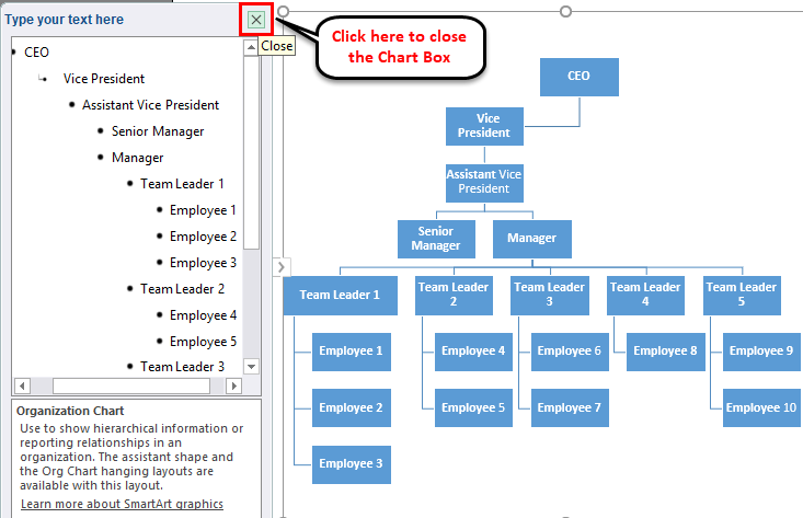
Step 8 – Same repeat the procedure for the next positions. For any upper position, click on Promote option under Create Graphic section. The final Organisation chart is shown below:
Step 9 – After creating the chart, you can close the chart Box by clicking the cross button, as shown below.
Editing the Chart
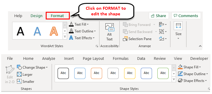
You can edit the chart anytime by using SmartArt Tools. If you want to edit or fill the color in shape, click on that shape and go to the FORMAT tab. Here a lot of options are available for editing. Refer to the below screenshot for your reference.
If you want to edit all the shapes simultaneously, select all shapes with the CTRL+A shortcut key and apply the formatting as required.
Excel Organization Chart – Example #2
Let’s take another example. Below is the management hierarchy:
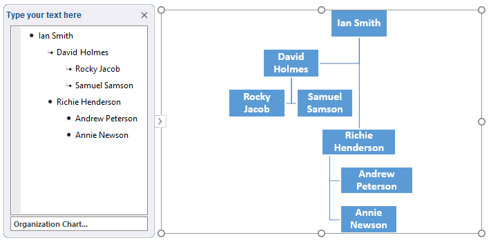
Ian Smith is the head of the Quality team, and David Holmes and Richie Henderson report to him. Rocky Jacob and Samuel Samson are the team agents who report to David Holmes. Andrew Peterson and Annie Newson report to Richie Henderson.
For creating the management chart, we will repeat the above process as we did in Example 1.
Below is the final chart:
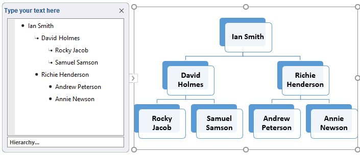
We can drag the shapes accordingly. You can choose the shape layouts by using the DESIGN tab.
The final editing management chart is given below:
Things to Remember about Organization Charts in Excel
- Organization charts help you to make better decisions faster.
- Before preparing the chart, you must collate the full information about the organization’s different roles.
- Then identify the relationship as per the reporting between them.
- You can format the chart using SmartArt tools and choose the shape layouts per your preference.
Recommended Articles
This has been a guide to Organization Charts in Excel. We discuss creating an Excel organization chart, practical examples, and a downloadable Excel template here. You can also go through our other suggested articles –


