Updated July 27, 2023
Definition of Histogram Examples
A histogram is a statistical tool for representing the distribution of the data set. It is a general estimation of the probability distribution of a continuous series of variable data.
It is a plot that answers all the queries with the underlying frequency distribution of continuous and probable data sets. Moreover, it gives a sense of the density of data. In a histogram, the area of the bar indicates the frequency of occurrences for each bin. This article will provide you with top examples of a histogram graph.
Examples of Histogram Graph
There are many examples of the histogram. Some of them are:-
- Bimodal
- Symmetric, Unimodal
- Skewed Right
- Skewed Left
- Multimodal
- Symmetric
1. Bimodal Histogram
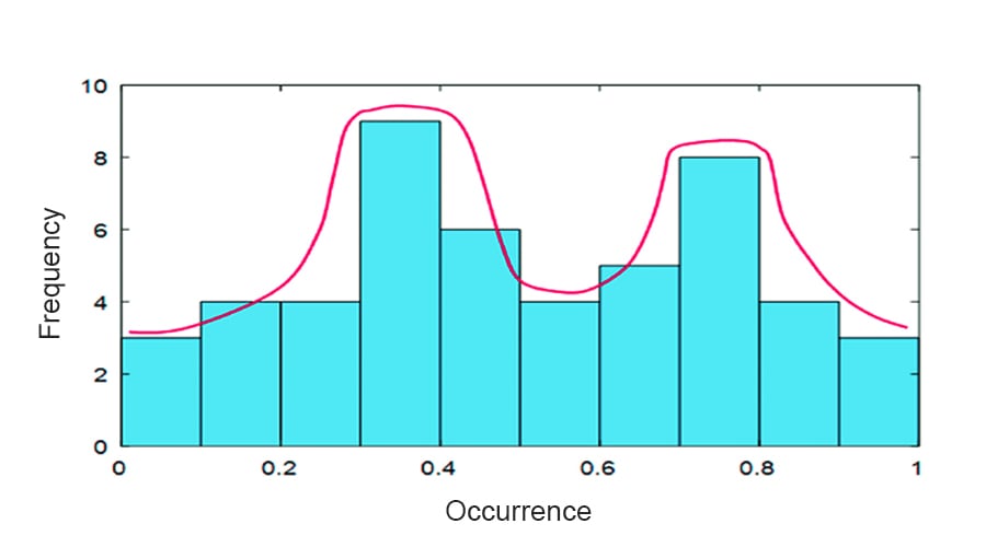
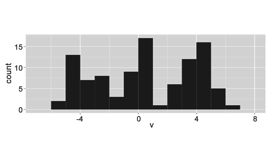
When a histogram has two peaks, it is a bimodal histogram. It has two values that appear most frequently in the data set.
Example 1
Many restaurants can expect more customers around 2:00 pm and 7:00 pm than at other times of the day and night. This makes the histogram graph bimodal since two separate time periods during the whole day correspond to two peak serving times for the restaurant.
Example 2
In India, people tend to do their grooming at weekends. So, if we depict a histogram for all seven days visits of people to parlors and salons, Saturdays and Sundays would be two extremes. The data distribution would be somewhat like the below:
2. Symmetric, Unimodal Histogram
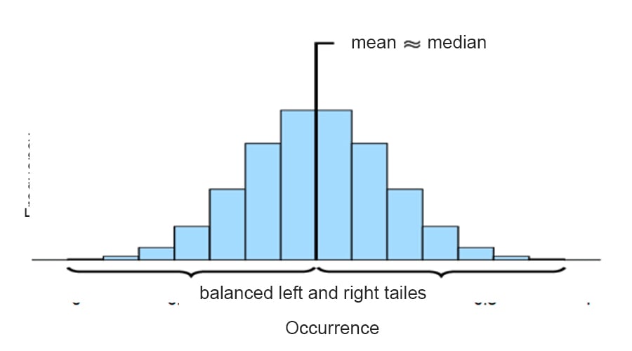
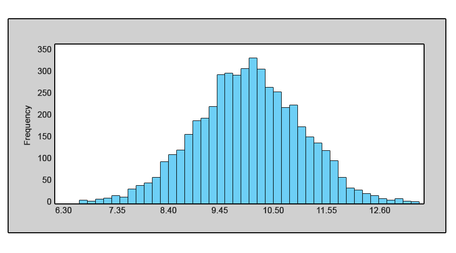
A histogram is unimodal if there is only one hump. This means that the frequency of occurrence of an event spreads in a manner where there are no extremes.
Example 1
Professor Brook wanted to see and count the hours spent by his students for the coming test. He came up with the following numbers: 1, 3, 2, 1, 5, 1, 4, 3, 2, 1, 1, where each number represents the number of hours each student spent for study. The same data is represented in a bar chart, and we can see a fair balance between left and right tails.
3. Skewed Right Histogram
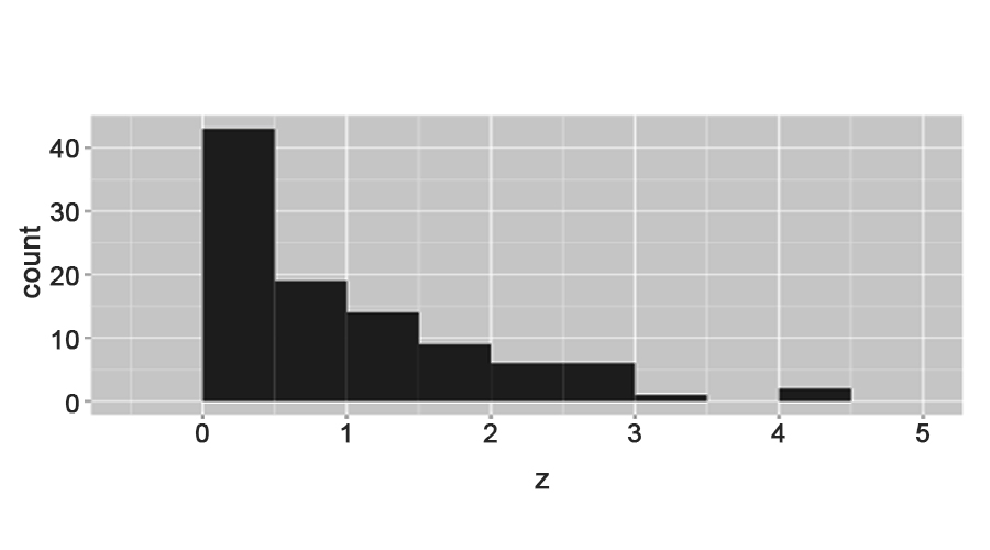
It is the histogram where very few large values are on the right, and most of the data are on the left side; such data are said to be skewed to the right. They are also known as positively-skewed distributions.
Example 1
It’s always challenging to get excellent marks in tough exams, say more than 90%. However, many students manage to get fair marks.
Example 2
Usually, there is a vast difference between wealthy, average, and poor people. A country’s wealth concentrates in a few hands, and the rest of the population lives with a shortage of money. It has its natural boundary at zero. The graph in both cases will be somewhat like the one below:
4. Skewed Left Histogram
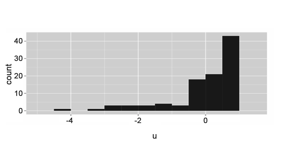
It is the histogram where very few large values are on the left, and most of the data are on the right side; such data are said to be skewed to the left. They are also known as negatively skewed distributions. That’s because there is a long elongated tail in the negative direction.
Example 1
In any general office, employees drink less tea or coffee, but as a later hour approaches, their tiredness increases, and they tend to drink more tea and coffee. Such data can be represented by the skewed left histogram, as shown in the graph below.
Example 2
A company has many employees with higher, middle, and operational-level jobs. Their salary also varies in the same manner. The graph for the same data would be somewhat like the below histogram:
5. Multimodal Histogram
It is a histogram where a multimodal distribution is shown as a continuous probability distribution with two or more modes. We know the sample or data is not homogeneous in a multimodal histogram. An observation or conclusion comes as overlapping distribution.
Example 1
Suppose a survey occurs among 50 youth of the millennial generation as to what they are following currently amongst GOT, Marvels, DC, IPL, upcoming World Cup; the answer could be an extreme of two or more.
Example 2
As a branch manager, Jorge decides to work when any customer wants to do their work at the banks. After a survey with ten customers, he got the result as 5, 8, 20, 10, 3, 6, 12, 25, 9, 11(in min). The graphical distribution for the same data would be somewhat like the below histogram:
6. Symmetric Histogram
In a histogram, the data are symmetric if they have the same shape on both sides of the medium. The two side looks the same if the histogram is folded in between. So, asymmetric distribution is a data distribution where one of the two halves appears as a mirror image of another half.
Example 1
The data often follow the symmetric distribution pattern if we survey 25 males to measure their weights and heights. Most people’s data will fall within a certain amount of the typical value with few extremes in either direction.
Example 2
Suppose XUZ Pvt. Ltd is a company where every 15 employees spend this money for lunch: $10, $5, $15, $23, $7, $9, $11, $18, $13, $4, $12, $8, $15, $3, $8.5. The graph for the same data will be like the below graph.
Conclusion – Histogram graph Examples
The histogram provides a visual interpretation of numerical data. It is done by showing the number of data points that fall within a specified range of values known as bins. So, we see that there could be innumerable examples of histograms from our daily life. Many histograms can be from the same dataset with different purposes and situations. Thus, the histogram is a handy tool for database interpretation.
The histogram is very important as it displays a large amount of data and the frequency of the data values. Also, the median and distribution of the data can be determined by a histogram. It can also show outliers or gaps in the data, if any. Histogram charts convey information about data sets faster than tables.
Recommended Articles
This has been a guide to Histogram Examples. Here we have discussed the top 6 practical examples of histogram graphs with a detailed explanation. You can also go through our other suggested articles to learn more –


