Updated March 24, 2023
What are Maps in Power BI?
In this article, we will see an outline on Power BI Maps. We all have used and inserted the Maps and 3D Maps in MS Excel which is quite complex to implement when we know that the tool which we are using is not meant for creating Map charts. To overcome such situations, Microsoft has given many such options and functions in Power BI which are not easy to use in MS Excel. Maps are one of those charts in Power BI. Now the question comes, how Power BI detects the locations which we have in our data and plot that into charts? And the answer is, through Bing Maps which is also a Microsoft product. Bing Maps locates the city, country and region name with the exact name and fill that into Power BI Maps.
How to Use Maps in Power BI?
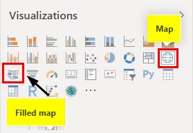
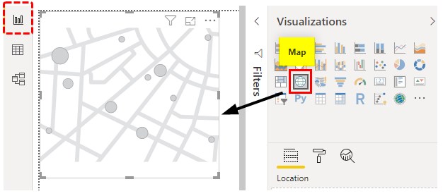
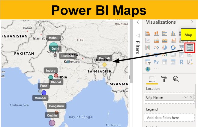
In Power BI, there are 2 types of Maps available. One is a Map and the other is Filled Map. Both types are there in the Visualization section as shown below.
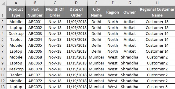
If we use the Filled Map option then we will be getting a global map of all the continents. Whereas if we use the Maps option, then we would see those regions only which are there in our uploaded data. And to use these Map options from Power BI, we need data of such kind which has the city or location names in a standard format. Below is a screenshot of that kind of sales data of the India region. The sales data is of some electronics products such as laptops, Mobile, Desktop and Tablet. Data consists of around 1000 lines which are perfect for plotting that on Maps.
You can download the excel workbook from the below link which is used for this example.
Example of Power BI Maps
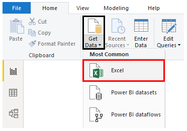
- Let’s start by first uploading the data in Power BI. For this, go to Get Data option from the Home menu ribbon and select the type of source we want. Here our data is in Excel so we will be selecting the same as shown below.
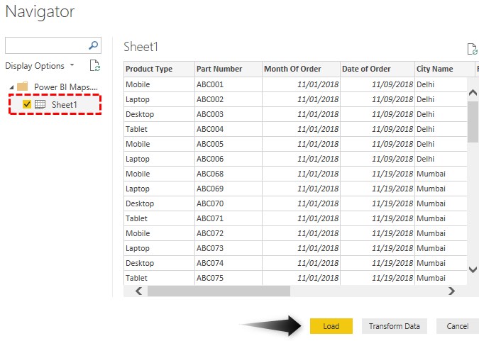
- Now browse the file location and from the Navigator window select the Sheet which we want to upload. Here that sheet is Sheet1 and then click on Load.
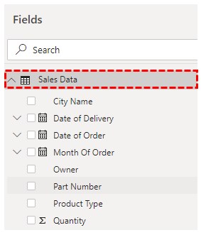
- This may take a few moments. Then we will see the uploaded data columns in the Field section as shown below. Also, we are renaming the Table name here as well from Sheet1 to Sales Data just to have proper sync.
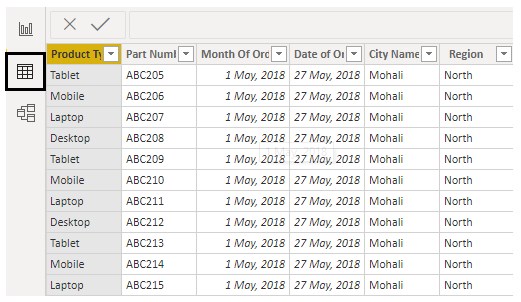
- We will be able to see the data which we have uploaded there in the Data tab as shown below.
- Now from the Report section, select Map chart type from Visualization as shown below.
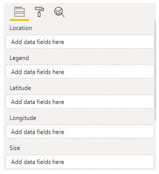
- Let’s see and understand available fields under Map.
- Location – It is the geographical location on the Map with the exact name there in Map.
- Legend – This is like Location, here we can insert any data type by which we want to see the data in Map.
- Longitude/ Latitude – This helps in finding the location on Bing Map.
- Size – This can be Population, Quantity or number which can be plotted on Map.
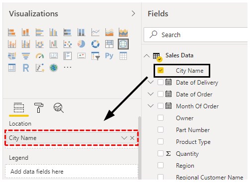
To start with first we will add the City Name into the Location field as shown below.
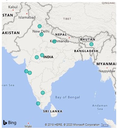
- We will see the name of cities will get populated on the Map of India. The color by which the city names are highlighted is in a default blue.
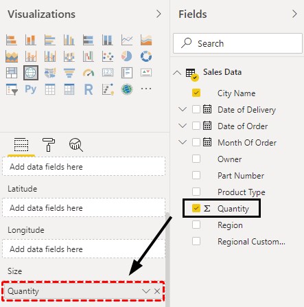
- Then we will insert the quantities sold in the Size field section.
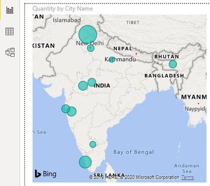
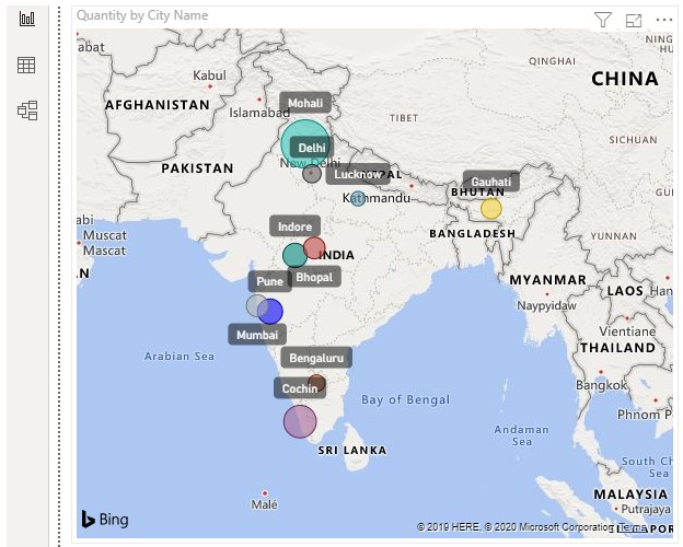
- As we do that, the size of the buddle there will get increased as per the size of data available in that region. Bigger the size of the bubble, higher the quantities sold in that City.
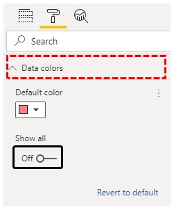
- This completes the creation of Map in Power BI. Now we can format the data fields as per our need to make created Map look even better. Let’s start by changing the color allocated to the cities. For this, go to Format and select Data Colors as shown below.
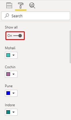
- To see all the city colors, click on Show All to enable ON. Here we have assigned different colors to each city name to distinguish them separately.
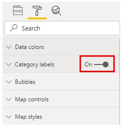
- Then we will turn on the Category labels from the Format option. This will help the viewer to see the name of cities properly.
- As we can see, the names of cities with bubbles are seen much clearly.
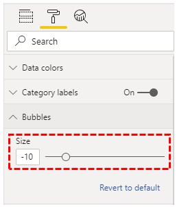
- We can also change the size of the bubble as per our needs. This can be done from the Format section as shown below.
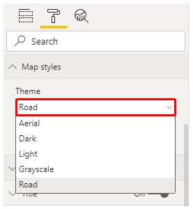
- We can change the theme of the map as well. By default, the Road theme is selected. We can select any theme to make our map more attractive. The use of this option depends on the data which is using.
Note: Power BI Maps file can also be downloaded from the link below and the final output can be viewed.
Pros of Power BI Maps
- Power BI Maps, give life to the maps.
- This is way easier than using Maps in Excel.
- It automatically picks the city names as per the data which we upload using Bing Map with high accuracy.
Things to Remember
- We can use Heat Maps if there data is global weather.
- Use the right theme as per the data used in Power BI for creating Maps.
- Power BI Maps are better than Filled Maps. Maps visualization gives visuals to those regions which are uploaded. After that, we can zoom in or out to fix the map.
- Size of the bubble should be used to show the size of the data.
Recommended Articles
This is a guide to Maps in Power BI. Here we discuss how to use visual maps in power bi along with practical examples and downloadable power bi template. You may also look at the following articles to learn more –

