Updated June 17, 2023

Introduction to CSS Gradient Generator
CSS gradient is one feature that falls under the data type image. CSS gradient generator is used for various transformations between two or more colors, which can serve as a background for the element. To put across the feature more virtually, the gradient can be defined as a block where two colors are transformed in a way the developer wants them to.
CSS Gradient Syntax and Types
CSS gradients are mainly of two types. The first type is a linear gradient, and the second is a radial gradient. With linear-gradient, one can ensure linear transitions of two or more colors such as horizontal, vertical, etc. On the other hand, radial-gradient takes a central point and shape for the transition of colors.
- Following is the syntax to create a linear gradient in CSS:
background-image: linear-gradient(direction/angle, color1, color2, color3...)- Here the developer can choose to define the direction (to left, to bottom, etc.) or customize their gradient using angles.
- The Radial Gradient in CSS is created using the following syntax:
background-image: radial-gradient(shape/size 'at' position, color1, color2, color3...)- If you shape the parameter, it can be a circle or ellipse. When using the size parameter, you can specify four values: closest-side, closest-corner, farthest-side, and farthest-corner.
Examples of CSS Gradient Generator
Let us look at some examples and learn the use of gradient features in CSS.
1. Linear Gradients for two colors through external CSS
- First, We will create a CSS file using the external style for this example. We will create ids with different gradient directions to demonstrate all the values. These IDs can be written in the following manner. Additional features can be implemented as per requirement.
Code:
#linear1
{
height: 50px;
width: 100px;
background-image: linear-gradient(to bottom,  pink, purple );
}- Additionally, we can add one more ID, using angle instead of direction, to define the transition of two colors. The syntax will be as follows:
Code:
#linearAngle
{
height: 50px;
width: 100px;
background-image: linear-gradient(50deg,  pink, purple );
}- Finally, the complete CSS file should look like this: (grad.css)
Code:
#linear1
{
height: 50px;
width: 100px;
background-image: linear-gradient(to bottom,  pink, purple );
}
#linear2
{
height: 50px;
width: 100px;
background-image: linear-gradient(to right,  pink, purple );
}
#linear3
{
height: 50px;
width: 100px;
background-image: linear-gradient(to top,  pink, purple );
}
#linear4
{
height: 50px;
width: 100px;
background-image: linear-gradient(to left,  pink, purple );
}
#linearAngle
{
height: 50px;
width: 100px;
background-image: linear-gradient(50deg,  pink, purple );
}- Now, we will create an HTML page. Since this is an external CSS, we will first call the CS file in the page’s header section.
- Further, we will call all the IDs through different <div> elements/blocks. The coding for the HTML file is as follows:
Code:
<html>
<head>
<title>Linear Gradient Test</title>
<link rel = "stylesheet" href = "grad.css">
</head>
<body>
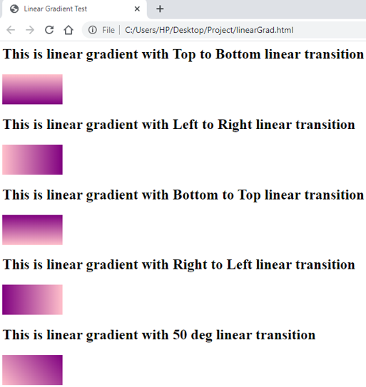
<h2>This is linear gradient with Top to Bottom linear transition</h2>
<div id="linear1"></div>
<h2>This is linear gradient with Left to Right linear transition</h2>
<div id="linear2"></div>
<h2>This is linear gradient with Bottom to Top linear transition</h2>
<div id="linear3"></div>
<h2>This is linear gradient with Right to Left linear transition</h2>
<div id="linear4"></div>
<h2>This is linear gradient with 50 deg linear transition</h2>
<div id="linearAngle"></div>
</body>
</html>- Saving this code as an HTML file and opening it in a browser will fetch results similar to the following screenshot:
Output:
2. Linear Gradient for diagonal transitions using Multiple Colors
- We can create diagonal gradients as well, using multiple directions.
- This example will demonstrate how to create a diagonally transitioned linear gradient. We will use external CSS for this demo.
- To create a CSS ID for a diagonal transition in a gradient, you can use more than two colors to enhance the understanding of the transition. The final CSS file should be similar to the code below:
Code:
#linearDiag
{
height: 100px;
width: 400px;
background-image: linear-gradient(to left bottom, indigo,blue, green, yellow, orange, red);
}
We will now create an HTML page. Once we have called the external CSS file in the header section, we will code for the body section to use the ID created in the CSS file. The final HTML code should be as follows:
Code:
<html>
<head>
<title>Linear Diagonal Gradient Test</title>
<link rel = "stylesheet" href = "grad.css">
</head>
<body>
<h2>This is linear diagonal gradient for right to left towards bottom transition</h2>
<div id="linearDiag"></div>
</body>- To get the output, save the HTML file and open it through a browser. It should be similar to the below screenshot:
Output:
3. Radial Gradient using three colors through External CSS
- We will use the external style for this example, so firstly, we will create a CSS file.
- In the CSS file, we will write various IDs with different parameters (positions, shape, color quotients, etc.) for radial gradients. The final CSS code should look like this:
Code:
#radi1
{
height: 100px;
width: 100px;
background-image: radial-gradient(yellow, orange, red);
}
#radi2
{
height: 100px;
width: 100px;
background-image: radial-gradient(yellow 5%, orange 10%, red 20%);
}
#radi3
{
height: 100px;
width: 100px;
background-image: radial-gradient(closest-corner at 50% 70%, green, blue, purple);
}
#radiCirc
{
height: 100px;
width: 100px;
background-image: radial-gradient(circle, red, yellow, orange);
}- We will create an HTML file and call for the style sheet in the header section. In the body section, we will create different <div> blocks using each of the IDs defined in the CSS code. The HTML should be similar to the following code:
Code:
<html>
<head>
<title>Radial Gradient Demonstration</title>
<link rel = "stylesheet" href = "radial.css">
</head>
<body>
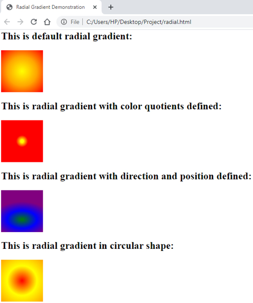
<h2>This is default radial gradient:</h2>
<div id="radi1"></div>
<h2>This is radial gradient with color quotients defined:</h2>
<div id="radi2"></div>
<h2>This is radial gradient with direction and position defined:</h2>
<div id="radi3"></div>
<h2>This is radial gradient in circular shape:</h2>
<div id="radiCirc"></div>
</body>
</html>- Saving this file and opening it through a browser will give the following output:
Output:
Explanation: The above example covered most of the basic uses of a CSS gradient. There is one more option for the developers, where they can repeat customized linear-gradient multiple times. This can be achieved through the function repeating-linear-gradient(). One can pass parameters similar to that of linear-gradient and achieve a repetitive result.
Recommended Articles
We hope that this EDUCBA information on the “CSS Gradient Generator” was beneficial to you. You can view EDUCBA’s recommended articles for more information.


