Updated March 27, 2023
Introduction to React Native Animation
To create a great user experience while using the application, the animation is very important. Physically believable motion in the interface is allowed by animations. The stationary objects should overcome inertia to start moving, and the objects in motion have momentum and rarely come to a stationary position immediately.
React Native provides two animations:
LayoutAnimation: It is used for animated global layout transactions and,
Animated: It is used to control specific values at a tiny level very interactively. React-Native provides the best animation API, which provides the ability to make different animations.
Syntax for Animation in React Native
Following are the syntax as given below:
1. Configuring Animations
Animation of an object for 2 seconds is created in the code below, and before reaching its final position, it slightly backs up.
Syntax:
Animated.timing(this.state.xPosition,  { toValue:  100,
easing:  Easing.back(), duration:  2000,
}).start();
2. Composing Animations
The animation edges to stop; then, it jumps back while spinning in parallel.
Syntax:
Animated.sequence([ Animated.decay(position,  {
velocity:  {x:  gestureState.vx,  y:  gestureState.vy}, deceleration:  0.997,
}),
Animated.parallel([ Animated.spring(position,  {
toValue:  {x:  0,  y:  0},
}),
Animated.timing(twirl,  { toValue:  360,
}),
]),
]).start();
3. Combining Animated Values
Syntax:
const  a  =  new  Animated.Value(1);
const  b  =  Animated.divide(1,  a);
Animated.spring(a,  {
toValue:  2,
}).start();
Examples of Animating in React Native
Here we will discuss how animation is done with a few examples:
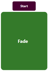
1. Fade Animation
Code:
import
React, { Component
} from
"react";
import {
Text,
View,
StyleSheet,
Animated,
TouchableOpacity
}  from  "react-native";
export  default  class  Fade  extends  Component  {
state  =  {
fadeValue:  new  Animated.Value(0)
};
_start  =  ()  =>  {
Animated.timing(this.state.fadeValue,  {
toValue:  1,
duration:  1000
}).start();
};
render() {
return  (
<View  style={styles.container}>
<TouchableOpacity  style={styles.btn}  onPress={()  =>  this._start()}>
<Text  style={styles.textBtn}>Start</Text>
</TouchableOpacity>
<Animated.View
style={{
opacity:  this.state.fadeValue,
height:  250,
width:  200,
margin:  5,
borderRadius:  12,
backgroundColor:  "#347a2a",
justifyContent:  "center"
}}
>
<Text  style={styles.text}>Fade  </Text>
</Animated.View>
</View>
);
}
}
const  styles  =  StyleSheet.create({
container:  {
flex:  1,
backgroundColor:  "#FFF",
alignItems:  "center",
justifyContent:  "center"
},
item: {},
btn: {
backgroundColor:  "#480032",
width:  100,
height:  40,
padding:  3,
justifyContent:  "center",
borderRadius:  6
},
text: {
fontSize:  20,
color:  "#fff",
fontWeight:  "bold",
textAlign:  "center"
},
item1:  {
backgroundColor:  "red",
padding:  20,
width:  100,
margin:  10
},
textBtn:  {
color:  "#f4f4f4",
fontWeight:  "bold",
textAlign:  "center"
}
});
Output:
Click on the Start button:
After Clicking on the Start button:
2. SlideDown and SlideUp Animation
Code:
import React, { Component } from 'react';
import { StyleSheet, View, Text, TouchableOpacity, LayoutAnimation, UIManager,
Platform } from 'react-native';
export default class Mynewapp
extends Component<{}>
{
constructor()
{
super();
if( Platform.OS === 'android' )
{
UIManager.setLayoutAnimationEnabledExperimental(true);
}
this.state = {
textLayoutHeight: 0,
updatedHeight: 0,
expand: false,
buttonText : 'Click Here To Expand'
}
}
expand_collapse_Function =()=>
{
LayoutAnimation.configureNext( LayoutAnimation.Presets.easeInEaseOut );
if( this.state.expand == false )
{
this.setState({
updatedHeight: this.state.textLayoutHeight,
expand: true,
buttonText: 'Click Here To Collapse'
});
}
else
{
this.setState({
updatedHeight: 0,
expand: false,
buttonText: 'Click Here To Expand'
});
}
}
getHeight(height)
{
this.setState({ textLayoutHeight: height });
}
render()
{
return(
<View style = { styles.MainContainer }>
<View style = { styles.ChildView }>
<TouchableOpacity activeOpacity = { 0.7 }
onPress = { this.expand_collapse_Function }
style = { styles.TouchableOpacityStyle }>
<Text style = { styles.TouchableOpacityTitleText
}>{this.state.buttonText}</Text>
</TouchableOpacity>
<View style = {{ height: this.state.updatedHeight, overflow:
'hidden' }}>
<Text style = { styles.ExpandViewInsideText }
onLayout = {( value ) => this.getHeight(
value.nativeEvent.layout.height )}>
Hello
</Text>
</View>
</View>
</View>
);
}
}
const styles = StyleSheet.create(
{
MainContainer:
{
flex: 1,
justifyContent: 'center',
paddingTop: (Platform.OS === 'ios') ? 20 : 0
},
ChildView:
{
borderWidth: 1,
borderColor: '#00BCD4',
margin: 5
},
TouchableOpacityStyle:
{
padding: 10,
backgroundColor: '#00BCD4'
},
TouchableOpacityTitleText:
{
textAlign: 'center',
color: '#fff',
fontSize: 20
},
ExpandViewInsideText:
{
fontSize: 16,
color: '#000',
padding: 12
}
});
Output:
After Clicking on the button
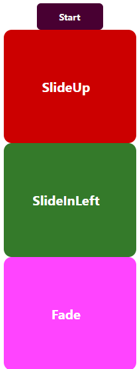
3. Group of Animations
Code:
import
React, { Component
} from
"react";
import {
Text,
View,
StyleSheet,
Animated,
TouchableOpacity
}  from  "react-native";
export  default  class  MyComponent  extends  Component  {
state  =  {
ready:  false,
SlideInLeft:  new  Animated.Value(0),
slideUpValue:  new  Animated.Value(0),
fadeValue:  new  Animated.Value(0)
};
_start  =  ()  =>  {
return  Animated.parallel([
Animated.timing(this.state.SlideInLeft,  {
toValue:  1,
duration:  500,
useNativeDriver:  true
}),
Animated.timing(this.state.fadeValue,  {
toValue:  1,
duration:  500,
useNativeDriver:  true
}),
Animated.timing(this.state.slideUpValue,  {
toValue:  1,
duration:  500,
useNativeDriver:  true
})
]).start();
};
render() {
let  {  slideUpValue,  fadeValue,  SlideInLeft  }  =  this.state;
return  (
<View  style={styles.container}>
<TouchableOpacity  style={styles.btn}  onPress={()  =>  this._start()}>
<Text  style={styles.textBtn}>Start</Text>
</TouchableOpacity>
<Animated.View
style={{
transform:  [
{
translateX:  slideUpValue.interpolate({
inputRange:  [0,  1],
outputRange:  [-600,  0]
})
}
],
flex:  1,
height:  250,
width:  200,
borderRadius:  12,
backgroundColor:  "#c00",
justifyContent:  "center"
}}
>
<Text  style={styles.text}>SlideUp  </Text>
</Animated.View>
<Animated.View
style={{
transform:  [
{
translateY:  SlideInLeft.interpolate({
inputRange:  [0,  1],
outputRange:  [600,  0]
})
}
],
flex:  1,
height:  250,
width:  200,
borderRadius:  12,
backgroundColor:  "#347a2a",
justifyContent:  "center"
}}
>
<Text  style={styles.text}>SlideInLeft  </Text>
</Animated.View>
<Animated.View
style={{
opacity:  fadeValue,
flex:  1,
height:  250,
width:  200,
borderRadius:  12,
backgroundColor:  "#f4f",
justifyContent:  "center"
}}
>
<Text  style={styles.text}>Fade  </Text>
</Animated.View>
</View>
);
}
}
const  styles  =  StyleSheet.create({
container:  {
flex:  1,
backgroundColor:  "#FFF",
alignItems:  "center"
},
item: {},
btn: {
backgroundColor:  "#480032",
width:  100,
height:  40,
padding:  3,
justifyContent:  "center",
borderRadius:  6,
marginTop:  29
},
text: {
fontSize:  20,
color:  "#fff",
fontWeight:  "bold",
textAlign:  "center"
},
item1:  {
backgroundColor:  "red",
padding:  20,
width:  100,
margin:  10
},
textBtn:  {
color:  "#f4f4f4",
fontWeight:  "bold",
textAlign:  "center"
}
});
Output:
Click on the Start Button:
After Clicking on the Start Button:
Conclusion
On the basis of the discussion above, we got to know that how one can create different animations like Fade, SlideUp, SlideDown, and SlideInLeft in React Native. It provides a huge variety of animations with the help of which one can design the best user experience in the application. One can configure different animations, also can combine different animated values, and even can compose different animations.
Recommended Articles
This is a guide to React to Native Animation. Here we discuss the Introduction and how animation is done in react native along with different examples and code implementation. You may also have a look at the following articles to learn more –


