Updated June 23, 2023
Introduction to Media Query CSS
Cascading Style Sheet 3(CSS3) introduces this media query technique. @media rule includes a certain block of CSS properties if a specific given condition is satisfied. This technique is used for accurate, responsive websites for smaller screen devices like mobiles, notepads, etc. In media queries, we have breakpoints; if our provided design does not behave the same for the breakpoints, then these media queries will solve the problem.
In media queries, we have a mobile-first concept, which means designing for mobile devices before designing for desktop devices or other devices like PCs, supercomputers, etc. Apply different styles for different media devices or media types using the @media rule. Frequent usages for media queries provide accurate, responsive web pages to desktops, mobile phones, laptops, and tablets. We can also apply these media queries for printed documents or screen readers like print, speech, or print (media type). We must apply these media styles to device screens of mobiles, PCs, Notepads, etc. Whichever devices are smaller or greater than the actual width.
Purpose of Media Queries
Given below are the purpose of media queries:
- Media queries are used to check.
- Height and width of a viewport.
- Height and width of a device.
- Tablet or phone in portrait mode or landscape mode( orientation) device resolution.
How to use Media Queries in CSS?
In CSS, the @media query contains different media types and consists of 1 or more expressions, which will become either false or true.
Syntax:
@media mediatype and (expressions) {
/* CSS Properties */
}
Example:
Code:
@media screen and (min-width: 580px) {
body {
background-color: red;
}
}
Examples of Media Query CSS
Given below are the examples:
Example #1 – With content
Code:
<!DOCTYPE html>
<html>
<head>
<title>
Media Query
</title>
<style>
/*By default screen becomes background is white and text is brown in color*/
body {
background-color: white;
color: brown;
}
p
{
border: solid 2px navy;
font-size: 24px;
}
/*If screen is 800px or less then background is red and text is white in color*/
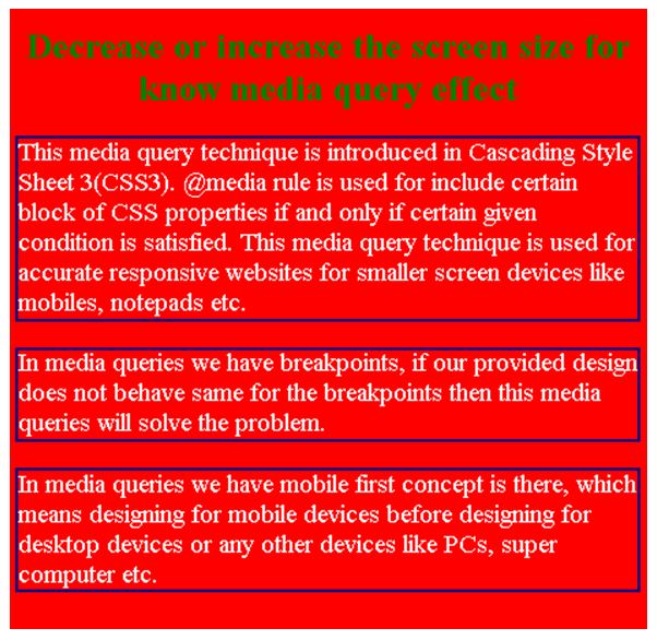
@media screen and (max-width: 800px) {
body {
background-color: red;
color: white;
}
}
/*If screen is 550px or less then background is fuchsia and text is white in color*/
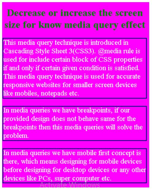
@media screen and (max-width: 550px) {
body {
background-color: fuchsia;
color: white;
}
}
h1
{
color: green;
text-align:center;
}
</style>
</head>
<body>
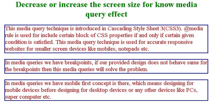
<h1>Decrease or increase the screen size for know media query effect</h1>
<p>This media query technique is introduced in Cascading Style Sheet 3(CSS3). @media rule is used for include certain block of CSS properties if and only if certain given condition is satisfied. This media query technique is used for accurate responsive websites for smaller screen devices like mobiles, notepads etc.</p>
<p>In media queries we have breakpoints, if our provided design does not behave same for the breakpoints then this media queries will solve the problem.</p>
<p>In media queries we have mobile first concept is there, which means designing for mobile devices before designing for desktop devices or any other devices like PCs, super computer etc.
</p>
</body>
</html>
Output:
Screen size 800px or less:
Screen size 800px or less:
Example #2 – Navigation Bar
Code:
<!DOCTYPE html>
<html>
<head>
<title>
Media Query
</title>
<style>
* {
box-sizing: border-box;
}
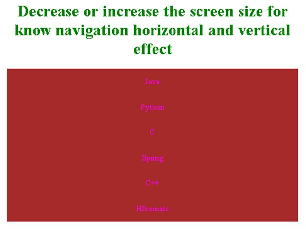
/*If screen is more than 700px then navigation becomes horizontal*/
.navBar {
overflow: hidden;
background-color: brown;
}
/* Style for navBar links */
.navBar a {
float: left;
text-align: center;
padding: 16px 18px;
text-decoration: none;
display: block;
color: fuchsia;
}
/* color change by hovering */
.navBar a:hover {
background-color: lightpink;
color: black;
}
/*If screen is 700px or less then navigation becomes vertical*/
@media screen and (max-width: 700px) {
.navBar a {
float: none;
width: 100%;
}
}
h1
{
color: green;
text-align:center;
}
</style>
</head>
<body>
<h1>Decrease or increase the screen size for know navigation horizontal and vertical effect</h1>
<div class="navBar">
<a href="#">Java</a>
<a href="#">Python</a>
<a href="#">C</a>
<a href="#">Spring</a>
<a href="#">C++</a>
<a href="#">HIbernate</a>
</div>
</body>
</html>
Output:
Default screen size:
Screen size is 700px or less:
Example #3 – With Columns
Code:
<!DOCTYPE html>
<html>
<head>
<title>
Media Query
</title>
<style>
* {
box-sizing: border-box;
}
/* create 4 columns equally */
.columnClass {
width: 25%;
padding: 20px;
float: left;
color: brown;
}
/* clear the floats */
.rowClass:after {
display: table;
clear: both;
content: "";
}
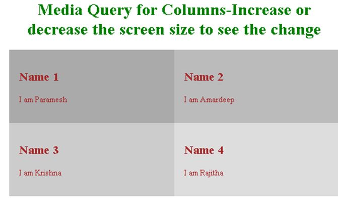
/*If screen is 800px or less then column width becomes 50% means 2 rows*/
@media screen and (max-width: 800px) {
.columnClass {
width: 50%;
}
}
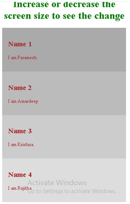
/*If screen is 800px or less then column width becomes 100% means 1 rows*/
@media screen and (max-width: 500px) {
.columnClass {
width: 100%;
}
}
h1
{
color: green;
text-align:center;
}
</style>
</head>
<body>
<h1>Media Query for Columns-Increase or decrease the screen size to see the change</h1>
<div class="rowClass">
<div class="columnClass" style="background-color:#aaa;">
<h2>Name 1</h2>
<p>I am Paramesh</p>
</div>
<div class="columnClass" style="background-color:#bbb;">
<h2>Name 2</h2>
<p>I am Amardeep</p>
</div>
<div class="columnClass" style="background-color:#ccc;">
<h2>Name 3</h2>
<p>I am Krishna</p>
</div>
<div class="columnClass" style="background-color:#ddd;">
<h2>Name 4</h2>
<p>I am Rajitha</p>
</div>
</div>
</body>
</html>
Output:
800px or less screen size:
500px or less screen size:
Default screen size:
Conclusion
Media Queries in CSS sets accurate screen sizes for smaller devices like mobiles, notepads, etc. Based on the screen size page will adjust the screen size by using the width property.
Recommended Articles
We hope that this EDUCBA information on “Media Query CSS” was beneficial to you. You can view EDUCBA’s recommended articles for more information.

