Updated April 14, 2023
Introduction to JQuery Modal
JQuery Modal is an overlay dialog box or in other words, a popup window that is made to display on the top or ‘overlayed’ on the current page. It is a pop up modal box that is converted into the viewport deliberately for the user to interact with before he can return to the actual site.
What is a Modal Pop Up Box?
A pop up modal box is a floating window or viewport which has a title and some content. Modal Pop Up boxes can be used for warnings or simple subscription forms or informational layer or ‘yes or no’ dialog box or alerts and as such. These Modal Pop-ups are generally seen being used on the internet for initiating subscriptions, controlling forms like registrations, or logins. These modal pop up boxes are deliberately stationed on the same page without any re-directions to other pages.
The Modal Pop-Ups can be created using HTML, CSS, or JavaScript for which one needs to know about Bootstrap Modal, CSS Modal and/or JQuery Modal. In this article, we will discuss JQuery Modal, its step by step creation and some of its examples.
Creating a JQuery Modal
So a Modal Pop Up can be used to help our users or display added important information without refreshing or redirecting the users to the new page. By no redirection, the user feels safe and experience better since he gets the relevant information in a popup box on the same page in a familiar page.
A simple and basic Modal can be easy to create and code and also sometimes considered more appropriate than the usage of plugins.
Steps to Create JQuery Modal
Below are the basic steps of creating a basic JQuery Modal.
Step #1 – The HTML
The first step is to draft your HTML code. We will leave the scripting part for the last. We will create a rough draft of our HTML code loosely structuring our modal since our final modal will be generated by the script.
HTML Code:
<body>
<!-- Code 1-->
<h2> <i> JQuery Modal Demo </i> </h2>
<!-- Trigger The JQuery Modal Dialog Box -->
<button id="modalBtn">Click to open Modal Demo DialogBox</button>
<!-- Our Modal Pop Up Box-->
<div id="modalDemo" class="jqModal">
<!-- Our Content for the Modal Dialog Box-->
<div class="content">
<span class="exit">×</span>
<p>Welcome to JQuery Modal Demo Text...</p>
</div>
</div>Our HTML structure has two parts. One will be the overlay part and one is the modal part. Modal part again has three parts:
- The Header contains Header for the Modal Pop Up.
- The Content contains the body text for the Modal.
- The Footer, which includes the exit or Close button.
Step #2 – The CSS
Next, we will add our CSS for the presentation of our code and dialog box. The overlay will be made fixed according to the user’s viewport. The width and height set to 100% relative gain to the user’s viewport aiming for complete coverage of the web page.
<head>
<style>
body {font-family:Verdana, Geneva, sans-serif;}
/* CSS for The Modal Dialog Box(background) */
.jqModal {
display: none; /* By default, display will be hidden */
position: fixed; /* Position will be fixed */
z-index: 1; /* makes the modal box display on the top */
padding-top: 100px; /* Location of the modal box */
left: 0;
top: 0;
width: 100%; /* width 100%, resizable according to window size */
height: 100%; /* height 100%, resizable according to window size */
overflow: auto; /* Enable scroll if needed */
background-color: rgb(0,0,0); /* color for the Fallback */
background-color: rgba(0,0,0,0.7); /* Opacity for the fallback */
}
/* CSS for Modal Dialog Content Text */
.content {
background-color:#FFF;
margin: auto;
padding: 20px;
border: 3px solid #809;
width: 80%;
}
/* CSS for Cross or exit or close Button */
.exit {
color: #809;
float: right;
font-size: 30px;
font-weight: bold;
}
.exit:hover,
.exit:focus {
color: #000;
cursor: pointer;
}
#modalBtn{
background-color: #4CAF50;
color: white;
padding: 12px 20px;
margin: 10px 0;
border: none;
border-radius: 4px;
cursor: pointer;
float: left;
}
</style>
</head>
Step #3 – The Script
The last step is the main and important step. It is here where we will trigger the modal pop up and make it visible for the user. We will be attaining the following points through our script:
> To open the Modal Pop Up on command or when triggered.
> To close or exit the Modal Pop Up when the user clicks the (x) button.
> To position the Modal Pop Up in the center and stay centered even if the user changes or resizes his viewport.
Script Code:
<script>
// Set object for the modal
var myModal = document.getElementById("modalDemo");
// Set object for the button that will trigger the modal box
var myButton = document.getElementById("modalBtn");
// Set an element that will close the modal box
var exitBtn = document.getElementsByClassName("exit")[0];
// Allows display of modal box, when user clicks the button
myButton.onclick = function() {
myModal.style.display = "block";
}
// Allows the user to close the modal box, when user will click on (x) button
exitBtn.onclick = function() {
myModal.style.display = "none";
}
// Allows the user to close the modal box, even when the user clicks anywhere outside of the modal box
window.onclick = function(event) {
if (event.target == myModal) {
myModal.style.display = "none";
}
}
</script>
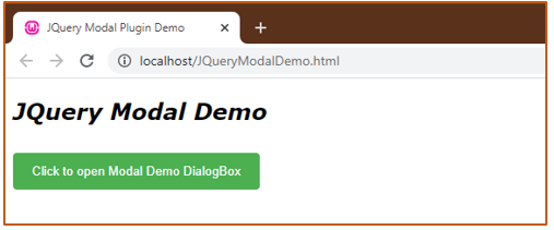
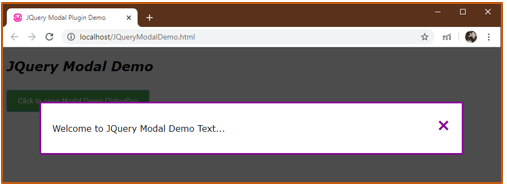
When the above code is executed, following is the output we get :
When the user clicks on the button ‘Click to open Modal Demo DialogBox’, we get our Modal Pop Up.
Without any doubts, you can code or create whichever type of modal for whatever aim and apply anywhere on your web page. However, there is always an easy and simple way out, some may call it more functional. You can always use plugins or templates like offered by PopupSmart which creates everything for you, you just need your aim right.
Recommended Articles
This is a guide to JQuery Modal. Here we discuss what is a Modal Pop Up Box and basic steps of creating it with the codes and outputs. You may also look at the following articles to learn more –


