Updated June 9, 2023
Introduction to CSS Checkbox Style
While designing pages in HTML, you might want to change the style of all or some of the elements like the checkbox, radio button, etc., of the page. CSS Checkbox Style is the style that is applied in your checkbox component of the HTML code by tweaking different values of the properties to achieve a rich modern look of your HTML UI design which can be more attractive to end users, eventually increasing more engagement of your webpage.
Syntax:
There is no definite syntax for the CSS checkbox styling, as these are generic CSS parameters that must be changed per your requirements. You can use CSS coding inside <style> tag or in external HTML code, which can be linked or imported. You can define properties such as height, style, color, width, and height according to the design requirements.
Example:
input[type="checkbox"] {
height:1.5em;
width:1.5em;
cursor:pointer;
position:relative;
-webkit-transition: .10s;
border-radius:4em;
background-color:red;
}
How does CSS Checkbox Style work?
- You need to mention the required values according to your need in the CSS section under the style tag or external CSS as per the syntax in your HTML code to get that style in the output.
- You can see the example section with code to see how you can implement different styles of one or multiple element(s) in your HTML code by the use of different values of parameters in the CSS section.
Examples of CSS Checkbox Style
Given below are the examples:
Example #1
In the first example, we will see a default checkbox which we generally see in a typical HTML page with no special style associated with the checkbox.
Code:
<html>
<body>
<h1>Which eduCBA courses do you like most? Mark all that apply</h1>
<label style = "font-size: 25px" >
Java
<input type="checkbox">
</label><p></p>
<label style = "font-size: 25px" >
Big Data
<input type="checkbox">
</label><p></p>
<label style = "font-size: 25px" >
Angular JS
<input type="checkbox">
</label><p></p>
</body>
</html>
Output:
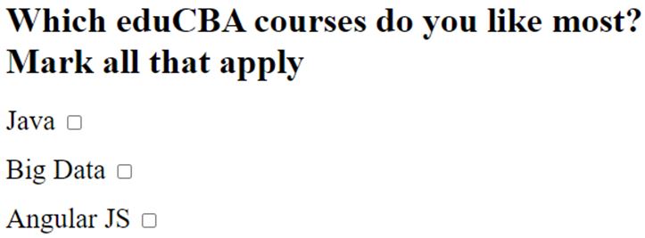
If you run the above code, you will see the below output as a default HTML checkbox.
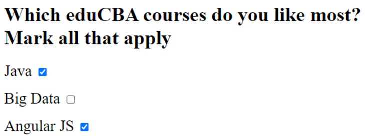
Once you click the checkbox, you will see the below output.
In the next examples, you will see how we are changing the style of checkboxes by tweaking different parameters in CSS.
Example #2
In the second example, we will see how a style of a default checkbox will be using different CSS properties. Once the link is clicked, the style and color of the checkbox will also change as per the values in the CSS code.
Code:
<!DOCTYPE html>
<html>
<style>
body {
padding:1em;
}
input[type="checkbox"] {
-webkit-appearance:none;
height:1.5em;
width:1.5em;
cursor:pointer;
position:relative;
-webkit-transition: .10s;
border-radius:4em;
background-color:red;
}
input[type="checkbox"]:checked {
background-color:blue;
}
input[type="checkbox"]:before, input[type="checkbox"]:checked:before {
position:absolute;
top:0;
left:0;
width:100%;
height:100%;
line-height:1.5em;
text-align:center;
color:white;
}
input[type="checkbox"]:checked:before {
content: '✔';
}
</style>
<body>
<h1>Which eduCBA courses do you like most? Mark all that apply</h1>
<label style = "font-size: 25px" >
Java
<input type="checkbox">
</label><p></p>
<label style = "font-size: 25px" >
Big Data
<input type="checkbox">
</label><p></p>
<label style = "font-size: 25px" >
Angular JS
<input type="checkbox">
</label><p></p>
</body>
</html>
Output:
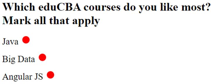
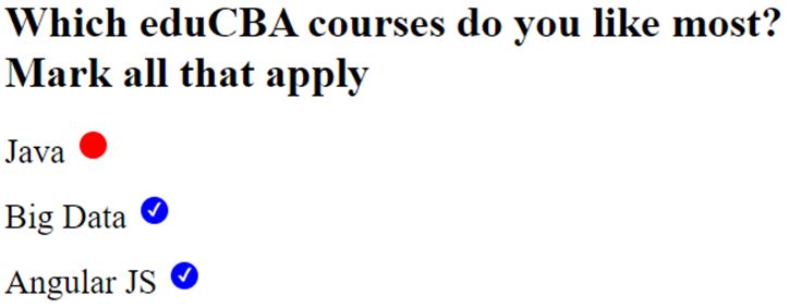
Those are not radio buttons; those are checkboxes. We have changed the style of checkboxes by tweaking the values of different CSS properties.
Compare the output with the default output in the previous example to compare the custom style.
Now when you click the checkboxes, those will change colors, and that is because of the tweaking in values of CSS properties.
Again compare the output with the default output in the previous example to compare the custom style.
Example #3
In this example, we will see a different style of a default checkbox achieved using other CSS properties. Once the link is clicked, the style and color of the checkbox will also change as per the values of properties in the CSS section of the HTML code.
Code:
<!DOCTYPE html>
<html>
<head>
<style>
/*create basic style*/
.styl {
display: block;
position: relative;
padding-left: 45px;
margin-bottom: 15px;
cursor: pointer;
font-size: 20px;
}
/* Hide the checkbox which is default*/
input[type=checkbox] {
visibility: hidden;
}
/* now create a custom checkbox based
on requirement */
.chkmrk {
position: absolute;
top: 0;
left: 0;
height: 25px;
width: 25px;
background-color: blue;
}
/* mention the background color to be
shown when it is checked */
.styl input:checked ~ .chkmrk {
background-color: green;
}
/* do not show when the checkbox is not checked */
.chkmrk:after {
content: "";
position: absolute;
display: none;
}
/* showthe checkmark when it is checked */
.styl input:checked ~ .chkmrk:after {
display: block;
}
/* now create a square to be the sign as
when checkbox is checked */
.styl .chkmrk:after {
left: 6px;
bottom: 5px;
width: 6px;
height: 6px;
border: solid white;
border-width: 4px 4px 4px 4px;
}
</style>
</head>
<body>
<h1>Which courses you love in eduCBA most? Mark all that apply</h1>
<label class="styl" style = "color:black;">
Java
<input type="checkbox">
<span class="chkmrk"></span>
</label>
<label class="styl" style = "color:black;">
Big Data and Analytics
<input type="checkbox" >
<span class="chkmrk"></span>
</label>
<label class="styl" style = "color:black;">
Angular JS
<input type="checkbox" >
<span class="chkmrk"></span>
</label>
</body>
</html>
Output:
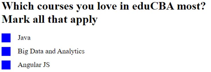
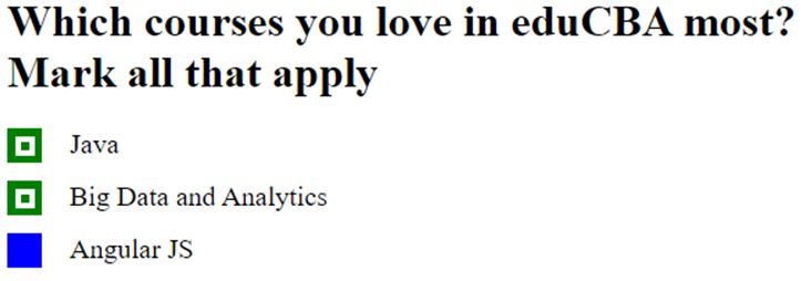
We have changed the style of checkboxes by tweaking the values of different CSS properties.
Compare the output with the other outputs in previous examples.
Now when you click the checkboxes, those will change style again. Again compare the output with outputs in previous examples, and see how this time the style is changed when the checkbox is clicked.
Conclusion
This concludes the topic “CSS Checkbox Style”. This article will be helpful for those who are associated with HTML design. Practically this styling in checkboxes gives the style and design of your HTML page a rich look and feel, which essentially increases user engagement.
Recommended Articles
We hope that this EDUCBA information on “CSS Checkbox Style” was beneficial to you. You can view EDUCBA’s recommended articles for more information.

