Updated June 16, 2023

Introduction to CSS Horizontal Align
CSS Box Alignment module features define and specify CSS Horizontal Align. It aligns and relates different sets of alignments for various boxes, and developers use it in boxes and layout models such as block layouts, grid layouts, table layouts, and flex layouts. These layouts are responsible for setting and aligning boxes in horizontal order. CSS files support both horizontal and vertical layouts for boxes and layouts. They also support images, text, and animation data in horizontal layouts.
Syntax and Parameters
The CSS codes are written within the HTML page using a style tag. We can follow some rules and syntax to make customized web pages more attractive.
<html>
<head>
<style>
.example{
position:absolute;
right:
left:
width:
height:
background-color:
}
</style>
<body>
</body>
</html>
The above codes represent the basic syntax for using CSS horizontal alignments with both left and right positions. The block elements can support it. We can enable the above css properties and pass some default values or user-defined values with any supported formats.
How Does Horizontal Align Work in CSS?
The Horizontal alignment is used for aligning the data contents horizontally and vertically for usual requirements in any web application. It has different sets of ways to achieve these features in the CSS file. The first type is CSS transform its one of the types for creating and aligning the data contents in the web pages for fixed content blocks with widths and heights in both directions. Sometimes, the blocks occupy 100% of the parent’s width when the HTML contents have a non-fixed width range. This allows them to expand across the entire width range of the parent containers, achieving a fully horizontal position. We can mark and check this by removing the customized width ranges for the contents using examples like codepen, etc. During this technique, it’s not acceptable for the work if the data contents are the inline level position of the elements it supports and works for only the block-level elements. The Modern flexbox is one of the main cross-axis layouts. It depends on the flex-direction property. By default, the flex-direction value is set to row. So the main axis is X, and the cross axis is Y. It belongs to the column direction. We can use <div> tag elements to align the elements in the web pages in the horizontal and vertical directions. Because mainly in div tag containers with fixed width and height, even though they have some default properties with values for presenting the web pages more attractive.
If we have aligned the text or any data through horizontal position in the web pages, we use <div> tag in html, which can be respected to the parent html elements. Also, the css margin property is enabled with the default values like auto for both the left and right side of the margins. We can set the style rules as margin, and the text will be aligned parallelly in Inline Elements on the page. Each line of the page content is a line box. We already said css has many different properties. Likewise, text-align is one of the properties for aligning the text values on the web page. We can use these properties to align the text as the center, left, right, or justified. The auto sometimes defaults the value of the properties like margin:0 auto. It supports the left, right, and center alignment for elements. We can use these types in the margin lines or boxes from the file. It will be reflected in the applications using div tag elements it will be possible for the block boxes.
Examples of CSS Horizontal Align
Here are the below examples:
Example #1
Code:
<!DOCTYPE html>
<html lang="en">
<head>
<meta charset="utf-8">
<title>Welcome To My Domain</title>
<style>
.first {
width: 83%;
margin: 2 auto;
padding: 23px;
background: green;
}
</style>
</head>
<body>
<div class="first">
<h1>Welcome To My Domain</h1>
<p>Users are Welcome</p>
</div>
</body>
</html>
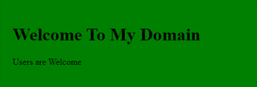
Output:
Example #2
Code:
<!DOCTYPE html>
<html>
<head>
<title>Welcome To My Domain</title>
<style>
.first {
padding: 12px;
width: 73%;
margin: 2 auto;
background-color: green;
text-align: center;
color: red;
border-radius: 1 2 52px 53px;
border: 2px yellow;
}
.second{
margin: 12px;
padding: 13px;
color: green;
border: 3px blue;
}
.third{
width: 122px;
display: inline-block;
background-color: blue;
}
.four{
text-align: right;
}
.five{
text-align: center;
}
.six{
text-align: left;}
.seven{
text-align: center;
}
.eight {
background-color: violet;
}
.nine{
float: right;
}
.ten{
position: absolute;
left: 153px;
}
</style>
</head>
<body>
<div class="first">Siva</div>
<div class="second">Raman</div>
<span class="third">Arun</span>
<span class="four">Kumar</span>
<span class="five">Sam</span>
<div class="six">
<div class="seven">xxx</div>
<div class="eight">user</div>
<div class="nine">welcome</div>
</div>
</body>
</html>
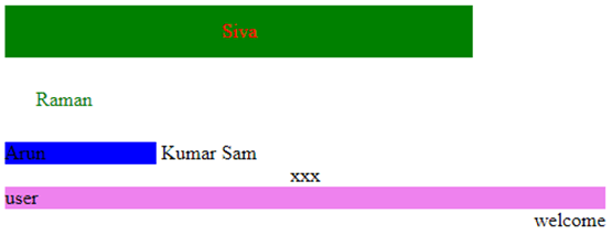
Output:
Example #3
Code:
<!DOCTYPE html>
<html>
<head>
<title>Welcome To My Domain</title>
<style>
.first {
padding: 12px;
width: 73%;
margin: 2 auto;
background-color: green;
text-align: center;
color: red;
border-radius: 1 2 52px 53px;
border: 2px yellow;
}
.second{
margin: 12px;
padding: 13px;
color: green;
border: 3px blue;
}
.third{
width: 122px;
display: inline-block;
background-color: blue;
}
.four{
text-align: right;
}
.five{
text-align: center;
}
.six{
text-align: left;
}
.seven{
text-align: center;
}
.eight {
background-color: violet;
}
.nine{
float: right;
}
.ten{
position: absolute;
left: 153px;
}
.eleven {
width: 83%;
margin: 2 auto;
padding: 23px;
background: green;
}
.sam {
position: absolute;
right: 3px;
width: 303px;
background-color: yellow;
}
</style>
</head>
<body>
<div class="six">Siva</div>
<div class="second">Raman</div>
<div class="third">Arun</div>
<div class="four">Kumar</div>
<div class="five">Sam</div>
<div class="eleven">
<img src="first.jpg"alt="centered image"/>
</div>
<div class="seven">xxx</div>
<div class="eight">user</div>
<div class="nine">welcome</div>
<div class="sam">Sarath</div>
</div>
</body>
</html>
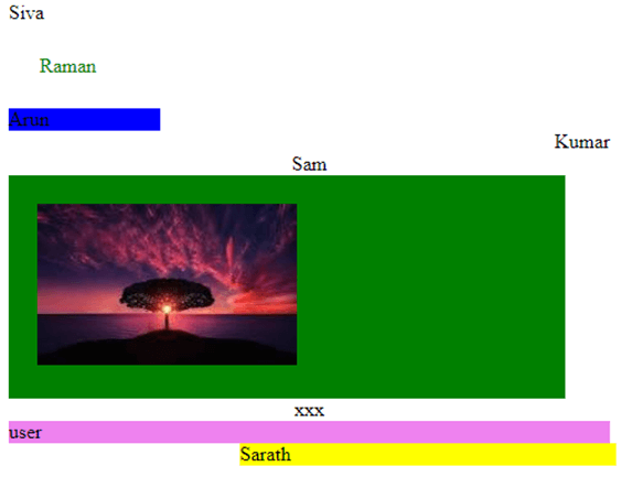
Output:
In the above three examples, we have used horizontal alignments in the different scenarios of the web pages’ left, right, and center positions. In the alignments, we have set some default values.
Conclusion
In the CSS technique, alignment is one of the features for creating web pages with user attractiveness. CSS utilizes horizontal alignment as a technique to align data with specific types. Also, we used margin property for aligning the data from the user perspective.
Recommended Articles
We hope that this EDUCBA information on “CSS Horizontal Align” was beneficial to you. You can view EDUCBA’s recommended articles for more information.


