Updated April 20, 2023

Introduction to React Native Elements
React Native Element is a library used for styling the React Application, it has components that are inbuilt and replaces the basic components of React Native. The styles provided by Elements are very much usable and can be customized according to our needs. Each and every component in Elements includes a <View/> component of React Native and the styling is done according to the props indicated. In this article, we will go through the working of Elements and we will see the usage of some of the Elements in the examples.
Syntax of React Native Element
Syntax of Different Elements with their Working:
1. Button
Buttons are the elements that can be displayed on the screen as text or picture and it is used to interact on the screen. Buttons help us in initiating actions on the application. The syntax of using a basic button is written below. We have provided the different attributes of our button like the title, color, and accessibility label which explains how the button will be displayed on the screen.
import { Button } from "react-native";
<Button
onPress={onPressLearnMore}
title="Click"
color=" #b1f266"
accessibilityLabel="Click the Button"
/>
2. Text
This is used to display Text. So whatsoever will be in between <Text> </Text> will get displayed in the output, according to the conditions applied for displaying the content. The working of Text in React Native is very simple, one just has to import Text through React Native, and then to display the text content, just place the content between <Text> </Text>.
import { Text } from "react-native";
<Text style={styles.baseText}>
<Text style={styles.titleText} onPress={onPressTitle}>
{titleText}
{"\n"}
{"\n"}
</Text>
<Text numberOfLines={5}>{bodyText}</Text>
</Text>
3. Image
Local images, images from static resources, or any other kind of images can be displayed using the Image React element. Firstly, Image is imported from react-native and then various net sources are used to fetch images and display them in our output.
import { Image } from "react-native";
<Image source={{uri: 'https://url_of_image.png'}}
style={{width: 68, height: 68}} />
<Image source={{uri: 'https://url_of_image.png'}} />
4. Tooltip
The tooltip is used to display informative text when one taps or clicks on the element. Firstly, Tooltip is imported through react-native-elements and within <Tooltip></Tooltip>, the text is displayed “Click me” and once you tap/click on the text, a pop-up comes with the text “Information Exist Here”.
import { Tooltip
, Text } from 'react-native-elements';
...
<Tooltip popover={<Text>Information Exist here</Text>}>
<Text>Click me</Text>
</Tooltip>
5. Overlay
The overlay is used to provide information or extract information from the user. Its a view floating over the content of the app. Firstly, Overlay is imported through react-native-elements and within <Overlay></Overlay> a floating text is displayed.
import { Overlay } from 'react-native-elements';
<Overlay isVisible={this.state.isVisible}>
<Text>It is an Example of Overlay!</Text>
</Overlay>;
6. Tiles
Tiles are used to show the content related to a subject, It works just as Cards on React native. Between <Tiles></Tiles> different tiles are displayed using <Placeholder/>. And Tiles are imported through @mobily/stacks.
import { Tiles } from "@mobily/stacks";
<Tiles space={2} columns={3}>
<Placeholder />
<Placeholder />
<Placeholder />
<Placeholder />
<Placeholder />
</Tiles>
Example of React Native Elements
Here are the following examples mentioned below
Example#1 – Various Elements Such as Images, Text, Button
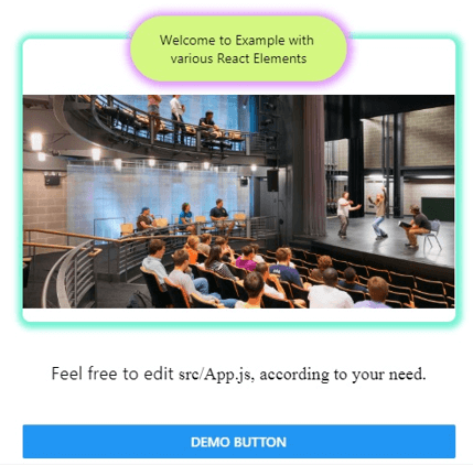
In the example below, various react to native elements like Images, Text, and buttons.
In the Attraction.js file, the View element is used as,
<View style={styles.wrapper}>
<View style={styles.distance}>
....
</View>
And Image element is used as,
<Image
accessibilityLabel="Teatro Solís"
source={{
uri: "http://theatreprojects.com/files/projects/allegheny-college-vukovich-center-for-communication-arts-01.jpg"
}}
resizeMode="contain"
style={styles.image}
/>
And Text element is used as,
<Text>Welcome to Example with various React Elements</Text>In the App.js file, the button element is used as,
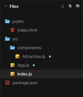
<Button onPress={() => {}} title="DEMO button" />The files used to implement the code below are:
Attraction.js
import React from "react";
import { Image
, StyleSheet
, Text
, View } from "react-native";
function Attraction(props) {
return (
<View style={styles.wrapper}>
<View style={styles.distance}>
<Text>Welcome to Example with various React Elements</Text>
</View>
<Image
accessibilityLabel="Teatro Solís"
source={{
uri: "http://theatreprojects.com/files/projects/allegheny-college-vukovich-center-for-communication-arts-01.jpg"
}}
resizeMode="contain"
style={styles.image}
/>
</View>
);
}
const styles = StyleSheet.create({
wrapper: {
backgroundColor: "#fff",
boxShadow: "1px 1px 6px 6px #74f2d3",
borderRadius: 8,
marginTop: 45
},
distance: {
backgroundColor: "#d4f781",
borderRadius: 50,
boxShadow: "1px 1px 8px 5px #df96fa",
paddingTop: 15,
paddingBottom: 15,
paddingLeft: 25,
paddingRight: 25,
textAlign: "center",
maxWidth: 225,
alignSelf: "center",
marginTop: -24
},
image: {
width: "99.9%",
height: 250,
resizeMode: "contain"
}
});
export default Attraction;
App.js
import React from "react";
import { StyleSheet
, Button
, Text
, View } from "react-native";
import Attraction from "./components/Attraction";
const Link = props => (
<Text
{...props}
accessibilityRole="link"
style={StyleSheet.compose(
styles.link,
props.style
)}
/>
);
function App() {
return (
<View style={styles.app}>
<Attraction />
<Text style={styles.text}>
Feel free to edit <Text style={styles.code}>src/App.js, according to your need</Text>.
</Text>
<Button onPress={() => {}} title="DEMO button" />
</View>
);
}
const styles = StyleSheet.create({
app: {
marginHorizontal: "auto",
maxWidth: 450
},
title: {
fontWeight: "bold",
fontSize: "1.75rem",
marginVertical: "2em",
textAlign: "center"
},
text: {
lineHeight: "1.75em",
fontSize: "1.15rem",
marginVertical: "2em",
textAlign: "center"
},
link: {
color: "#a151f0"
},
code: {
fontFamily: "times"
}
});
export default App;
index.js
import React from "react";
import ReactDOM from "react-dom";
import App from "./App";
ReactDOM.render(<App />, document.getElementById("root"));
Output:
Example#2 – Tooltip, a React Native Element
In the example below, Tooltip is imported through,
import ReactTooltip from "react-tooltip";
And is used as,
<div className="App">
<ReactTooltip />
<h1 onClick={handleClick} data-tip="🏓 Click to Subscribe">
Heyoo Buddy
</h1>
<h2 data-tip="😅 Greetings from EDUCBA 😅">
Welcome to EDUCBA!
</h2>
<a href="" data-tip="This Doesn't take you Anywhere 😅">
Link to Nowhere
</a>
</div>
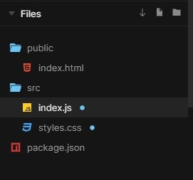
In the example, the files used are:
index.js
import React from "react";
import ReactDOM from "react-dom";
import ReactTooltip from "react-tooltip";
import "./styles.css";
function App() {
const handleClick = () => {
alert("Woaah! Thanks for Subscribing");
};
return (
<div className="App">
<ReactTooltip />
<h1 onClick={handleClick} data-tip="🏓 Click to Subscribe">
Heyoo Buddy
</h1>
<h2 data-tip="😅 Greetings from EDUCBA 😅">
Welcome to EDUCBA!
</h2>
<a href="" data-tip="This Doesn't take you Anywhere 😅">
Link to Nowhere
</a>
</div>
);
}
const rootElement = document.getElementById("root");
ReactDOM.render(<App />, rootElement);
styles.css
.App {
font-family: 'Times New Roman'
, Times
, serif;
}
::selection {
background: #bf6ad9;
color: #db326e;
}
Output:
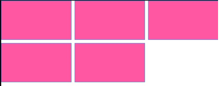
Example #3 – Tile, a React Native Element
In the example below, the tile element is imported as,
import { Tiles } from "@mobily/stacks";
And is used as,
<Tiles space={2} columns={3}>
<Placeholder />
<Placeholder />
<Placeholder />
<Placeholder />
<Placeholder />
</Tiles>
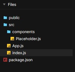
The files used to implement the example below are:
Placeholder.js
import React from "react";
import { View
, StyleSheet } from "react-native";
const styles = StyleSheet.create({
root: {
backgroundColor:"#ff57a2",
borderWidth: StyleSheet.hairlineWidth,
borderColor: "#4784ed"
}
});
export const Placeholder = props => {
const { width, height= 99, style } = props;
return <View style={[styles.root, { width, height }, style]} />;
};
App.js
import React from "react";
import { Tiles } from "@mobily/stacks";
import { Placeholder } from "./components/Placeholder";
const App = () => {
return (
<Tiles space={2} columns={3}>
<Placeholder />
<Placeholder />
<Placeholder />
<Placeholder />
<Placeholder />
</Tiles>
);
};
export default App;
index.js
import { AppRegistry } from "react-native";
import App from "./App";
AppRegistry.registerComponent("App", () => App);
AppRegistry.runApplication("App", {
rootTag: document.getElementById("root")
});
Output:
Conclusion
On the basis of the above article, we understood the concept of Elements. We went through the working of React Native elements with their respective syntaxes and understood the usage of Elements from the examples demonstrated above. I hope this article, would have made Elements quite simpler to understand and implement.
Recommended Articles
This is a guide to React Native Element. Here we discuss the introduction, syntax, and working of React Native Elements along with different examples and code implementation. You may also have a look at the following articles to learn more –
