Updated June 28, 2023

Introduction to Bootstrap flexbox
The bootstrap flexbox helps to make responsive web application content and their container. Flexbox creates space between containers and elements based on the device screen size and is beneficial for responsive web design. It controls the height, width, and size of the element according to the user’s requirements and desired position. It also manages the layout of the elements and the flexbox container. Additionally, it aligns the elements within the web application container as needed. The flexbox class serves as a replacement for the float class.
Syntax
- The basic flexbox syntax is below.
- The d-flex class is useful for bootstrap4 flexbox. The flex class is keeping inside of the div tag.
<div class = "d-flex"> Bootstrap flexbox items <div>- The bootstrap inline flexbox syntax is below.
- The d-inline-flex class is useful for equal space between elements and containers.
- It works as a responsive and stable layout for the web application.
<div class = "d-inline-flex"> Bootstrap flexbox items <div>- The bootstrap horizontal flexbox syntax is below.
- The flexbox items place in one row using a flex row class.
<div class = "d-flex flex-row"> Bootstrap flexbox items <div>- The reverse horizontal flexbox items display the right side of the component.
<div class = "d-flex flex-row-reverse"> Bootstrap flexbox items <div>- The basic vertical flexbox syntax is below.
- The flexbox items display vertically using the flex column class in the bootstrap4.
- The default and reverse vertical flexbox class used as per the user’s requirement.
<div class = "d-flex flex-column"> Bootstrap flexbox items <div>
<div class = "d-flex flex-column-reverse"> Bootstrap flexbox items <div>- The basic bootstrap flexbox alignment syntax is below.
- The flexbox is useful to justify-content class for display the flexbox item position as per requirement.
- The start, end, between, around, and center alignments are used with flex class.
<div class = "d-flex justify-content-start"> Bootstrap flexbox items </div>
<div class = "d-flex justify-content-end"> Bootstrap flexbox items </div>- The basic flexbox wrap syntax is below.
- The flexbox used to wrap, reverse wrap, and no wrap with respective flexbox classes.
<div class = "d-flex flex-wrap"> Bootstrap flexbox items </div>
<div class = "d-flex flex-wrap-reverse"> Bootstrap flexbox items </div>- The flex-nowrap is the default flexbox. The users need to use it for design and responsive purposes.
<div class = "d-flex flex-nowrap"> Bootstrap flexbox items </div>How does flexbox work in Bootstrap?
- The bootstrap4 supportive files add in the head section of the html page for bootstrap flexbox.
<head>
<meta name = "viewport" content = "width = device-width, initial-scale = 1">
<link rel = "stylesheet" href = "https://maxcdn.bootstrapcdn.com/bootstrap/4.5.2/css/bootstrap.min.css">
<script src = "https://ajax.googleapis.com/ajax/libs/jquery/3.5.1/jquery.min.js">
</script>
<script src = "https://cdnjs.cloudflare.com/ajax/libs/popper.js/1.16.0/umd/popper.min.js">
</script>
<script src = "https://maxcdn.bootstrapcdn.com/bootstrap/4.5.2/js/bootstrap.min.js">
</script>
</head>- The flexbox class adds in required container tag like <div> tag.
<div class = "d-flex"> The bootstrap flexbox content </div>- The flexbox elements and content are placed inside of the div tag.
<body>
<div class="d-flex p-1 bg-danger">
<div class="p-1 m-1 bg-success text-white">Flex first content </div>
<div class="p-1 m-1 bg-warning text-white">Flex second content </div>
</div>
</body>
Examples
Here are the following examples mention below
Example #1
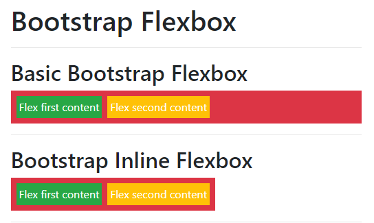
The basic flexbox and inline flexbox example and output.
Code:
<!DOCTYPE html>
<html lang="en">
<head>
<title>Bootstrap flexbox Example</title>
<meta charset="utf-8">
<meta name = "viewport" content = "width = device-width, initial-scale = 1">
<link rel = "stylesheet" href = "https://maxcdn.bootstrapcdn.com/bootstrap/4.5.2/css/bootstrap.min.css">
<script src = "https://ajax.googleapis.com/ajax/libs/jquery/3.5.1/jquery.min.js">
</script>
<script src = "https://cdnjs.cloudflare.com/ajax/libs/popper.js/1.16.0/umd/popper.min.js">
</script>
<script src = "https://maxcdn.bootstrapcdn.com/bootstrap/4.5.2/js/bootstrap.min.js">
</script>
</head>
<body>
<div class="container mt-3">
<h1> Bootstrap Flexbox </h1>
<hr>
<h2> Basic Bootstrap Flexbox </h2>
<div class="d-flex p-1 bg-danger">
<div class="p-1 m-1 bg-success text-white">Flex first content </div>
<div class="p-1 m-1 bg-warning text-white">Flex second content </div>
</div>
<hr>
<h2> Bootstrap Inline Flexbox </h2>
<div class="d-inline-flex p-1 bg-danger">
<div class="p-1 m-1 bg-success text-white">Flex first content </div>
<div class="p-1 m-1 bg-warning text-white">Flex second content </div>
</div>
<hr>
</div>
</body>
</html>
Output:
Example #2
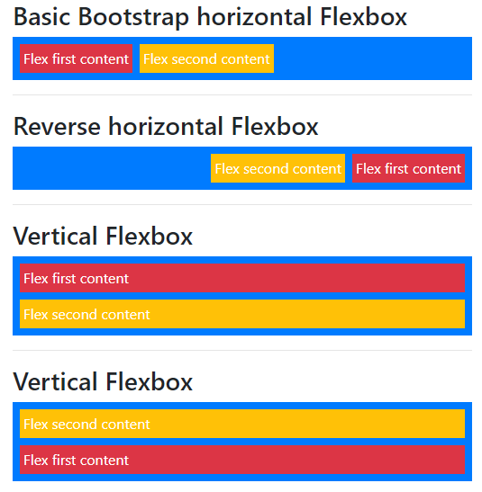
The horizontal and vertical example and output.
Code:
<!DOCTYPE html>
<html>
<head>
<title>Bootstrap flexbox Example</title>
<meta name = "viewport" content = "width = device-width, initial-scale = 1">
<link rel = "stylesheet" href = "https://maxcdn.bootstrapcdn.com/bootstrap/4.5.2/css/bootstrap.min.css">
<script src = "https://ajax.googleapis.com/ajax/libs/jquery/3.5.1/jquery.min.js">
</script>
<script src = "https://cdnjs.cloudflare.com/ajax/libs/popper.js/1.16.0/umd/popper.min.js">
</script>
<script src = "https://maxcdn.bootstrapcdn.com/bootstrap/4.5.2/js/bootstrap.min.js">
</script>
</head>
<body>
<div class="container">
<h3> Basic Bootstrap horizontal Flexbox </h3>
<div class="d-flex flex-row p-1 bg-primary">
<div class="p-1 m-1 bg-danger text-white">Flex first content </div>
<div class="p-1 m-1 bg-warning text-white">Flex second content </div>
</div>
<hr>
<h3> Reverse horizontal Flexbox </h3>
<div class="d-flex flex-row-reverse p-1 bg-primary">
<div class="p-1 m-1 bg-danger text-white">Flex first content </div>
<div class="p-1 m-1 bg-warning text-white">Flex second content </div>
</div>
<hr>
<h3> Vertical Flexbox </h3>
<div class="d-flex flex-column p-1 bg-primary">
<div class="p-1 m-1 bg-danger text-white">Flex first content </div>
<div class="p-1 m-1 bg-warning text-white">Flex second content </div>
</div>
<hr>
<h3> Vertical Flexbox </h3>
<div class="d-flex flex-column-reverse p-1 bg-primary">
<div class="p-1 m-1 bg-danger text-white">Flex first content </div>
<div class="p-1 m-1 bg-warning text-white">Flex second content </div>
</div>
<hr>
</div>
</body>
</html>
Output:
Example #3
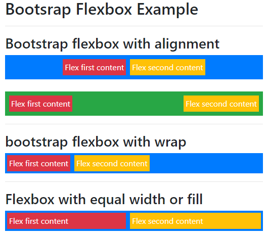
The flexbox with alignment and size example and output.
Code:
<!DOCTYPE html>
<html>
<head>
<title>Bootstrap flexbox Example</title>
<meta name = "viewport" content = "width = device-width, initial-scale = 1">
<link rel="stylesheet" href="https://maxcdn.bootstrapcdn.com/bootstrap/4.5.2/css/bootstrap.min.css">
<script src="https://ajax.googleapis.com/ajax/libs/jquery/3.5.1/jquery.min.js"></script>
<script src="https://cdnjs.cloudflare.com/ajax/libs/popper.js/1.16.0/umd/popper.min.js"></script>
<script src="https://maxcdn.bootstrapcdn.com/bootstrap/4.5.2/js/bootstrap.min.js"></script>
</head>
<body>
<div class="container">
<h2> Bootsrap Flexbox Example </h2> <hr>
<h3> Bootstrap flexbox with alignment</h3>
<div class="d-flex justify-content-center p-1 bg-primary">
<div class="p-1 m-1 bg-danger text-white">Flex first content </div>
<div class="p-1 m-1 bg-warning text-white">Flex second content </div>
</div> <br>
<div class="d-flex justify-content-between p-1 bg-success">
<div class="p-1 m-1 bg-danger text-white">Flex first content </div>
<div class="p-1 m-1 bg-warning text-white">Flex second content </div>
</div>
<hr>
<h3> bootstrap flexbox with wrap </h3>
<div class="d-flex flex-wrap bg-primary">
<div class="p-1 m-1 bg-danger text-white">Flex first content </div>
<div class="p-1 m-1 bg-warning text-white">Flex second content </div>
</div>
<hr>
<h3> Flexbox with equal width  or fill</h3>
<div class="d-flex  bg-primary">
<div class="p-1 m-1 flex-fill bg-danger text-white">Flex first content </div>
<div class="p-1 m-1 flex-fill bg-warning text-white">Flex second content </div>
</div>
<hr>
</div>
</body>
</html>
Output:
Conclusion
The bootstrap flexbox is used for the advanced design and responsive layout of the web application. The flexbox is useful for attractive and user-friendly for all screen sizes of the devices.
Recommended Articles
We hope that this EDUCBA information on “Bootstrap flexbox” was beneficial to you. You can view EDUCBA’s recommended articles for more information.


