Updated April 3, 2023

Definition of Bootstrap Breakpoints
The bootstrap breakpoint is an element used for responsive layout and content interfaces in the web application. It is controlling screen width size and web application elements as per device requirement. It is an element that sets the size and screen view of the web application and makes a mobile responsive application. The website works on most laptops and desktops but it helps to control the height, width, and size of the website as per various types of screen devices.
It is made of websites depending on small, medium, large, extra-large size screen devices.
Syntax
- The bootstrap has mainly four breakpoints which are sm, md, lg, and xl.
- The bootstrap has a “mobile-first” responsive framework therefore extra – a small (xs) breakpoint is the default size in the web application.
- The bootstrap small (sm) breakpoint which is used for equal and greater than 576px screen size devices.
- The small breakpoint uses the media query or –breakpoint – on the web page. The small breakpoint syntax is below.
@media (min-width: 576px) { web application elements }
*–sm–*- The bootstrap medium (md) breakpoint is used for equal and greater than 768px screen size devices.
- The medium breakpoint uses the media query or –breakpoint – on the web page. The medium breakpoint syntax is below.
@media (min-width: 768px) { web application elements }
*–md–*- The bootstrap large (lg) breakpoint which is used for equal and greater than 992px screen size devices.
- The large breakpoint uses the media query or –breakpoint – on the web page. The large breakpoint syntax is below.
@media (min-width: 992px) { web application elements }
*–lg–*- The bootstrap extra-large (xl) breakpoint which is used for equal and greater than 1200px screen size devices.
- The extra-large breakpoint uses the media query or –breakpoint – on the web page. The extra-large breakpoint syntax is below.
@media (min-width: 1200px) { web application elements }
*–xl–*
How do Breakpoints work in Bootstrap?
- Bootstrap is a mobile-first language and used for responsive websites. The below attributes used for the bootstrap responsive application.
<meta name = "viewport" content = "width=device-width, initial-scale=1">- The bootstrap supportive files add in the web application page for the bootstrap breakpoint.
<link rel = "stylesheet" href = "https://maxcdn.bootstrapcdn.com/bootstrap/4.5.2/css/bootstrap.min.css">
<script src = "https://ajax.googleapis.com/ajax/libs/jquery/3.5.1/jquery.min.js">
</script>
<script src = "https://cdnjs.cloudflare.com/ajax/libs/popper.js/1.16.0/umd/popper.min.js">
</script>
<script src = "https://maxcdn.bootstrapcdn.com/bootstrap/4.5.2/js/bootstrap.min.js">
</script>- The bootstrap breakpoint syntax was added in the body section of the page.
<div class = "row">
<div class = "col-sm-1" > small breakpoint </div>
<div class = "col-md-1" > medium breakpoint </div>
<div class = "col-lg-1" > large breakpoint </div>
<div class = "col-xl-1" > extra large breakpoint </div>
</div>- The media queries add in the style tag of the head section in the html page.
<head>
<style>
@media only screen and (min-width:600px) {.col-sm-2 {background: red ;}}
@media only screen and (min-width: 768px) {
.col-md-2 {background: aqua ;}
}
</style>
</head>
<body>
<div class = "container-fluid">
<div class = "row">
<div class = "col-sm-2" > small breakpoint </div>
<div class = "col-md-2" > medium breakpoint </div>
</div>
</div>
</body>
Examples of Bootstrap Breakpoints
Let us discuss examples of Bootstrap Breakpoints.
Example #1: Using media queries
Code:
<!DOCTYPE html>
<html>
<head>
<title>Bootstrap breakpoint Example</title>
<meta charset="utf-8">
<meta name="viewport" content="width=device-width, initial-scale=1">
<link rel="stylesheet" href="https://maxcdn.bootstrapcdn.com/bootstrap/4.5.2/css/bootstrap.min.css">
<script src="https://ajax.googleapis.com/ajax/libs/jquery/3.5.1/jquery.min.js"></script>
<script src="https://cdnjs.cloudflare.com/ajax/libs/popper.js/1.16.0/umd/popper.min.js"></script>
<script src="https://maxcdn.bootstrapcdn.com/bootstrap/4.5.2/js/bootstrap.min.js"></script>
<style>
@media only screen and (min-width:600px) {.col-2 {background: red;}}
@media only screen and (min-width: 768px) {
.col-2 {background: aqua;}
}
@media only screen and (min-width: 992px) {
.col-2 {background: yellow;}
}
@media only screen and (min-width: 1200px) {
.col-2 {background:orange;}
}
.col-2{
border:1px solid black;
}
</style>
</head>
<body>
<div class="container-fluid">
<h1> Bootstrap breakpoint Example </h1>
<div class = "row">
<div class="col-2" > small breakpoint </div>
<div class="col-2" > medium breakpoint </div>
<div class="col-2" > large breakpoint </div>
<div class="col-2" > extra large breakpoint </div>
</div>
</div>
</body>
</html>
Output:
The small breakpoint with media query output is below.
The medium breakpoint with media query output is below.
The large breakpoint with media query output is below.
The extra-large breakpoint with media query output is below.
Example #2: Using column
Code:
<!DOCTYPE html>
<html>
<head>
<title>Bootstrap breakpoint Example</title>
<meta charset="utf-8">
<meta name="viewport" content="width=device-width, initial-scale=1">
<link rel="stylesheet" href="https://maxcdn.bootstrapcdn.com/bootstrap/4.5.2/css/bootstrap.min.css">
<script src="https://ajax.googleapis.com/ajax/libs/jquery/3.5.1/jquery.min.js"></script>
<script src="https://cdnjs.cloudflare.com/ajax/libs/popper.js/1.16.0/umd/popper.min.js"></script>
<script src="https://maxcdn.bootstrapcdn.com/bootstrap/4.5.2/js/bootstrap.min.js"></script>
<style>
.col-sm-2{
border:1px solid black;
background-color:lightgrey;
}
.col-md-2{
border:1px solid black;
background-color:orange;
}
.col-lg-2{
border:1px solid black;
background-color:yellow;
}
.col-xl-2{
border:1px solid black;
background-color:aqua;
}
</style>
</head>
<body>
<div class="container-fluid">
<div class = "row">
<div class="col-sm-2" > small breakpoint </div>
<div class="col-sm-2" > medium breakpoint </div>
<div class="col-sm-2" > large breakpoint </div>
<div class="col-sm-2" > extra large breakpoint </div>
</div>
<div class = "row">
<div class="col-md-2" > small </div>
<div class="col-md-2" > medium </div>
<div class="col-md-2" > large </div>
<div class="col-md-2" > extra large </div>
</div>
<div class = "row">
<div class="col-lg-2" > small </div>
<div class="col-lg-2" > medium </div>
<div class="col-lg-2" > large </div>
<div class="col-lg-2" > extra large
</div>
</div>
<div class = "row">
<div class="col-xl-2" > small </div>
<div class="col-xl-2" > medium </div>
<div class="col-xl-2" > large </div>
<div class="col-xl-2" > extra large </div>
</div>
</div>
</body>
</html>
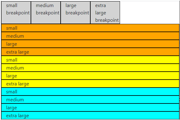
Output:
The small breakpoint output is below.
The medium breakpoint and large breakpoint output are below.
The extra-large breakpoint output is below.
Example #3: Combination of more than one breakpoint
Code:
<!DOCTYPE html>
<html>
<head>
<title>Bootstrap breakpoint Example</title>
<meta charset="utf-8">
<meta name="viewport" content="width=device-width, initial-scale=1">
<link rel="stylesheet" href="https://maxcdn.bootstrapcdn.com/bootstrap/4.5.2/css/bootstrap.min.css">
<script src="https://ajax.googleapis.com/ajax/libs/jquery/3.5.1/jquery.min.js"></script>
<script src="https://cdnjs.cloudflare.com/ajax/libs/popper.js/1.16.0/umd/popper.min.js"></script>
<script src="https://maxcdn.bootstrapcdn.com/bootstrap/4.5.2/js/bootstrap.min.js"></script>
<style>
.col-sm-2{
border:1px solid black;
background-color: aqua;
}
.col-lg-2{
border:1px solid black;
background-color: yellow;
}
</style>
</head>
<body>
<div class="container-fluid">
<h1> Bootstrap breakpoint Example </h1>
<div class = "row">
<div class="col-sm-2 col-md-2" > small breakpoint </div>
<div class="col-sm-2 col-md-2" > medium breakpoint </div>
<div class="col-sm-2 col-md-2" > large breakpoint </div>
<div class="col-sm-2 col-md-2" > extra large breakpoint </div>
</div>
<div class = "row">
<div class="col-sm-2 col-lg-2" > small </div>
<div class="col-sm-2 col-lg-2" > medium </div>
<div class="col-sm-2 col-lg-2" > large </div>
<div class="col-sm-2 col-lg-2" > extra large </div>
</div>
</div>
</body>
</html>
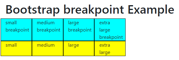
Output:
Description
- The small breakpoint is useful for mobile and phone devices.
- The medium breakpoint is used for tablets and mini laptops.
- The large breakpoint is used for desktop and laptop devices.
Conclusion
It makes web applications user-friendly as per the availability of the screen device. It mostly works for mobile, laptop, desktop, and tablet devices.
Recommended Articles
This is a guide to Bootstrap Breakpoints. Here we discuss the definition, How do Breakpoints work in Bootstrap? and examples with code implementation respectively. You may also have a look at the following articles to learn more –


