Introduction to InDesign grid template
The following article provides an outline for InDesign grid template. Grid Templates in Adobe InDesign are commonly used to create books, posters, brochures, print and magazine designs. Grids are an essential prerequisite requirement to create a balanced and consistent layout on InDesign. Grids and guidelines are used to stabilize and equilibrate the arrangement of text, images, symbols, shapes and other artworks created on a particular page. For beginners using grids and rulers is a very important and basic technique to design creative artworks with accuracy and precision.
How to Create and Use Grid Template?
Grids are used to manage the course of content that helps in giving grading to the artwork, providing a natural look to the artwork, which is easier to acknowledge and understand on the whole.
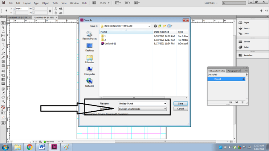
Grid Templates are nothing but templates that have readymade grids and guidelines made and structured in an appropriate system and can be used whenever required. To create Grid Templates, users can save the InDesign file in the InDesign Template format for future purposes.
Creating Grids on InDesign is the easiest process to function. Users can either create Grids manually, or they can use tools available in the program. However, the users should always remember that these grids, guidelines and rulers are all non-printable lines which are only used for creating a proper and precise Design.
How to create Grids and Guides manually on InDesign?
In Adobe InDesign the user can create baseline and document grids that are non-printable lines. Baselines grids are used for texts and appear on the canvas only. While the document grids appear on the whole document. We can change the color of the grids and also show/hide them according to our requirements.
Following are the steps to create grids on InDesign:-
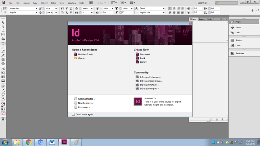
- Launch InDesign
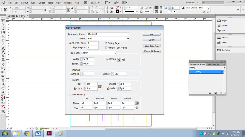
- Create a new document with facing pages and with no columns or margins.
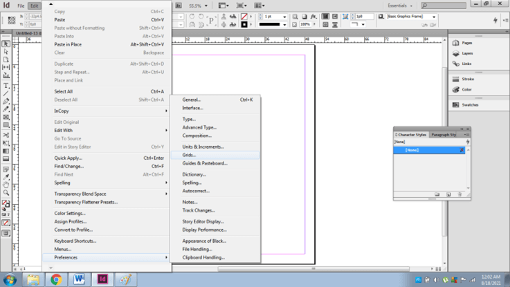
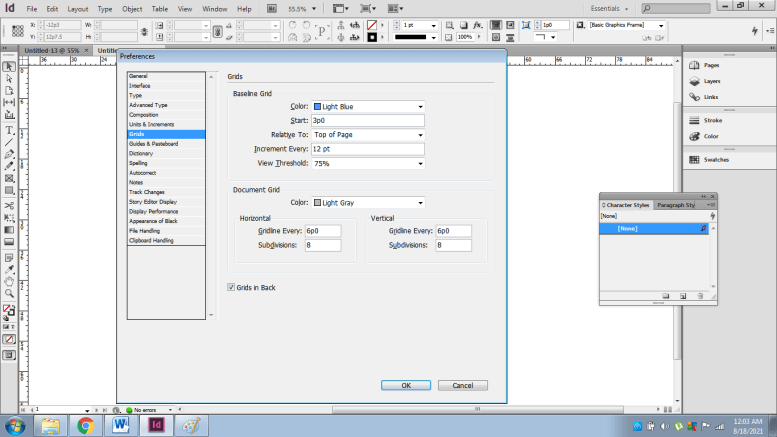
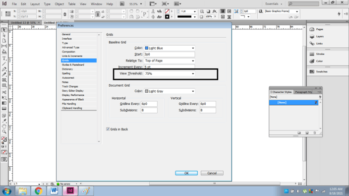
- Now, go to Edit > Preferences > Grids
- A dialog box will appear.
- In this, we can adjust the Baseline as well as the document grid settings.
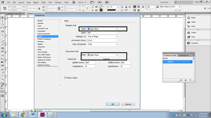
- At 1st we can edit the color of both the grids.
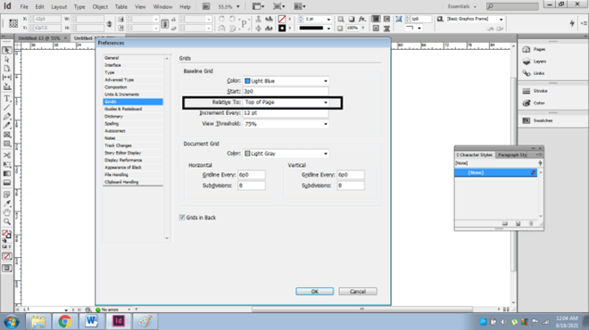
- Baselines grids are mostly used for text writing, so, in the Relative To option, select the grid’s origin; Top of the page or Top Margin.
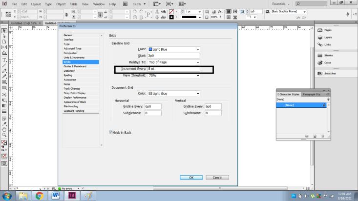
- In the Increment Every option, we type a value that is required to create grids after every certain. For example, we type 5pt, so, after every 5pt, grids will be created.
- View Threshold option is for the zooms magnify settings. It is used to view the guidelines after a certain zoom value.
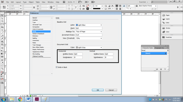
- Next, we create document grids.
- We have individual options for horizontal and vertical grids with the number of subdivisions required.
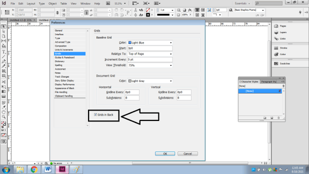
- Finally, in the last step, we have grids in the black option, which is used to keep all the artworks behind the grids when this option is deselected. While if selected, all the artworks are placed in front of the grids.
How to show/hide Grids/ Guides?
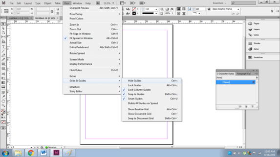
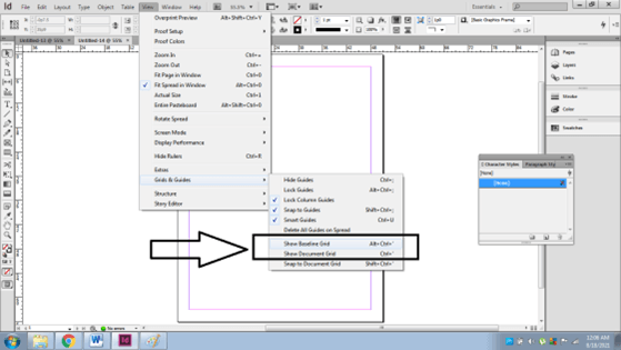
In continuation to the above procedure, we can show or hide the grids whenever the user requires them. For this go to View > Grids& Guides> Show/ Hide Grids.
We can also lock the Guides by using the same process. There is an individual option to show/ hide Document and baseline grids.
How to Snap objects to guides/ grids and modify them?
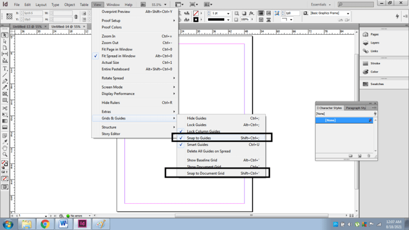
In addition to this, the user can also use snapping tools which are used when the user moves or scales a particular object, and it snaps according to the snap zone of the guides creates. Snapping helps in the proper movement of objects without harming the display and arrangement of the document.
For this, Go to View> Grids & Guides and use Snap to Guides or Snap to document grid options. In these document, grids is also used for Baseline grids snapping.
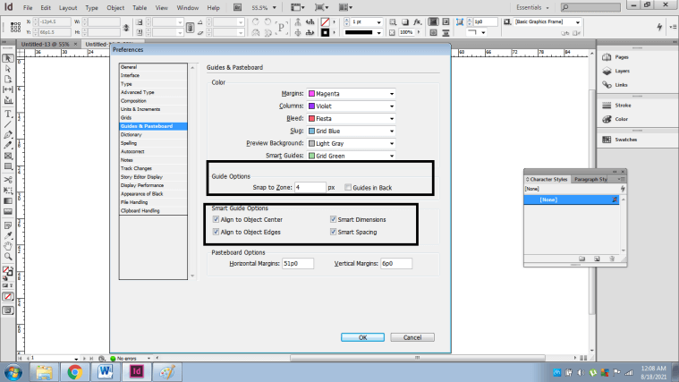
To change or modify the snap zone, alignment of guides; Go to Edit> Preferences> Guides & Pasteboard and modify the settings from here.
How to create Grids using the tools in Adobe InDesign and edit them accordingly?
In this procedure, the user creates the margins and columns, ruler guides and general guides for their projects.
Following is the procedure:-
- We launch InDesign and create a new document.
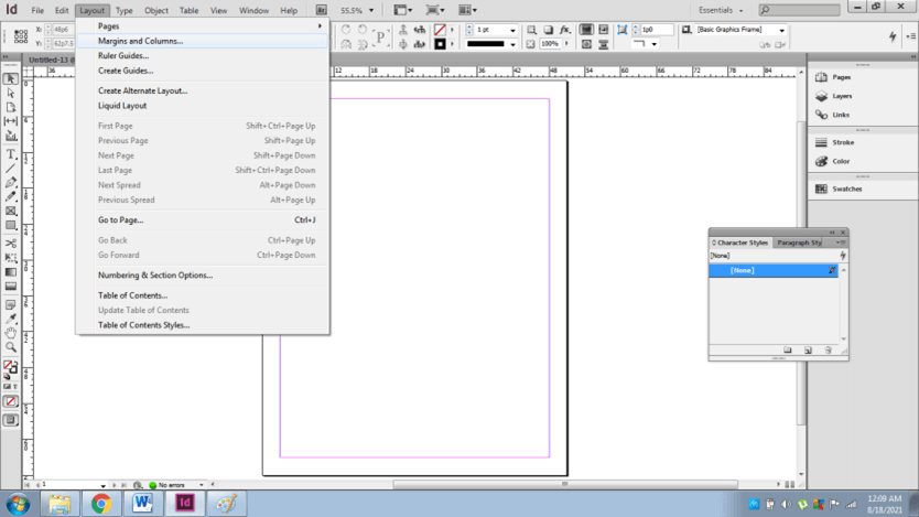
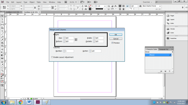
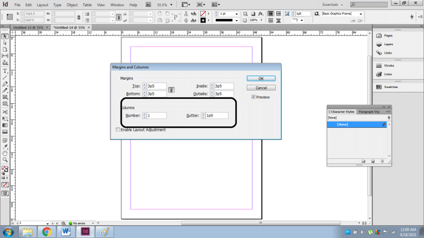
- Next, Go to layout> margins& columns.
- To create margins and increase that area from outside or inside, use the margin option.
- To create guides, increase the number of columns and gutter( space between the columns)
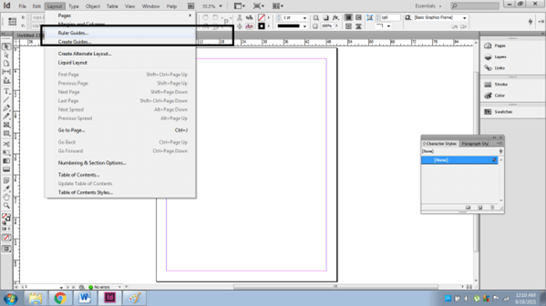
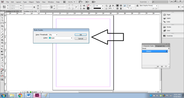
- To create ruler Guides, go to Layout> Ruler Guides. In this, we can edit the color and the threshold of the ruler guides and then create rulers accordingly.
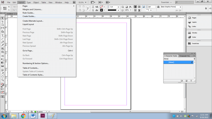
- Next, we can create guides manually by; Go to Layout> Create guides.
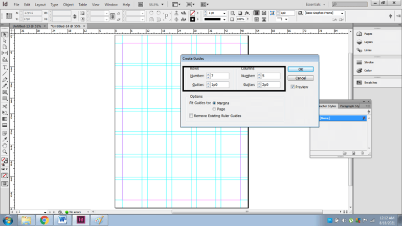
- A dialog box appears; we can modify the number of rows and columns required. It also has individual Gutter settings.
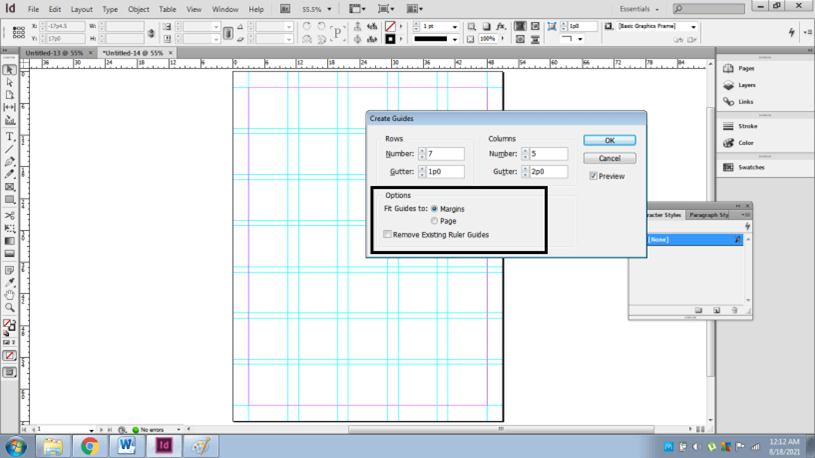
- We can also change the fitting of the guides to the Page or the Margin. Click Ok to successfully save the settings.
Finally, once the grids and guidelines are created, the user can save the file in the InDesign template format so that the template can be used as required by the users.
Conclusion – InDesign grid template
Summarizing the above article, we learned in this course that; having proper knowledge of grids and guidelines in detail will help the user create a proper and accurate structure and encourage them to practice and improve their skills on these technical functions.
Adobe InDesign is a vast program and which is used for multiple projects and purposes that is only useful when the users master the basic techniques of creating an artwork.
Recommended Articles
This is a guide to InDesign grid template. Here we discuss the proper knowledge of grids and guidelines in detail that will help the user create a proper and accurate structure. You may also have a look at the following articles to learn more –

