Updated August 9, 2023

If you’re a person with heavy data analysis needs – for your home or business-you’re likely to be pleased with the new Excel Workbook feature introduced by Microsoft with the 2016 release. Excel commands a staggeringly large loyalty base, with over 750 million users across the globe, each with its own diverse needs and vociferous inputs on what can make this tool better. If you consider the past few releases, Microsoft has been listening!
The new 2016 Excel Workbook features make quite a difference in your analytical computing usage. Microsoft has packed everything from simple to complex to brilliantly profound, making the 2016 Excel Workbook much more versatile, smarter, and mightier. In this post, we celebrate the recent (2016) changes that transform the humble Excel Workbook into its present potent form.
1. Smarter Autocorrect
You often needed an Excel workbook function or formula but forgot the exact name. You know it exists but is currently clueless about the right fit. For instance, you want to check if a particular cell contains numeric values. So you know that the function to use has something to do with (but obviously) “number”. And you type “number,” hoping Excel will provide the rest. It doesn’t.
So you ask your friend seated in the next cube, and he asks his friend (err, Google) and finds out that the function you’re looking for is known as “isnumber”. Bah! Yes, it sounds fairly simple to remember. But life would have been infinitely easier if Excel had been more helpful.
Guess what, folks: Microsoft has noted your pain!
The autocorrect feature has been smartened to include the specific text you type and all formulas and functions that include your text. So you no longer have to memorize the exact names, casing, and all, because your Excel workbook’s built-in autocorrect feature smartly supplies it all. This is a big relief; thank you, Microsoft!
2. Improved Functions of Excel Workbook
Following its vast improvement on the smarter autocorrect feature, Microsoft takes this reasoning into other Excel Workbook functions. There are too many to name here, but we’re listing a few more popular ones for your reference.
- IFS: Consider that you’re trying to compute a fairly simple calculation through Excel – If a particular cell is a number, an odd number, and if its sum with the previous value is greater than X, set the value to Y. That’s just about 2-3 is for you. But by the time you capture this in Excel with all that nested If, it gets complicated! The new IFS function works much as normal brackets do. No nesting is required; instead, list your calculation from left to right, and Excel will determine the obvious. Oh, and it also comes with an else “catch all” that comes into effect when none of the IFS is met. Nice!
- CONCAT: This is an extended version of CONCATENATE with a simpler name. It’s easier to type and also supports a range of cell references. (The older concatenate function is also available but only supports single cell references).
- MAXIFS & MINIFS: This uses the IFS function to capture multiple criteria across a range of cells and then find the maximum/ minimum amongst the cells that meet the specified criteria.
- TETJOIN: With this function, you can combine text from multiple cells across several ranges and list them together, separated by delimiters. Mighty is useful when converting rows/ columns to text based on additional criteria.
- SWITCH: You can consider this an advanced extension of the IFS function, where an expression is checked against multiple values, and the first “match” is returned. If none of the values matches, an else clause holds.
3. New Funnel Charts
Do you know how you often wish the bar graphs in your Excel workbook could align in order so they show progression? Or, heck, even regression, so you can demonstrate how a task has been achieved over time in phases. The new funnel chart type facilitates this.
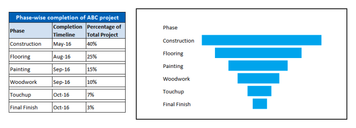
Funnel charts are among the newer lot of charts introduced in 2016. Unlike bar charts that are all over the place, reflecting statistical data, funnel charts can be utilized to capture the gradual completion of a process/phase/stage over time. For ideal use, the numbers should decrease so the bar graphs line up in a neat funnel.
For example, let us consider that you want to capture the different phases of an Engineering/Construction project to illustrate the total workload complete at each stage. A funnel chart would be your natural preference, as showcased in the figure below.
4. Smarter Insertion of Pictures
This might seem like a trivial feature in a computing application like Excel. Yet, it has worth. Insert a skewed picture, and Excel will automatically rotate it right to suit the camera’s orientation so your pictures display straight and perfectly. And that is a good thing! With this, Microsoft is becoming increasingly picky about the finish.
5. Introduction of 6 New Chart Types
We’ve already covered the Funnel chart type earlier. But other new additions include:
- TreeMap chart: This hierarchical chart type cleverly allows for blank cells within its structure. For instance, let’s say you want to capture the different summer courses offered at a University on weekdays and weekends. Some days have 2 courses, some have 3, and some have only one course offered. This is difficult to capture using any other chart type, as the distribution is not even. But with TreeMap charts, you can compare courses easily and use colors to classify them differently.
- Sunburst Chart: Consider the older Doughnut chart – it captures data without hierarchy. This has been extended to include hierarchies and blank cells, making up the new Sunburst Chart. This chart too supports classifying multiple categories through color.
- Histogram Chart: This is best used to capture distribution data and multiple frequencies within each distribution (called a “Bin”). This comes in 2 types, the straightforward Histogram and the Pareto chart (Histogram sorted in descending order of chart lines).
- Box & Whisker Chart: This chart type is useful for capturing more complex statistical data.
- Waterfall Chart: This chart type is best used to capture the running effect on a single attribute over stages. For instance, let’s consider the financial figures through 4 quarters. Each quarter may be positively or negatively influenced by other attributes (like the cost of sales promos, salary payouts, cost of raw materials, etc.). The waterfall effect on the financial results can be easily illustrated using this chart type.
6. Solid Database Integration, Providing Better BI
While the world was all about big data, Excel provided the most basic database functionality, and any advanced feature was, at best, an add-on feature. Perhaps one feature sorely lacking in earlier versions of Excel Workbook was database compatibility and integration. This is fixed in the 2016 version.
The new 2016 Excel Workbook comes pre-loaded with advanced DB features, easily accessible through the Data Tab. This includes:
- Fetching data from an external Database through a “Power Query” (accessible via Data Tab->New Query->From Database)
- Creating a relevant data Model for tables imported from different Databases.
- Retention of Power Pivot, first introduced in the 2013 version. This was Microsoft’s biggest improvement in the BI space. The Pivot Table comes with multiple enhancements, including:
- Automatic grouping of time-related fields.
- Automatic detection of the relationship between tables.
- Drill-down buttons so you can easily analyze data at the lowest level of the hierarchy.
- Refined creating, editing, and deletion features to manage each Chart better.
- PowerViews and PowerMap, earlier add-on features (in the 2013 version), are now part of the main application. These can be enabled through File->Options->Advanced->Data->Enable Data Analysis Add-ins: Power Pivot, Power View & Power Map. (Note: The Power Map feature is now called 3D Maps and is directly accessible via Insert Tab->3d Maps)
- Enhanced forecasting with a single mouse click Earlier versions supported only linear data forecasting, not so with the newer version. The 2016 Excel workbook has an exclusive forecasting button providing powerful “one-click forecasting” features. This is accessible via Data Tab->Forecast Sheet (within Forecast Group). The subsequent “Create Forecast Worksheet” wizard empowers you to effortlessly create a visual forecast based on “exponential smoothing”, a statistical model far superior to linear forecasting.
Together, these 2016 Excel Workbook features make it a BI intelligence tool to reckon with!
7. Templates
Excel 2016 is also loaded with 3 interesting templates supporting your varied personal data-analysis needs.
- My Cashflow template: This empowers you to play around with your money. This template helps you import your expenses to understand how your money is spent. Err, virtually.
- Stock analysis template: As the name indicates, you can import data related to your (NASDAQ) stocks and monitor them from Excel.
- Calendar Insights: This one helps you import your calendar information into a data dashboard to recognize how your time is being spent.
As you can see, each template provides potential features far-leap from the simple Excel Workbook. All you have to do is import raw data (from Outlook, an external Database, or a compatible data source) and watch the complex data analysis/ forecasting/ charts unfold! Once chosen, these templates quickly create the initial set-up for you.
8. Ink your Equations
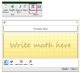
This one is for those who think far better with a pen (or a stylus) than a mouse/keyboard. Have a complex math equation you want to use in your 2016 Excel Workbook? No problem. Just write it by hand using a touch device, and Excel will do the rest. This feature of converting (almost) hand-written equations into Excel-readable text is accessible via Insert Tab->Equation->Ink Equation. A preview screen lets you insert the equation using a stylus or finger on a touch-sensitive device.
In addition to the above features exclusive to the 2016 Excel Workbook, other refined features run through all Office 2016 applications, including Excel.
- Students from registered Schools/ Universities can access the online version of the 2016 Excel Workbook completely free as part of the (online) Office 365 Education suite. Incidentally, this suite also comes with 1TB data storage availability on OneDrive, making it easy for users to back their 2016 Excel Workbook data within the cloud space.
- Office 2016 is power packed with features that make online collaboration with other Office 2016 users seamless. The “Share” feature facilities this across the Office Suite. Excel additionally empowers you to share your data analysis results (like reports, charts, and the whole Workbook itself) with other users within your workgroup using the “Publish to Power BI” feature.
- Do anything more easily with “Tell Me”. This is Clippie, the older Office helper tool’s descendant, except it comes as a straightforward button. The pop-up window allows you to insert your request (like “How to create a pivot chart”), and “Tell Me” will guide you through the detailed steps to complete your request.
- 2016 Excel Workbook provides constant access to a Bing-powered lookup called “Insights,” which helps you stay on top of what you’re working on. For instance, typing “Financial forecast” will bring up all related pages and online articles in no time. It’s like having the world-wide-web embedded into your Excel Workbook!
- Improved readability with 3 new themes: Color, Dark Grey and Dark. These use high-contrast color palettes without being an eyesore.
In summary, we hope that this post has clearly illustrated the finer features of the 2016 Excel Workbook. If you’re on the fence about trying/ buying this latest product, consider its top 3 advantages:
- More powerful Database integration features.
- More powerful BI and forecasting features.
- Solid templates that can help you track and manage your money, stocks, and time wisely.
These three features are its best “selling points”. We reckon that it’s more than worth it!


