Updated August 9, 2023
Excel Pivot Chart
Pivot Chart in Excel is a way to give visual effects to the pivot table data. The pivot Chart option is in the Insert menu tab under the Charts section. We can either create a pivot table and then apply the Pivot Chart over it, or we can directly select the Pivot Chart, which will eventually take us to create a Pivot Table. Once a pivot table is created, the Pivot Chart automatically detects the chart suitable for the available data set. We can also change charts such as Columns, Bars, Lines, Pie, Areas, etc., which are also in the recommended charts option.
Build your First Pivot Chart in 10 Easy Steps
This post shows you how to build your first pivot chart in 10 steps.
Step 1: Prepare your Data in a Tabular Format
The first step is tabularizing your raw data into even rows and columns. It is best to work this chart on a table with at least 2-3 columns so the pivot chart has enough column fields to project meaningful statistics. The pivot chart in Excel works with null figures, too, but for a balanced chart, ensure that you have no null values in key columns. Also, make sure your data is clean, with no duplicate values.
For example, we will create a pivot chart with data from a mid-scale publisher to capture sales statistics figures across popular periodicals.
The table will contain 3 field columns: the name of the Journal, the Month of publication, and the total number of Sales (in hundreds). The combination of (Journal + Month) will uniquely identify a row in the table. Further, care has been taken to ensure no null values for any row. The table data has also been sorted in order of month, which is unnecessary.
- Prepare similar data in a fresh sheet in Excel, and name the worksheet “Raw Data”.
Step 2: Create a Pivot Table for the Data
A pivot table ideally holds the data that feeds into a pivot chart in Excel. You can directly create the pivot chart referencing the prepared raw data. Excel will implicitly create a pivot table and a pivot chart. But this can overwhelm new users as the resulting chart will have too many parameters to manage.
We will explicitly create a pivot table for easier understanding and then use it to feed a pivot chart in Excel. With this, you can easily understand the in-between steps and better manage the data parameters that feed into the chart. Once you become an expert, you can create the pivot chart directly from raw data.
To create the pivot table,
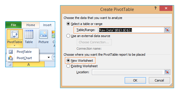
- Click on the Insert tab in the main ribbon
- Click on the pivot table drop-down button, and select the pivot table
- Here, you can feed in data through any of the following options:
- Manually select the range of cells that make up the raw data. The cells will be highlighted, and their table positions captured (shown in the picture above). OR,
- Use an external data source (like a Microsoft Access Database connection or any other data source connection).
We will choose the first option by manually selecting the cells in the table created in Step-1. Be sure to include all rows and columns of the created table data.
- Select the “New Worksheet” checkbox to create the required pivot table in a fresh Excel sheet for better clarity. Excel will create the pivot table in a new Worksheet. Name this “Pivot table”.
Step 3: Get Familiar with the Pivot Table Parameters
In this step, there are no explicit actions. But it is a marker to help you understand the different parameters of the Pivot Table.
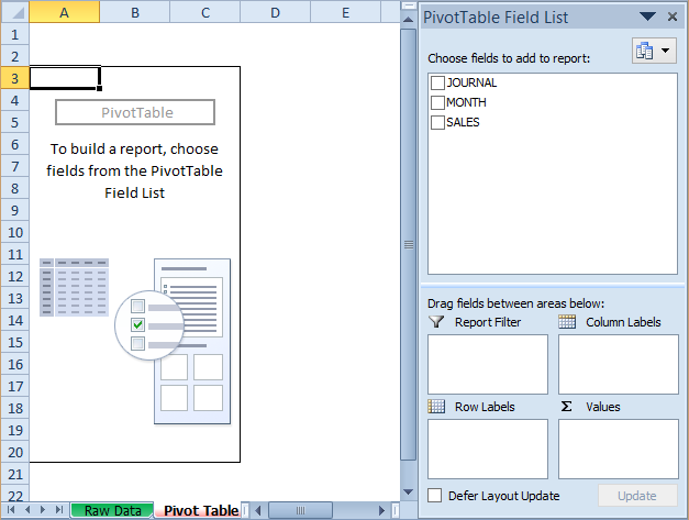
Once the pivot table is created, click anywhere on the table to reveal 2 tabs:
- The actual pivot table is displayed on the left-hand side of the worksheet. Only an empty template is displayed when you first create the table. Once the table’s parameters are defined and customized, the table is populated with values from the raw data provided.
- Field list containing the columns you want to populate into the table. This is further divided into:
- Pivot table fields: By default, this will contain all the column fields in the raw data selected.
- Row labels and Column labels will determine the raw data fields (rows and columns) displayed in the pivot table. (So a column field can feed into the table statistics by selecting (a) above, but it will remain hidden from view until it is explicitly chosen in the Column label.)
- Report filter: This sets restrictions to filter out rows from the raw data.
- Values: This will determine the statistical data computed by the pivot table.
Together, this screen marks the “PivotTable Tools” view. Any time you want to alter or refresh your pivot table, return this view. We will learn to customize the pivot table created in further steps so it reveals figures relevant to our raw data.
Step 4: Choose the Column Fields Applicable to the Pivot Table
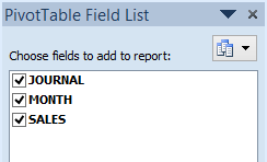
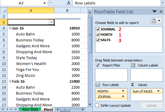
All the column fields selected in the raw data are available in a pivot table by default. However, one must explicitly select them to apply to the newly created pivot table. We will keep it simple by checking all columns of our raw data under the “PivotTable Field List” tab.
Step 5: Customize the Pivot Table Fields
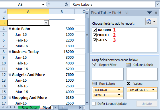
The order in which you select the column fields for the pivot table determines the order in which they are added. This, in turn, controls the Row Labels and Column labels and affects the final values computed in the pivot table. So as per the order selected in Step 4, (1) Journal, 2) Month, and 3) Sales), the table will display the total Sales for every Journal, grouped by Month.
- Let us uncheck all the boxes and try this revised order: 1) Month 2) Journal 3) Sales. This will display the total Sales for every Month, grouped by Journal.
As you can see, the order of selection has a significant impact on the way the pivot table is rendered. For our example, we will retain the order captured in Step 4.
Step 6: Customize the Pivot Table Values
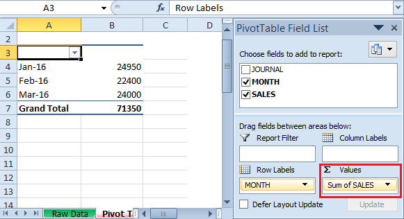
By default, MS Excel uses the SUM function to calculate the values rendered in the table.
- For instance, let us consider that you only add 2 column fields in the following order: 1) Month 2) Sales. This will automatically display the total SUM of Sales for each month.
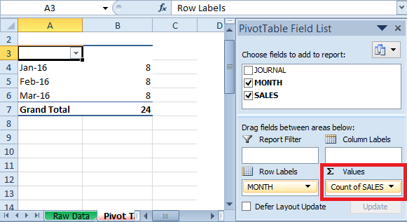
Now consider that you want to display the total number of publications sold monthly across all journals. You can render this by using the COUNT function as follows:
- Click on the “Values” tab of the Pivot table worksheet view. By default, this is set to the SUM function.
- Click on the drop-down box, select “Value Field Settings…” and select the COUNT function in the resulting list box.
- The table will compute the monthly sales count (indicating the number of publications sold), as listed below.
Step 7: Create a Chart to Project the Pivot Table
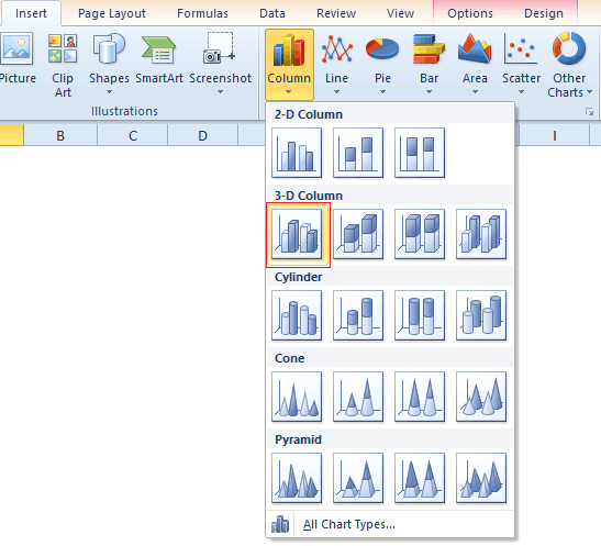
Now that we have a fully functional pivot table, any chart type that projects this table serves as an intermittent pivot chart in Excel. In our example, we will create a basic 3D-Column chart to project our pivot table.
For this,
- Click on the pivot table created in Step 5 and then click on the Insert tab.
- Click on the Column drop-down menu and select 3D-Column.
This will automatically project your chart into a column graph.
A few things to note here:
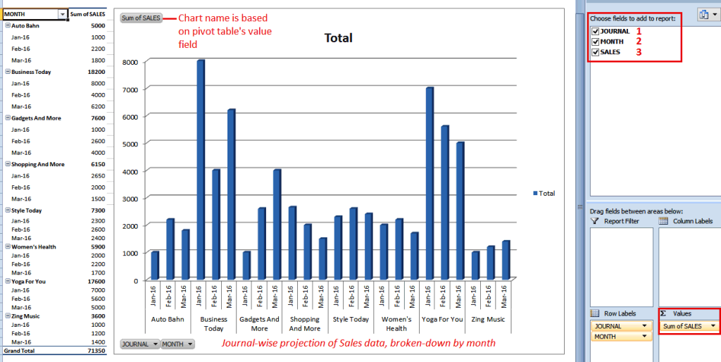
- The chart name is based on the Value field column. So here, it is the Sum of SALES.
- The chart takes the pivot table’s field columns. Here, columns 1) Journal, 2) Month, and 3) Sales were chosen to create the displayed chart. Together, these parameters capture the Journal-wise projection of Sales data, broken down by month.
And voila, you have created your first (intermittent) pivot-table-based chart! Well done! J
Do note; you can vary the charts you create on the pivot table by experimenting with the different chart types provided by Excel under Insert Tab – Charts. In each case, the chart is a projection of the pivot table data and is a pivot chart in Excel. You will learn how to create and customize a pivot chart directly from the raw input data in further steps.
Step 8: Create a Pivot Chart
Now that you’re familiar with a pivot table and the charts projected of its data, we will skip steps 2-7 and see how we can directly project our raw data into a pivot chart. Yes, no table and no intermittent chart; we create a pivot chart from the raw data straight from Step 1! You now know and customize its parameters, so the pivot chart is clean and relevant.
To create a pivot chart,
- Select the cells that contain your raw data, as created in Step 1.
- Click on the Insert tab and the “PivotTable” drop-down menu. Select “PivotChart”.
- Create the Pivot Chart just as you created the Pivot Table in Step 2, going with the default settings and clicking on Ok.
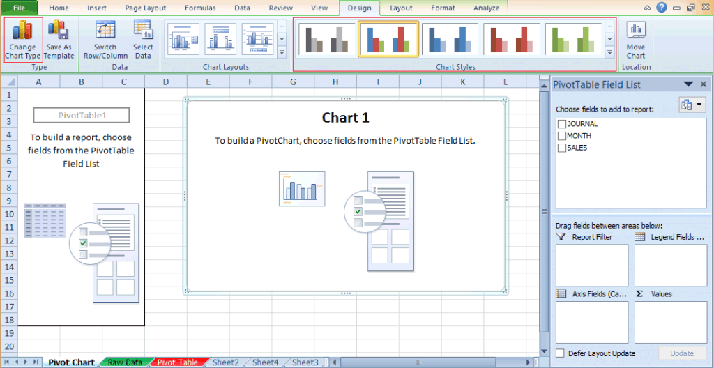
- The pivot chart gets created as displayed below. Name this worksheet as “Pivot Chart”.
A few things to note:
- When you click on the Pivot Chart area, the view that opens up is the “PivotChart Tools” View. This is a very familiar view, combining the sum of Steps 2-7. This view becomes available when you click on the pivot table cells. (Note: This view further allows you to customize the pivot table preferences, but we will go with the default settings for our example.)
- By default, Excel renders a Column chart, much like what we explicitly created in Step 7. You can change this effortlessly using the “Change Chart Type” button in the Design tab (as highlighted in the pic above).
We will customize this pivot chart in Excel to render the desired final data chart in further steps. J
Step 9: Parameterize the Pivot Chart
Okay, we will quickly summarize the steps applied in the earlier chart to our newly created pivot chart.
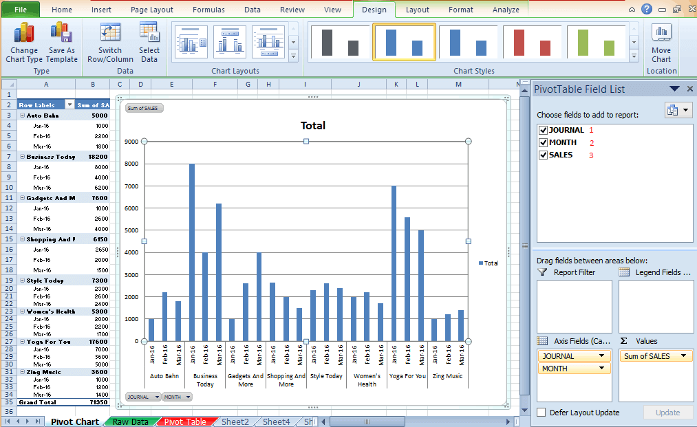
- Click on the cells containing the pivot table to access the “PivotTable Field List” view on the right-hand side.
- Check Journal, Month, and Sales in order. This will project Journal-wise sales data broken down by month.
- Retain the value field to the default setting: Sum of SALES.
And the pivot chart is now complete!
Step 10: Customize the Pivot Chart in Excel
In this final step, we will apply 3 customizations to our created pivot chart in Excel, so you understand the range of alterations you can make with a single mouse click.
Customize the chart area:
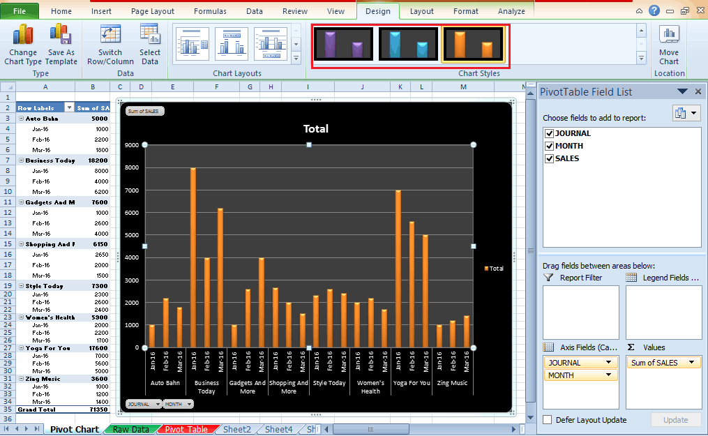
- The default pivot chart renders with blue column lines. But what if you desire a more dramatic display? Using the various “Chart Styles” in the “PivotChart Tools” ribbon is possible.
- Explore the chart styles available on your system and choose an option with a color scheme and display that suits your preferences.
- And…. the pivot chart’s display instantly alters as per the new suiting, colorful and glamorous! J
Customize the chart type – 1:
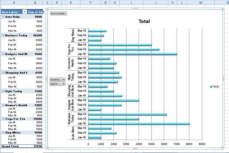
The default column graph serves most chart needs. But what if your data is not best suited to this chart type? For instance, our data projects sales for 8 Journals across 3 months, totaling 24 column bars. Perhaps this is more legible when projected as horizontal lines instead of columns? You can test this with a single mouse click, as captured below.
- Click “Change Chart Type,” the left-most button in the “PivotChart Tools” view.
- The displayed list box shows chart types supported in your version of Microsoft Excel. Regardless of the chart type, the current settings will continue (like the input data fields, the value field, etc.)
- Select the “Bar” chart type and click Ok. The altered chart display is shown below.
As you can see, this is a tad more readable. J
Customize the chart type – 2:
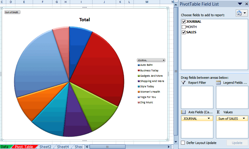
In our final example, let us consider that you want to explore each publication’s total market share. You no longer care about the month-wise breakdown, only the total sales figures.
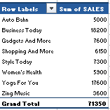
- The first step is to uncheck all chart column fields and reselect only 2 columns in order: 1) Journal and 2) Sales. The resulting table looks like this.
- Next, the bar or column charts are not the best suited for this data. So click the “Change Chart Type” command button, scroll down the displayed list box, and select the Pie chart. The resultant pivot chart in Excel looks as displayed below:
As you can see, this is a finer representation of your data than the bar and line graphs. You can also explore the “Chart Layouts” and “Chart Styles” commands to alter the visual display per your requirements.
Conclusion
A Pivot Chart in Excel is created from a pivot table with defined field columns and values. In this post, you have learned the finer nuances of this chart, so no matter which chart type you choose, you can effectively render the chart to suit your data.
Do look for further posts on the different types of charts available in Excel for advanced knowledge.
Recommended Article
This has been a guide to Pivot chart in Excel remains a solid favorite with students, home users, and business professionals alike. These are the following external link related to the pivot chart in Excel.

