Updated February 15, 2023
Introduction to Angular Material Accordion
An angular material accordion is nothing but a component with more than one or a single section that is expandable. It provides a foundation for building our accordion component, which was custom. CDK accordion will provide logic for an accordion pattern of interaction without using any styles. We can customize the angular material accordion appearance based on the need of our application.
What is Angular Material Accordion?
Angular material accordion is not coming with the treatment of accessibility because it doesn’t have control over markup. We need to set the accordion trigger element as a button while the body container will contain a role as a region. It is an interactive component consisting of a panel containing content and headers. After clicking on this panel, we can expand, collapse, and show the panel’s description area. The jquery UI library contains the accordion component, which includes several API options. Angular material accordion is very useful and essential in AngularJS.
Angular Material Accordion Project
Below we are configuring the project of the angular material accordion.
We need to install angular material CLI in our system to configure the project. The below example is to install the angular Material CLI.
1. Install the angular material CLI by using the npm command. In the below example, we install angular CLI on the ubuntu system.
Code:
npm install -g @angular/cliOutput:
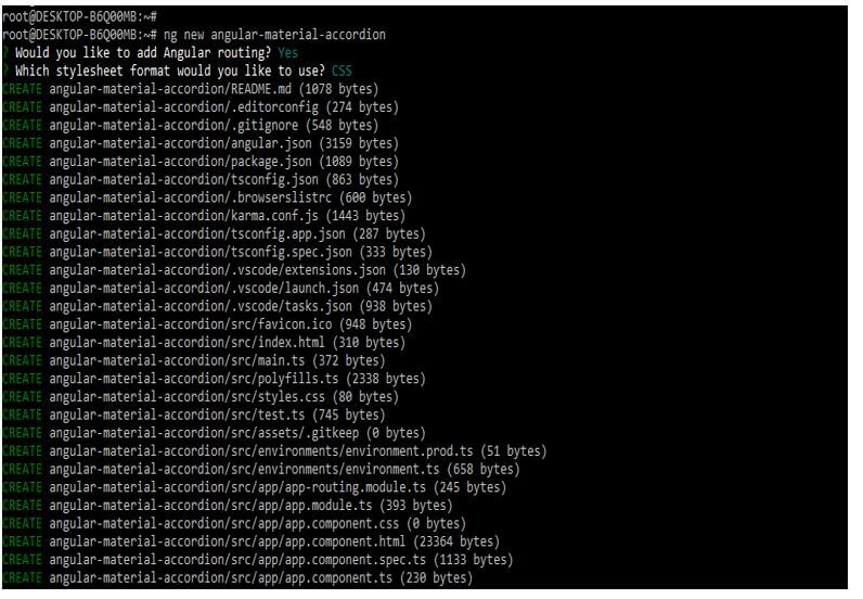
In the below example, we are creating the new project name angular-material-accordion; when creating the project, we define the routing of angular as yes, and we define the format of the style sheet as yes.
Code:
ng new angular-material-accordionOutput:
2. We have installed three packages on our system that are used when developing web pages or web applications using AngularJS. This package is used to import the component in our application. Angular Material is essential in adding the specified packages and importing the module into our application. We are installing these packages by using the npm command as follows.
Code:
npm install @angular/material –saveOutput:
3. Now, we will add the library to our project. We must first go into our project folder to add the library to our project folder. We cannot add the library to our project without going into the project folder.
Code:
cd angular-material-accordion/
ng add @angular/material
Output:
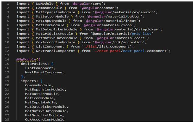
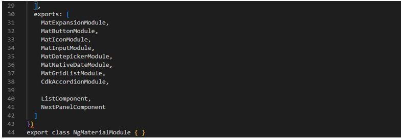
4. To use this, we must import the mat expansion module into our custom module. It depends on us adding the material module in a root module or a custom module. We are adding all the material modules into the custom module. Now we are editing the material.module.ts file as follows.
Code:
  import { NgModule } from '@angular/core';
   …….
   @NgModule ({
declarations: [
 ListComponent,
 NextPanelComponent
],
 imports: [
CommonModule,
MatExpansionModule,
MatButtonModule,
MatIconModule,
MatInputModule,
MatDatepickerModule,
MatNativeDateModule,
MatGridListModule,
CdkAccordionModule
],
exports: [
 MatExpansionModule,
 MatButtonModule,
 MatIconModule,
 MatInputModule,
 MatDatepickerModule,
 MatNativeDateModule,
 MatGridListModule,
 CdkAccordionModule,
 ListComponent,
 NextPanelComponent
 ] } )
export class NgMaterialModule { }
Output:
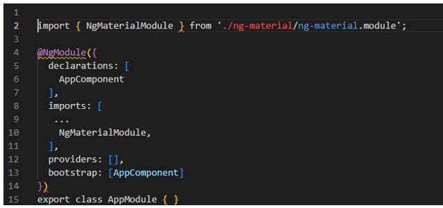
5. In the below example, we are importing the module into the app.module.ts file. We can see that we are importing the various modules in our app module file as follows.
Code:
import { NgMaterialModule } from './ng-material/ng-material.module';
@NgModule({
declarations: [
AppComponent
],
imports: [
...
NgMaterialModule,
],
providers: [],
bootstrap: [AppComponent]
})
export class AppModule { }
Output:
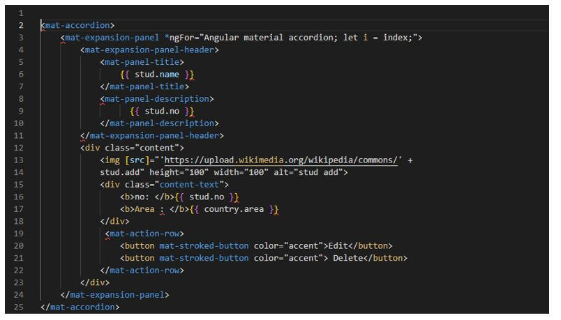
6. Adding code into the app.component.html file as follows.
Code:
<mat-accordion>
<mat-expansion-panel *ngFor="Angular material accordion; let i = index;">
<mat-expansion-panel-header>
<mat-panel-title>
{{ stud.name }}
</mat-panel-title>
<mat-panel-description>
{{ stud.no }}
……
</div>
<mat-action-row>
<button mat-stroked-button color="accent">Edit</button>
<button mat-stroked-button color="accent"> Delete</button>
</mat-action-row>
</div>
</mat-expansion-panel>
</mat-accordion>
Output:
Accordion Add Expansion Panel
- The mat expansion panel is an angular directive to create an expandable detail.
- The mat expansion header panel represents the header section which contains the panel’s summary. The mat panel title will represent the panel title.
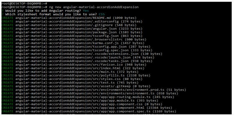
- The below example is the accordion add expansion panel as follows. In the below example, we create the new project name as angular-material-accordionAddExpansion. When creating a project, we defined angular routing as yes and the style sheet format as yes.
Code:
ng new angular-material-accordionAddExpansionOutput:
- Now we are defining the workspace for our application. When defining the new workspace for our application, we are defining routing; yes, we are defining the stylesheet format as CSS. Finally, we are defining the name of our project as angular-material-accordionAddExpansion as follows.
Code:
cd angular-material-accordionAddExpansion/
ng add @angular/material
Output:
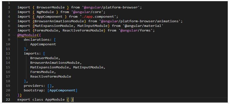
- Now we add the following code to the app.module.ts file. We are importing the module into this file; we can see that we have imported multiple modules.
Code:
import { BrowserModule } from '@angular/platform-browser';
……..
@NgModule({
declarations: [
AppComponent
],
imports: [
  BrowserModule,
  BrowserAnimationsModule,
  MatExpansionModule, MatInputModule,
  FormsModule,
  ReactiveFormsModule
  ],
providers: [],
  bootstrap: [AppComponent]
  })
export class AppModule { }
Output:
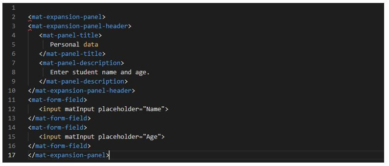
- Now we are adding the following code into the app.component.html file as follows.
Code:
<mat-expansion-panel>
 <mat-expansion-panel-header>
  <mat-panel-title>
Personal data
   </mat-panel-title>
   <mat-panel-description>
   Enter student name and age.
  </mat-panel-description>
 </mat-expansion-panel-header>
<mat-form-field>
  <input matInput placeholder = "Name">
</mat-form-field>
<mat-form-field>
  <input matInput placeholder = "Age">
 </mat-form-field>
</mat-expansion-panel>
Output:
Conclusion
Angular material accordion is not coming with the treatment of accessibility because it doesn’t have control over markup. It is nothing but a component with more than one or a single section that is expandable. The jquery UI library contains an accordion component containing many API options.
Recommended Articles
This is a guide to Angular Material Accordion. Here we discuss the introduction, angular material accordion project, and add an expansion panel. You may also have a look at the following articles to learn more –


