Updated February 15, 2023
Introduction to Angular Material Calendar
In the angular material calendar, we use the datepicker; this will allow the user to enter the date by using input as text or by using the date from the calendar. Angular material calendar is made using different directives, several components, and the module of date implementation, which works together. The datepicker comprises text input and a popup calendar connected via the matDatePicker property.
Overview of Angular Material Calendar
It contains the toggle button of the datepicker is optional, which gives the user to open the popup of the date picker. To use it in our code, we need to import the mat date picker module in our program; without importing this module, we cannot use the same in our code. It will work similarly to mat from the field. If we want to select the date of range instead of a single date, we can use the mat date range input or the mat date range picker component. Both these components will work similarly to mat datepicker.
Angular Material Calendar Component
- The mat date range input component is used with the directive of the form group. The start view property of the mat datepicker is used to set the view, showing when the calendar will open first. By default, it will be a setting year, month, or multi-year; it will open the month’s view. The month, year, or year’s range is open on the calendar, which was determined in the first checking if any date we have selected currently.
- Material docs contain extensive documentation for the component of the date picker. This component will render input to the user to select the date from the calendar.
- This is very useful in the form of data entry; we cannot get the value of the date every time from the user; it is necessary to display a calendar that always opens.
- In the below example, we are using the calendar component as follows. Below we are configuring the project of the angular material calendar component. First, we need to install angular material CLI in our system to configure the angular material calendar component project.
1. Install the angular material CLI on the ubuntu system. In the below example, we install angular CLI using the npm command.
Code:
npm install -g @angular/cliOutput:
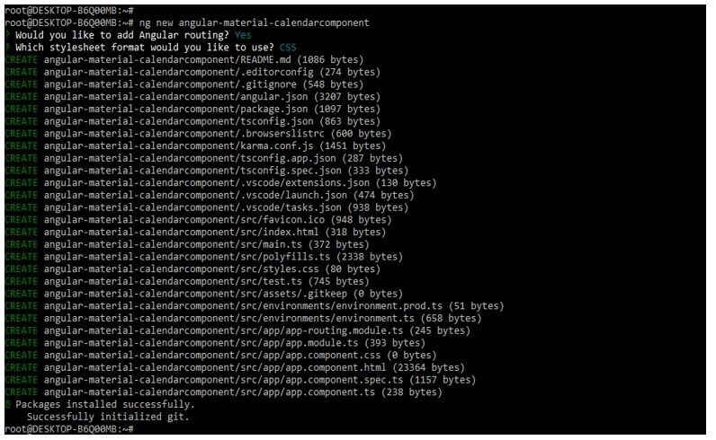
2. Now, in the below example, we are creating a new project name, angular-material-calendarcomponent; when creating this project, we are defining routing as yes also, and we are describing the format of the style sheet as yes.
Code:
ng new angular-material-calendarcomponentOutput:
3. Now, we are installing the below packages that are used at the time of developing the application. This package is used to import the component in our application. We are installing these packages by using the npm command as follows.
Code:
npm install @angular/material –saveOutput:
4. Now, we are adding the library files to our project. We are adding the library as follows.
Code:
cd angular-material-calendarcomponent/
ng add @angular/material
Output:
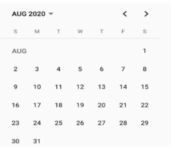
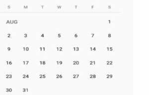
5. After setting up the project structure now, we are using a calendar by using a mat calendar selector. In the below example, we are using the div class; in the div class, we are using the class of calendar wrapper. Then we use the mat calendar selector to select the date from the calendar.
Code:
<div class = "calendar-wrapper">
<mat-calendar #calendar [(selected)] = "selectedDate">
</mat-calendar>
</div>
Output:
6. We can also use the view child property in the component to access the calendar element.
Code:
@ViewChild ('calendar') calendar: MatCalendar <cal>;
selectedDate: cal;
Output:
Angular Material Calendar Events
The angular calendar contains the two events. First is the selectedChange, and second is the monthSelected.
1. selectedChange
This event in the angular material calendar will execute when there is a change in the selection of date. The argument of the event handler contains the date object which was selected.
Code:
<mat-calendar #calendar [(selected)] = "selectedDate"
(selectedChange) = "dateChanged ($event)">
</mat-calendar>
Output:
2. monthSelected
This event in the angular material calendar will execute when there is a change in the selection of the month. The argument of the event contains the date object.
Code:
<mat-calendar #calendar [(selected)] = "selectedDate"
(monthSelected) = "monthSelected($event)">
</mat-calendar>
Output:
Angular Material Calendar Highlight
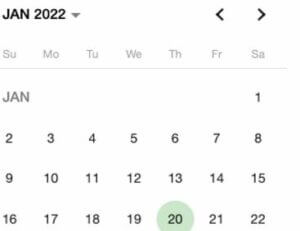
- We can highlight the angular material calendar date. The below example shows how we can highlight the calendar date as follows.
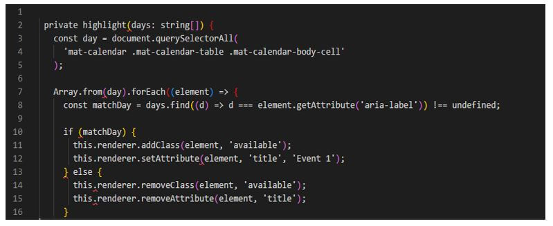
- We need to use a renderer’s service to manipulate the HTML output in a calendar component. This is used to draw the user’s attention to the highlighted date.
- The renderer service adds and removes the attributes and CSS classes. The below example shows angular material calendar highlights as follows.
Code:
private highlight(days: string[]) {
const day = document.querySelectorAll (
'mat-calendar .mat-calendar-table .mat-calendar-body-cell'
);
Array.from(day).forEach((element) => {
const matchDay = days.find ((d) => d === element.getAttribute ('aria-label')) !== undefined;
if (matchDay) {
this.renderer.addClass (element, 'available');
this.renderer.setAttribute (element, 'title', 'Event 1');
} else {
this.renderer.removeClass (element, 'available');
this.renderer.removeAttribute (element, 'title');
}
Output:
Example of Weekends
- We are using angular directive to create control of the date picker from which date can be selected from the calendar, or we can take input directly from the input box. We have already created the angular project, so we do not need to create it again.
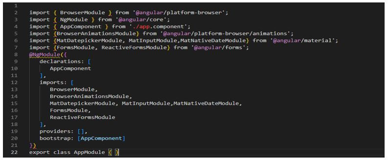
- The below example shows the weekend’s dates as follows. First, we are modifying the app.module.ts file. Then, we import various modules for the angular material component in this file.
Code:
import { BrowserModule } from ‘@angular/platform-browser’;
  ……..
  @NgModule({
  declarations: [
  AppComponent
  ],
  imports: [
BrowserModule,
BrowserAnimationsModule,
MatDatepickerModule, MatInputModule, MatNativeDateModule,
FormsModule,
ReactiveFormsModule
  ],
  providers: [],
  bootstrap: [AppComponent]
  })
export class AppModule { }
Output:
- Now we are modifying the app.cpmponent.html file as follows.
Code:
<mat-form-field>
….
<mat-datepicker #date></mat-datepicker>
</mat-form-field>
Output:
Conclusion
It contains the toggle button of the datepicker is optional, which gives the user to open the popup of the date picker. We are using the datepicker; this will allow the user to enter the date by using input as text or by using the date from the calendar.
Recommended Articles
This is a guide to Angular Material Calendar. Here we discuss the introduction, angular material calendar component, events, and highlights. You may also have a look at the following articles to learn more –


