Updated March 30, 2023
Introduction to Angular Material Expansion Panel
Angular material provides us with one more exacting feature, an expansion panel; this helps us show the detailed view or summary of any of the features. Also, we can have any type of action inside it based on the requirement. For example, we can use an expansion panel where we do not want the initial summary to be viewed by the user without a click or their intention. Although it is closed by default, we can make this open after doing some property changes. To implement this, we can use a material library that has an in-build module; we can directly use those modules to implement this functionality by making the changes into the existing project.
Syntax of Angular Material Expansion Panel
Before using this, we have to make a few changes to the project, but first, we can have a look at the syntax for this, which is given by the material.
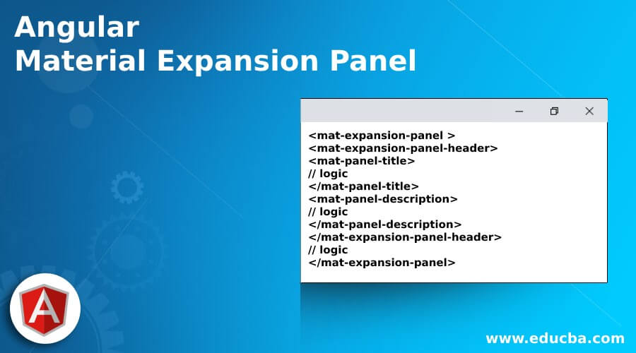
<mat-expansion-panel >
<mat-expansion-panel-header>
<mat-panel-title>
// logic
</mat-panel-title>
<mat-panel-description>
// logic
</mat-panel-description>
</mat-expansion-panel-header>
// logic
</mat-expansion-panel>
As you can see from the above syntax, we are trying to use ‘mat-expansion-panel’ and other selectors to implement the expansion panel from the material library. Each of them has its own significance.
How does Expansion Panel work in Angular Material?
As we know that why we are using this and what kind of module material library has been provided to implement this feature, we can use this where we want to show the detailed summary of our any of the functionality or its majorly dependents upon the requirement we have.
Here we will see what configurations and changes we need to make in our exiting project to make this work.
1. MatExpansionModule
Angular material provides us with this module which helps us to create the expansion panel inside our application. By the use of this, we can easily create the panel without much code and also, it gives us various options to show our content inside it, with the heading and description etc., features. In order to implement this inside our application, we need to have this module ‘MatExpansionModule’ present inside our root module or any of the child modules in which we want this to implement.
See the below code and put it inside the root module \;
Code:
import {MatExpansionModule} from '@angular/material/expansion';2. mat-expansion-panel
This selector we can used to show or create our expansion panel on the UI, it contains our content which we want to show on click. Also, it comes up with few properties which we can use; some of them are mentioned below:
- hideToggle: It is used to hide the selector.
- expanded: Whether the selector is expandable or not.
- afterExpand: Emit the event whenever the panel is expanded.
- closed: Emits an event when the panel is closed.
- destroyed: Emits an event whenever the panel is destroyed.
- opened: Emits an event whenever the panel is opened.
After doing all this now, we can check the steps required to follow to have the angular project setup from scratch.
Follow the below steps to create your angular project using the material library.
1. Just install the below angular CI by using the below command; it is easy to use and run.
Code:
npm install -g @angular/cli2. Now, we can create the angular project by executing the below command. Also, we can have specified the name of the project for our application.
Code:
ng new your project name
>> ng new my-first-project
3. Now, we can install the angular dependency just by running the below command to the project path.
Code:
npm install4. After all this, we can now run our project by executing the below command; it should run without any errors on the command prompt.
Code:
ng serve5. Now, we can use the URL below to run our application from the local env, on port 4200, default without setting.
http://localhps:4200
6. And now, the very last step is to execute and install the material library inside the project, which is mentioned below.
Code:
ng add @angular/materialAfter this, we will be able to use the expansion panel inside the project.
Example of Angular Material Expansion Panel
Different examples are mentioned below:
a. index.html code:
<link href="https://fonts.googleapis.com/icon?family=Material+Icons" rel="stylesheet">
<my-expansion-demo>loading..</my-expansion-demo>
b. demo.exapnsion.component.ts code:
import { Component, ViewChild } from '@angular/core';
import {MatAccordion} from '@angular/material/expansion';
@Component({
selector: 'my-expansion-demo',
templateUrl: './demo.exapnsion.component.html',
styleUrls: [ './demo.exapnsion.component.css' ]
})
export class DemoExpansion {
name = 'Angular';
@ViewChild(MatAccordion) acc: MatAccordion;
}
c. demo.exapnsion.component.html code:
<div>
<h3><u><i>Expansion panel demo using Angular Material !!</i></u></h3>
<button mat-raised-button color="accent"(click)="acc.openAll()">Expand</button>
<button mat-raised-button color="primary" (click)="acc.closeAll()">Close</button>
</div>
<br/><br/>
<mat-accordion class="example-headers-align" multi>
<mat-expansion-panel>
<mat-expansion-panel-header>
<mat-panel-title>
User Information
</mat-panel-title>
<mat-panel-description>
Provide Info
<mat-icon>info</mat-icon>
</mat-panel-description>
</mat-expansion-panel-header>
<mat-form-field appearance="fill">
<mat-label>First name</mat-label>
<input matInput>
</mat-form-field>
<mat-form-field appearance="fill">
<mat-label>Last name</mat-label>
<input matInput>
</mat-form-field>
<mat-form-field appearance="fill">
<mat-label>City</mat-label>
<input matInput>
</mat-form-field>
<mat-form-field appearance="fill">
<mat-label>Country</mat-label>
<input matInput>
</mat-form-field>
</mat-expansion-panel>
d. module.ts code:
import {NgModule} from '@angular/core';
import {MatExpansionModule} from '@angular/material/expansion';
@NgModule({
exports: [
MatExpansionModule,
]
})
export class DemoMaterialExpansionModule {}
Output:
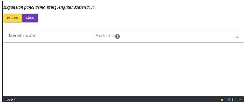
Initial look:
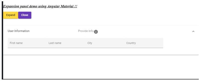
After click icon:
Try to click close and expand to perform the same action on the expandable panel.
Conclusion
As we have seen all the steps which needs to be followed and taken care of while creating the expansion panel using a material library, all the steps you should follow, as it is mentioned in this article to successfully create your very first expansion panel, it is very easy to use, handle, maintainable and understandable by the developers as well.
Recommended Articles
We hope that this EDUCBA information on “Angular Material Expansion Panel” was beneficial to you. You can view EDUCBA’s recommended articles for more information.


