Updated April 4, 2023

Introduction to Angular material module
In Angular we have one of the most important term ‘Module’, it has a common meaning in a material library as well. A module can be defined as the piece of functionality of an application. The module consists of group components, services, pipes and directive which is related or used in the application. Inside one module we can have any number of components, services, etc. If we talk about the material library, it provides us many build-in modules which we used to create different types of components in our application. This module contains components, directives to provide one single functionality of the user. Let’s take an example to understand button, icon, checkbox, and many more it ha. If we want to use this then we have to import this module inside our root module file after that we will be able to use this, in the coming section of the tutorial we will see the different types of modules available in detail for better understanding and clarity.
Syntax:
To define or create a module we have to follow the below syntax define and need to use some in build module from the angular library to make it is a module, for better understanding see below;
import { BrowserModule } from '@angular/platform-browser';
import { NgModule } from '@angular/core';
// import any module from the library ..//
@NgModule({
declarations: [
// your component goes here .//
],
imports: [
// imports will o here ..//
],
providers: [],
bootstrap: [bootstrap component will go here /../]
})
export class Module_Name { }
As you can see in the above syntax we are using ‘NgModule’ to declare our import and cerate the module for our application. We can have any number of child modules in angular application but only one root module. In the coming section, we will see the material module.
How does module work in Angular material?
As we already know that we can create our custom module in angular, now in this section we will have closer look at the different types of modules provided by the material library and how to use them in our application, let’s get started
1) MatButtonModule: In order to create a button using the material library we can use ‘MatButtonModule’ and we can import this inside the application to use it. Below see the reference code to import this, this module is present inside the ‘@angular/material/button’ folder after installing material;
e.g. :
import {MatButtonModule} from '@angular/material/button';2) MatButtonToggleModule: In order to create a toggle button using the material library we can use ‘MatButtonToggleModule’ and we can import this inside the application to use it. Below see the reference code to import this, this module is present inside the ‘@angular/material/button-toggle’ folder after installing material;
e.g. :
import {MatButtonToggleModule} from '@angular/material/button-toggle';3) MatCardModule: In order to create a card using the material library we can use ‘MatCardModule’ and we can import this inside the application to use it. Below see the reference code to import this, this module is present inside the ‘@angular/material/card’ folder after installing material;
e.g. :
import {MatCardModule} from '@angular/material/card';4) MatCheckboxModule: In order to create a checkbox using the material library we can use ‘MatCheckboxModule’ and we can import this inside the application to use it. Below see the reference code to import this, this module is present inside the ‘@angular/material/checkbox’ folder after installing material;
e.g. :
import {MatCheckboxModule} from '@angular/material/checkbox';5) MatDatepickerModule: In order to create a date picker using the material library we can use ‘MatDatepickerModule’ and we can import this inside the application to use it. Below see the reference code to import this, this module is present inside the ‘@angular/material/datepicker’ folder after installing material;
e.g. :
import {MatDatepickerModule} from '@angular/material/datepicker';6) MatDialogModule: In order to create dialog using material library we can use ‘MatDialogModule’ and we can import this inside the application to use it. Below see the reference code to import this, this module is present inside the ‘@angular/material/dialog’ folder after installing material;
e.g. :
import {MatDialogModule} from '@angular/material/dialog';7) MatIconModule: In order to create an icon using the material library we can use ‘MatIconModule’ and we can import this inside the application to use it. Below see the reference code to import this, this module is present inside the ‘@angular/material/icon’ folder after installing material;
e.g. :
import {MatIconModule} from '@angular/material/icon';8) MatInputModule: In order to create an input field using the material library we can use ‘MatInputModule’ and we can import this inside the application to use it. Below see the reference code to import this, this module is present inside the ‘@angular/material/input’ folder after installing material;
e.g. :
import {MatInputModule} from '@angular/material/input';Example
Simple app to show usage of material module inside the angular application;
1) index.html code :
<!DOCTYPE html>
<html lang="en">
<head>
<meta charset="utf-8">
<meta name="viewport" content="width=device-width, initial-scale=1.0">
<link href="https://fonts.googleapis.com/icon?family=Material+Icons&display=block" rel="stylesheet">
<title> material module demo  </title>
</head>
<body class="mat-app-background">
<demo-app>Loading..</demo-app>
<span class="version-info">Current build: 12.1.4</span>
</body>
</html>
2) module.ts code :
import { NgModule } from '@angular/core';
import { BrowserModule } from '@angular/platform-browser';
import { FormsModule } from '@angular/forms';
import {MatButtonModule} from '@angular/material/button';
import {MatButtonToggleModule} from '@angular/material/button-toggle';
import {MatCardModule} from '@angular/material/card';
import {MatCheckboxModule} from '@angular/material/checkbox';
@NgModule({
declarations: [ DemoComponent ],
bootstrap:    [ DemoComponent ],
imports: [
BrowserModule, FormsModule,
MatButtonModule,
MatButtonToggleModule,
MatCardModule,
MatCheckboxModule,]
})
export class DemoModule { }
3) demo-module.component.ts code :
import { Component } from '@angular/core';
@Component({
selector: 'demo-app',
templateUrl: './demo-module.component.html',
styleUrls: [ './demo-module.component.css' ]
})
export class DemoComponent  {
name = 'module demo';
}
4) demo-module.component.html code :
<h5><u><i>Angular material module Demo</i></u></h5>
<h4>Button</h4>
<mat-form-field>
<button mat-raised-button>Basic</button>
<button mat-raised-button color="primary">Primary</button>
<button mat-raised-button color="accent">Accent</button>
<button mat-raised-button color="warn">Warn</button>
<button mat-raised-button disabled>Disabled</button>
</mat-form-field>
<h4>checkbox</h4>
<section>
<mat-checkbox class="example-margin">One</mat-checkbox>
<mat-checkbox class="example-margin">Two</mat-checkbox>
</section>
<h4>checkbox</h4>
<mat-radio-group aria-label="Select an option">
<mat-radio-button value="1">item 1</mat-radio-button>
<mat-radio-button value="2">item 2</mat-radio-button>
<mat-radio-button value="2">item 3</mat-radio-button>
</mat-radio-group>
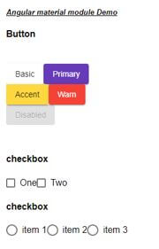
Output:
Conclusion
By the use of the material module, we can directly take advantage of the in-build function it provides. we just have to import the module from the material library and start using its components, directives to create our UI easily and fast.
Recommended Articles
We hope that this EDUCBA information on “Angular material module” was beneficial to you. You can view EDUCBA’s recommended articles for more information.


