Updated April 5, 2023

Introduction to Angular Material navbar
Angular material also provides us navbar, which is nothing but collapsible side content. This type of site content can be used to show the menu of an application or different types of features available to the application. This type of sidebar is often known as a navbar, and with the help of material, we can easily implement this. Otherwise, a developer has to make so many changes to the HTML, CSS, and code as well to maintain this. But material makes it easy for us to use and design with default designing and styling. We will make few configurations inside the angular application after adding the material library then it is ready to use. Here we will see in detail how it works and use this inside our application in detail.
Syntax of Angular Material navbar
We have to make use of directives in order to create our navbar using the material library, let’s see the basic syntax which will create a basic navbar for us.
<mat-sidenav-container>
<mat-sidenav mode="side" opened>Text !!</mat-sidenav>
<mat-sidenav-content>Text two !!</mat-sidenav-content>
</mat-sidenav-container>
As you can see in the above example we are using ‘mat-sidenav-container’, ‘mat-sidenav’, and ‘mat-sidenav-content’ this will be required to create our side navbar on the full screen.
How to Create navbar in Angular Material?
Let’s see the different types of the directive we have and configuration.
- MatSidenavModule: This is the main class that contains the required directive to create our navbar in the material. This has to be imported inside the root module or any child module in which you want to use this.
For reference copy the below code to your root module:
Example:
import {MatSidenavModule} from '@angular/material/sidenav';- <mat-sidenav-container>: This is the parent we can say for content and sidenav, it acts as a structure for both of them.
- <mat-sidenav-content>: Inside this tag our main content will be present which we want to show a the part of navbar.
- <mat-sidenav>: This directive or tag will add the navbar for us, in short, create the navbar a basic one.
Below we have made use of all three tags in order to use this:
<mat-sidenav-container class="example-container">
<mat-sidenav mode="side" opened>Navbar </mat-sidenav>
<mat-sidenav-content> Main </mat-sidenav-content>
</mat-sidenav-container>
Now let’s see the steps that need to be taken in order to step up our angular material project initially.
1. First install the angular CLI which enables us to download the required packages and library for our project.
You can download it by typing the below command on your command to make sure you have already installed the node.
Example:
npm install -g @angular/cli)The above command will install the CLI globally in our system hence we can use it globally when required.
2. Now in this step we will try to create the new angular project from scratch, this project will not be a material project that we have to add later by installing the material dependency inside our project. So just execute the below command on your Command Prompt and press enter.
Example:
ng new your project name
>> ng new my-first-project
This command will create the project with the name my-first-project, you can create your project with any name mentioned.
3. Just to make sure try one command which is mentioned below to install all the required libraries into our project.
Example:
npm install4. Now you can test and run your project by typing the simple command which is mentioned below. This is just to make sure that we are on the right track and our project has been created without any error or bugs inside it.
Example:
ng serve5. Go on the browser and try to run the application with the below URL.
Example:
http://localhps:4200
By default, the angular project runs on port 4200, you can change it as per your need if required.
6. Now everything is set we have our angular project now we will add the material library to our project just by running the below command on the command prompt.
Example:
ng add @angular/materialExamples of Angular Material navbar
Given below are the examples mentioned:
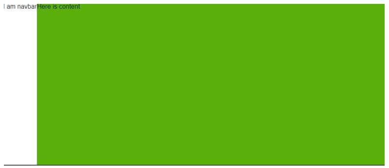
Example #1
Basic navbar.
HTML Code:
<div >Demo navbar</div>
<mat-sidenav-container class="example-container" >
<mat-sidenav mode="side" opened>I am navbar</mat-sidenav>
<mat-sidenav-content><span>Here is content</span></mat-sidenav-content>
</mat-sidenav-container>
component.ts Code:
import {Component} from '@angular/core';
@Component({
selector: 'sidenav-demo',
templateUrl: 'sidenav-demo.html',
styleUrls: ['sidenav-demo.css'],
})
export class NavBarDemo {
}
module Code:
import {NgModule} from '@angular/core';
import {MatSidenavModule} from '@angular/material/sidenav';
@NgModule({
exports: [
MatSidenavModule,
]
})
export class DemoNavBarMaterial {}
index.html Code:
<!DOCTYPE html>
<html lang="en">
<head>
<meta charset="utf-8">
<meta name="viewport" content="width=device-width, initial-scale=1.0">
<link href="https://fonts.googleapis.com/icon?family=Material+Icons&display=block" rel="stylesheet">
<title>Demo basic navbar</title>
</head>
<body class="mat-app-background">
<sidenav-demo>Loading..</sidenav-demo>
<span class="version-info">Current build: 12.1.0</span>
</body>
</html>
Output:
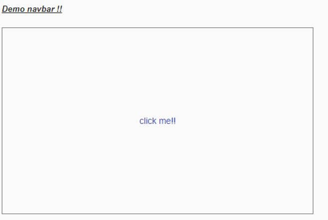
Example #2
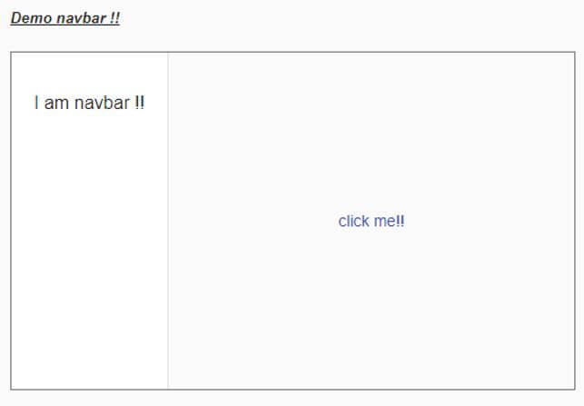
Drawbar navbar using angular material it will work and show navbar on click of a button.
HTML Code:
<h5><u><i>Demo navbar !!</i></u></h5>
<mat-drawer-container class="example-container" autosize>
<mat-drawer #drawer class="example-sidenav" mode="side">
<p>I am navbar !!</p>
</mat-drawer>
<div class="example-sidenav-content">
<button type="button" mat-button color="primary" (click)="drawer.toggle()">
click me!!
</button>
</div>
</mat-drawer-container>
component.ts Code:
import {Component} from '@angular/core';
@Component({
selector: 'sidenav-demo',
templateUrl: 'sidenav-demo.html',
styleUrls: ['sidenav-demo.css'],
})
export class NavBarDemo {
}
module code:
import {NgModule} from '@angular/core';
import {MatSidenavModule} from '@angular/material/sidenav';
@NgModule({
exports: [
MatSidenavModule,
]
})
export class DemoNavBarMaterial {}
index.html Code:
<!DOCTYPE html>
<html lang="en">
<head>
<meta charset="utf-8">
<meta name="viewport" content="width=device-width, initial-scale=1.0">
<link href="https://fonts.googleapis.com/icon?family=Material+Icons&display=block" rel="stylesheet">
<title>Demo basic navbar</title>
</head>
<body class="mat-app-background">
<sidenav-demo>Loading..</sidenav-demo>
<span class="version-info">Current build: 12.1.0</span>
</body>
</html>
Output:
After button click:
Conclusion
As we have already seen how to create our own navbar using the angular material library, all the steps are mentioned in the article, it is easy to use and maintain with little code changes to the existing application. which makes it readable to the developers as well.
Recommended Articles
We hope that this EDUCBA information on “Angular Material navbar” was beneficial to you. You can view EDUCBA’s recommended articles for more information.


