Updated February 15, 2023
Introduction to Angular Material Popup
The angular material popup module is easy to implement using JS’s framework. The service of MatDialog is used for the opening dialog of the modal by using animation and material design styles. At the time of opening the browser of MatDialog, which focuses on not escaping the root element. By default, first, the tabbable element will receive focus on it; we can also customize which element will receive focus using the autofocus property.
Overview of Angular Material Popup
The angular material popup is used to construct attractive and functional web pages and the web application while keeping the design principle. It is a built-in module with UI components that work across desktop, web, and mobile applications. We can use the mat dialog service to open the popup window by using material design animation and material design styling. To use it in our project, we first need to install angular CLI in our system; without installing angular CLI, we can use the angular material popup.
How to Create Confirmation Angular Material Popup?
Below steps shows how we are creating a confirmation angular material popup as follows:
Below we are creating the project of the angular material popup. But first, we need to install angular material CLI in our system to create the confirmation angular material popup project.
1. In the below example, we are installing angular material CLI on the ubuntu system. In the below example, we install angular CLI using the npm command as follows.
Code:
npm install -g @angular/cliOutput:
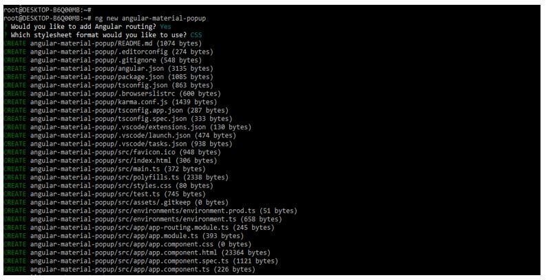
2. In the below example, first, we create a new project name angular-material-popup; when creating the angular material popup project, we are using routing as yes, and we are using the style sheet format as yes.
Code:
ng new angular-material-popupOutput:
3. We are installing the below packages used when developing the application. This package is used to import the module into our application. We are installing these packages by using the npm command as follows.
Code:
npm install @angular/material –saveOutput:
4. Below, we are adding the library to our project. We use the ng add command to add the library to the project. Also, we are setting the global angular material typography style as yes. Finally, we define angular material browser animations as yes as follows.
Code:
cd angular-material-popup/
ng add @angular/material
Output:
5. Now, we are installing the hammerjs using the npm command.
Code:
npm install --save hammerjsOutput:
6. In the example below, we are adding the code to the material.module.ts file.
Code:
import { NgModule } from '@angular/core';
import { MatDialogModule, MatFormFieldModule, MatButtonModule, MatInputModule } from '@angular/material';
import { FormsModule } from '@angular/forms';
@NgModule({
exports: [FormsModule, MatDialogModule, MatFormFieldModule, MatButtonModule, MatInputModule]
})
export class MaterialModule {}
Output:
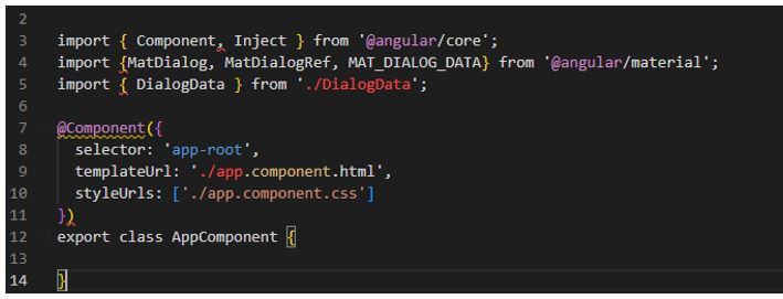
7. We need to add the code below to the app.component.ts file.
Code:
@Component({
selector: 'app-root',
templateUrl: './app.component.html',
styleUrls: ['./app.component.css']
})
export class AppComponent {
}
Output:
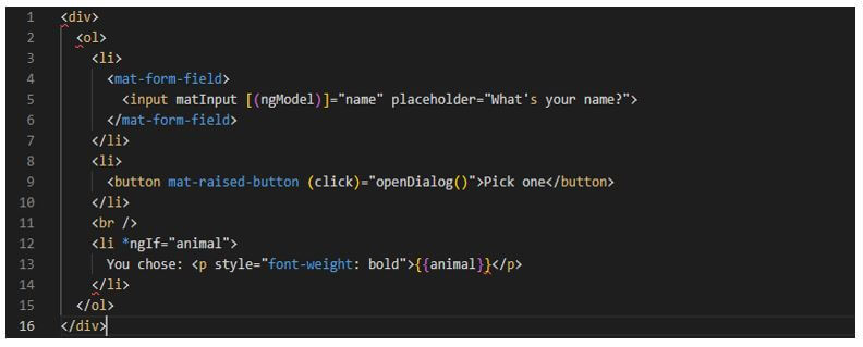
8. Modal component class accepts the dialog data and displays the same inside the dialog. In the below example, we are writing the modal.component.html file as follows.
Code:
<div>
<ol>
<li>
<mat-form-field>
……..
</mat-form-field>
</li>
……
</li>
</ol>
</div>
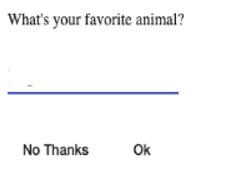
Output:
Angular Material Popups & Modals
- We are using the bottom sheet service in it and the modules. The MatBottomSheet attribute is used when we use popups and modals in AngularJS.
- While using the open method in popups and modals, the method will return an instance of the mat bottom sheet reference object.
Code:
const bottomSheetRef = bottomSheet.open (component, {
ariaLabel : 'Angular material popups and modals } )
Output:
- The mat bottom sheet reference is a reference to opened sheet subscription of the event. The component is beside the sheet of the mat reference object. In the below example, we are using the afterDismissed method; also, we are using the dismiss method as follows.
Code:
bottomSheetRef.afterDismissed ().subscribe (() => {
console.log ('Angular material popups and modals);
} );
bottomSheetRef.dismiss ();
Output:
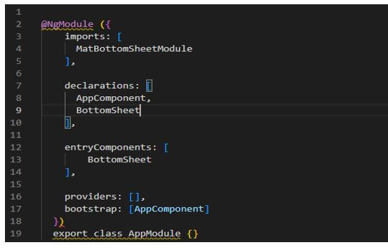
- The MatBottomSheet and MatDialog are initiating components when we run a project. The angular compiler in angular popups and modal will need more info to create the factory component. After adding any component in the factory method, which goes into a module of entry component as follows.
Code:
@NgModule({
imports: [
MatBottomSheetModule
],
……….
})
export class AppModule {}
Output:
Examples of Angular Material Popup
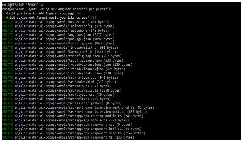
In the example below, creating a new project name angular-material-popupexample at the time of creating the project, we are using routing as yes and the style sheet format as yes.
Code:
ng new angular-material-popupexampleOutput:
Below we are adding the library to our project as follows. We are choosing a pre-built theme name as custom; this is a default theme used when adding the library.
Code:
cd angular-material-popupexample/
ng add @angular/material
Output:
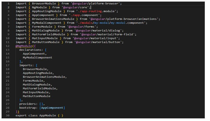
Below we are importing the module into the app.module.ts file as follows.
Code:
import { BrowserModule } from '@angular/platform-browser';
….
MatButtonModule
],
providers: [],
bootstrap: [AppComponent]
})
export class AppModule { }
Output:
In the below example, we are creating a component modal as follows.
Code:
ng generate component modals/my-modalOutput:
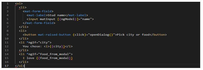
Now we are updating the app.component.html file as follows.
Code:
<ol>
<li>
<mat-form-field>
…..
</li>
</ol>
Output:
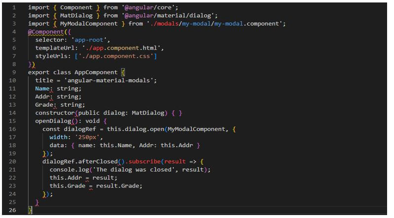
Now we are updating the app.component.ts file as follows.
Code:
import { Component } from '@angular/core';
……
this.Grade = result.Grade;
});
Output:
Conclusion
It is used to construct attractive and functional web pages and applications while keeping the design principle. By default, first, the tabbable element will receive focus on it; we can also customize which element will receive using the autofocus property.
Recommended Articles
This is a guide to Angular Material Popup. Here we discuss the introduction and how to create a confirmation angular material popup with examples. You may also have a look at the following articles to learn more –
