Updated April 17, 2023

Introduction to Angular Material Select
In angular material we have one more component which is called select, it helps us to select values from the list of options available. It works in the same way as <select> basic elements we have, but in material, it comes with styling and animations also. It is very useful when we want to select a single value from the list of options, we have so many different requirements where we want our users to select a single value from the list, for example, we want them to select country, city and state for their address because it cannot be multiple. In such scenarios, we can go for select in material angular which makes the UI more interactive and user friendly.
Syntax of Angular Material Select
As we know it is the same as <select> element but in material, we have standard syntax to use this inside the application.
<mat-form-field >
<mat-select>
<mat-option>
</mat-option>
</mat-select>
</mat-form-field>
As you can see above is the basic syntax for using select in angular material, here we are using ‘mat-select’ to create the functionality.
How Select Works in Angular Material?
Select is used to select a value from the list, also it enables us to have a specific value according to the input we have. In application, we may have different or so many requirements where we want only one value from the list of values we have, which specify the value for the given label. So this can be achievable with the help of select components.
1. MatSelectModule: In order to implement this, we have this module inside the root module file, then only we will be able to use this. We can import this in any child module file in which we want this functionality to implement.
See the below code and use it as it is inside your root module file.
Code:
import {MatSelectModule} from '@angular/material/select';2. matSelect: It can be exposed by this name ‘matSelect’ and can be used on the template by this selector ‘mat-select’, after that only we will be able to see the changes on the UI, it always takes a list object which it can iterate.
It also comes up with different properties some of them are mentioned below:
- id: Used to give the unique id.
- multiple: Used to indicate if the user is allowed to select multiple values or not.
- disabled: Used to indicate whenever the component is disabled.
- errorStateMatcher: When error messages are shown.
- placeholder: Used to indicate if the value is not yet selected.
- required: Used to show that value is required to be select.
Now in order to implement this, we have to have the angular project with the material library installed or added inside it.
For this, you need to follow the below steps which will help us to get started with our first component implementation in angular.
1. the First step will be to install the Angular CLI, which makes our work easy to maintain and handle the angular project, just execute the below command and install it globally on the system.
Code:
npm install -g @angular/cli2. Second step is to install and create the angular project, here we can specify the name of our angular project after which it will be carted by this name only inside the system.
Code:
ng new your project name
>> ng new my-first-project
You can provide any of them in place of ‘my-first-project’.
3. Now install the angular dependency by running the below command it is optional we can have used it if required or angular is not able to find any dependency.
Code:
npm install4. Start the angular server just by executing the below command on the command prompt inside your src folder.
Code:
ng serve5. Once the server is started successfully then we can now test our application by running the below URL on the browser, with the default port of 4200.
http://localhps:4200
6. Now we can add the material library which can be done by using the below command, after this successful installation we are ready to use the material component inside our application.
Code:
ng add @angular/materialExample of Angular Material Select
Given below is the example mentioned:
a. index.html code
<link href="https://fonts.googleapis.com/icon?family=Material+Icons" rel="stylesheet">
<link href="https://fonts.googleapis.com/css?family=Roboto:300,400,500" rel="stylesheet">
<link rel="stylesheet" href="https://unpkg.com/normalize.css@8.0.0/normalize.css">
<my-select>loading.. </my-select>
b. demo.select.component.ts code
import { Component } from '@angular/core';
interface Flower {
value: string;
viewValue: string;
}
interface Cars {
value: string;
viewValue: string;
}
@Component({
selector: 'my-select',
templateUrl: './demo.select.component.html',
styleUrls: [ './demo.select.component.css' ]
})
export class DemoSelectComponent {
name = 'Angular';
flowers: Flower[] = [
{value: 'one-0', viewValue: 'Rose'},
{value: 'two-1', viewValue: 'Sun Flower'},
{value: 'three-2', viewValue: 'Lotus'},
{value: 'four-1', viewValue: 'Lilly'},
{value: 'five-1', viewValue: 'Tulip'},
];
cars: Cars[] = [
{value: 'one-0', viewValue: 'BMW'},
{value: 'two-1', viewValue: 'AUDI'},
{value: 'three-2', viewValue: 'MB'},
{value: 'four-1', viewValue: 'MG'},
{value: 'five-1', viewValue: 'VW'},
];
}
c. demo.select.component.html code
<h4>Angular Material Select Demo</h4>
<mat-form-field appearance="fill">
<mat-label>Select favourite Flower</mat-label>
<mat-select>
<mat-option *ngFor="let flower of flowers" [value]="flower.value">
{{flower.viewValue}}
</mat-option>
</mat-select>
</mat-form-field>
<br/><br/>
<mat-form-field appearance="fill">
<mat-label>Select favourite Car</mat-label>
<mat-select>
<mat-option *ngFor="let car of cars" [value]="car.value">
{{car.viewValue}}
</mat-option>
</mat-select>
</mat-form-field>
d. module.ts code:
import { NgModule } from "@angular/core";
import { BrowserModule } from "@angular/platform-browser";
import { MaterialModule } from "./material.module";
import { BrowserAnimationsModule } from '@angular/platform-browser/animations';
import {MatSelectModule} from '@angular/material/select';
import { DemoSelectComponent } from "./app.component";
@NgModule({
imports: [BrowserModule, BrowserAnimationsModule, MaterialModule, MatSelectModule],
declarations: [DemoSelectComponent],
bootstrap: [DemoSelectComponent]
})
export class DemoAppModule {}
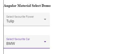
Output:
Conclusion
As we already have seen the required steps which need to be taken in order to use the select from material library. It is also one of the important components from the material libraries, which is easy to use, handle, readable, and maintainable as well by the developers.
Recommended Articles
We hope that this EDUCBA information on “Angular Material Select” was beneficial to you. You can view EDUCBA’s recommended articles for more information.


