Updated March 27, 2023

Introduction to ASP.NET CheckBoxList
The CheckBoxList class is derived from the class System.Web.UI.WebControls.ListControls. ASP.NET CheckBoxList is a web control that can be used to collate the items that can be checked, thus giving the user the ability to select multiple items simultaneously. This list of items in the CheckBoxList can be dynamically generated using the Data Binding functions. The CheckBoxList control class implements different interfaces such as INamingContainer, IPostBackDataHandler, IRepeatInfoUser.
Syntax:
The checkboxlist can be created using the design section by dragging and dropping the control from the ASP.NET toolbar window, or else it can also create from the markup section using the following code.
<asp:CheckBoxList id= "checkboxlist1" AutoPostBack = "True" TextAlign = "Right" OnSelectedIndexChanged = "CheckList_Clicked" runat= "server">
<asp:ListItem> Item 1 </asp:ListItem>
<asp:ListItem> Item 2 </asp:ListItem>
<asp:ListItem> Item 3 </asp:ListItem>
The above code will create a checkboxlist named “checkboxlist1” containing items “Item1”, “Item2” and “item3” created using the element <asp:ListItem>. These items contain a checkbox preceding every element in the list.
Properties of ASP.NET CheckBoxList
The checkboxlist items can be accessed with different properties.
- CellPadding: Sets the distance between the content of the cell.
- RepeatedItemCount: This shows the total number of items in the list.
- RepeatColumns: Gets the number of columns to display in the CheckboxList
- RepeatDirection: This property sets the direction in which the controls in the checkboxlist are displayed that are vertically or horizontally.
- cellspacing: It can be used to set the distance between two cells of the checkboxlist.
- HasFooter: Checks if the checkboxlist has a footer section. This is a Boolean property, false indicating no footer section.
- HasHeader: Checks if the checkboxlist has a header section. This is a Boolean property, false indicating no header section.
- HasSeparators: Checks if the checkboxlist has a separator between the items in the list. This is a Boolean property, false indicating no separators between the items.
- RenderWhenDataEmpty: This property gets the value or sets the value for the condition when there is no data in the data source. True indicating the control is still rendered even there is no data in the data source.
- RepeatLayout: Specifies how the list will be rendered either with table element, ul element or a span element.
- TextAlign: Specifies the text alignment of the items in the checkboxes.
- Items: Gets the collection of items from the list.
- AutoPostBack: If set to true, an auto postback will occur whenever the user selects a checkbox in the list.
To bound a CheckBoxList control to a data source, a data source needs to be created using the DataControlObject, which has the items that are used to display. Once this data source is created, use the DataBind method to bind the data source to the CheckBoxList control. The two different properties, “DataTextField’ and “DataValueField”, can be used to specify which fields in the data source to bind to the Text and the Value properties, respectively.
- DataTextField: Specifies the name of the data source field, which is bound to the text of the checkboxlist items.
- DataValueField: Return the name of the data source field, which is bound to the value of the checkboxlist items.
- DataSource: Specifies the data source that populates the items in the checkboxlist box.
Example of ASP.NET CheckBoxList
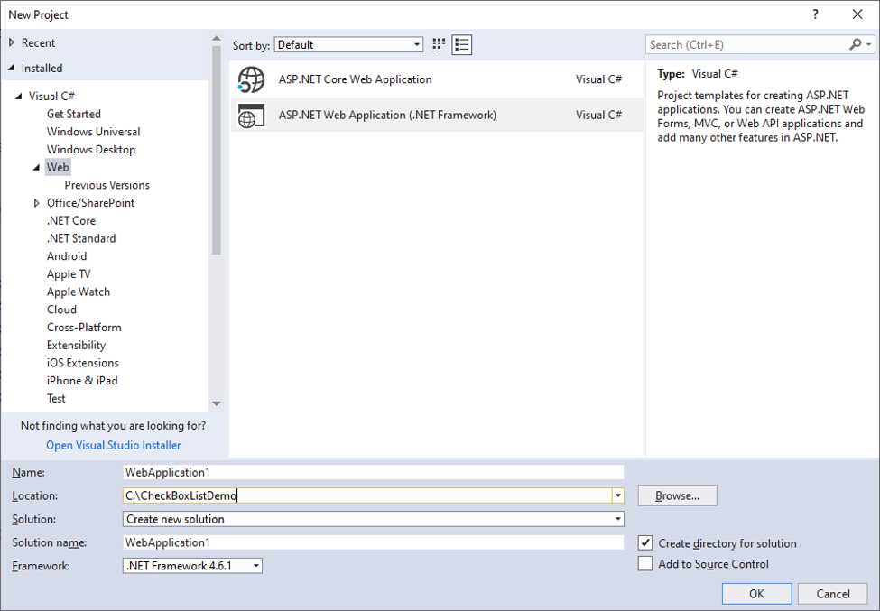
1. Open a Visual Studio 2017 and create an empty web site. Give a name to the application like CheckBoxList_Example.
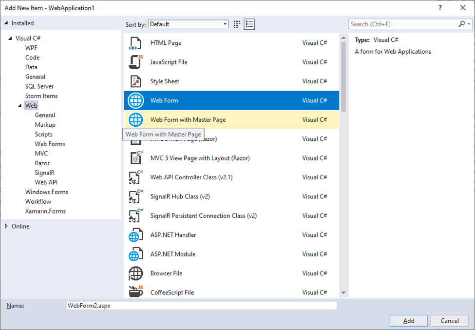
2. Add a Web Form to the website. Go to Solution Explorer -> Add -> New Item. Select Web Form from the dialog. Name the web form like CheckBoxList_Example.aspx
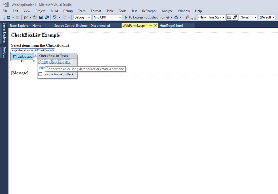
3. In the design section of the web form, drag and drop a checkboxlist from the toolbar present on the screen’s left-hand side. The smart arrow helps the user to bind the checkboxlist to the data source. Also, drag and drop three labels, add meaningful messages to our web form, and display the selected items.
The checkboxlist can also be added for the code section of the web form as follows:
<asp:CheckBoxList id="checkboxlist1" AutoPostBack="True" CellPadding="5" CellSpacing="5" RepeatColumns="2" RepeatDirection="Vertical" RepeatLayout="Flow" TextAlign="Right" OnSelectedIndexChanged="Check_Clicked" runat="server">4. Add items to the checkboxlist using the below code.
<asp:ListItem>Item 1</asp:ListItem>
<asp:ListItem>Item 2</asp:ListItem>
<asp:ListItem>Item 3</asp:ListItem>
<asp:ListItem>Item 4</asp:ListItem>
<asp:ListItem>Item 5</asp:ListItem>
<asp:ListItem>Item 6</asp:ListItem>
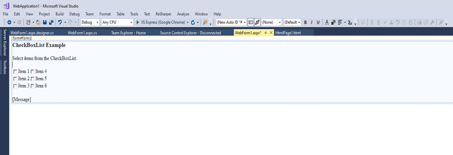
The design of the above code would look like this:
5. In the code section, write the following code to display the selected items from the checkboxlist is as follows:
void Check_Clicked (Object sender, EventArgs e)
{
Message.Text = "Selected Item(s):<br /><br />";
// Iterate through the Items collection of the CheckBoxList
// control and display the selected items.
for (int i=0; i<checkboxlist1.Items.Count; i++)
{
if (checkboxlist1.Items[i].Selected)
{Message.Text += checkboxlist1.Items[i].Text + "<br />";            }
}
}
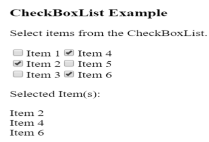
The final output of the program would look like this:
The above code creates a checkboxlist with six items; on selecting these items by ticking into the checkboxes, the selected items are displayed in the label below. The repeat direction used for this checkboxlist is vertical, and the repeat layout is set to ‘flow’, which means the items will be aligned vertically in equal parts.
The CheckBoxList also consists of the constructor.
CheckBoxList checkboxlistObject = new CheckBoxList ();It creates a new instance of the CheckBoxList item. Using the object “checkboxlistObject”, a new list can be created from the code section; also, an array of checkboxes can be created similarly. An event can also be manually registered using the code.
checkboxlistObject.SelectedIndexChanged += new EventHandler (this.Check_Clicked);Conclusion
The checkbox list is a web control that eases the task by listing the options in one box and providing the facility to check multiple elements at the same time. Also, the items in the checkbox list can be arranged according to the user’s imagination with the help of layout properties. This checkbox list can also be bound to the data source, which means the values can be set at run time. This small functionality proves to be useful in many instances as it provides a better display of data on a web page.
Recommended Articles
This is a guide to ASP.NET CheckBox List. Here we discuss the syntax and properties of the ASP.NET checkbox list along with different examples and its code implementation. You may also have a look at the following articles to learn more –
