Updated April 3, 2023
Introduction to Bootstrap Border
The bootstrap provides many utilities to advance design and make an attractive web application. The bootstrap border is one of the utilities to make edges around the image, container, and elements. The border makes the element border as per user requirements according to size, shape, and visibility. The border is providing a designing line at the end of the required element.
Syntax
The basic syntax is below.
<span class = "border"> Element content inside of border container. </span>- The border class is used for creating a border around the container.
- The contextual border syntax is below.
<span class = "border border-primary"> Element content inside of border container. </span>- The primary is one of the contextual using with border class.
- The border-primary class was used along with the border class to represent the primary border.
The border-radius syntax is below.
<span class = "rounded-lg"> Element content inside of border container. </span>- The User can use either a rounded class or circle class to represent the shape of the border.
- The lg, sm is the sizes of the border-radius, which is large and small, respectively.
- The border is removed syntax is below.
<span class = ”border border-top-0”> Element content inside of border container. </span>- The border-top-0 class used to remove the top side of the container border
How Does Border Work in Bootstrap?
The bootstrap supportive file includes in the head section. This file path is below.
<link rel = "stylesheet" href = "https://maxcdn.bootstrapcdn.com/bootstrap/4.5.2/css/bootstrap.min.css">
<script src = "https://ajax.googleapis.com/ajax/libs/jquery/3.5.1/jquery.min.js">
</script>
<script src =     "https://cdnjs.cloudflare.com/ajax/libs/popper.js/1.16.0/umd/popper.min.js">
</script>
<script src = "https://maxcdn.bootstrapcdn.com/bootstrap/4.5.2/js/bootstrap.min.js">
</script>
The bootstrap border class used in the body section of the web pages.
<span class = "border"> Element content inside of border container. </span>The basic bootstrap border steps are below.
<!DOCTYPE html>
<html>
<head>
<meta name = "viewport" content = "width = device-width, initial-scale = 1">
<link rel = "stylesheet" href = "https://maxcdn.bootstrapcdn.com/bootstrap/4.5.2/css/bootstrap.min.css">
<script src = "https://ajax.googleapis.com/ajax/libs/jquery/3.5.1/jquery.min.js">
</script>
<script src =     "https://cdnjs.cloudflare.com/ajax/libs/popper.js/1.16.0/umd/popper.min.js">
</script>
<script src = "https://maxcdn.bootstrapcdn.com/bootstrap/4.5.2/js/bootstrap.min.js">
</script>
<style>
.border {
display: inline-block;
width: 70px;
height: 70px;
}
</style>
</head>
<body>
<div class = "container">
<h3> Borders </h3>
<span class = "border"> element of container </span>
</div>
</body>
</html>
The border class used inside of the span tag and span size adjust using CSS.
Examples of Bootstrap Border
Different examples are mentioned below:
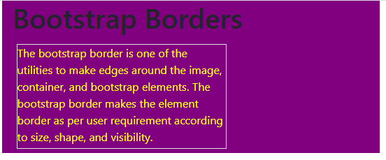
Example #1
The basic border example and output.
Code:
<!DOCTYPE html>
<html>
<head>
<title> Bootstrap Border Example </title>
<meta charset="utf-8">
<meta name="viewport" content="width=device-width, initial-scale=1">
<link rel="stylesheet" href="https://maxcdn.bootstrapcdn.com/bootstrap/4.5.2/css/bootstrap.min.css">
<script src="https://ajax.googleapis.com/ajax/libs/jquery/3.5.1/jquery.min.js"></script>
<script src="https://cdnjs.cloudflare.com/ajax/libs/popper.js/1.16.0/umd/popper.min.js"></script>
<script src="https://maxcdn.bootstrapcdn.com/bootstrap/4.5.2/js/bootstrap.min.js"></script>
<style>
.border {
display: inline-block;
width: 300px;
height: 150px;
margin: 6px;
color:yellow;
}
.container{
background-color:purple;
}
</style>
</head>
<body>
<div class="container">
<h1> Bootstrap Borders </h1>
<span class="border"> The bootstrap border is one of the utilities to make edges around the image, container, and bootstrap elements.
The bootstrap border makes the element border as per user requirement according to size, shape, and visibility.</span>
</div>
</body>
</html>
Output:
Example #2
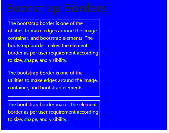
The bootstrap border class is used to remove border examples and output.
Code:
<!DOCTYPE html>
<html>
<head>
<title> Bootstrap Border Example </title>
<meta charset="utf-8">
<meta name="viewport" content="width=device-width, initial-scale=1">
<link rel="stylesheet" href="https://maxcdn.bootstrapcdn.com/bootstrap/4.5.2/css/bootstrap.min.css">
<script src="https://ajax.googleapis.com/ajax/libs/jquery/3.5.1/jquery.min.js"></script>
<script src="https://cdnjs.cloudflare.com/ajax/libs/popper.js/1.16.0/umd/popper.min.js"></script>
<script src="https://maxcdn.bootstrapcdn.com/bootstrap/4.5.2/js/bootstrap.min.js"></script>
<style>
#border1 {
display: inline-block;
width: 300px;
height: 150px;
margin: 6px;
color:yellow;
}
.container{
background-color:blue;
}
.border{
display: inline-block;
width: 300px;
height: 90px;
margin: 6px;
color:yellow;
}
</style>
</head>
<body>
<div class="container">
<h1> Bootstrap Borders </h1>
<span class="border" id="border1"> The bootstrap border is one of the utilities to make edges around the image, container, and bootstrap elements.
The bootstrap border makes the element border as per user requirement according to size, shape, and visibility.</span>
<span class="border border-top-0"> The bootstrap border is one of the utilities to make edges around the image, container, and bootstrap elements. </span>
<span class="border border-bottom-0"> The bootstrap border makes the element border as per user requirement according to size, shape, and visibility. </span>
</div>
</body>
</html>
Output:
Description
- The first block is a basic border.
- The second block is a display top side to remove the border.
- Third block display to remove the bottom side border.
Example #3
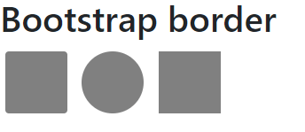
The border radius example and output.
Code:
<!DOCTYPE html>
<html>
<head>
<title>Bootstrap border Example</title>
<meta charset="utf-8">
<meta name="viewport" content="width=device-width, initial-scale=1">
<link rel="stylesheet" href="https://maxcdn.bootstrapcdn.com/bootstrap/4.5.2/css/bootstrap.min.css">
<script src="https://ajax.googleapis.com/ajax/libs/jquery/3.5.1/jquery.min.js"></script>
<script src="https://cdnjs.cloudflare.com/ajax/libs/popper.js/1.16.0/umd/popper.min.js"></script>
<script src="https://maxcdn.bootstrapcdn.com/bootstrap/4.5.2/js/bootstrap.min.js"></script>
<style>
div {
display: inline-block;
width: 70px;
height: 70px;
margin: 6px;
background-color:grey;
}
</style>
</head>
<body>
<h1> Bootstrap border </h1>
<div class="rounded"> </div>
<div class="rounded-circle"> </div>
<div class="rounded-0"> </div>
</body>
</html>
Output:
Description:
- The first container is a rounded radius border.
- The second container is a circle radius border.
- The third container is removing the rounded radius border.
Example #4
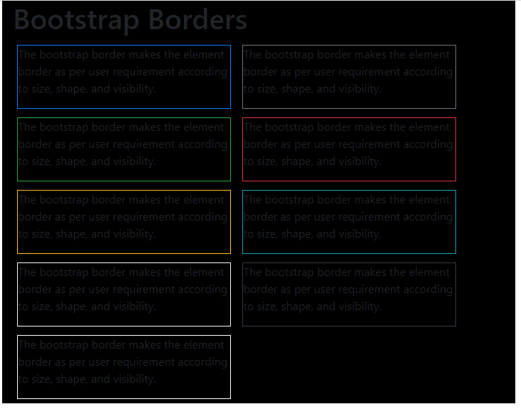
The contextual border example and output.
Code:
<!DOCTYPE html>
<html>
<head>
<title> Bootstrap Border Example </title>
<meta charset="utf-8">
<meta name="viewport" content="width=device-width, initial-scale=1">
<link rel="stylesheet" href="https://maxcdn.bootstrapcdn.com/bootstrap/4.5.2/css/bootstrap.min.css">
<script src = "https://ajax.googleapis.com/ajax/libs/jquery/3.5.1/jquery.min.js">
</script>
<script src = "https://cdnjs.cloudflare.com/ajax/libs/popper.js/1.16.0/umd/popper.min.js">
</script>
<script src = "https://maxcdn.bootstrapcdn.com/bootstrap/4.5.2/js/bootstrap.min.js">
</script>
<style>
#border1 {
display: inline-block;
width: 300px;
height: 150px;
margin: 6px;
color:yellow;
}
.container{
background-color:black;
}
.border{
display: inline-block;
width: 300px;
height: 90px;
margin: 6px;
}
</style>
</head>
<body>
<div class="container">
<h1> Bootstrap Borders </h1>
<span class="border border-primary">The bootstrap border makes the element border as per user requirement according to size, shape, and visibility.</span>
<span class="border border-secondary">The bootstrap border makes the element border as per user requirement according to size, shape, and visibility.</span>
<span class="border border-success">The bootstrap border makes the element border as per user requirement according to size, shape, and visibility.</span>
<span class="border border-danger">The bootstrap border makes the element border as per user requirement according to size, shape, and visibility.</span>
<span class="border border-warning">The bootstrap border makes the element border as per user requirement according to size, shape, and visibility.</span>
<span class="border border-info">The bootstrap border makes the element border as per user requirement according to size, shape, and visibility.</span>
<span class="border border-light">The bootstrap border makes the element border as per user requirement according to size, shape, and visibility.</span>
<span class="border border-dark">The bootstrap border makes the element border as per user requirement according to size, shape, and visibility.</span>
<span class="border border-white">The bootstrap border makes the element border as per user requirement according to size, shape, and visibility.</span>
</div>
</body>
</html>
Description:
- The different types of contextual are below in the output.
- It represents a different meaning in different colors.
Output:
Conclusion
It is a useful utility to make an attractive web application. The borders are useful for many containers, images to show partition more visibly. In addition, the border helps to look elegant, user-friendly web applications.
Recommended Articles
This is a guide to Bootstrap Border. Here we discuss How Does Border Work in Bootstrap and Examples, along with the codes and outputs. You may also have a look at the following articles to learn more –
