Updated March 27, 2023

Introduction to Bootstrap Collapse Sidebar
Collapse Side Bar in Bootstrap is defined as a list of links or buttons or content on any side of the page when we click on the button sidebar hidden or shown simultaneously. Collapse Side Bar can be on the left side or right side depending upon the user requirement. Make the user feel full-page display without showing additional features until click on the Collapse button.
Real-time Example:
If we want to display the main content like Home, Register, Login, Order details, etc. preferred on the left side collapsible sidebar. Filters like Brand name, cost, color, size, new products, etc. preferred on the right side collapsible sidebar. This we can observe in Amazon or Flipkart e-commerce websites. Collapse features can also be applied to top and bottom also.
Why Bootstrap over HTML?
- In HTML developers must write each and every class, ids, links, buttons, etc. cascading styles.
- Whereas in Bootstrap most of the predefined classes, links, and buttons, etc. with their own cascading styles to reduce code complexity.
How does Collapse Side Bar Work in Bootstrap?
- In bootstrap collapse sidebar feature works based on data-toggle=”collapse”
Syntax:
<button type="button" class="btn btn-info" data-toggle="collapse"
data-target="#collapseText">Collapse</button>
<div id="collapseText">Hide and Show Me by Clicking above button</div>
Explanation:
- type=”button”: Gives you the type of text.
- class=”btn btn-info”: Gives pre-defined styles provided by bootstrap libraries.
- data-toggle=”collapse”: Gives collapse feature by clicking the button or other.
- data-target=”#collapseText”: Gives target field for where to apply collapse feature.
- id=”collapseText”: To get collapse feature we must give data-target value in id attribute. As you can see target-field=collapseText and id= collapseText both are same.
Include bootstrap feature in our application we must specify some pre-defined libraries inside our application.
They are as follows:
1. Includes bootstrap view.
<meta name="viewport" content="width=device-width, initial-scale=1">2. Includes ajax and jQuery libraries.
<script src="https://ajax.googleapis.com/ajax/libs/jquery/3.4.1/jquery.min.js"></script>3. Includes bootstrap libraries.
<link rel="stylesheet" href="https://maxcdn.bootstrapcdn.com/bootstrap/3.4.1/css/bootstrap.min.css">4. Includes bootstrap libraries.
<script src="https://maxcdn.bootstrapcdn.com/bootstrap/3.4.1/js/bootstrap.min.js"></script>Examples of Bootstrap Collapse Sidebar
Given below are the examples of Bootstrap Collapse Sidebar:
Example #1
Collapse on bottom content.
Code:
<!DOCTYPE html>
<html>
<head>
<meta name="viewport" content="width=device-width, initial-scale=1">
<script
src="https://ajax.googleapis.com/ajax/libs/jquery/3.4.1/jquery.min.js"></script>
<link rel="stylesheet"
href="https://maxcdn.bootstrapcdn.com/bootstrap/3.4.1/css/bootstrap.min.css">
<script
src="https://maxcdn.bootstrapcdn.com/bootstrap/3.4.1/js/bootstrap.min.js"></script>
</head>
<body>
<h2>Bootstrap Collapse Demo</h2>
<button type="button" class="btn btn-info" data-toggle="collapse"
data-target="#collapseText">Click Me To Collapse</button>
<div id="collapseText" class="collapseClass">I am displayed
because of bootstrap collapse feature. Please click me again to hide.
</div>
</body>
</html>
Output:


Explanation:
- In the above code data-toggle=”collapse” data-target=”#collapseText” and id=”collapseText” gives you desired collapse output.
Example #2
Collapse on bottom content with href.
Code:
<!DOCTYPE html>
<html>
<head>
<meta name="viewport" content="width=device-width, initial-scale=1">
<script
src="https://ajax.googleapis.com/ajax/libs/jquery/3.4.1/jquery.min.js"></script>
<link rel="stylesheet"
href="https://maxcdn.bootstrapcdn.com/bootstrap/3.4.1/css/bootstrap.min.css">
<script
src="https://maxcdn.bootstrapcdn.com/bootstrap/3.4.1/js/bootstrap.min.js"></script>
</head>
<body>
<h2>Bootstrap Collapse Demo</h2>
<a href="#buttonRef" class="btn btn-primary" data-toggle="collapse">Click
Me To Collapse</a>
<div id="buttonRef" class="collapse">I am displayed because of
bootstrap collapse feature. Please click me again to hide.</div>
</body>
</html>
Output:


Explanation:
- In the above code data-toggle=”collapse” href=”#buttonRef ” and id=”buttonRef” gives you desired collapse output.
- In the first example we have taken data-target and in the second example taken href attributes. In both cases, we got the same output.
Example #3
Collapse on bottom content class=“collapse show”.
Code:
<!DOCTYPE html>
<html>
<head>
<meta name="viewport" content="width=device-width, initial-scale=1">
<script
src="https://ajax.googleapis.com/ajax/libs/jquery/3.4.1/jquery.min.js"></script>
<link rel="stylesheet"
href="https://maxcdn.bootstrapcdn.com/bootstrap/3.4.1/css/bootstrap.min.css">
<script
src="https://maxcdn.bootstrapcdn.com/bootstrap/3.4.1/js/bootstrap.min.js"></script>
</head>
<body>
<h2>Bootstrap Collapse Demo</h2>
<button type="button" data-target="#targetText" data-toggle="collapse" class="btn btn-primary">Click Me To Collapse</button>
<div id="targetText" class="collapse show">I am
displayed because of bootstrap collapse feature. Please click me again
to hide.</div>
</body>
</html>
Output:


Explanation:
- In the above code data-toggle=”collapse” data-target=”#dataTraget ” id=” dataTraget” and class=”collapse show” gives you desired collapse output.
- In the first example, we have taken data-target, the second example has taken href attributes and the third example class as collapse show. In all the cases we got same output.
Example #4
Collapse on side bar content.
Code:
<!DOCTYPE html>
<html>
<head>
<meta name="viewport" content="width=device-width, initial-scale=1">
<link rel="stylesheet"
href="https://maxcdn.bootstrapcdn.com/bootstrap/3.4.1/css/bootstrap.min.css">
<script
src="https://ajax.googleapis.com/ajax/libs/jquery/3.4.1/jquery.min.js"></script>
<script
src="https://maxcdn.bootstrapcdn.com/bootstrap/3.4.1/js/bootstrap.min.js"></script>
<link rel="stylesheet" href="SideBarCollapse.css">
<script type="text/javascript" src="SideBarCollapse.js"></script>
<script>function showNagination() {
document.getElementById("sideBarId").style.width = "260px";
document.getElementById("click").style.marginLeft = "260px";
}
function hideNavigation() {
document.getElementById("sideBarId").style.width = "0";
document.getElementById("click").style.marginLeft = "0";
}
</script>
<style>
.sideBarClass {
height: 100%;
z-index: 1;
width: 0;
transition: 0.5s;
position: fixed;
top: 0;
padding-top: 60px;
left: 0;
background-color: #111;
overflow-x: hidden;
}
.sideBarClass button {
padding: 7px 7px 7px 31px;
font-size: 24px;
display: block;
transition: 0.25s;
color: gray;
}
.button {
font-size: 21px;
background-color: purple;
cursor: pointer;
color: silver;
border: none;
padding: 11px 16px;
}
.sideBarClass button:hover {
color: fuchsia;
}
.sideBarClass .hideButton {
position: absolute;
font-size: 37px;
top: 0;
margin-left: 55px;
right: 26px;
}
.clickClass {
padding: 16px;
transition: margin-left .5s;
}
.button:hover {
background-color: #444;
}
@media screen and (max-height: 450px) {
.sideBarClass {
padding-top: 15px
}
.sideBarClass button {
font-size: 18px;
}
}
body {
font-family: serif;
}
</style>
</head>
<body>
<div id="click" class="clickClass">
<button class="button" onclick="showNagination()">Click On This Side Bar</button>
<h2>Collapsed Side Bar Demo</h2>
<p>Click on Side Bar to Hide and Open Side Bar.</p>
</div>
<div id="sideBarId" class="sideBarClass">
<a href="javascript:void(0)" class="hideButton"
onclick="hideNavigation()">Close</a>
<button type="button">First Link</button>
<button type="button">Second Link</button>
<button type="button">Third Link</button>
<button type="button">Fourth Link</button>
<button type="button">Fifth Link</button>
<button type="button">Sixth Link</button>
</div>
</body>
</html>
Output:


Explanation:
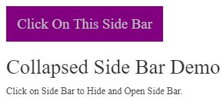
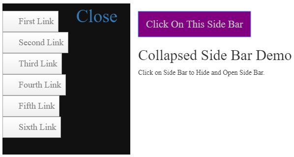
- As you can see in the above output, we have taken Click on This Side Bar button.
- Inside side content, we have taken 5 buttons.
- When we press Click on This Side Bar button then, a sidebar opens.
Recommended Articles
This is a guide to Bootstrap Collapse Sidebar. Here we discuss the introduction, why bootstrap over HTML? how does collapse sidebar work in bootstrap? and examples. Collapse in bootstrap can be achieved by the data-target, href and class as collapse show attributes. You may also have a look at the following articles to learn more –


