Updated April 1, 2023

Introduction to Bootstrap Container Fluid
Bootstrap has a container to contain the row. The row is used for the grid system or set column in the container. The container sets the margin of the element in bootstrap.
There are two container classes in bootstrap which is below.
- The class container
- The class container-fluid
The bootstrap container-fluid is used for the full-width container of the display screen. This responsive container-fluid can modify as per display screen size.
Syntax
The syntax is below.
<div class= "container-fluid ">
<h1> BOOTSTRAP CONTAINER FLUID </h1>
<p> the bootstrap container-fluid is used for the full-width container of the display screen. </p>
</div>- The division tag (div) need to place the class of bootstrap container fluid.
- The class = “container-fluid” used for set margin and grid system.
- The other tags and elements used inside of the div tag as per need.
Examples to Implement Bootstrap Container Fluid
Below are the examples to implement for the same:
Examples #1
Display simple information content using a container-fluid class.
Code:
<!DOCTYPE html>
<html>
<head>
<title> Bootstrap container fluid </title>
<meta charset= "utf-8">
<meta name= "viewport" content= "width=device-width, initial-scale=1">
<link rel= "stylesheet" href= "https://maxcdn.bootstrapcdn.com/bootstrap/3.4.1/css/bootstrap.min.css">
</head>
<body>
<div class="container-fluid" style="background-color: pink;" >
<h1> Bootstrap container fluid simple example </h1>
<p> The container sets the margin of the element in bootstrap.
There are two container classes in bootstrap which is following.
The class container.
The class container-fluid.
</p>
<p> The bootstrap container-fluid is used for the full-width container of the display screen. This responsive container-fluid can modify as per display screen size. </p>
</div>
<script src= "https://ajax.googleapis.com/ajax/libs/jquery/3.4.1/jquery.min.js"> </script>
<script src= "https://maxcdn.bootstrapcdn.com/bootstrap/3.4.1/js/bootstrap.min.js"> </script>
</body>
</html>
Output:
Explanation: The above image shows the output of normal bootstrap container fluid. The container fluid class used with the pink background color. Background colors used for getting to know the width and margin of container fluid class in bootstrap. The division tag contains the class = “container-fluid”. The under container fluid class, the header tag, and the paragraph tag used to display information.
Example #2
The example with the grid system.
<!DOCTYPE html>
<html>
<head>
<title> Bootstrap container fluid </title>
<meta charset= "utf-8">
<meta name= "viewport" content= "width=device-width, initial-scale=1">
<link rel= "stylesheet" href= "https://maxcdn.bootstrapcdn.com/bootstrap/3.4.1/css/bootstrap.min.css">
</head>
<body>
<div class= "container-fluid" style= "background-color: pink;" >
<div class="row">
<h1> Bootstrap container fluid for using grid system </h1>
<div class= "col-xs-4" style= "background-color: yellow;">
The bootstrap container-fluid is used for the full-width container of the display screen. <br> This responsive container-fluid can modify as per display screen size.
</div>
<div class= "col-xs-4" style= "background-color: #32CD32;">
The bootstrap container-fluid is used for the full-width container of the display screen. <br> This responsive container-fluid can modify as per display screen size.
</div>
<div class= "col-xs-4" style= "background-color: red;">
The bootstrap container-fluid is used for the full-width container of the display screen. <br> This responsive container-fluid can modify as per display screen size.
</div>
</div>
</div>
<script src= "https://ajax.googleapis.com/ajax/libs/jquery/3.4.1/jquery.min.js">
</script>
<script src= "https://maxcdn.bootstrapcdn.com/bootstrap/3.4.1/js/bootstrap.min.js">
</script>
</body>
</html>
Output:
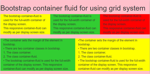
Explanation: The container-fluid class used to display the full-width screen. The class = “row” used under class= “container-fluid” to make column. The row class used for horizontal group and contain column class. In this example, columns make three partitions using class= “col-xs-4”. To make responsive container-fluid, extra small size (xs) used in class.
Example #3
The container fluid contains more than one row and many elements.
Code:
<!DOCTYPE html>
<html>
<head>
<title> Bootstrap container fluid </title>
<meta charset= "utf-8">
<meta name= "viewport" content= "width=device-width, initial-scale=1">
<link rel= "stylesheet" href= "https://maxcdn.bootstrapcdn.com/bootstrap/3.4.1/css/bootstrap.min.css">
</head>
<body>
<div class= "container-fluid" style= "background-color: pink;" >
<div class="row">
<h1> Bootstrap container fluid for using grid system </h1>
<div class= "col-xs-4" style= "background-color: yellow;">
The bootstrap container-fluid is used for the full-width container of the display screen. <br> This responsive container-fluid can modify as per display screen size.
</div>
<div class= "col-xs-4" style= "background-color: #32CD32;">
The bootstrap container-fluid is used for the full-width container of the display screen. <br> This responsive container-fluid can modify as per display screen size.
</div>
<div class= "col-xs-4" style= "background-color: red;">
The bootstrap container-fluid is used for the full-width container of the display screen. <br> This responsive container-fluid can modify as per display screen size.
</div>
</div>
<br>
<div class="row">
<div class= "col-sm-6" style= "background-color: #32CD32;"> •The container sets the margin of the element in bootstrap. <br>
There are two container classes in bootstrap which is below. <br>
The class container. <br>
The class container-fluid. <br>
The bootstrap container-fluid is used for the full-width container of the display screen. This responsive container-fluid can modify as per display screen size.
</div>
<div class= "col-sm-6" style= "background-color: yellow;">  •The container sets the margin of the element in bootstrap. <br>
There are two container classes in bootstrap which is below. <br>
The class container. <br>
The class container-fluid. <br>
The bootstrap container-fluid is used for the full-width container of the display screen. This responsive container-fluid can modify as per display screen size. </div>
</div>
<br>
</div>
<script src= "https://ajax.googleapis.com/ajax/libs/jquery/3.4.1/jquery.min.js"></script>
<script src= "https://maxcdn.bootstrapcdn.com/bootstrap/3.4.1/js/bootstrap.min.js"></script>
</body>
</html>
Output:
Explanation: The above output is multiple rows in one container-fluid class. There are used two rows to set different grid systems. The pink background shows the container fluid. The col-xs-4 class and col-sm-6 class used to make partition of row. The col-xs-4 class used for three columns in row and col-sm-6 used for two columns in one row. The column’s height set according to content size automatically.
Example #4
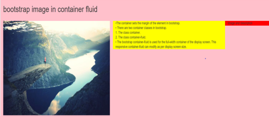
The bootstrap container-fluid with the image.
Code:
<!DOCTYPE>
<html>
<head>
<title> Bootstrap container fluid </title>
<meta charset= "utf-8">
<meta name= "viewport" content= "width=device-width, initial-scale=1">
<link rel= "stylesheet" href= "https://maxcdn.bootstrapcdn.com/bootstrap/3.4.1/css/bootstrap.min.css">
</head>
<body>
<div class= "container-fluid" style= "background-color: pink;" >
<h1> bootstrap image in container fluid </h1>
<br>
<div class="row">
<div class= "col-md-5"> <img src="path/image.jpg" >
</div>
<div class= "col-md-5" style= "background-color: yellow;">  •The container sets the margin of the element in bootstrap. <br>
There are two container classes in bootstrap.<br>
The class container.<br>
The class container-fluid.<br>
The bootstrap container-fluid is used for the full-width container of the display screen. This responsive container-fluid can modify as per display screen size. </div>
<div class= "col-md-2" style= "background-color: red;"> Image and description
</div>
</div>
<br>
</div>
<script src= "https://ajax.googleapis.com/ajax/libs/jquery/3.4.1/jquery.min.js"></script>
<script src= "https://maxcdn.bootstrapcdn.com/bootstrap/3.4.1/js/bootstrap.min.js"></script>
</body>
</html>
Output:
Conclusion
This gives padding and margin full-screen size. It makes web application specious and removes unwanted margin. The container fluid helps to use a full display screen without wasting space. It gives the required space, margin, and alignment. It is the partition of the rows and columns as per requirement.
Recommended Articles
This is a guide to Bootstrap Container Fluid. Here we discuss the introduction to Bootstrap Container with proper codes and outputs for better understanding. You can also go through our other related articles to learn more –


