Updated July 1, 2023
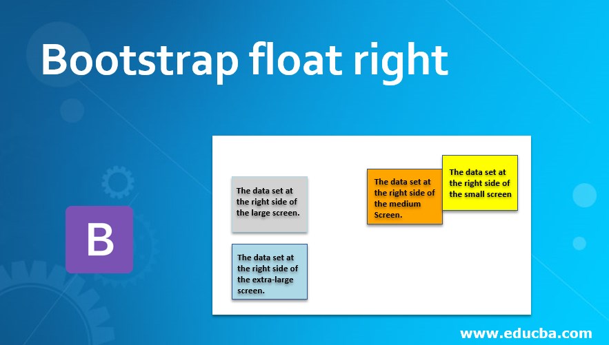
Introduction to Bootstrap float right
The bootstrap float has mainly two classes. The float-right and float-left classes have in Bootstrap. The element’s positioning is determined by the class requirements, with the option to place it either on the left or right side. To position an element on the right side, the “float: right” property is utilized. This property allows the element to float to the right, and other elements will flow around it.
How Does float right work?
The float right uses the float-right class for normal viewport at the web application. Here we used a small screen size for a phone device.
Example:
<!DOCTYPE html>
<html>
<head>
<title> Bootstrap Float Right Example </title>
<meta name= "viewport" content= "width=device-width, initial-scale=1">
<link rel= "stylesheet" href= "https://maxcdn.bootstrapcdn.com/bootstrap/4.1.0/css/bootstrap.min.css">
</head>
<body>
<div class="container">
<h2> Bootstrap Float Right Example </h2>
<div class="clear">
<div class="float-right"> Today’s Tutorial. </div>
The bootstrap float has mainly two classes. The float-right, float-left classes have in bootstrap. The element placed at left or right according to class requirement.
The bootstrap float right is used to place the element in the right side position. The other elements place around the floating content.
</div>
</div>
<script src= "https://ajax.googleapis.com/ajax/libs/jquery/3.3.1/jquery.min.js"></script>
<script src= "https://maxcdn.bootstrapcdn.com/bootstrap/4.1.0/js/bootstrap.min.js"></script>
</body>
</html>
Syntax
- The main syntax of bootstrap float right is below.
<div class = "float- right" >- The responsive float right is below.
| Bootstrap float right syntax | Details of syntax |
| class= “float-sm-right” | The data set at the right side of the small screen. |
| class= “float-md-right” | The data set at the right side of the medium screen. |
| class= “float-lg-right” | The data set at the right side of the large screen. |
| class= “float-xl-right” | The data set at the right side of the extra-large screen. |
Examples of Bootstrap float right
Below are the different examples:
Example #1
The heading and details of contents use float right. The basic class, class=”float-right” is used for example.
Code:
<!DOCTYPE html>
<html>
<head>
<title> Bootstrap Float Right Example </title>
<meta name= "viewport" content= "width=device-width, initial-scale=1">
<link rel= "stylesheet" href= "https://maxcdn.bootstrapcdn.com/bootstrap/4.1.0/css/bootstrap.min.css">
<style>
.float-right{
width: 100px;
height: 100px;
border: 1px solid black;
padding: 5px;
background-color: orange;
}
</style>
</head>
<body>
<div class= "container">
<h2> Bootstrap Float Right Example </h2>
<div class= "clear">
<div class= "float-right"> Today’s Tutorial. </div>
The bootstrap float has mainly two classes. The float-right, float-left classes have in bootstrap. The element placed at left or right according to class requirement.
The bootstrap float right is used to place the element in the right side position. The other elements place around the floating content.
</div>
</div>
<script src= "https://ajax.googleapis.com/ajax/libs/jquery/3.3.1/jquery.min.js"></script>
<script src= "https://maxcdn.bootstrapcdn.com/bootstrap/4.1.0/js/bootstrap.min.js"></script>
</body>
</html>
Output
Description:
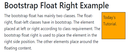
- The above output shows an orange box on the right side.
- The rest of the elements are automatically set around the box.
Example #2
The responsive float-right example is below.
The “float-sm-left” class is used for small screen-size devices.
Code:
<!DOCTYPE html>
<html>
<head>
<title> Bootstrap Float Right Example </title>
<meta name = "viewport" content = "width=device-width, initial-scale=1">
<link rel = "stylesheet" href= "https://maxcdn.bootstrapcdn.com/bootstrap/4.1.0/css/bootstrap.min.css">
<style>
.float-md-right{
width: 100px;
height: 100px;
border: 1px solid black;
padding: 5px;
background-color: orange;
}
</style>
</head>
<body>
<div class= "container">
<h2> Bootstrap Float Right Example </h2>
<div class= "clear">
<div class= "float-md-right"> Today’s Tutorial. </div>
The bootstrap float has mainly two classes. The float-right, float-left classes have in bootstrap. The element placed at left or right according to class requirement.
The bootstrap float right is used to place the element in the right side position. The other elements place around the floating content.
</div>
</div>
<script src = "https://ajax.googleapis.com/ajax/libs/jquery/3.3.1/jquery.min.js">
</script>
<script src = "https://maxcdn.bootstrapcdn.com/bootstrap/4.1.0/js/bootstrap.min.js">
</script>
</body>
</html>
Output for the medium size screen
Output for the small size screen
Description:
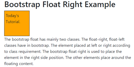
- The above output has according to small and medium screen sizes.
- The medium-size float-right class is used in the example.
- The content is placed right side when the device screen size is medium or above.
- The small size screen devices show simply as other web application content works.
Example #3
The below example is responsive float right for all screen sizes.
Code:
<!DOCTYPE html>
<html>
<head>
<title> Bootstrap float right Example </title>
<meta name ="viewport" content ="width=device-width, initial-scale=1">
<link rel ="stylesheet" href= "https://maxcdn.bootstrapcdn.com/bootstrap/4.4.1/css/bootstrap.min.css">
<script src= "https://ajax.googleapis.com/ajax/libs/jquery/3.4.1/jquery.min.js">
</script>
<script src= "https://cdnjs.cloudflare.com/ajax/libs/popper.js/1.16.0/umd/popper.min.js">
</script>
<script src= "https://maxcdn.bootstrapcdn.com/bootstrap/4.4.1/js/bootstrap.min.js">
</script>
<style>
.float-md-right{
width: 140px;
height: 100px;
border: 1px solid black;
padding: 5px;
background-color: orange;
}
.float-sm-right{
width: 140px;
height: 100px;
border: 1px solid black;
padding: 5px;
background-color: yellow;
}
.float-lg-right{
width: 140px;
height: 100px;
border: 1px solid black;
padding: 5px;
background-color: lightgrey;
}
.float-xl-right{
width: 140px;
height: 100px;
border: 1px solid black;
padding: 5px;
background-color: lightblue;
}
</style>
</head>
<body>
<div class= "container">
<h2> Responsive bootstrap Floats right </h2>
<p> The bootstrap float has mainly two classes. The float-right, float-left classes have in bootstrap. The element placed at left or right according to class requirement.
The bootstrap float right is used to place the element in the right side position. The other elements place around the floating content.
</p>
<div class= "clear">
<div class= "float-sm-right"> The data set at the right side of the small screen.       </div> <br>
<div class= "float-md-right"> The data set at the right side of the medium screen.       </div> <br>
<div class= "float-lg-right"> The data set at the right side of the large screen.       </div> <br>
<div class= "float-xl-right"> The data set at the right side of the extra-large screen. </div> <br>
</div>
</div>
</body>
</html>
Output for Small Screen Size
Output for Medium Screen Size
Output for Large Screen Size
Description:
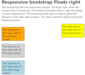
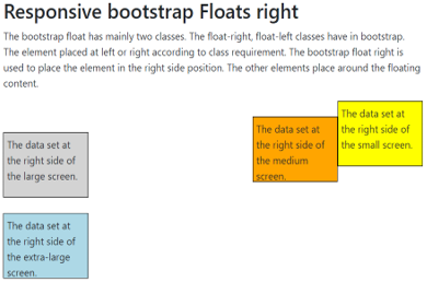
- The above outputs are small, medium, and large screen sizes that float right.
- All bootstrap float content sets the right side when the screen size is large.
- The float-sm-right, float-md-right class used for small and medium screen size devices.
Conclusion
The float right makes web applications in the standard format. It looks user-friendly, and easy to point out important elements in the application. The web applications look elegant, attractive, and formatted using float right.
Recommended Articles
This is a guide to Bootstrap float right. Here we discuss how Bootstrap floats right works along with the examples. You may also have a look at the following articles to learn more –
