Updated March 29, 2023

Introduction to Bootstrap Labels
The bootstrap labels are designed and flexible components that supply extra information about the content. The bootstrap labels are layout components that provide tips and additional small information on the main content. The bootstrap labels are highlight or markup the content with minimum space and information. The labels are the adjustable component which is modified as per tag, elements, and content size.
Syntax
- The bootstrap label classes are mostly come up with the <span> tag.
- The basic label syntax is below.
<span class ="label label-primary"> Extra Information </span>- The class label and contextual label class are always working together in the labels.
- The class label and class label-primary are placed inside of span tag.
- The labels always adjust with the content size or text size.
- The label with heading size syntax is below.
<h1> the labels in bootstrap <span class ="label label-primary"> Extra information </span>
</h1>- The <span> tag is used inside of <h1> tag with the <h1> tag text and label and label-primary classes are placed inside of span tag.
How Bootstrap Labels Works?
- To provide bootstrap components like labels, we need a bootstrap3 or bootstrap4 support file.
- The bootstrap is responsive for mobile, laptop, desktop devices framework.
- We include <meta> tag with their attributes in the head section of the HTML file. The syntax is below.
<meta name = "viewport" content = "width=device-width, initial-scale = 1">The bootstrap3 includes three support files in the head section of the HTML file.
<link rel= "stylesheet" href= "https://maxcdn.bootstrapcdn.com/bootstrap/3.4.1/css/bootstrap.min.css">
<script src= "https://ajax.googleapis.com/ajax/libs/jquery/3.5.1/jquery.min.js">
</script>
<script src= "https://maxcdn.bootstrapcdn.com/bootstrap/3.4.1/js/bootstrap.min.js">
</script>
The bootstrap4 includes four support files in the head section of the HTML file.
<link rel = "stylesheet" href = "https://maxcdn.bootstrapcdn.com/bootstrap/4.5.0/css/bootstrap.min.css">
<script src = "https://ajax.googleapis.com/ajax/libs/jquery/3.5.1/jquery.min.js"> </script>
<script src = "https://cdnjs.cloudflare.com/ajax/libs/popper.js/1.16.0/umd/popper.min.js">
</script>
<script src = "https://maxcdn.bootstrapcdn.com/bootstrap/4.5.0/js/bootstrap.min.js">
</script>
The bootstrap labels syntax with the required tags placed in the body section of the HTML file.
<h3> The Bootstrap New Style
<span class = "label label-warning"> Add </span>
</h3>
To know how to assemble files and label syntax in the HTML file. The Basic label example is below.
<!DOCTYPE html>
<html>
<head>
<title> Bootstrap labels Example </title>
<meta name = "viewport" content = "width=device-width, initial-scale=1">
<link rel= "stylesheet" href= "https://maxcdn.bootstrapcdn.com/bootstrap/3.4.1/css/bootstrap.min.css">
<script src = "https://ajax.googleapis.com/ajax/libs/jquery/3.5.1/jquery.min.js">
</script>
<script src = "https://maxcdn.bootstrapcdn.com/bootstrap/3.4.1/js/bootstrap.min.js">
</script>
</head>
<body>
<div class = "container-fluid">
<h3> The Bootstrap Labels </h3>
<h3> The Bootstrap New Style file <span class="label label-warning"> Add </span> </h4>
<h4> The website template new version <span class="label label-primary"> update </span>
</h4>
</div>
</body>
</html>
The label-warning and label classes are placed inside of the <h3> heading tag.
The label and label-primary classes are placed inside of the <h4> heading tag.
Examples of Bootstrap Labels
Different examples are mentioned below:
Example #1
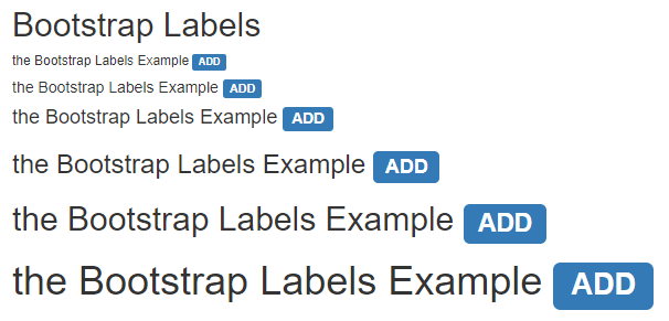
The basic label with heading size examples and their output are below.
Code:
<!DOCTYPE html>
<html>
<head>
<title>Bootstrap Labels Example</title>
<meta charset="utf-8">
<meta name ="viewport" content ="width=device-width, initial-scale=1">
<link rel ="stylesheet" href ="https://maxcdn.bootstrapcdn.com/bootstrap/3.4.1/css/bootstrap.min.css">
<script src ="https://ajax.googleapis.com/ajax/libs/jquery/3.5.1/jquery.min.js">
</script>
<script src ="https://maxcdn.bootstrapcdn.com/bootstrap/3.4.1/js/bootstrap.min.js">
</script>
</head>
<body>
<div class ="container-fluid">
<h2> Bootstrap Labels </h2>
<h6> the Bootstrap Labels Example <span class ="label label-primary"> ADD </span>
</h6>
<h5> the Bootstrap Labels Example <span class ="label label-primary"> ADD </span>
</h5>
<h4> the Bootstrap Labels Example <span class ="label label-primary"> ADD </span>
</h4>
<h3> the Bootstrap Labels Example <span class ="label label-primary"> ADD </span>
</h3>
<h2> the Bootstrap Labels Example <span class ="label label-primary"> ADD </span>
</h2>
<h1> the Bootstrap Labels Example <span class ="label label-primary"> ADD </span>
</h1>
</div>
</body>
</html>
Output:
Description:
- The label and label-primary classes are used in the span tag.
- The span tag placed inside of heading tag from <h1> to <h6>.
- The label can adjust according to heading text size.
Example #2
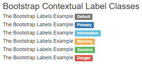
The label with different contextual class examples and their output is below.
Code:
<!DOCTYPE html>
<html>
<head>
<title> Bootstrap label Example </title>
<meta charset ="utf-8">
<meta name ="viewport" content ="width=device-width, initial-scale=1">
<link rel ="stylesheet" href ="https://maxcdn.bootstrapcdn.com/bootstrap/3.4.1/css/bootstrap.min.css">
<script src ="https://ajax.googleapis.com/ajax/libs/jquery/3.5.1/jquery.min.js">
</script>
<script src ="https://maxcdn.bootstrapcdn.com/bootstrap/3.4.1/js/bootstrap.min.js">
</script>
</head>
<body>
<div class ="container-fluid">
<h2> Bootstrap Contextual Label Classes </h2>
<h4> The Bootstrap Labels Example <span class ="label label-default"> Default </span>
</h4>
<h4> The Bootstrap Labels Example <span class ="label label-primary"> Primary </span>
</h4>
<h4> The Bootstrap Labels Example <span class ="label label-info"> Information </span>
</h4>
<h4> The Bootstrap Labels Example <span class ="label label-warning"> Warning </span>
</h4>
<h4> The Bootstrap Labels Example <span class ="label label-success"> Success </span>
</h4>
<h4> The Bootstrap Labels Example   <span class ="label label-danger"> Danger </span>
</h4>
</div>
</body>
</html>
Output:
Description:
- The label class and their contextual label class are placed inside of the <h4> tag.
- There are six contextual labels: label-default, label-primary, label-info, label-warning, label-success, and label-danger.
- The contextual label has different colors. We can use it to highlight or mark up the element using labels.
Example #3
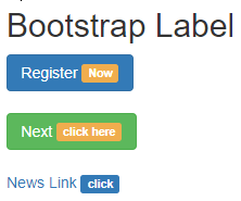
The bootstrap label example and their output are below.
Code:
<!DOCTYPE html>
<html>
<head>
<title> Bootstrap label Example </title>
<meta charset ="utf-8">
<meta name ="viewport" content ="width=device-width, initial-scale=1">
<link rel ="stylesheet" href ="https://maxcdn.bootstrapcdn.com/bootstrap/3.4.1/css/bootstrap.min.css">
<script src ="https://ajax.googleapis.com/ajax/libs/jquery/3.5.1/jquery.min.js">
</script>
<script src ="https://maxcdn.bootstrapcdn.com/bootstrap/3.4.1/js/bootstrap.min.js">
</script>
</head>
<body>
<div class ="container-fluid">
<h2> Bootstrap Label </h2>
<button type ="button" class ="btn btn-primary"> Register <span class ="label label-warning"> Now </span> </button> <br> <br>
<button type ="button" class ="btn btn-success"> Next <span class ="label label-warning"> click here </span> </button> <br> <br>
<a href="#"> News Link <span class ="label label-primary"> click </span> </a> <br>
</div>
</body>
</html>
Output:
Description:
- The labels used with button tags and href links on the above example.
- The label and contextual label class are placed inside of the button tag to provide extra information about the button.
- The label-warning and label classes are placed inside of the <a> tag with their link.
Example #4
The Basic bootstrap label example and their Output are below.
Code:
<!DOCTYPE html>
<html>
<head>
<title> Bootstrap labels Example </title>
<meta name = "viewport" content = "width=device-width, initial-scale=1">
<link rel= "stylesheet" href= "https://maxcdn.bootstrapcdn.com/bootstrap/3.4.1/css/bootstrap.min.css">
<script src = "https://ajax.googleapis.com/ajax/libs/jquery/3.5.1/jquery.min.js">
</script>
<script src = "https://maxcdn.bootstrapcdn.com/bootstrap/3.4.1/js/bootstrap.min.js">
</script>
</head>
<body>
<div class = "container-fluid">
<h3> The Bootstrap Labels </h3>
<h3> The Bootstrap New Style file <span class="label label-warning"> Add </span> </h4>
<h4> The website template new version <span class="label label-primary"> update </span>
</h4>
</div>
</body>
</html>
Output:
Conclusion
The bootstrap labels are one of the more adjustable, flexible, and user-friendly components. This provides a small amount of information that helps the user on the web application. In addition, the label is a lightweight component to make meaningful extra content of the web application.
Recommended Articles
This is a guide to Bootstrap Labels. Here we discuss How Bootstrap Labels Works and examples along with codes and outputs. You may also have a look at the following articles to learn more –


