Updated April 15, 2023

Introduction to Bootstrap Offset
The bootstrap offset is a part of the grid system useful for making space in the column on the left side. The bootstrap offset is making some free space in the column for a responsive application. The offset is left side space management in the column of the grid system and makes attractive and advance websites.
Syntax
The basic syntax is below.
<div class ="col-md-6 col-md-offset-2"> column after half </div>- The class “col – {required viewport} – offset – {required column size}” is used for offset.
- The most medium size of display viewport used in offset but smaller size viewport also applicable.
- The offset column class comes after the main column class to display the required size of the column with the left space.
- The class “col-md-6” is used for six columns in the medium viewport with two columns offset.
How does offset work in Bootstrap?
- The bootstrap needed certain HTML and CSS elements to get offset.
- The HTML file is created in the web application and <!DOCTYPE html> tag is needed in the HTML file.
- The bootstrap is responsive technology to view application for every size of devices.
- The following tag is useful for responsive web design.
<meta name = "viewport" content = "width=device-width, initial-scale = 1">- The bootstrap added some supported online files to get bootstrap elements and utilities for advanced design.
- The following three files are bootstrap files for offset.
<link rel= "stylesheet" href = "https://maxcdn.bootstrapcdn.com/bootstrap/3.4.1/css/bootstrap.min.css">
<script src = "https://ajax.googleapis.com/ajax/libs/jquery/3.5.1/jquery.min.js">
</script>
<script src = "https://maxcdn.bootstrapcdn.com/bootstrap/3.4.1/js/bootstrap.min.js">
</script>- The offset class used inside of the div tag with other grid system classes.
<div class = "container">
<div class = "col-md-6 col-md-offset-2"> column after half </div>
</div>- The offset working procedure is below.
<!DOCTYPE html>
<html>
<head>
<title> Bootstrap offset Example </title>
<meta name = "viewport" content = "width =device-width, initial-scale= 1">
<link rel ="stylesheet" href =       "https://maxcdn.bootstrapcdn.com/bootstrap/3.4.1/css/bootstrap.min.css">
<script src = "https://ajax.googleapis.com/ajax/libs/jquery/3.5.1/jquery.min.js">
</script>
<script src = "https://maxcdn.bootstrapcdn.com/bootstrap/3.4.1/js/bootstrap.min.js">
</script>
</head>
<body>
<div class = "container">
<div class = "col-md-6 col-md-offset-2"> column after half </div>
</div>
</body>
</html>
Examples
Different examples are mentioned below:
Example #1
The basic offset example and output
Code:
<!DOCTYPE html>
<html>
<head>
<title> Bootstrap offset Example </title>
<meta name = "viewport" content = "width =device-width, initial-scale= 1">
<link rel = "stylesheet" href = "https://maxcdn.bootstrapcdn.com/bootstrap/3.4.1/css/bootstrap.min.css">
<script src = "https://ajax.googleapis.com/ajax/libs/jquery/3.5.1/jquery.min.js">
</script>
<script src = "https://maxcdn.bootstrapcdn.com/bootstrap/3.4.1/js/bootstrap.min.js">
</script>
</head>
<body>
<div class = "container">
<h2> Bootstrap offset Example </h2>
<div class = "row" style = "background-color: lightgrey ;">
<div class = "col-md-6” style = "background-color: lightcyan ;"> starting column with 6 grids </div>
<div class = "col-md-6 col-sm-offset-2" style = "background-color: lavender ;"> six grids columns with 2 grids offset </div>
</div>
</div>
</body>
</html>
Output:
Description
- The first normal column is the light cyan color which is shown in output images.
- The second div tag comes with an offset that has a lavender color column.
- The background color is a light grey color shown in the 2 columns left for the second number column.
Example #2
The offset with separate rows, for example, and output.
Code:
<!DOCTYPE html>
<html>
<head>
<title> Bootstrap offset Example </title>
<meta name = "viewport" content = "width =device-width, initial-scale= 1">
<link rel = "stylesheet" href = "https://maxcdn.bootstrapcdn.com/bootstrap/3.4.1/css/bootstrap.min.css">
<script src = "https://ajax.googleapis.com/ajax/libs/jquery/3.5.1/jquery.min.js">
</script>
<script src = "https://maxcdn.bootstrapcdn.com/bootstrap/3.4.1/js/bootstrap.min.js">
</script>
</head>
<body>
<div class="container">
<h2> Bootstrap offset Example </h2>
<div class= "row" style = "background-color: lightgrey;">
<div class = "col-md-6" style = "background-color: lightcyan ; border:1px solid black"> starting column with 6 grids </div>
<div class = "col-md-6" style = "background-color: lightcyan ; border:1px solid black"> starting column with 6 grids </div>
</div>
<div class= "row" style = "background-color: lightgrey ;">
<div class = "col-md-5 col-md-offset-1" style = "background-color: yellow ; border:1px solid black"> six grids columns with 1 grids offset </div>
<div class = "col-md-5 col-md-offset-1" style = "background-color: yellow ; border:1px solid black"> six grids columns with 1 grids offset </div>
</div>
</div>
</body>
</html>
Output:
Description
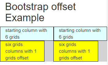
- The first row of columns shows the default grid system with a light cyan color and without space.
- The second row of columns is shown with yellow color, and the offset shows with light grey color.
Example #3
The bootstrap offset with a small device size example and output.
Code:
<!DOCTYPE html>
<html>
<head>
<title> Bootstrap offset Example </title>
<meta name = "viewport" content = "width =device-width, initial-scale= 1">
<link rel = "stylesheet" href ="https://maxcdn.bootstrapcdn.com/bootstrap/3.4.1/css/bootstrap.min.css">
<script src = "https://ajax.googleapis.com/ajax/libs/jquery/3.5.1/jquery.min.js">
</script>
<script src = "https://maxcdn.bootstrapcdn.com/bootstrap/3.4.1/js/bootstrap.min.js">
</script>
</head>
<body>
<div class = "container">
<h2> Bootstrap offset Example </h2>
<div class= "row" style = "background-color: lightgrey;">
<div class = "col-sm-6" style = "background-color: lightcyan ; border:1px solid black"> starting column with 6 grids </div>
<div class = "col-sm-6" style = "background-color: lightcyan ; border:1px solid black"> starting column with 6 grids </div>
</div>
<div class= "row" style = "background-color: lightgrey ;">
<div class = "col-sm-5 col-sm-offset-1" style = "background-color: yellow ; border:1px solid black"> six grids columns with 1 grids offset </div>
<div class = "col-sm-5 col-sm-offset-1" style = "background-color: yellow ; border:1px solid black"> six grids columns with 1 grids offset </div>
</div>
</div>
</body>
</html>
Output:
Description
- The most of offset used for medium screen size devices to look spacious and attractive.
- The offset is working with a small size of screen devices.
Example #4
The offset with extra small device size example and output
Code:
<!DOCTYPE html>
<html>
<head>
<title> Bootstrap offset Example </title>
<meta name = "viewport" content = "width =device-width, initial-scale= 1">
<link rel = "stylesheet" href = "https://maxcdn.bootstrapcdn.com/bootstrap/3.4.1/css/bootstrap.min.css">
<script src = "https://ajax.googleapis.com/ajax/libs/jquery/3.5.1/jquery.min.js">
</script>
<script src = "https://maxcdn.bootstrapcdn.com/bootstrap/3.4.1/js/bootstrap.min.js">
</script>
</head>
<body>
<div class = "container">
<h2> Bootstrap offset Example </h2>
<div class= "row" style = "background-color: lightgrey;">
<div class = "col-xs-6" style = "background-color: lightcyan ; border:1px solid black"> starting column with 6 grids </div>
<div class = "col-xs-6" style = "background-color: lightcyan ; border:1px solid black"> starting column with 6 grids </div>
</div>
<div class= "row" style = "background-color: lightgrey ;">
<div class = "col-xs-5 col- xs-offset-1" style = "background-color: yellow ; border:1px solid black"> six grids columns with 1 grids offset </div>
<div class = "col-xs-5 col-xs-offset-1" style = "background-color: yellow ; border: 1px solid black"> six grids columns with 1 grids offset </div>
</div>
</div>
</body>
</html>
Output:
Conclusion
- The bootstrap offset makes an advance and attractive columns content using left side space.
- It is adjusted with the size of columns and the size of useable devices.
Recommended Articles
This is a guide to Bootstrap Offset. Here we discuss How does offset work in Bootstrap and Examples, along with the codes and outputs. You may also have a look at the following articles to learn more –


