Updated March 28, 2023

Introduction to Bootstrap Pager
Bootstrap Pager is working just like a pagination concept. Pager concept applied for moving among the pages with next and previous buttons or links. Pagers main moto is to move among the content immediately by links or buttons. It has 2 links or buttons provided for access next and previous content. Create previous and next buttons in bootstrap we have used .pager class to an unordered list(<ul>) element.
Why Bootstrap over HTML?
- In HTML developer needs to write all the styles for each every id, link, class, buttons etc.
- In case of bootstrap we have all predefined classes to get default styles which are more accurate than our custom logic. By using bootstrap predefined classes, we can save the time for writing CSS styles.
Why do we use Bootstrap Pager?
Real Time Scenario:
- Let’s take amazon website or Flipkart website for displaying available products in their database. Let suppose they have 1 million products with them. If they are trying to show all the items at a time, customer must wait more time like one day for see all the product lists.
How should we tackle this situation?
- Instead of showing all the item at a time we can show them 50 to 100 items at a time by using list of link buttons. If customer not satisfied with first 50 to 100 products, then he will move to next 50 to 100 items so on. This concept is called as pager.
Syntax for Pager:
<ul class="pager"> //bootstrap default class for pager
<li><a href="#">Go Back to Previous Page</a></li>
<li><a href="#">Go Next Page</a></li>
</ul>- Accessing all bootstrap predefined classes into our application we must use some predefined bootstrap libraries in our code.
They are a follows:
1. Includes bootstrap view
<meta name="viewport" content="width=device-width, initial-scale=1">2. Includes ajax and jQuery libraries
<script src="https://ajax.googleapis.com/ajax/libs/jquery/3.4.1/jquery.min.js"></script>3. Includes bootstrap libraries
<link rel="stylesheet" href="https://maxcdn.bootstrapcdn.com/bootstrap/3.4.1/css/bootstrap.min.css">4. Includes bootstrap libraries
<script src="https://maxcdn.bootstrapcdn.com/bootstrap/3.4.1/js/bootstrap.min.js"></script>Examples
Given below are the examples:
Example #1
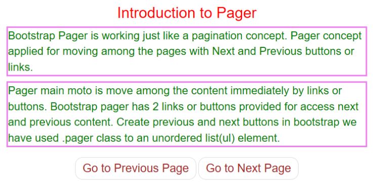
Previous and Next Links pager.
Code:
<!DOCTYPE html>
<html>
<head>
<meta charset="ISO-8859-1">
<title>Pager</title>
<meta charset="utf-8">
<meta name="viewport" content="width=device-width, initial-scale=1">
<link rel="stylesheet"
href="https://maxcdn.bootstrapcdn.com/bootstrap/3.4.1/css/bootstrap.min.css">
<script
src="https://ajax.googleapis.com/ajax/libs/jquery/3.4.1/jquery.min.js"></script>
<script
src="https://maxcdn.bootstrapcdn.com/bootstrap/3.4.1/js/bootstrap.min.js"></script>
CSS Code
<style>
h2 {
color: red;
text-align: center;
}
p {
color: green;
font-size: 22px;
border-style: solid;
border-color: violet;
}
a {
color: brown;
font-size: 23px;
}
</style>
</head>
<body>
<div class="container">
<h2>Introduction to Pager</h2>
<p>Bootstrap Pager is working just like a pagination concept.
Pager concept applied for moving among the pages with Next and
Previous buttons or links.
<p>Pager main moto is move among the content immediately by links
or buttons. Bootstrap pager has 2 links or buttons provided for
access next and previous content. Create previous and next buttons in
bootstrap we have used .pager class to an unordered list(ul) element.</p>
<ul class="pager">
<li><a href="https://www.educba.com/">Go to Previous Page</a></li>
<li><a
href="https://www.educba.com/category/software-development/software-development-tutorials/java-tutorial/">Go
to Next Page</a></li>
</ul>
</div>
</body>
</html>
Output:
Explanation:
- Above output, we can conclude that pager gives default styles by default values of bootstrap to the 2 links.
Example #2
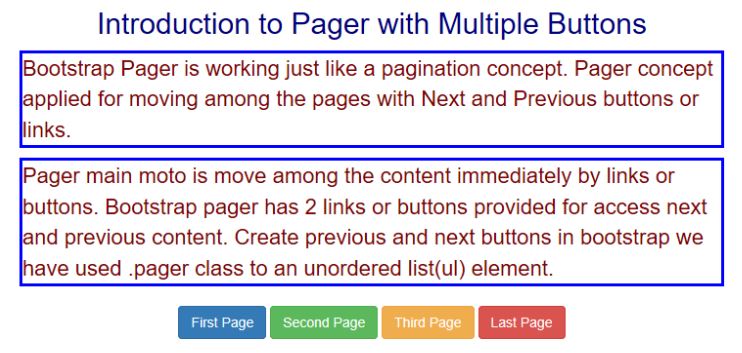
Pager with Buttons.
Code:
<!DOCTYPE html>
<html>
<head>
<meta charset="ISO-8859-1">
<title>Pager</title>
<meta charset="utf-8">
<meta name="viewport" content="width=device-width, initial-scale=1">
<link rel="stylesheet"
href="https://maxcdn.bootstrapcdn.com/bootstrap/3.4.1/css/bootstrap.min.css">
<script
src="https://ajax.googleapis.com/ajax/libs/jquery/3.4.1/jquery.min.js"></script>
<script
src="https://maxcdn.bootstrapcdn.com/bootstrap/3.4.1/js/bootstrap.min.js"></script>
CSS Code
<style>
h2 {
color: navy;
text-align: center;
}
p {
color: maroon;
font-size: 22px;
border-style: solid;
border-color: blue;
}
</style>
</head>
<body>
<div class="container">
<h2>Introduction to Pager with Multiple Buttons</h2>
<p>Bootstrap Pager is working just like a pagination concept.
Pager concept applied for moving among the pages with Next and
Previous buttons or links.
<p>Pager main moto is move among the content immediately by links
or buttons. Bootstrap pager has 2 links or buttons provided for
access next and previous content. Create previous and next buttons in
bootstrap we have used .pager class to an unordered list(ul) element.</p>
<ul class="pager">
<li><button type="button" class="btn btn-primary">First
Page</button></li>
<li><button type="button" class="btn btn-success">Second
Page</button></li>
<li><button type="button" class="btn btn-warning">Third
Page</button></li>
<li><button type="button" class="btn btn-danger">Last
Page</button></li>
</ul>
</div>
</body>
</html>
Output:
Explanation:
- Above output, we can conclude that pager gives default styles by default values of bootstrap to the 4 buttons.
Example #3
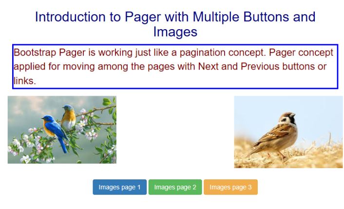
Pager with Buttons and Images.
Code:
<!DOCTYPE html>
<html>
<head>
<meta charset="ISO-8859-1">
<title>Pager</title>
<meta charset="utf-8">
<meta name="viewport" content="width=device-width, initial-scale=1">
<link rel="stylesheet"
href="https://maxcdn.bootstrapcdn.com/bootstrap/3.4.1/css/bootstrap.min.css">
<script
src="https://ajax.googleapis.com/ajax/libs/jquery/3.4.1/jquery.min.js"></script>
<script
src="https://maxcdn.bootstrapcdn.com/bootstrap/3.4.1/js/bootstrap.min.js"></script>
CSS Code:
<style>
h2 {
color: navy;
text-align: center;
}
p {
color: maroon;
font-size: 22px;
border-style: solid;
border-color: blue;
}
* {
box-sizing: border-box;
}
.row {
display: flex;
}
.column {
flex: 33.33%;
padding: 5px;
}
</style>
</head>
<body>
<div class="container">
<h2>Introduction to Pager with Multiple Buttons and Images</h2>
<p>Bootstrap Pager is working just like a pagination concept.
Pager concept applied for moving among the pages with Next and
Previous buttons or links.</p>
<div class="row">
<div class="column">
<img src="2.jpg" style="width: 100%">
</div>
<div class="column"></div>
<div class="column">
<img src="6.jpg" style="width: 100%">
</div>
</div>
<ul class="pager">
<li><button type="button" class="btn btn-primary">Images
page 1</button></li>
<li><button type="button" class="btn btn-success">Images
page 2</button></li>
<li><button type="button" class="btn btn-warning">Images
page 3</button></li>
</ul>
</div>
</body>
</html>
Output:
Explanation:
- Above output, we can conclude that pager gives default styles by default values of bootstrap to the 3 button images.
Conclusion
It is just like a pagination used for accessing the content with buttons or links among all pages. Pager can be achieved by .pager class in bootstrap which gives default styles for the links and buttons.
Recommended Articles
This is a guide to Bootstrap Pager. Here we discuss the introduction, why bootstrap over HTML, why we use bootstrap pager, and examples. You may also have a look at the following articles to learn more –


