Updated March 18, 2023

Introduction to Bootstrap Progress Bars
Almost all programmers would be well known about Bootstrap. It displays the progress, how much a user has done /completed the things. Bootstrap provides a certain class for displaying the Progress Bars. This class is built under the bootstrap library. Progress Bars displays progress state to users, i.e. indicates how much they have covered of their task. The progress bar may be in the form of a loader, bar or maybe in many other forms. It displays the percentage of completion of the task/event. Progress Bars implementation can be achieved quickly on web pages using classes provided by Bootstrap.
What is Bootstrap Progress Bars?
Progress Bar displays the progress of the current task, such as how much the task is completed & how much it is pending. It refers to the Progress Bar created by Bootstrap.
Thus it can be created using the class “progress” in the parent element & the recent child element will have a class “progress-bar”. we can see the following screenshot for the progress bar.
The following are given the HTML of the progress bar having different completion progress status. These progress bars are created using bootstrap. we can see the parent element containing bootstrap class “progress” & its child element containing class “progress bar” provided by the Bootstrap library.
<div class="progress">
<div class="progress-bar" style="width: 60%" >
<span>60% Complete</span>
</div>
</div>
<br>
<div class="progress">
<div class="progress-bar" style="width: 80%">
<span>80% Complete</span>
</div>
</div>
<br>
<div class="progress">
<div class="progress-bar"  style="width: 100%">
<span>100% Complete</span>
</div>
</div>
To create the bootstrap progress bar/loaders, the bootstrap library should be included on the page.
Types
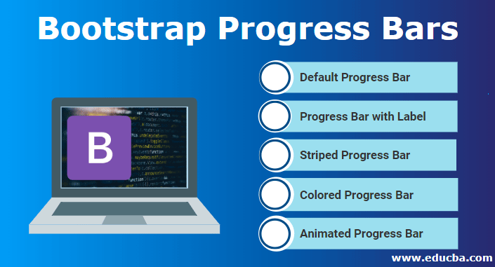
They may be having different types and different features.
- Default Progress Bar,
- Progress Bar with Label
- Striped Progress Bar
- Colored Progress Bar
- Animated Progress Bar
Let us look at these types in detail as mentioned below:
1. Default Progress Bar
Default Progress Bar can add using the Bootstrap library, certain predefined classes used on the parent & child element to create the default progress bar. The above given an example is the best suit to the default progress bar.
2. Progress Bar with Label
Progress Bar with Label is similar to the default one; It also contains the value on the bar whatever has been processed. This can be created by adding the element “<span>60% Complete</span>” in-between of the child element.
The height of the progress bar is controlled by the parent element’s height, which is containing class “progress”.
e.g. In the below-given example, span element added in between of the child element. This span element will be visible as a label on the progress bars.
<div class="progress">
<div class="progress-bar" style="width: 60%" >
<span>60% Complete</span>
</div>
</div>
<br>
<div class="progress">
<div class="progress-bar" style="width: 80%">
<span>80% Complete</span>
</div>
</div>
<br>
<div class="progress">
<div class="progress-bar"  style="width: 100%">
<span>100% Complete</span>
</div>
</div>
In the below-given example, we can see that the added span is visible as the value of the progress bar in the middle of the bar as a label; that’s why it is known as a progress bar with a label.
3. Striped Progress Bar
This is a bit different in view. We can see that bootstrap class “progress-bar-striped” in the inner element gives stripped like a view to the element. The following are given the HTML for the Striped Progress Bar.
<div class="progress">
<div class="progress-bar progress-bar-striped" role="progressbar" style="width: 20%" aria-valuenow="20" aria-valuemin="0" aria-valuemax="100">
</div>
</div>
<br>
<div class="progress">
<div class="progress-bar progress-bar-striped" role="progressbar" style="width: 40%" aria-valuenow="40" aria-valuemin="0" aria-valuemax="100">
</div>
</div>
<br>
<div class="progress">
<div class="progress-bar progress-bar-striped" role="progressbar" style="width: 60%" aria-valuenow="60" aria-valuemin="0" aria-valuemax="100">
</div>
</div>
<br>
<div class="progress">
<div class="progress-bar progress-bar-striped" role="progressbar" style="width: 80%" aria-valuenow="80" aria-valuemin="0" aria-valuemax="100">
</div>
</div>
<br>
<div class="progress">
<div class="progress-bar progress-bar-striped" role="progressbar" style="width: 100%" aria-valuenow="100" aria-valuemin="0" aria-valuemax="100">
</div>
</div>
Below given the view of the Striped Progress Bar.
4. Colored Progress Bar
In the above-given progress bar, different colors can be added to the progress bar using bootstrap classes. some of those classes are given below
- bg-success
- bg-info
- bg-warning
- bg-danger
The above-given classes are known as background utility classes.
<div class="progress">
<div class="progress-bar progress-bar-striped" role="progressbar" style="width: 20%" aria-valuenow="20" aria-valuemin="0" aria-valuemax="100">
</div>
</div>
<br>
<div class="progress">
<div class="progress-bar progress-bar-striped bg-danger" role="progressbar" style="width: 40%" aria-valuenow="40" aria-valuemin="0" aria-valuemax="100">
</div>
</div>
<br>
<div class="progress">
<div class="progress-bar progress-bar-striped bg-info" role="progressbar" style="width: 60%" aria-valuenow="60" aria-valuemin="0" aria-valuemax="100">
</div>
</div>
<br>
<div class="progress">
<div class="progress-bar progress-bar-striped bg-warning" role="progressbar" style="width: 80%" aria-valuenow="80" aria-valuemin="0" aria-valuemax="100">
</div>
</div>
<br>
<div class="progress">
<div class="progress-bar progress-bar-striped bg-success" role="progressbar" style="width: 100%" aria-valuenow="100" aria-valuemin="0" aria-valuemax="100">
</div>
</div>
The above-given classes in the inner HTML element can add color to the progress bar as given in the below screenshot.
5. Animated Progress Bar
This refers to the Progress Bar with Animation. Bootstrap library provides class “active” to add animation in the Progress Bar whenever progress status changes, progress status changes slowly to the updated state.
<div class="progress">
<div class="progress-bar progress-bar-striped" role="progressbar" style="width: 20%" aria-valuenow="20" aria-valuemin="0" aria-valuemax="100">
</div>
</div>
<br>
<div class="progress">
<div class="progress-bar progress-bar-striped active" role="progressbar" style="width: 40%" aria-valuenow="40" aria-valuemin="0" aria-valuemax="100">
</div>
</div>
If an “active” class is available in the created progress bar & their progress state changes to the new state. In this scenario, the progress bar will slowly navigate to that new state; either progress status increases or decreases.
Conclusion
This is a smarter and efficient way to represent the progress status. Progress Bar Representation can describe too much information that can’t be described in a few sentences. Before creating the Bootstrap Progress Bar, it is important to include the bootstrap library in the application.
Recommended Articles
This is a guide to Bootstrap Progress Bars. Here we discuss the basic concept, Types along with Codes in a simple and detail manner. You can also go through our other suggested articles to learn more –


