Updated April 1, 2023

Introduction to Bootstrap row
The Bootstrap row is an essential element in the bootstrap grid system to hold the column class. It is used for horizontal partition in the container class of the web application. The bootstrap row class is used to make a horizontal layout to contain the column class on the web page. It is divided space and makes columns using col class in the bootstrap grid system.
Syntax
- It is useful on every web page to make an attractive and specious web application.
- The container and container fluid contains one or more than one-row classes.
- The basic bootstrap row is used row class, and syntax is below.
<div class = "container">
<div class = "row">
...
</div>
</div>- The row class contains the column which makes a responsive website or web application.
<div class = "container">
<div class = "row">
<div class = "col-sm-8"></div>
<div class = "col-sm-8"></div>
</div>
</div>- The columns are used for small screen size devices and make two parts of the row in the web page.
- The more than one-row class is used in one container, which syntax is below.
<div class = "container">
<div class = "row">
<div class = "col-sm-8"></div>
<div class = "col-sm-8"></div>
</div>
<div class = "row">
<div class="col-sm-4"></div>
<div class = "col-sm-4"></div>
<div class = "col-sm-4"></div>
</div>
</div>
How does row work in Bootstrap?
The bootstrap needed certain HTML and CSS elements to get bootstrap offset.
- The HTML file is created in the web application and <!DOCTYPE html> tag is needed in the HTML file.
The bootstrap is responsive technology to view application every size of devices.
The following tag is useful for responsive web design.
<meta name = "viewport" content = "width=device-width, initial-scale = 1">The bootstrap added some supported online files to get bootstrap elements and utilities for advanced design.
The following three files are bootstrap files for bootstrap offset.
<link rel= "stylesheet" href = "https://maxcdn.bootstrapcdn.com/bootstrap/3.4.1/css/bootstrap.min.css">
<script src = "https://ajax.googleapis.com/ajax/libs/jquery/3.5.1/jquery.min.js">
</script>
<script src = "https://maxcdn.bootstrapcdn.com/bootstrap/3.4.1/js/bootstrap.min.js">
</script>
The syntax is used in the body section of the web page.
<div class = "container">
<div class = "row">
...
</div>
</div>
The bootstrap offset working procedure is below.
<!DOCTYPE html>
<html>
<head>
<title> Bootstrap offset Example </title>
<meta name = "viewport" content = "width =device-width, initial-scale= 1">
<link rel ="stylesheet" href =          "https://maxcdn.bootstrapcdn.com/bootstrap/3.4.1/css/bootstrap.min.css">
<script src = "https://ajax.googleapis.com/ajax/libs/jquery/3.5.1/jquery.min.js">
</script>
<script src = "https://maxcdn.bootstrapcdn.com/bootstrap/3.4.1/js/bootstrap.min.js">
</script>
</head>
<body>
<div class = "container">
<div class = "row">
<div class = "col-sm-6"> column1 </div>
<div class = "col-sm-6">column2 </div>
</div>
</div>
</body>
</html>
Examples
Different examples are mentioned below:
Example #1
The basic bootstrap row example and output are below.
Code:
<!DOCTYPE html>
<html>
<head>
<title> Bootstrap Row Example </title>
<meta charset = "utf-8">
<meta name = "viewport" content = "width=device-width, initial-scale=1">
<link rel = "stylesheet" href = "https://maxcdn.bootstrapcdn.com/bootstrap/3.4.1/css/bootstrap.min.css">
<script src = "https://ajax.googleapis.com/ajax/libs/jquery/3.5.1/jquery.min.js">
</script>
<script src = "https://maxcdn.bootstrapcdn.com/bootstrap/3.4.1/js/bootstrap.min.js">
</script>
</head>
<body>
<div class = "container-fluid">
<h1> Bootstrap Row Example </h1>
<div class = "row" style = "background-color: lightgrey">
The bootstrap row class is used to make a horizontal layout to contain column class on the web page.
The bootstrap row is divided space and makes columns using col class in the bootstrap grid system.
</div>
</div>
</body>
</html>
Output:
Explanation:
- This is responsive, which is shown in light grey color.
- The row class is placed inside of the container-fluid class and applies background color style.
Example #2
With column example and output is below.
Code:
<!DOCTYPE html>
<html>
<head>
<title> Bootstrap Row Example </title>
<meta charset = "utf-8">
<meta name = "viewport" content = "width=device-width, initial-scale=1">
<link rel = "stylesheet" href = "https://maxcdn.bootstrapcdn.com/bootstrap/3.4.1/css/bootstrap.min.css">
<script src = "https://ajax.googleapis.com/ajax/libs/jquery/3.5.1/jquery.min.js">
</script>
<script src = "https://maxcdn.bootstrapcdn.com/bootstrap/3.4.1/js/bootstrap.min.js">
</script>
</head>
<body>
<div class = "container-fluid">
<h1> Bootstrap Row Example </h1>
<div class = "row" style = "background-color: lightgrey">
<div class = "col-sm-6" style = "border: 2px solid red">
The bootstrap row class is used to make a horizontal layout to contain column class on the web page.
</div>
<div class = "col-sm-6" style = "border: 2px solid red">
The bootstrap row is divided space and makes columns using col class in the bootstrap grid system.
</div>
</div>
</div>
</body>
</html>
Output:
Explanation:
- The row can contain more than two-column and less than twelve columns according to device size.
Example #3
The more than one bootstrap row example and output.
Code:
<!DOCTYPE html>
<html>
<head>
<title> Bootstrap Row Example </title>
<meta charset = "utf-8">
<meta name = "viewport" content = "width=device-width, initial-scale=1">
<link rel = "stylesheet" href="https://maxcdn.bootstrapcdn.com/bootstrap/3.4.1/css/bootstrap.min.css">
<script src = "https://ajax.googleapis.com/ajax/libs/jquery/3.5.1/jquery.min.js">
</script>
<script src = "https://maxcdn.bootstrapcdn.com/bootstrap/3.4.1/js/bootstrap.min.js">
</script>
</head>
<body>
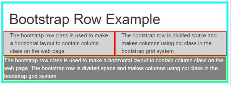
<div class = "container-fluid" style = "border: 5px solid cyan">
<h1> Bootstrap Row Example </h1>
<div class = "row" style = "background-color: lightgrey">
<div class = "col-sm-6" style = "border: 2px solid red">
The bootstrap row class is used to make a horizontal layout to contain column class on the web page.
</div>
<div class = "col-sm-6" style = "border: 2px solid red">
The bootstrap row is divided space and makes columns using col class in the bootstrap grid system.
</div>
</div>
<div class = "row" style = "background-color: grey; color: white; border: 2px solid yellow">
The bootstrap row class is used to make a horizontal layout to contain column class on the web page.
The bootstrap row is divided space and makes columns using col class in the bootstrap grid system.
</div>
</div>
</body>
</html>
Output:
Explanation:
- The row class is placed inside of the container-fluid class, which has a cyan color thick border.
- The first row has a light grey color, and the second row has grey color in the output.
Example #4
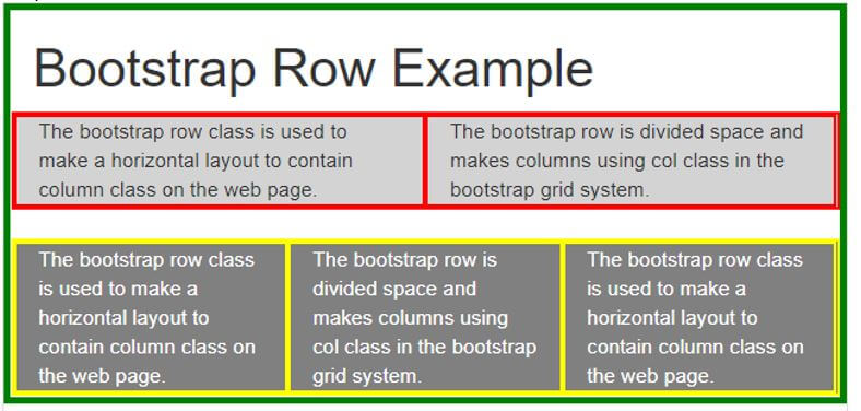
The multiple columns in different bootstrap row examples and output.
Code:
<!DOCTYPE html>
<html>
<head>
<title> Bootstrap Row Example </title>
<meta charset = "utf-8">
<meta name = "viewport" content = "width=device-width, initial-scale=1">
<link rel = "stylesheet" href="https://maxcdn.bootstrapcdn.com/bootstrap/3.4.1/css/bootstrap.min.css">
<script src = "https://ajax.googleapis.com/ajax/libs/jquery/3.5.1/jquery.min.js">
</script>
<script src = "https://maxcdn.bootstrapcdn.com/bootstrap/3.4.1/js/bootstrap.min.js">
</script>
</head>
<body>
<div class = "container-fluid" style = "border: 5px solid green">
<h1> Bootstrap Row Example </h1>
<div class = "row" style = "background-color: lightgrey; border: 2px solid red">
<div class = "col-sm-6" style = "border: 2px solid red">
The bootstrap row class is used to make a horizontal layout to contain column class on the web page.
</div>
<div class = "col-sm-6" style = "border: 2px solid red">
The bootstrap row is divided space and makes columns using col class in the bootstrap grid system.
</div>
</div>
<br>
<div class = "row" style = "background-color: grey; color: white ; border: 2px solid yellow">
<div class = "col-sm-4" style = "border: 2px solid yellow">
The bootstrap row class is used to make a horizontal layout to contain column class on the web page.
</div>
<div class = "col-sm-4" style = "border: 2px solid yellow">
The bootstrap row is divided space and makes columns using col class in the bootstrap grid system.
</div>
<div class = "col-sm-4" style = "border: 2px solid yellow">
The bootstrap row class is used to make a horizontal layout to contain column class on the web page.
</div>
</div>
</div>
</body>
</html>
Output:
Conclusion
It is an important part of spacing and adjusts elements, images in the web application. It is used to make web applications user friendly and attractive. It makes formatting and specious web application.
Recommended Articles
This is a guide to Bootstrap row. Here we discuss the introduction; how does row work in bootstrap? And examples, respectively. You may also have a look at the following articles to learn more –


