Updated June 30, 2023
Definition of Bootstrap Spinner
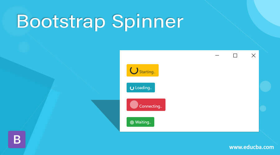
The bootstrap spinner is one component to shows loading the web pages in the web application. A loader is displayed when there is a delay in a web page or web server to show the display screen of a web application. It is an animated component to show the user when displaying the loading state of the web pages.
Syntax:
- The basic syntax needs a spinner-border class.
- The syntax is below.
<div class = "spinner-border"> </div>- The growing spinner syntax needs a spinner-grow class.
- The growing spinner syntax is below.
<div class = "spinner-grow "> </div>- The colored spinner syntax needed a contextual class with a spinner class.
- The colored spinner syntax is below, which is a warning contextual class.
<div class = "spinner-border text-warning"> </div>- The button syntax needs “btn btn-success” class with a spinner class.
- The button syntax is below, which is the success contextual button.
<button class = "btn btn-success">
<span class = "spinner-border"> </span>
</button>
How does Spinner work in Bootstrap?
- The responsive bootstrap spinner needs the below attributes.
<meta name = "viewport" content = "width = device-width, initial-scale = 1">- The bootstrap supporting file on the web page.
<link rel = "stylesheet" href = "https://maxcdn.bootstrapcdn.com/bootstrap/4.5.2/css/bootstrap.min.css">
<script src = "https://ajax.googleapis.com/ajax/libs/jquery/3.5.1/jquery.min.js">
</script>
<script src = "https://cdnjs.cloudflare.com/ajax/libs/popper.js/1.16.0/umd/popper.min.js">
</script>
<script src = "https://maxcdn.bootstrapcdn.com/bootstrap/4.5.2/js/bootstrap.min.js">
</script>- The modified syntax is used in the body section of the HTML page.
Syntax 1:
<div class = "spinner-border"> </div>Syntax 2:
<button class = "btn btn-success">
<span class = "spinner-border"> </span>
</button>- All steps are combined together to get a bootstrap spinner.
<!DOCTYPE html>
<html>
<head>
<title> Bootstrap Spinner Example </title>
<meta name = "viewport" content = "width = device-width, initial-scale = 1">
<link rel = "stylesheet" href = "https://maxcdn.bootstrapcdn.com/bootstrap/4.5.2/css/bootstrap.min.css">
<script src = "https://ajax.googleapis.com/ajax/libs/jquery/3.5.1/jquery.min.js">
</script>
<script src = "https://cdnjs.cloudflare.com/ajax/libs/popper.js/1.16.0/umd/popper.min.js">
</script>
<script src = "https://maxcdn.bootstrapcdn.com/bootstrap/4.5.2/js/bootstrap.min.js">
</script>
</head>
<body>
<div class = "container">
<h2> Bootstrap Spinner Example </h2>
<div class = "spinner-border"> </div> <br>
<button class = "btn btn-success">
<span class = "spinner-border"> </span>
</button>
</div>
</body>
</html>
Examples
Below we will discuss some examples with output.
Example #1
Code:
<!DOCTYPE html>
<html>
<head>
<title> Bootstrap Spinner Example </title>
<meta name = "viewport" content = "width = device-width, initial-scale = 1">
<link rel = "stylesheet" href = "https://maxcdn.bootstrapcdn.com/bootstrap/4.5.2/css/bootstrap.min.css">
<script src = "https://ajax.googleapis.com/ajax/libs/jquery/3.5.1/jquery.min.js">
</script>
<script src = "https://cdnjs.cloudflare.com/ajax/libs/popper.js/1.16.0/umd/popper.min.js">
</script>
<script src = "https://maxcdn.bootstrapcdn.com/bootstrap/4.5.2/js/bootstrap.min.js">
</script>
</head>
<body>
<div class = "container">
<h2> Bootstrap Spinner Example </h2>
<div class = "spinner-border"> </div> <br>
<div class = "spinner-grow"> </div> <br>
<button class = "btn btn-success">
<span class = "spinner-border"> </span>
</button>
</div>
</body>
</html>
Output:
Description:
The first spinner is a border spinner which is shown in the output. The second is a growing spinner which is also shown in the output. The third is a button spinner that is modified with a button tag.
Example #2 – Basic border spinner with Size
Code:
<!DOCTYPE html>
<html>
<head>
<title> Bootstrap Spinner Example </title>
<meta name = "viewport" content = "width = device-width, initial-scale = 1">
<link rel = "stylesheet" href = "https://maxcdn.bootstrapcdn.com/bootstrap/4.5.2/css/bootstrap.min.css">
<script src = "https://ajax.googleapis.com/ajax/libs/jquery/3.5.1/jquery.min.js">
</script>
<script src = "https://cdnjs.cloudflare.com/ajax/libs/popper.js/1.16.0/umd/popper.min.js">
</script>
<script src = "https://maxcdn.bootstrapcdn.com/bootstrap/4.5.2/js/bootstrap.min.js">
</script>
</head>
<body>
<div class = "container">
<h2> Bootstrap Border Spinner Example </h2>
<div class = "spinner-border"> </div>
<div class = "spinner-border spinner-border-sm"> </div> <br><br>
<button class = "btn btn-success">
<span class = "spinner-border"> </span>
</button>
<button class = "btn btn-success">
<span class = "spinner-border spinner-border-sm"> </span>
</button>
</div>
</body>
</html>
Output:
Description:
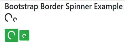
The spinner-border class is used for the border spinner, which is displayed in the output. The spinner-border-sm class is used for the display smaller size of the spinner.
Example #3 – Growing spinner
Code:
<!DOCTYPE html>
<html>
<head>
<title> Bootstrap Spinner Example </title>
<meta name = "viewport" content = "width = device-width, initial-scale = 1">
<link rel = "stylesheet" href = "https://maxcdn.bootstrapcdn.com/bootstrap/4.5.2/css/bootstrap.min.css">
<script src = "https://ajax.googleapis.com/ajax/libs/jquery/3.5.1/jquery.min.js">
</script>
<script src = "https://cdnjs.cloudflare.com/ajax/libs/popper.js/1.16.0/umd/popper.min.js">
</script>
<script src = "https://maxcdn.bootstrapcdn.com/bootstrap/4.5.2/js/bootstrap.min.js">
</script>
</head>
<body>
<div class = "container">
<h2> Bootstrap growing Spinner Example </h2>
<div class = "spinner-grow"> </div>
<div class = "spinner-grow spinner-grow-sm"> </div><br><br>
<button class = "btn btn-info">
<span class = "spinner-grow"> </span>
</button>
<button class = "btn btn-info">
<span class = "spinner-grow spinner-grow-sm"> </span>
</button>
</div>
</body>
</html>
Output:
Description:
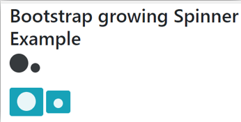
The “spinner-grow” class in Bootstrap is utilized to display a growing spinner animation. It is typically used to indicate an ongoing process or loading state.
Example #4 – Colored spinner
Code:
<!DOCTYPE html>
<html>
<head>
<title> Bootstrap Spinner Example </title>
<meta name = "viewport" content = "width = device-width, initial-scale = 1">
<link rel = "stylesheet" href = "https://maxcdn.bootstrapcdn.com/bootstrap/4.5.2/css/bootstrap.min.css">
<script src = "https://ajax.googleapis.com/ajax/libs/jquery/3.5.1/jquery.min.js">
</script>
<script src = "https://cdnjs.cloudflare.com/ajax/libs/popper.js/1.16.0/umd/popper.min.js">
</script>
<script src = "https://maxcdn.bootstrapcdn.com/bootstrap/4.5.2/js/bootstrap.min.js">
</script>
</head>
<body>
<div class = "container">
<h2> Bootstrap colored Spinner Example </h2>
<button class = "btn btn-secondary">
<span class = "spinner-border"></span>
</button>
<div class = "spinner-grow text-warning"> </div>
<span class = "spinner-border text-primary"></span>
<br> <br>
<button class = "btn btn-info">
<span class = "spinner-border spinner-border-sm"></span>
</button>
<div class = "spinner-grow spinner-grow-sm text-danger"> </div>
<span class = "spinner-border spinner-grow-sm text-success">
</span>
</div>
</body>
</html>
Output:
Description:
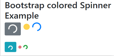
The “text-primary” class is utilized to apply a blue color to the displayed content. It is a Bootstrap class that helps define the visual appearance of text elements.
Example #5 – Button with text
Code:
<!DOCTYPE html>
<html>
<head>
<title> Bootstrap Spinner Example </title>
<meta name = "viewport" content = "width = device-width, initial-scale = 1">
<link rel = "stylesheet" href = "https://maxcdn.bootstrapcdn.com/bootstrap/4.5.2/css/bootstrap.min.css">
<script src = "https://ajax.googleapis.com/ajax/libs/jquery/3.5.1/jquery.min.js">
</script>
<script src = "https://cdnjs.cloudflare.com/ajax/libs/popper.js/1.16.0/umd/popper.min.js">
</script>
<script src = "https://maxcdn.bootstrapcdn.com/bootstrap/4.5.2/js/bootstrap.min.js">
</script
</head>
<body>
<div class = "container">
<h2> Bootstrap colored Spinner Example </h2>
<button class = "btn btn-warning">
<span class = "spinner-border"></span>
Starting..
</button>
<br> <br>
<button class = "btn btn-info">
<span class = "spinner-border spinner-border-sm">
</span>
Loading..
</button>
<br> <br>
<button class = "btn btn-danger">
<span class = "spinner-grow">
</span>
Connecting..
</button>
<br> <br>
<button class = "btn btn-success">
<span class = "spinner-grow spinner-grow-sm">
</span>
Waiting..
</button>
</div>
</body>
</html>
Output:
Conclusion
This component used indicates the web page loading state to the user. It is utilized to provide the user with information about the loading conditions of a web page. It is an animated component to get information in the symbolic form.
Recommended Articles
This is a guide to Bootstrap Spinner. Here we discuss the introduction, how Spinner works in Bootstrap, and examples. You may also have a look at the following articles to learn more –

