Updated March 27, 2023

Introduction to Bootstrap Sticky Header
Sticky Header in Bootstrap is used when the navigation bar wants to fix at the top position even page scroll down to the bottom. It means the navigation bar is always fixed on the top. Now a day’s sticky header feature has almost all the websites because it is very difficult to select the different options from the navigation bar. When we scroll down the page navigation bar can’t be displayed then we have to go to the top again and select the option. It will kill user time therefore developers come up with sticky header concepts in bootstrap.
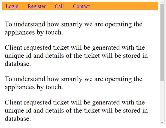
Demonstration: Before scroll down to the bottom
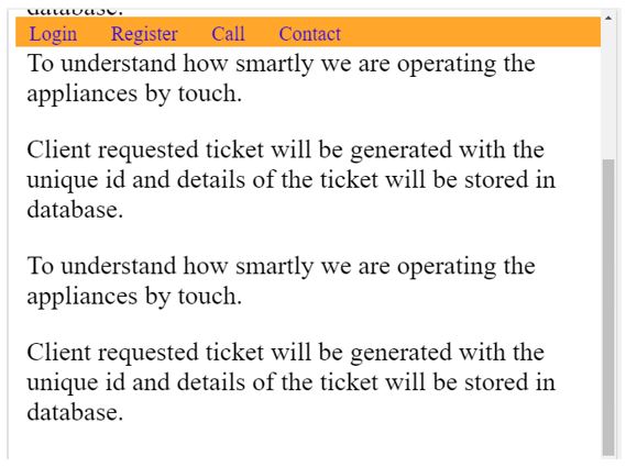
After scroll down to the bottom:
- As you can see in both the cases the navigation bar is on the top only.
Why Bootstrap over HTML?
- In HTML, developers must write each and every class, ids, links, buttons, etc. cascading styles.
- Whereas in Bootstrap most of the predefined classes, links, and buttons, etc. with their own cascading styles to reduce code complexity.
How does Sticky Header work in Bootstrap?
Sticky Header is nothing but navigation bar, if we want to make navigation bar becomes stick at the top (sticky header) then use offsetTop within the JavaScript file.
Syntax:
var stickyHeader = navbar.offsetTop;
function getMyStickyHeader() {
if (window.pageYOffset >= stickyHeader { // window.pageYOffset takes vertical movement of the page
navbar.classList.add("stickyHeader "); //sticks the navigation bar at top if we scroll the page
} else {
navbar.classList.remove("stickyHeader "); // removes sticky navigation bar feature if we scroll the page to the top
}
}
Include bootstrap feature in our application we must specify some pre-defined libraries inside our application.
They are as follows:
- Includes bootstrap view
<meta name="viewport" content="width=device-width, initial-scale=1">- Includes ajax and jQuery libraries
<script src="https://ajax.googleapis.com/ajax/libs/jquery/3.4.1/jquery.min.js"></script>- Includes bootstrap libraries
<link rel="stylesheet" href="https://maxcdn.bootstrapcdn.com/bootstrap/3.4.1/css/bootstrap.min.css">- Includes bootstrap libraries
<script src="https://maxcdn.bootstrapcdn.com/bootstrap/3.4.1/js/bootstrap.min.js"></script>Examples of Bootstrap Sticky Header
Below are the given examples:
Example #1
Sticky Header without nav class Example.
Code:
<!DOCTYPE html>
<html>
<head>
<meta name="viewport" content="width=device-width, initial-scale=1">
<style>
body {
font-size: 29px;
}
#navbar {
background-color: orange;
}
#navbar a {
color: blue ;
text-align: center;
padding: 12px 15px;
text-decoration: none;
font-size: 22px;
}
.content {
padding: 12px;
}
.stickyHeader {
position: fixed;
width: 100%;
}
</style>
</head>
<body>
<div id="navbar" class="navbar navbar-inverse">
<a class="active" href="javascript:void(0)">Home</a>
<a href="javascript:void(0)">News</a>
<a href="javascript:void(0)">Contact</a>
</div>
<div class="content">
<p>To understand how smartly we are operating the appliances by
touch.</p>
<p>Client requested ticket will be generated with the unique id
and details of the ticket will be stored in database.</p>
<p>To understand how smartly we are operating the appliances by
touch.</p>
<p>Client requested ticket will be generated with the unique id
and details of the ticket will be stored in database.</p>
<p>To understand how smartly we are operating the appliances by
touch.</p>
<p>Client requested ticket will be generated with the unique id
and details of the ticket will be stored in database.</p>
</div>
<script>
window.onscroll = function() {getMyStickyHeader()};
var navbar = document.getElementById("navbar");
var stickyHeader = navbar.offsetTop;
function getMyStickyHeader() {
if (window.pageYOffset >= stickyHeader) {
navbar.classList.add("stickyHeader")
} else {
navbar.classList.remove("stickyHeader");
}
}
</script>
</body>
</html>
Output:
Explanation:
Before scrolling after scrolling navigation bar still at the top position only.
Example #2
Sticky Header without nav class Example.
Code:
<!DOCTYPE html>
<html lang="en">
<head>
<title>Sticky Header</title>
<meta charset="utf-8">
<meta name="viewport" content="width=device-width, initial-scale=1">
<link rel="stylesheet"
href="https://maxcdn.bootstrapcdn.com/bootstrap/3.4.1/css/bootstrap.min.css">
<script
src="https://ajax.googleapis.com/ajax/libs/jquery/3.4.1/jquery.min.js"></script>
<script
src="https://maxcdn.bootstrapcdn.com/bootstrap/3.4.1/js/bootstrap.min.js"></script>
</head>
<style>
body {
font-size: 29px;
}
#navbar a {
text-align: center;
padding: 12px 15px;
text-decoration: none;
font-size: 22px;
}
.content {
padding: 12px;
}
.stickyHeader {
position: fixed;
width: 100%;
}
</style>
<body>
<nav id="navbar" class="navbar navbar-inverse">
<div class="container-fluid">
<ul class="nav navbar-nav">
<li><a href="#">EDCBA Training</a></li>
<li><a href="#">Java Course</a></li>
<li><a href="#">Python Course</a></li>
<li><a href="#">C Course</a></li>
<button type="button">Register</button>
<button type="button">Locate</button>
</ul>
</div>
</nav>
<div class="content">
<p>To understand how smartly we are operating the appliances by
touch.</p>
<p>Client requested ticket will be generated with the unique id
and details of the ticket will be stored in database.</p>
<p>To understand how smartly we are operating the appliances by
touch.</p>
<p>Client requested ticket will be generated with the unique id
and details of the ticket will be stored in database.</p>
<p>To understand how smartly we are operating the appliances by
touch.</p>
<p>Client requested ticket will be generated with the unique id
and details of the ticket will be stored in database.</p>
</div>
<script>
window.onscroll = function() {
getMyStickyHeader()
};
var navbar = document.getElementById("navbar");
var stickyHeader = navbar.offsetTop;
function getMyStickyHeader() {
if (window.pageYOffset >= stickyHeader) {
navbar.classList.add("stickyHeader")
} else {
navbar.classList.remove("stickyHeader");
}
}
</script>
</body>
</html>
Output:
Explanation:
Before scrolling after scrolling navigation bar still at the top position only.
Example #3
Sticky Header without nav class Example.
Code:
<!DOCTYPE html>
<html lang="en">
<head>
<title>Sticky Header</title>
<meta charset="utf-8">
<meta name="viewport" content="width=device-width, initial-scale=1">
<link rel="stylesheet"
href="https://maxcdn.bootstrapcdn.com/bootstrap/3.4.1/css/bootstrap.min.css">
<script
src="https://ajax.googleapis.com/ajax/libs/jquery/3.4.1/jquery.min.js"></script>
<script
src="https://maxcdn.bootstrapcdn.com/bootstrap/3.4.1/js/bootstrap.min.js"></script>
</head>
<style>
body {
font-size: 29px;
}
#navbar a {
text-align: center;
padding: 12px 15px;
text-decoration: none;
font-size: 22px;
}
.content {
padding: 12px;
}
.stickyHeader {
position: fixed;
width: 100%;
}
</style>
<body>
<nav id="navbar" class="navbar navbar-default">
<div class="container-fluid">
<ul class="nav navbar-nav">
<li><a href="#">Account</a></li>
<li><a href="#">Transfer</a></li>
<li><a href="#">Appointment</a></li>
<li><a href="#">User Profile</a></li>
<button type="button" class="btn btn-primary">Login</button>
<button type="button" class="btn btn-danger">Check My Balance</button>
</ul>
</div>
</nav>
<div class="content">
<p>To understand how smartly we are operating the appliances by
touch.</p>
<p>Client requested ticket will be generated with the unique id
and details of the ticket will be stored in database.</p>
<p>To understand how smartly we are operating the appliances by
touch.</p>
<p>Client requested ticket will be generated with the unique id
and details of the ticket will be stored in database.</p>
<p>To understand how smartly we are operating the appliances by
touch.</p>
<p>Client requested ticket will be generated with the unique id
and details of the ticket will be stored in database.</p>
</div>
<script>
window.onscroll = function() {
getMyStickyHeader()
};
var navbar = document.getElementById("navbar");
var stickyHeader = navbar.offsetTop;
function getMyStickyHeader() {
if (window.pageYOffset >= stickyHeader) {
navbar.classList.add("stickyHeader")
} else {
navbar.classList.remove("stickyHeader");
}
}
</script>
</body>
</html>
Output:
Explanation:
Before scrolling after scrolling navigation bar is still at the top position only.
Conclusion
Sticky Header is used to fix the navigation bar at the top to access all the elements of navigation header even we scroll down the page.
Recommended Articles
This is a guide to Bootstrap Sticky Header. Here we discuss the basic concept, examples and how does sticky header work in Bootstrap? You may also have a look at the following articles to learn more –


