Updated April 20, 2023

Definition of Bootstrap Styling Buttons
The bootstrap styling button is an important component that interacts with the user and web application in one click. The bootstrap styling button is a user interface component that works as navigation of your website or web applications. The bootstrap styling button is an attractive clicking component to helps users connect the web application. The bootstrap styling buttons help to communicate and know the information in the minimum size for the users.
Syntax:
- The basic bootstrap button needs input type and class elements to create a button.
- The basic bootstrap button syntax is below.
<button type="button" class="btn">Bootstrap Button </button>- The bootstrap styling buttons need button style class.
- The bootstrap styling button syntax is below.
<button type="button" class="btn btn-primary"> Bootstrap styling Button </button>- The button classes is used with <a>, <input>, <button> tags.
- The syntax of the bootstrap styling button with the input tag is below.
<input type="button" class="btn btn-primary" value= " Bootstrap Button with Tag">How to Create Styling Buttons in Bootstrap?
- The bootstrap needed certain HTML and CSS elements to get bootstrap offset.
The HTML file is created in the web application and <!DOCTYPE html> tag is needed in the HTML file. - The bootstrap is responsive technology to view application every size of devices.
- The following tag is useful for responsive web design.
<meta name = "viewport" content = "width=device-width, initial-scale = 1">- The bootstrap added some supported online files to get bootstrap elements and utilities for advanced design.
- The following three files are bootstrap files for bootstrap offset.
<link rel= "stylesheet" href = "https://maxcdn.bootstrapcdn.com/bootstrap/3.4.1/css/bootstrap.min.css">
<script src = "https://ajax.googleapis.com/ajax/libs/jquery/3.5.1/jquery.min.js">
</script>
<script src = "https://maxcdn.bootstrapcdn.com/bootstrap/3.4.1/js/bootstrap.min.js">
</script>- The bootstrap styling button syntax is used in the body section of web page.
<button type="button" class="btn btn-primary"> Bootstrap styling Button </button>- The bootstrap styling button working procedure is below.
<!DOCTYPE html>
<html>
<head>
<title> Bootstrap offset Example </title>
<meta name = "viewport" content = "width =device-width, initial-scale= 1">
<link rel ="stylesheet" href = "https://maxcdn.bootstrapcdn.com/bootstrap/3.4.1/css/bootstrap.min.css">
<script src = "https://ajax.googleapis.com/ajax/libs/jquery/3.5.1/jquery.min.js">
</script>
<script src = "https://maxcdn.bootstrapcdn.com/bootstrap/3.4.1/js/bootstrap.min.js">
</script>
</head>
<body>
<div class = "container">
<form>
<div class="form-group">
<label for="email">Email:</label>
<input type="email" class="form-control">
</div>
<div class="form-group">
<label for="pwd">Password:</label>
<input type="password" class="form-control">
</div>
<button type="submit" class="btn btn-success">Register</button>
<input type="submit" class="btn btn-danger"value="Reset" >
</form>
</div>
</body>
</html>
Examples of Bootstrap Styling Buttons
Following are the examples are given below:
Example #1
the basic bootstrap button example and output.
<!DOCTYPE html>
<html lang="en">
<head>
<title>Bootstrap styling button Example</title>
<meta charset="utf-8">
<meta name="viewport" content="width=device-width, initial-scale=1">
<link rel="stylesheet" href="https://maxcdn.bootstrapcdn.com/bootstrap/3.4.1/css/bootstrap.min.css">
<script src="https://ajax.googleapis.com/ajax/libs/jquery/3.5.1/jquery.min.js">
</script>
<script src="https://maxcdn.bootstrapcdn.com/bootstrap/3.4.1/js/bootstrap.min.js">
</script>
</head>
<body>
<div class="container">
<form>
<div class = "form-group">
<label > Email: </label>
<input type = "email" class="form-control">
</div>
<div class = "form-group">
<label >Password:</label>
<input type="password" class="form-control">
</div>
<button type="submit" class="btn btn-default"> Register </button>
<button type="submit" class="btn "> Reset </button>
</form>
</div>
</body>
</html>
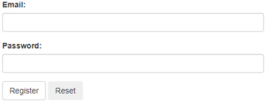
Output:
Explanation: This example used the bootstrap form to understand of bootstrap basic buttons. The reset button used only the “btn” class for the basic bootstrap button. The Register button used the “btn btn-default” class for the bootstrap styling button.
Example #2
The bootstrap contextual button example and output.
<!DOCTYPE html>
<html lang="en">
<head>
<title>Bootstrap styling button Example</title>
<meta charset="utf-8">
<meta name="viewport" content="width=device-width, initial-scale=1">
<link rel="stylesheet" href="https://maxcdn.bootstrapcdn.com/bootstrap/3.4.1/css/bootstrap.min.css">
<script src="https://ajax.googleapis.com/ajax/libs/jquery/3.5.1/jquery.min.js">
</script>
<script src="https://maxcdn.bootstrapcdn.com/bootstrap/3.4.1/js/bootstrap.min.js">
</script>
</head>
<body>
<nav class="navbar navbar-default">
<div class="container-fluid">
<div class="navbar-header">
<a class="navbar-brand>Navbar</a>
</div>
<ul class="nav navbar-nav">
<li>
<button type="button" class="btn btn-info"" href="#">Home
</button>
</li>
<li>
<button type="button" class="btn btn-primary"" href="#"> contacts </button>
</li>
<li>
<button type="button" class="btn btn-success"" href="#"> Page1</button>
</li>
<li>
<button type="button" class="btn btn-warning"" href="#"> Page2 </button>
</li>
</ul>
</div>
</nav>
</body>
</html>Output:
Explanation: This example used a navigation bar to understand the bootstrap styling button. The contextual button used for styling and attractive looking bootstrap navigation bar.
Example #3
The bootstrap styling button with tag example and output.
<!DOCTYPE html>
<html lang = "en">
<head>
<title> Bootstrap styling button Example </title>
<meta charset="utf-8">
<meta name = "viewport" content="width=device-width, initial-scale=1">
<link rel = "stylesheet" href = "https://maxcdn.bootstrapcdn.com/bootstrap/3.4.1/css/bootstrap.min.css">
<script src = "https://ajax.googleapis.com/ajax/libs/jquery/3.5.1/jquery.min.js">
</script>
<script src = "https://maxcdn.bootstrapcdn.com/bootstrap/3.4.1/js/bootstrap.min.js">
</script>
</head>
<body>
<div class="container">
<h1> Bootstrap contextual Buttons with Tags</h1>
<p> Visit to google.com click on button</p>
<a href="https://www.google.com/" class="btn btn-primary" role="button"> Google </a><br><br>
<p> To know more information click on button</p>
<button type="button" class="btn btn-info"> MORE INFO </button><br><br>
<form>
<div class = "form-group">
<label > Email: </label>
<input type = "email" class = "form-control">
</div>
<div class = "form-group">
<label > Password: </label>
<input type = "password" class = "form-control">
</div>
<input type="submit" class="btn btn-success" value="Submit">
<input type="button" class="btn btn-warning" value="Reset">
</form>
</div>
</body>
</html>
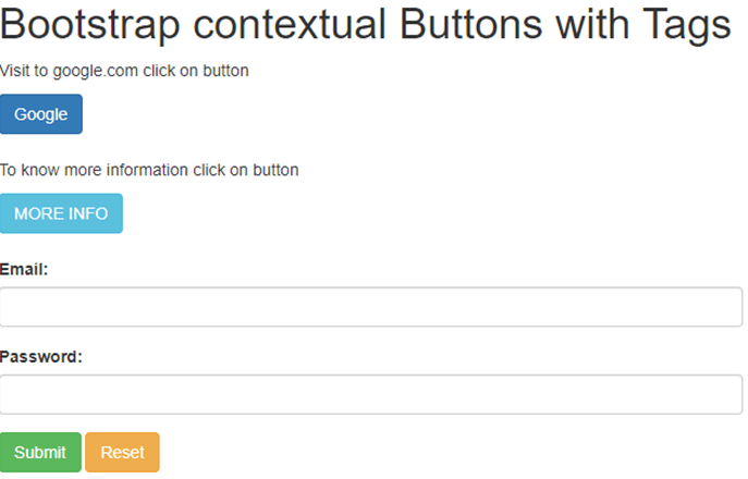
Output:
Explanation: The <a>, <input>, <button> tags used for create buttons.
Example #4
The bootstrap styling button with size example and output.
<!DOCTYPE html>
<html lang = "en">
<head>
<title> Bootstrap styling button Example </title>
<meta charset="utf-8">
<meta name = "viewport" content="width=device-width, initial-scale=1">
<link rel = "stylesheet" href = "https://maxcdn.bootstrapcdn.com/bootstrap/3.4.1/css/bootstrap.min.css">
<script src = "https://ajax.googleapis.com/ajax/libs/jquery/3.5.1/jquery.min.js">
</script>
<script src = "https://maxcdn.bootstrapcdn.com/bootstrap/3.4.1/js/bootstrap.min.js">
</script>
</head>
<body>
<div class="container">
<h2> Bootstrap Button Sizes </h2>
<button type="button" class="btn btn-success btn-lg">Large button</button>
<button type="button" class="btn btn-primary">Normal button </button>
<button type="button" class="btn btn-danger btn-sm">Small button </button>
<button type="button" class="btn btn-warning btn-xs"> extra Small</button>
</div>
</body>
</html>
Output:
Explanation: The btn-lg class works for a large bootstrap styling button. The btn-sm, btn-xs works for small and extra small buttons.
Recommended Articles
This is a guide to Bootstrap Styling Buttons. Here we also discuss the definition and how to create styling buttons in bootstrap? along with different examples and its code implementation. You may also have a look at the following articles to learn more –


