Updated June 21, 2023

Introduction to Bootstrap Toggle Button
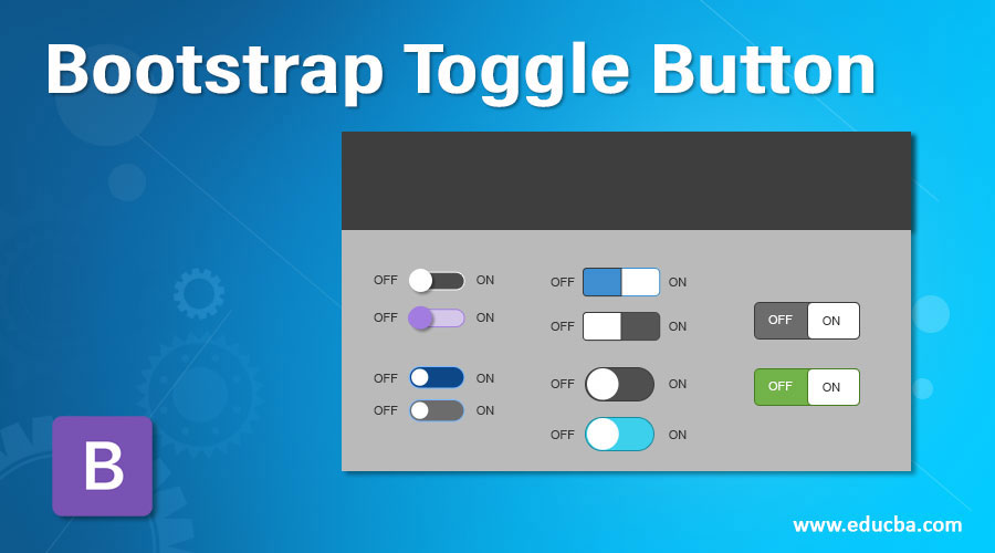
Toggle Button in Bootstrap is used for choosing any one choice from 2 toggle button choices. Toggle Button is also called a switch button. We can achieve the toggle button functionality using <input type=” checkbox”>. It is used for activating one option from the two predefined options. We can say this button is for the on/off action button.
This toggle button is used most of the time with question-related forms.
Example: Do you have a disability? Yes/No. If we choose Yes, we have to provide more information like disability type, percentage of disability, period of disability, etc.
Because of these toggle buttons, we can reduce the form-filling time by disabling the inapplicable options. Toggle Buttons Used Areas:
- On/Off functionality
- Forms
- Preference choices
Why Bootstrap over HTML?
- In HTML, developers must write every class, ID, link, button, cascading style, etc.
- In Bootstrap, most predefined classes, links, buttons, etc., have cascading styles to reduce code complexity.
How does it work in Bootstrap?
Bootstrap Toggle Button worked based on <input type=” checkbox” class=” any predefined bootstrap class”>.
1. Default Toggle Button
Syntax:
<div class="custom-control custom-switch">
<input type="checkbox" class="custom-control-input">
<label class="custom-control-label" for="customSwitches">Any statement</label>
</div>
Explanation:
- class= “custom-control custom-switch”> gives predefined bootstrap styles around the checkbox button and provides the default with a toggle button.
- class=” custom-control-input” makes the checkbox a custom control input button.
- class= “custom-control-label” makes labels with default styles.
- for= “customSwitches” makes the toggle button iterative.
2. Switch Button
Syntax:
<div class="switch">
<label>
Off
<input type="checkbox" checked>
<span class="lever"></span> On
</label>
</div>
Explanation:
- class= “switch” is used for creating a switch toggle button.
- class= “lever” makes button on/off functionality.
3. Default Toggle Button with Disabled Attribute
Syntax:
<div class="custom-control custom-switch">
<input type="checkbox" class="custom-control-input" disabled=”disbaled”>
<label class="custom-control-label" for="customSwitches">Any statement</label>
</div>
4. Switch Toggle Button with the Disabled Attribute
Syntax:
<div class="switch">
<label>
Off
<input type="checkbox" disabled=”disbaled”>
<span class="lever"></span> On
</label>
</div>
Include the bootstrap feature in our application. We must specify some pre-defined libraries inside our application. They are as follows:
1. Includes bootstrap view
<link rel="stylesheet" href="https://maxcdn.bootstrapcdn.com/bootstrap/4.4.1/css/bootstrap.min.css">2. It includes Ajax and jQuery libraries
<script src="https://ajax.googleapis.com/ajax/libs/jquery/3.4.1/jquery.min.js"></script>3. It includes bootstrap libraries
<script src="https://cdnjs.cloudflare.com/ajax/libs/popper.js/1.16.0/umd/popper.min.js"></script>4. It includes bootstrap libraries
<script src="https://maxcdn.bootstrapcdn.com/bootstrap/4.4.1/js/bootstrap.min.js"></script>Examples of Bootstrap Toggle Button
Given below are the examples as follows:
Example #1 – Default toggle button
Code:
<!DOCTYPE html>
<html>
<head>
<title>Toggle/Switch Button</title>
<meta charset="utf-8">
<meta name="viewport" content="width=device-width, initial-scale=1">
<link rel="stylesheet"
href="https://maxcdn.bootstrapcdn.com/bootstrap/4.4.1/css/bootstrap.min.css">
<script
src="https://ajax.googleapis.com/ajax/libs/jquery/3.4.1/jquery.min.js"></script>
<script
src="https://cdnjs.cloudflare.com/ajax/libs/popper.js/1.16.0/umd/popper.min.js"></script>
<script
src="https://maxcdn.bootstrapcdn.com/bootstrap/4.4.1/js/bootstrap.min.js"></script>
</head>
<body>
<div class="custom-control custom-switch">
<input type="checkbox" class="custom-control-input" id="customSwitches">
<label class="custom-control-label" for="customSwitches">1. Do you want to want switch on this button 1?</label><br>
<label class="custom-control-label">2. Do you want to want switch on this button 2?</label><br><label class="custom-control-label" for="customSwitches">3. Do you want to want switch on this button 3?</label><br><label class="custom-control-label" for="customSwitches">4. Do you want to want switch on this button 4?</label></div>
</body>
</html>
Output:
Example #2 – Disabling default toggle button
Code:
<!DOCTYPE html>
<html>
<head>
<title>Disable Toggle/Switch Button</title>
<meta charset="utf-8">
<meta name="viewport" content="width=device-width, initial-scale=1">
<link rel="stylesheet"
href="https://maxcdn.bootstrapcdn.com/bootstrap/4.4.1/css/bootstrap.min.css">
<script
src="https://ajax.googleapis.com/ajax/libs/jquery/3.4.1/jquery.min.js"></script>
<script
src="https://cdnjs.cloudflare.com/ajax/libs/popper.js/1.16.0/umd/popper.min.js"></script>
<script
src="https://maxcdn.bootstrapcdn.com/bootstrap/4.4.1/js/bootstrap.min.js"></script>
</head>
<body>
<div class="custom-control custom-switch">
<input type="checkbox" class="custom-control-input" id="customSwitches" disabled="disabled">
<label class="custom-control-label" for="customSwitches">1. Do you want to want switch on this button 1?</label><br>
<label class="custom-control-label"> 2. Do you want to want switch on this button 2?</label><br><label class="custom-control-label" for="customSwitches"> 3. Do you want to want switch on this button 3?</label><br><label class="custom-control-label" for="customSwitches"> 4. Do you want to want switch on this button 4?</label></div>
</body>
</html>
Output:
Explanation:
You can’t toggle the disabled-buttons.
Example #3 – Switch Button
Code:
<!DOCTYPE html>
<html>
<head>
<title>Toggle/Switch Button</title>
<meta name="viewport" content="width=device-width, initial-scale=1">
<link rel="stylesheet"
href="https://maxcdn.bootstrapcdn.com/bootstrap/4.4.1/css/bootstrap.min.css">
<script
src="https://ajax.googleapis.com/ajax/libs/jquery/3.4.1/jquery.min.js"></script>
<script
src="https://cdnjs.cloudflare.com/ajax/libs/popper.js/1.16.0/umd/popper.min.js"></script>
<script
src="https://maxcdn.bootstrapcdn.com/bootstrap/4.4.1/js/bootstrap.min.js"></script>
</head>
<body>
<div class="switch">
<label>Do you want switch on your computer firewall?</label>
<label>
Off
<input type="checkbox">
<span class="lever"></span> On
</label>
<br> <label>Do you want switch on your computer Notifications?</label>
<label>
Off
<input type="checkbox">
<span class="lever"></span> On
</label>
<br> <label>Do you want switch on auto update your computer?</label>
<label>
Yes
<input type="checkbox">
<span class="lever"></span> No
</label>
<br> <label>Do you want switch on your computer wifi?</label>
<label>
Off
<input type="checkbox">
<span class="lever"></span> On
</label>
<br> <label>Do you want install this software?</label>
<label>
Yes
<input type="checkbox">
<span class="lever"></span> No
</label>
</div>
</body>
</html>
Output:
Example #4 – Disabling switch buttons
Code
<!DOCTYPE html>
<html>
<head>
<title>Toggle/Switch Button</title>
<meta name="viewport" content="width=device-width, initial-scale=1">
<link rel="stylesheet"
href="https://maxcdn.bootstrapcdn.com/bootstrap/4.4.1/css/bootstrap.min.css">
<script
src="https://ajax.googleapis.com/ajax/libs/jquery/3.4.1/jquery.min.js"></script>
<script
src="https://cdnjs.cloudflare.com/ajax/libs/popper.js/1.16.0/umd/popper.min.js"></script>
<script
src="https://maxcdn.bootstrapcdn.com/bootstrap/4.4.1/js/bootstrap.min.js"></script>
</head>
<body>
<br>
<div class="switch">
<label>Do you want switch on your computer firewall?</label>
<label>
Off
<input type="checkbox" disabled>
<span class="lever"></span> On
</label>
<br> <label>Do you want switch on your computer Notifications?</label>
<label>
Off
<input type="checkbox" disabled>
<span class="lever"></span> On
</label>
<br> <label>Do you want switch on auto update your computer?</label>
<label>
Yes
<input type="checkbox" disabled>
<span class="lever"></span> No
</label>
<br> <label>Do you want switch on your computer wifi?</label>
<label>
Off
<input type="checkbox" disabled>
<span class="lever"></span> On
</label>
<br> <label>Do you want install this software?</label>
<label>
Yes
<input type="checkbox" disabled>
<span class="lever"></span> No
</label>
</div>
</body>
</html>
Output:
Explanation:
You can’t toggle the disabled-buttons.
Conclusion
Toggle Button is used to choose one option from 2 options. It is used to reduce entering all the form data by choosing the Yes/No options from the toggle button.
Recommended Articles
We hope that this EDUCBA information on the “Bootstrap Toggle Button” was beneficial to you. You can view EDUCBA’s recommended articles for more information.


