Updated March 18, 2023

Introduction to Button in React Native
As we know that buttons are key elements of a user interface that work after pressing them. Therefore it is necessary to learn how buttons are created in react native. This article will see how buttons are created in react native, their syntax, and different types of buttons available in react native. Also, we will see some examples showing the use of buttons in react applications.
Syntax with Property Types
The syntax and property types are explained as follows:
Syntax:
import React, { Component } from 'react'
import { Button } from 'react-native'
const Test = () => {
return (
<Button
//define the properties of button
/>
)
}
export default Test
Property Types with Description:
The above syntax shows how a button is used in react native. It involves defining an XML tag with a button element; now, different properties can be defined for a button according to our requirements. Here is the list of properties with their type and description.
| PropertyName | Type | Use |
| onPress | function | This is a required property, and it requires specifying the function that will be executed when this button is clicked. |
| Title | String | This is the text that would be displayed as a label on the button, and this is a required property. |
| Color | Color | It is an optional property required to set the background color of the button. |
| Disabled | boolean | It is used to disable touch events of a button. |
| textID | String | It is an optional property required to identify a button uniquely. |
| Accessibility Label | String | Used to display text for blindness accessibility capabilities to a button. |
Types of Buttons in React Native
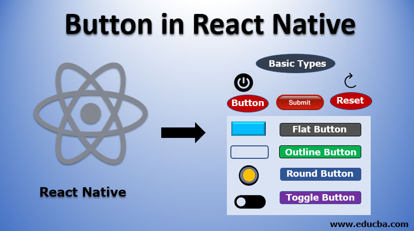
Buttons in React can be classified into the following types:
1. Basic Types: These fall into the basic category and can be of the following types:
- Button: This is used for defining click buttons.
- Submit: This type of button is used along with a form to submit details.
- Reset: Used to clear field contents on click of it.
2. Flat Button: This has a style of no background color. To create a flat button in react, set the CSS class to e-flat.
3. Outline Button: This type of button contains a border with a transparent background. To create this type of button, set the CSS class as an e-outline.
4. Round Button: This button is in a circular shape. To create a round button, set CSS class to e-round.
5. Toggle Button: Toggle button is a button whose state can be changed. Let us consider an example of a play and pause button. On Click of this button, its state is changed, and after another click, it regains its state. This state change function is achieved by click the event of the button. To create a toggle, we need to set the isToggle property to true.
Examples of Button in React Native
Below are the examples of Button in React Native:
Example #1
To start things, let us design a simple button to show how its click event is handled.
Code:
import { AppRegistry } from "react-native";
import React, { Component } from 'react';
import { Alert, Button, StyleSheet, View } from 'react-native';
export default class ButtonDemo extends Component {
onPressButton() {
Alert.alert ('Hello Welcome to Edubca!')
}
render() {
return (
<View style={styles.container}>
<View style={styles.buttonContainer}>
<Button
onPress={this.onPressButton}
title="Click Me"
color="#000000"
/>
</View>
</View>
);
}
}
const styles = StyleSheet.create({
container: {
flex: 1,
justifyContent: 'center',
},
buttonContainer: {
margin: 20
},
multiButtonContainer: {
margin: 20,
flexDirection: 'row',
justifyContent: 'space-between'
}
})
AppRegistry.registerComponent("App", () => ButtonDemo);
AppRegistry.runApplication("App", {
rootTag: document.getElementById("root")
});
Output:
On clicking the above button, an alert will be generated showing the popup with text.
Output:
This alert is generated because the onPress event is triggered, which calls the onPressButton method, which contains the alert’s logic. Hence the above example shows how a button is created in react native and how its click event is handled.
Example #2
In this example, we see how we can change the opacity of a button in react. For this purpose, we will use a TouchableOpacity tag that will contain a button tag in it.
Code:
import React from 'react'
import { TouchableOpacity, StyleSheet, View, Text } from 'react-native'
const TestApp = () => {
return (
<View style = {styles.container}>
<TouchableOpacity>
<Text style = {styles.text}>
Button
</Text>
</TouchableOpacity>
</View>
)
}
export default TestApp
const styles = StyleSheet.create ({
container: {
alignItems: 'center',
},
text: {
borderWidth: 1,
padding: 25,
borderColor: 'black',
backgroundColor: 'blue'
}
})
Output:
After pressing this button, we will see the below change.
Output:
Conclusion
From the above discussion, we have a clear understanding of how we can create buttons to react. We can provide different styles and customizations to provide a better user experience. The button component offers built-in animations, and their click event can be handled using the onPress method.
Recommended Article
This is a guide to Button in React Native. Here we discuss the Introduction, syntax, types, and examples of Button in React Native along with Code Implementation. You can also go through our other suggested articles to learn more –


