Updated March 21, 2023

Introduction to Conditional Formatting in Tableau
Many times during analysis, we come across situations when a need arises for quick classification. The classification helps understand important differences, based on which crucial decision in the problem context can be made. Amongst ways to quickly classify data, the one approach that is widely used is conditional formatting. As the name goes, it essentially means formatting data values based on certain conditions, and color-coding forms the most important part of this data analysis tool. Tableau through its versatile conditional formatting features makes it possible to apply the concept even over graphs that make visualizations quite interactive and communicative.
How to Perform Conditional Formatting in Tableau?
Now, we’ll learn a step by step approach to performing conditional formatting in Tableau through three form of illustrations:
Illustration 1
For the first demonstration, we are using distribution volume data which contains volume distributed by distributed units. Important dimensions here are Region and Distribution Unit, and Distribution Volume is a measure. Our goal is to classify distribution units based on distribution volume. We will categorize them into very high, high, moderate and low volume distribution units. How we will do that, let’s see:
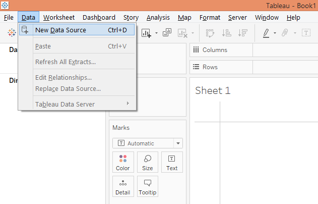
Step 1: To load the data source, click on “New Data Source” in the Data menu. Alternatively, click on “Connect to Data”.
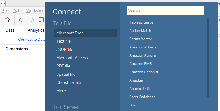
Step 2: Now, in the “Connect” section, select the requisite data source type. In this case, it is “Microsoft Excel”. Then load the data.
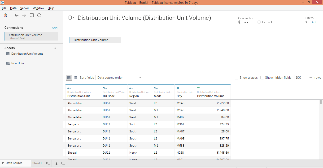
Step 3: The loaded data can be seen in the “Data Source” tab as shown by the below screenshot.
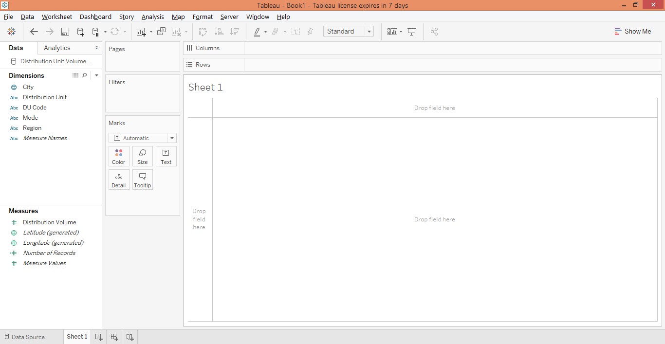
Step 4: Moving to the sheet tab, we can see the dimensions and the measure present in the dataset. They are present in the respective sections.
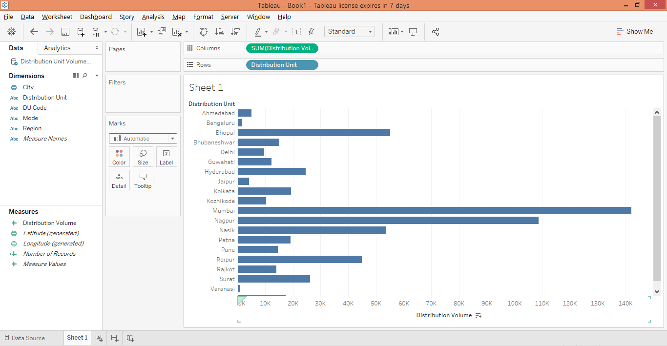
Step 5: To begin with, drag dimension Distribution Unit into Rows region and measure Distribution Volume into the Columns region. A horizontal bar chart gets generated as shown below. If the default chart type is different, select a bar chart in “Show Me”.
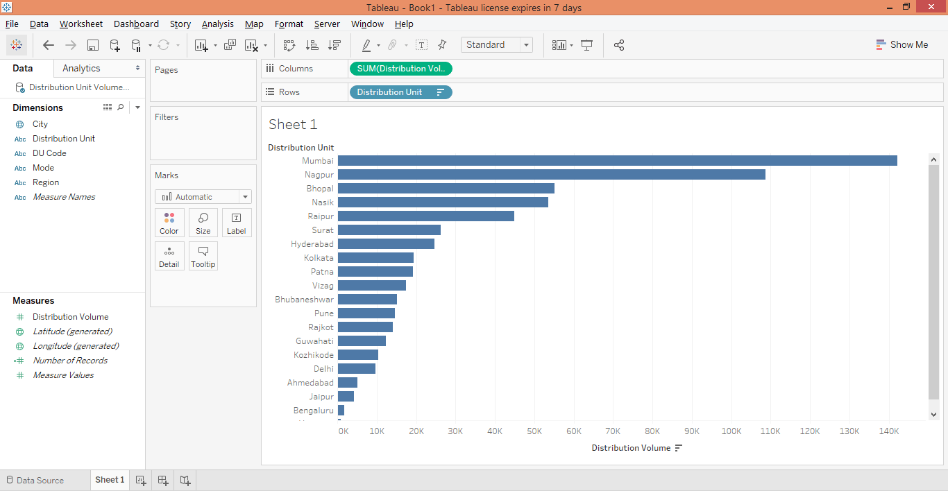
Step 6: Sort the result in descending order by clicking over the sort icon as shown in the below screenshot.
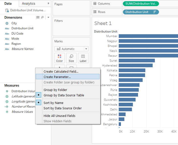
Step 7: Next, we will create three parameters that we will use to serve our purpose. The parameters will basically help to categorize distribution units based on distribution volumes. To create the first parameter, right-click anywhere in the blank space in the Data section, and click on “Create Parameter…” as shown in the below screenshot.
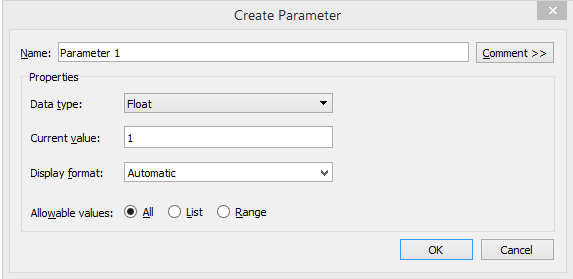
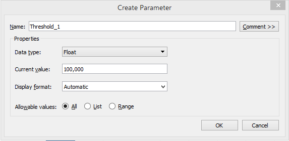
Step 8: Following the above procedure pops up the “Create Parameter” dialogue box as shown below.
Step 9: Perform the following changes in the “Create Parameter” dialogue box. Change the name to “Threshold_1”, keep the data type “Float”, and set the current value to 100,000 with Display format as Automatic and Allowable values selected to All. Finally, click OK to create the parameter. This is as shown below.
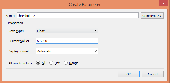
Step 10: Similarly, create the second parameter with the name “Threshold_2”, with the Current value set to 50,000 with other details set as shown below.
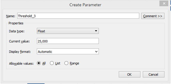
Step 11: Finally, create the third parameter. Name it “Threshold_3”. Set the current value for this parameter to 25,000 with other details set as shown below.
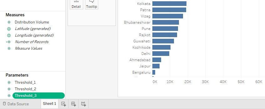
Step 12: The three parameters that we created can be seen as shown by the below screenshot. Now, we will use them appropriately to achieve our objective.
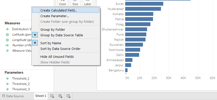
Step 13: The parameters that we created won’t serve our purpose unless they are used in a calculated field to correctly categorize the distribution units based on distribution volume. So, next, we will create a calculated field. For that right-click anywhere in the blank space in the Data section, and click on “Create Calculated Field…”.
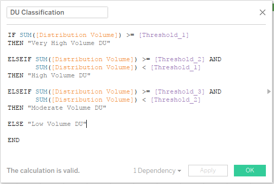
Step 14: The field that we created looks like as shown below. We named it “DU Classification”. The most important point, we used the three parameters we created earlier in the calculated field. What the code does is that if for any distribution unit value is greater than Threshold_1 i.e. 100,000 then it will classify it as “Very High Volume DU”. Similarly, it will do the other classifications.
Note: We didn’t hard code the values in the field, because hard-coding may not allow us to deal with the context-based changes. If we have parameters at our disposal, then as the context changes, changing parameters’ values will accordingly be reflected in the calculated field. E.g. If we intend to categorize distribution units with distribution volume above 200,000 as Very High Volume DU then, we will just change the Current value for Threshold_1 from 100,000 to 200,000 without actually changing the value in the code in the calculated field.
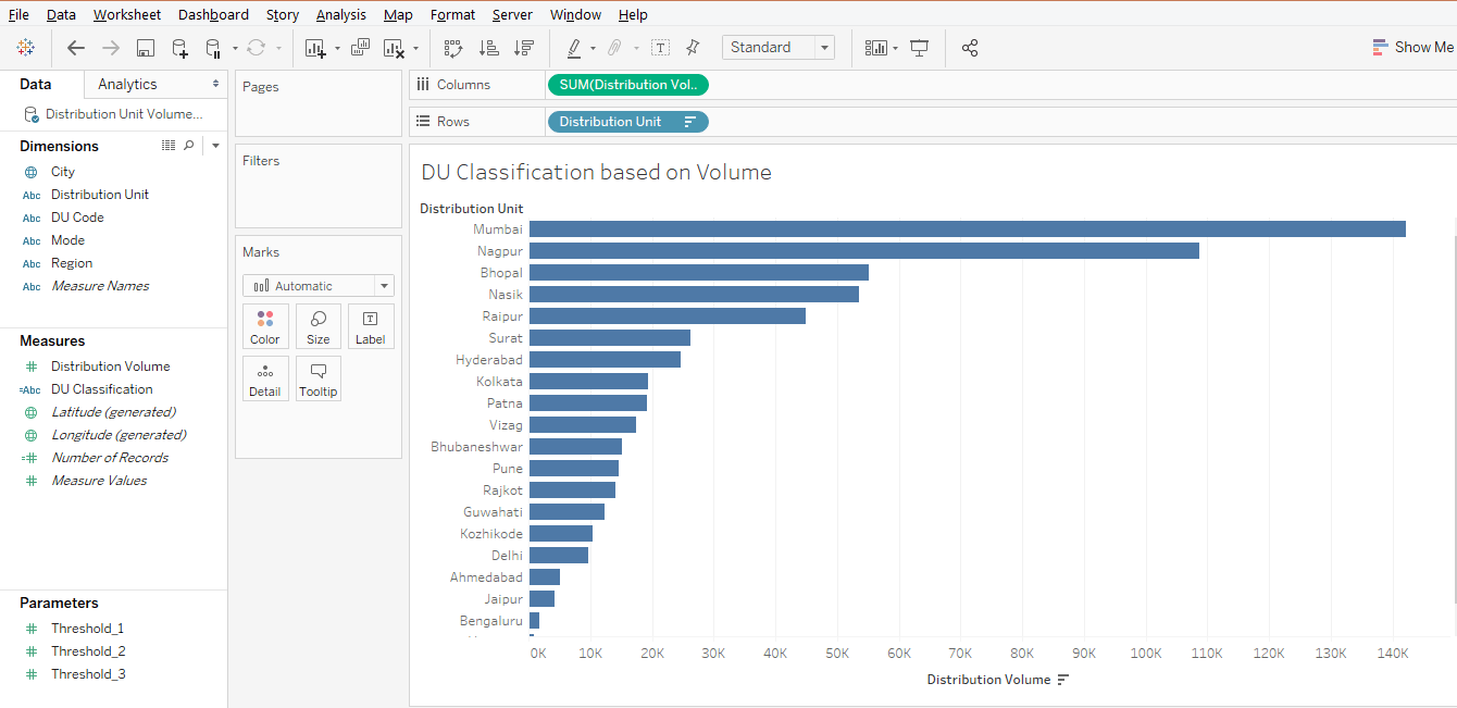
Step 15: As can be seen in the below screenshot, the calculated field “DU Classification” appears under Measures.
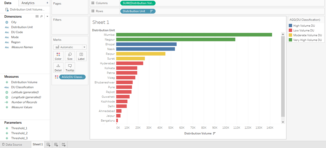
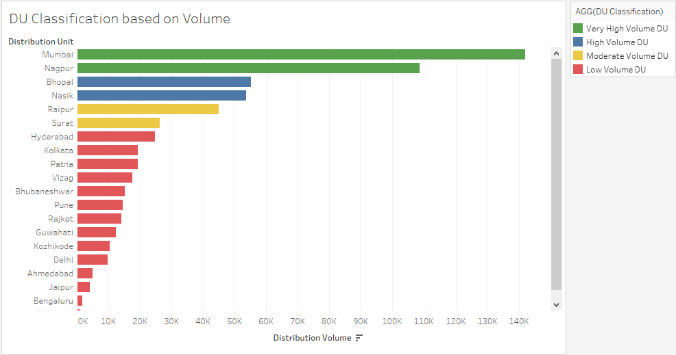
Step 16: Just drag the calculated field “DU Classification” over Color in Marks, and as we can see in the below screenshot, the Distribution Units get categorized into four different categories based on their volume contribution. The categories can be seen on the right side of the screenshot.
Step 17: Let’s have a closer look at the visualization. Also, we change the order of the categories in the legend; this can be done by just dragging a category up or down using a mouse. Now, in legend, the categories seem to be in the right order.
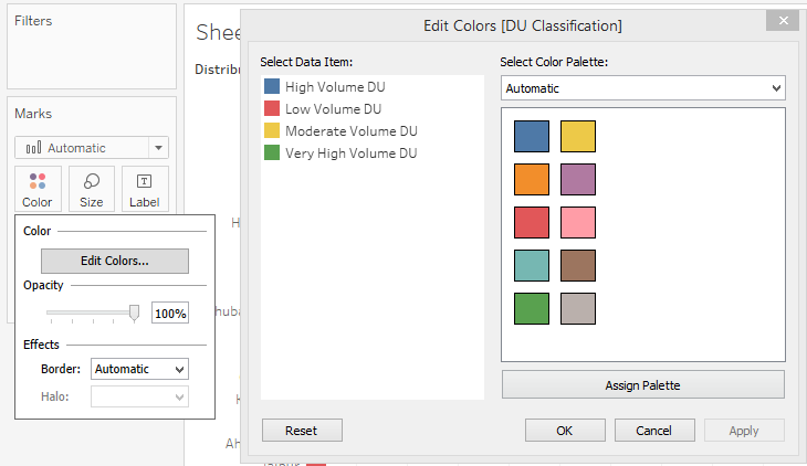
Step 18: Last but not least, we can change the color of a category. For that just click over Color in the Marks card, then clicking over “Edit Colors” make requisite color selections.
Illustration 2
In this illustration, we are going to perform condition formatting of the type of Microsoft Excel. In Microsoft Excel, we have a ready-to-use option that formats the background color of the cells based on the values. Here the degree of the color changes based on the magnitude of the value. However, in Tableau, things become quite tricky especially when we intend to have such kind of conditional formatting in our analysis. To achieve the objective, we will go slightly off the track. Let’s see how we can do it in Tableau.
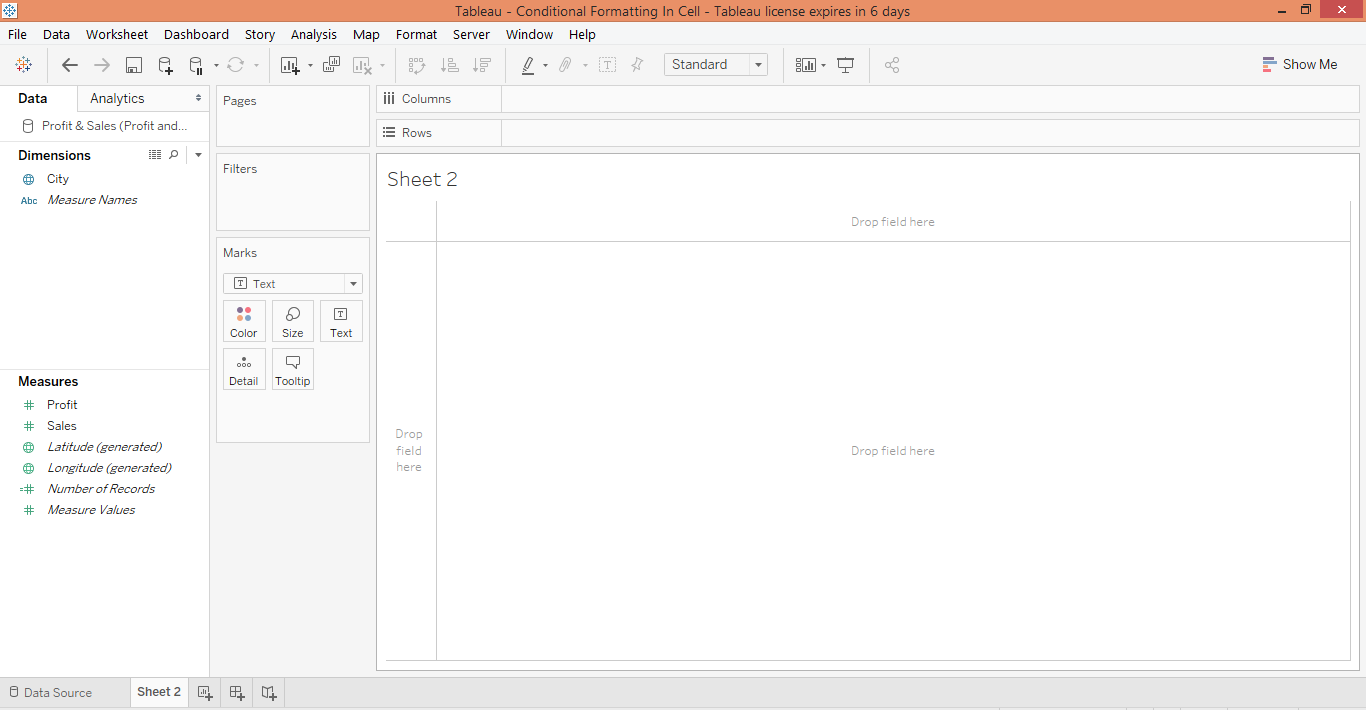
Step 1: Our data for this demonstration contains Profit and Sales figures for twenty major Indian cities. The data has been loaded into Tableau. Moving to the sheet tab we can see the only dimension City and the two measures Profit and Sales present in the respective sections.
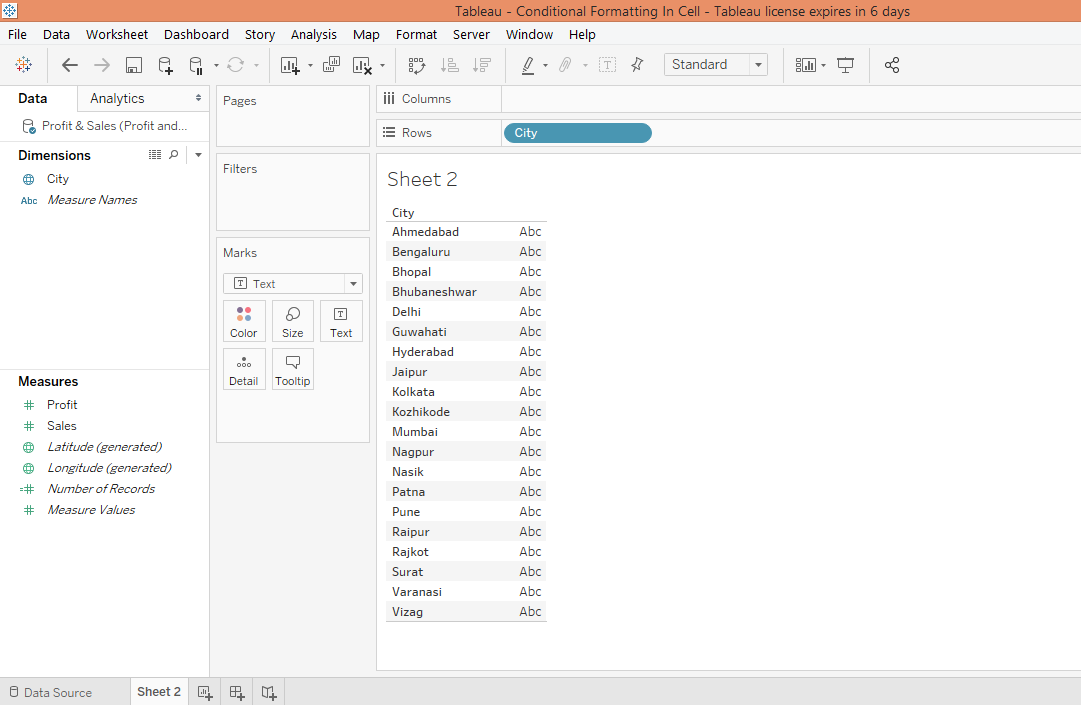
Step 2: To being with, drag dimension City into Rows region as shown below.
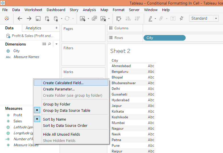
Step 3: The next step is to create a calculated field. This is as shown below.
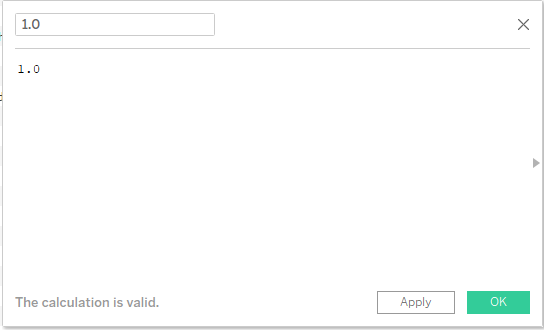
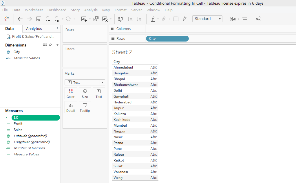
Step 4: Create the calculated field with name 1.0 and also write 1.0 in the code section. Once created, this field can be seen in the Measures section as shown in the screenshot subsequent to the below screenshot.
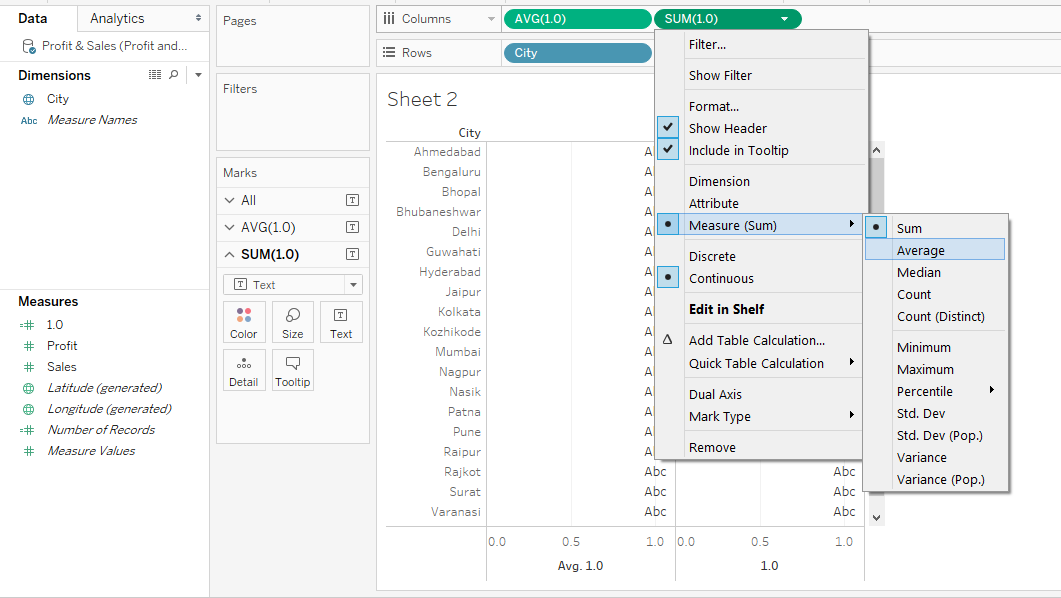
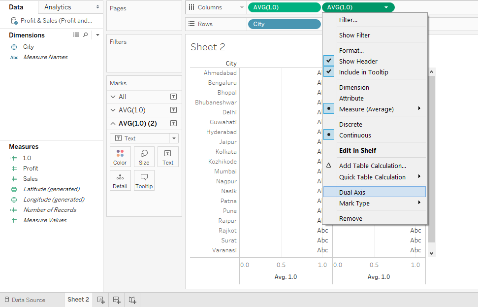
Step 5: Drag the calculated field 1.0 twice one-by-one into the Columns region. Change the type of 1.0 to AVG (Average). For that go to the dropdown menu of the field, then click on Average in Measure.
Step 6: Next, in the dropdown menu of the second 1.0 measure, click on “Dual Axis”. This is as shown in the below screenshot.
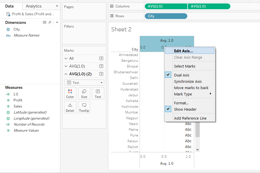
Step 7: We will now modify the top and bottom axes. Right-click on the top axis, and click on the “Edit Axis” post which a dialogue box appears as shown by the screenshot subsequent to the below screenshot.
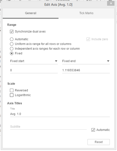
Step 8: The default selections and values in the Edit Axis dialogue box are as shown in the below screenshot.
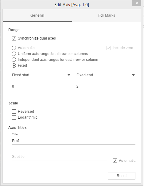
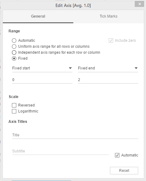
Step 9: Ensure that changes in the “General” section of the “Edit Axis” dialogue box are made as shown below.
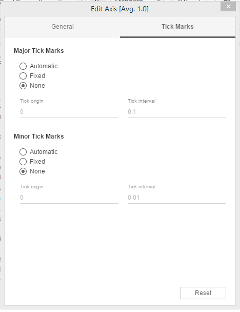
Step 10: Now, in the “Tick Marks” section of the dialogue box, select “None” for Major Tick Marks as well as Minor Tick Marks.
Step 11: For bottom axis also, perform changes in both “General” as well as “Tick Marks” section, similar to the ones performed in the top axis except that Title is kept blank in the “General” section as shown below.
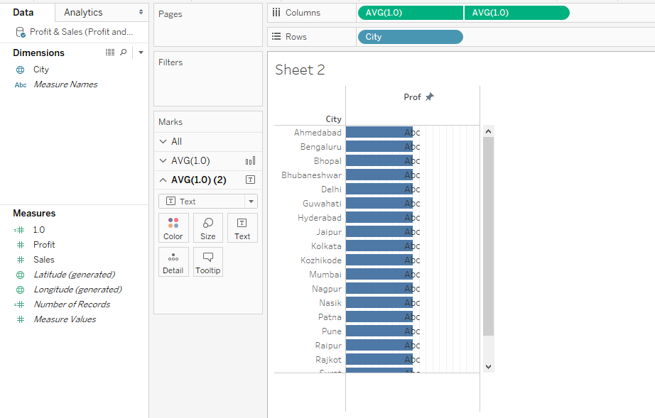
Step 12: Performing the above steps gives us the following visualization. Notice, the blue bars are half the size of the cell, because in the “Fixed end” in the General section of the Edit Axis dialogue box, we have value 2, and in the 1.0 field we have value 1.
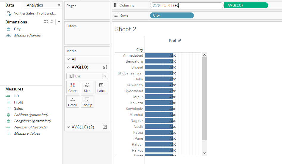
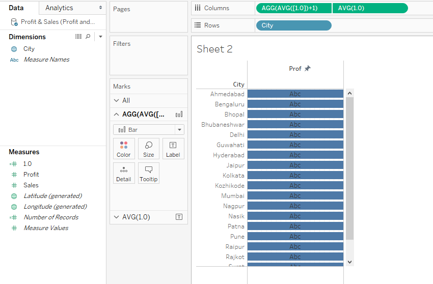
Step 13: To get full-size bars, double click over the pill of the first 1.0 measure and just add 1 as shown below.
Step 14: The above steps give us full-size in-cell bars as can be seen in the below screenshot.
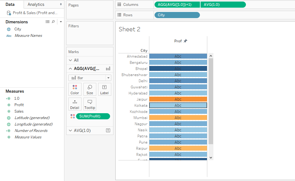
Step 15: Now, for the first 1.0 field in the Marks Card, drag Profit over Color. Doing this gives different colored bars. Please note, the different colored bars are due to different values of Profit measure.
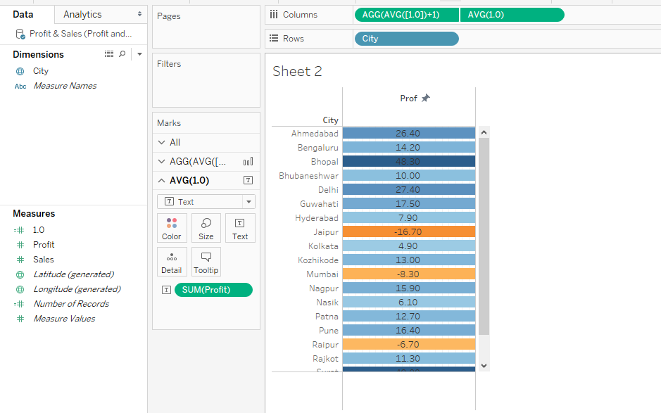
Step 16: Now, in the second 1.0 measure, drag Profit over Text in Marks card, this makes values appear in the cells as can be seen below.
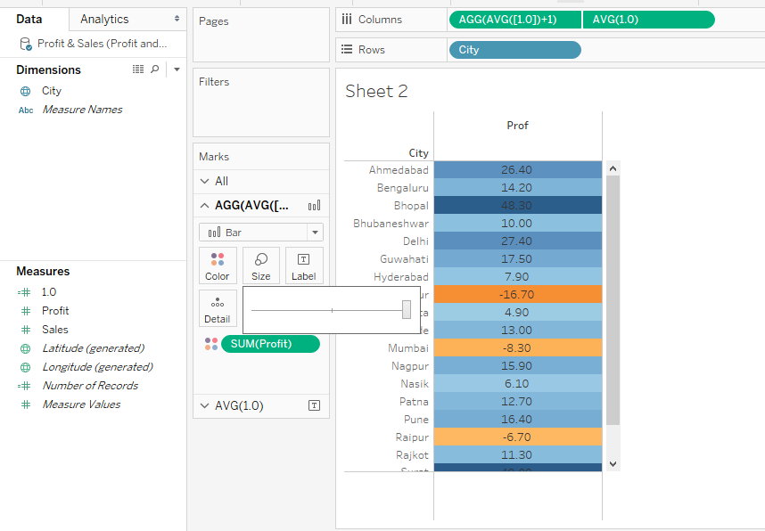
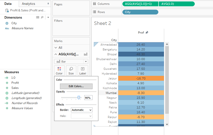
Step 17: In the above screenshot, we can see that the colors have not filled the complete cell. To have full cell filled color, select the highest size by dragging the size slider to the rightmost side for the first 1.0 field. This is illustrated below. And as we can see, now, the cells are completely colored-filled.
Step 18: If we find the brightness of the background colors very high, we change to reduce it by adjusting the opacity, based on the requirement, through the Opacity slider in the Color section. In this case, we kept the opacity to 90%. Similarly, we can adjust opacity for text values through settings in the second 1.0 measure. However, opacity for text values should be kept to 100% in order to have them clearly appear over the background colors. Note, in the visualization below, we can see negative values being clearly distinguished from the positive ones. Negative values are indicated by orange as against blue for the positive values. Moreover, based on the value, the degree of brightness changes for the color.
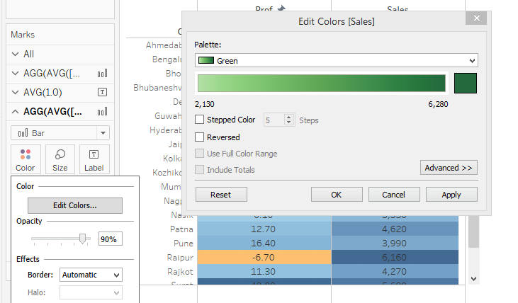
Step 19: The above steps we performed for the Profit measure. We have another important measure in the dataset which is Sales. For measure Sales too we intend to perform a similar analysis. So, just repeat the above steps. At last, change the color for Sales to Green as shown below, or any suitable color can be selected.
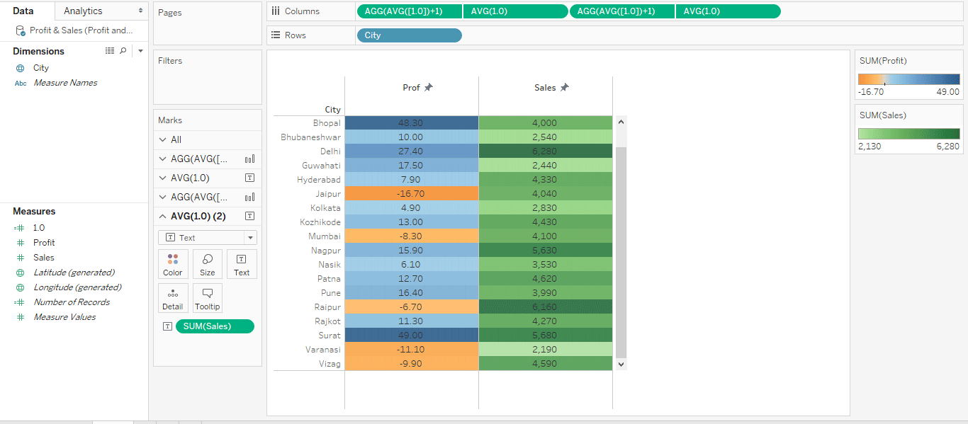
Step 20: Now, the analysis that we performed using conditional formatting looks like as shown in the below screenshot. On the right side, we can see the color assigned based on the range of Profit and Sales values. This values dependent color based formatting that offers crucial insights into data gives the concept the name.
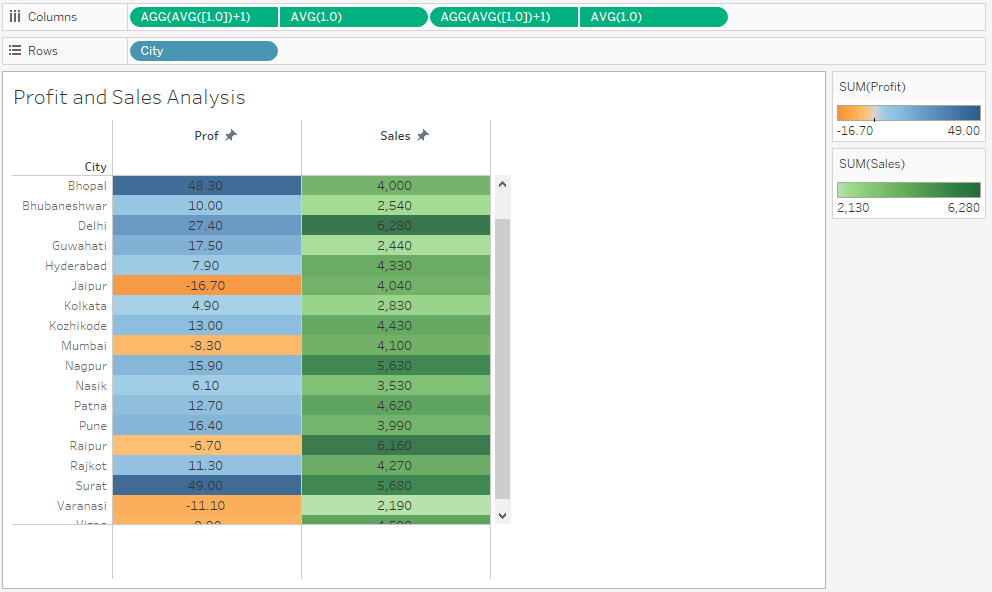
Step 21: The following screenshot gives us a closer look at the analysis that we performed using conditional formatting.
Illustration 3
For this illustration, we will use the dataset used in the first illustration. Here we will highlight the top five and bottom five cities. Let’s go to Tableau:
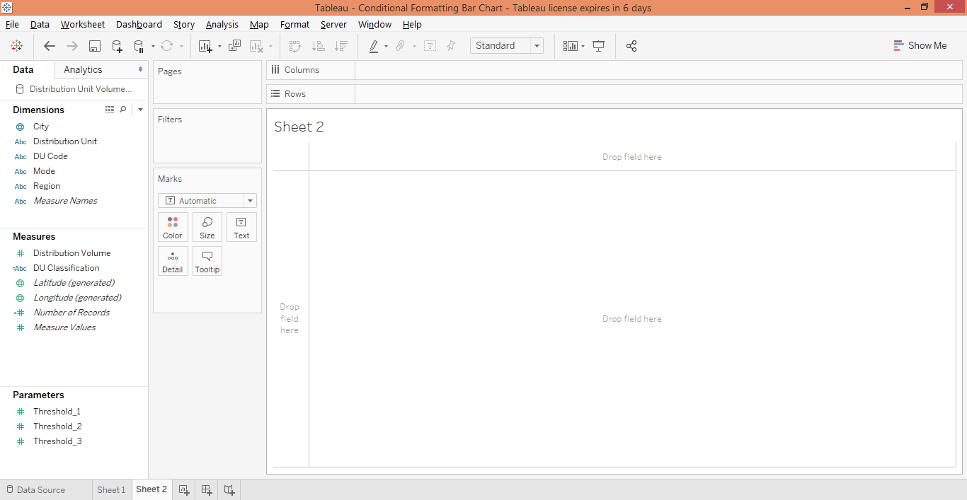
Step 1: We have the data loaded with dimensions and measures as shown in the below screenshot.
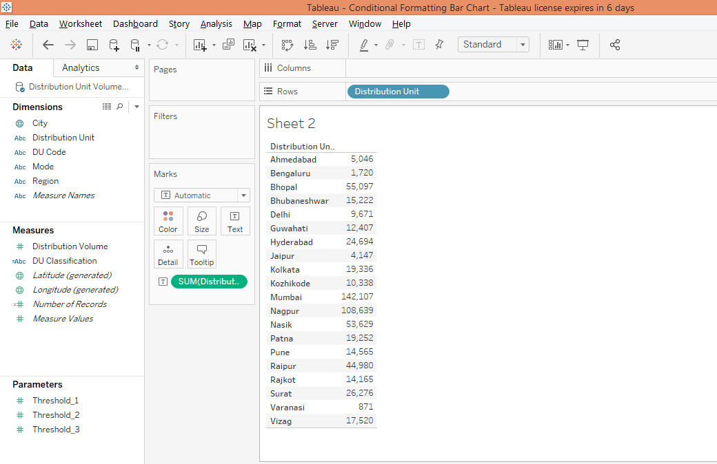
Step2: Drag dimension Distribution Unit into Rows region and measure Distribution Volume over Text in the Marks card as shown in the below screenshot.
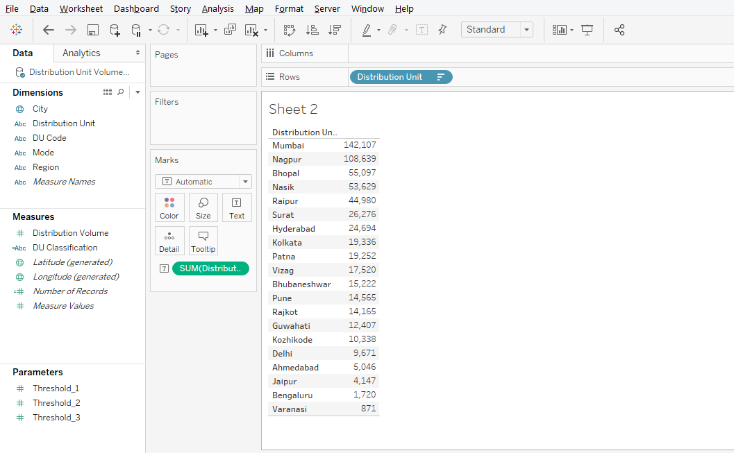
Step 3: Sort the result into descending order so that we get cities in highest to the lowest order of distribution volume. This is as shown below.
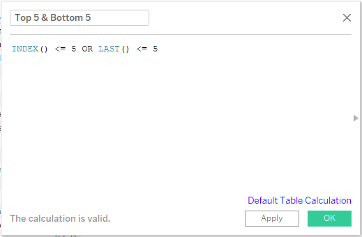
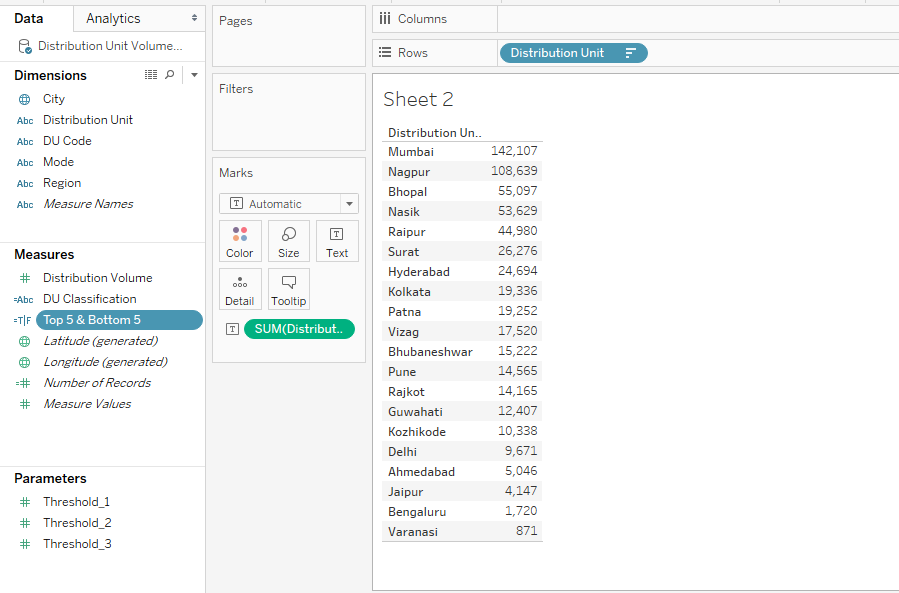
Step 4: Next, create a calculated field. The steps for creating a calculated field have been covered in the preceding sections. We want to highlight the top five and bottom five distribution units, so name the calculated field as “Top 5 & Bottom 5”. In the code section we are employing INDEX() AND LAST() functions. INDEX() function returns the index of the current row while LAST() returns the number of rows from the current row to the last row. INDEX() starts calculation from 1 while LAST() starts from 0. The two functions have been used as shown in the below screenshot.
Step 5: The newly created calculated field appears as a measure as can be seen in the below screenshot.
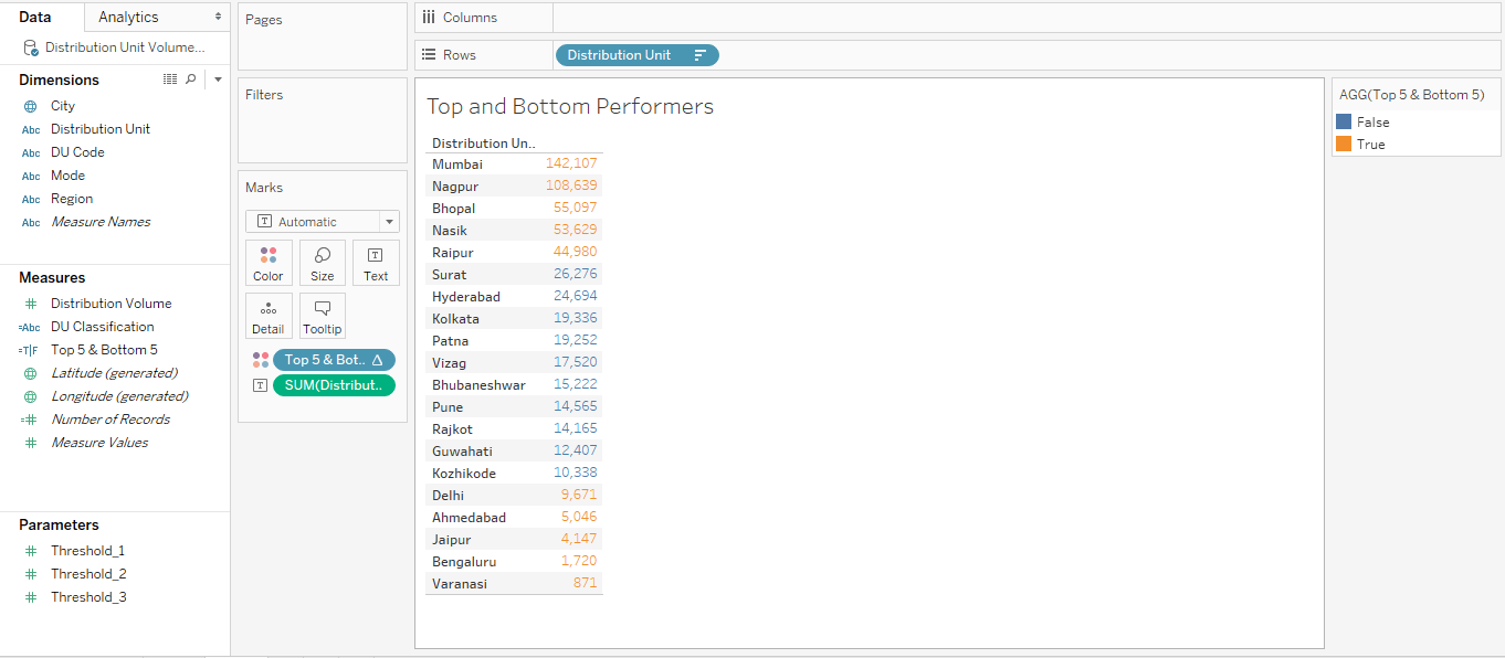
Step 6: Now, just drag the newly created calculated field “Top 5 & Bottom 5” over Color in the Marks card, and we can see the top and bottom 5 regions have got highlighted in red color. The categories appear as False and True values as can be seen located on the right side of the screen.
Conclusion
Through various illustrations, we tried to get deeper into the concept of conditional formatting in Tableau. However, being a very interactive visualization tool, multiple ways can be discovered which require using functionalities provided by the tool. Tableau, thus, facilitates applying conditional formatting to visualizations without restricting to a fixed way.
Recommended Articles
This is a guide to Conditional Formatting in Tableau. Here we discuss a step by step approach to performing conditional formatting in Tableau through three forms of illustrations. You can also go through our other related articles to learn more-
