Updated June 17, 2023

Introduction to CSS Curved Border
Curved border in CSS can be done by border-radius property. Border-radius property removes the corners of the elements and replaces with a certain radius. Based on the given border-radius value curved border shape depends. Border-radius values can be in pixels or percentages. You can apply border-radius to all four sides of elements such as images, buttons, paragraphs, etc. You can also simultaneously apply border-radius on two sides, like a top, bottom, left and right.
Real-Time Usage: Beautifying images, buttons, headers, paragraphs, etc., with the required radius by border-radius property.
How does Curved Border Work in CSS?
As discussed above, the curved border can be generated with a border radius. Observe the below syntaxes:
Syntax 1:
div
{
border-radius: 10px;
}
border-radius: Can be applied to the top, right, bottom, and left sides.
Syntax 2:
div
{
border-radius: 10px 10px 10px 10px;
}
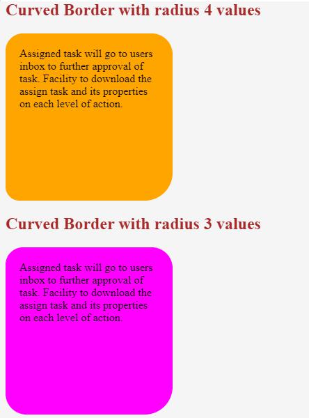
Explanation: If we apply border-radius with four values, then the first value is for the top-left corner, the second value is for the top-right corner, the third value is for the bottom-right corner, and the fourth value is for the bottom-left corner applied respectively.
Syntax 3:
div
{
border-radius: 10px 10px 10px;
}
Explanation: If we apply border-radius with three values, the first value is for the top-left corner, the second value is for the top-right corner and bottom-right corner, and the third value is for the bottom-left corner applied, respectively.
Syntax 4:
div
{
border-radius: 10px 10px;
}
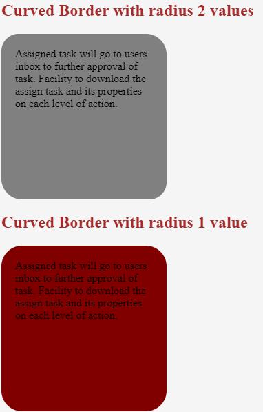
Explanation: If we apply border-radius with two values, the first is for the top-left corner and top-right corner, and the second is for the bottom-right corner and bottom-left corner applied, respectively.
Syntax 5:
div
{
border-radius: 10px;
}
Explanation: If we apply border-radius with a single value, then apply it for all four sides equally. If we want to apply only margin side border-radius, then CSS provides predefined properties. border-top-left-radius: 10px: apply border-radius 10px to top-left side.
Syntax 6:
div
{
border-top-left-radius: 10px;
}
border-top-right-radius: 10px: apply border radius 10px to top-right side.
Syntax 7:
div
{
border-top-right-radius: 10px;
}
border-bottom-left-radius: 10px: apply border radius 10px to bottom-left side.
Syntax 8:
div
{
border-bottom-left-radius: 10px;
}
border-bottom-right-radius: 10px: apply border radius 10px bottom-right side.
Syntax 9:
div
{
border-bottom-right-radius: 10px;
}Examples of CSS Curved Border
Following are the different examples:
Example #1
border-radius with 4 and 3 values for paragraphs:
Code:
<!DOCTYPE html>
<html>
<head>
<title>Curved Border</title>
</head>
<style>
.values4 {
height: 200px;
width: 200px;
border-radius: 25px 30px 40px 20px;
padding: 20px;
background-color: orange;
}
.values3 {
height: 200px;
width: 200px;
border-radius: 25px 30px 40px;
padding: 20px;
background-color: fuchsia;
}
</style>
<body>
<font color="brown" style=""><h2>Curved Border with radius
4 values</h2></font>
<div class="values4">Assigned task will go to users inbox to
further approval of task. Facility to download the assign task and its
properties on each level of action.</div>
<font color="brown" style=""><h2>Curved Border with radius
3 values</h2></font>
<div class="values3">Assigned task will go to users inbox to
further approval of task. Facility to download the assign task and its
properties on each level of action.</div>
</body>
</html>
Output:
Explanation: The above code border radius applied 4 and 3 values for paragraphs. After using the curved radius output shown above.
Example #2
border-radius with 2 and 1 values for paragraphs:
Code:
<!DOCTYPE html>
<html>
<head>
<title>Curved Border</title>
</head>
<style>
.values4 {
height: 200px;
width: 200px;
border-radius: 25px 30px;
padding: 20px;
background-color: gray;
}
.values3 {
height: 200px;
width: 200px;
border-radius: 30px;
padding: 20px;
background-color: maroon;
}
</style>
<body>
<font color="brown" style=""><h2>Curved Border with radius
2 values</h2></font>
<div class="values4">Assigned task will go to users inbox to
further approval of task. Facility to download the assign task and its
properties on each level of action.</div>
<font color="brown" style=""><h2>Curved Border with radius
1 value</h2></font>
<div class="values3">Assigned task will go to users inbox to
further approval of task. Facility to download the assign task and its
properties on each level of action.</div>
</body>
</html>
Output:
Explanation: The above code border radius applied 2 and 1 values for paragraphs. After using the curved radius output shown above.
Example #3
border-radius with 4 and 3 values for paragraphs:
Code:
<!DOCTYPE html>
<html>
<head>
<title>Curved Border</title>
</head>
<style>
.tl {
height: 200px;
width: 200px;
border-top-left-radius: 50px;
background-color: gray;
}
.tr {
height: 200px;
width: 200px;
border-top-right-radius: 50px;
background-color: maroon;
}
</style>
<body>
<font color="brown" style=""><h2>Curved Border with radius
Top-Left</h2></font>
<div >
<img src="m1.jpg" class="tl">
</div>
<font color="brown" style=""><h2>Curved Border with radius
Top-Right</h2></font>
<div >
<img src="m1.jpg" class="tr">
</div>
</body>
</html>
Output:
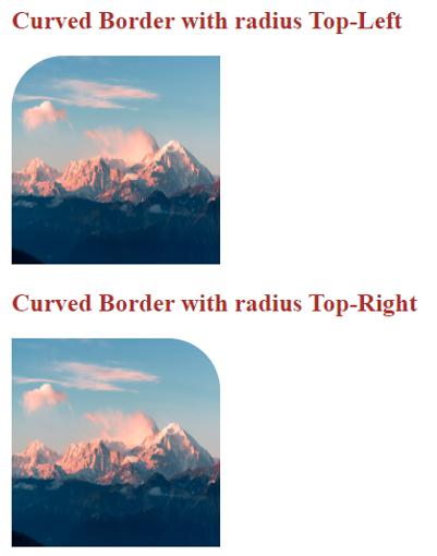
Explanation: In the above code, border-radius applied top-left and top-right values for images after using the curved radius output above.
Example #4
border-radius with top-left and top-right values for images:
Code:
<!DOCTYPE html>
<html>
<head>
<title>Curved Border</title>
</head>
<style>
.tl {
height: 200px;
width: 200px;
border-bottom-left-radius: 50px;
background-color: gray;
}
.tr {
height: 200px;
width: 200px;
border-bottom-right-radius: 50px;
background-color: maroon;
}
</style>
<body>
<font color="brown" style=""><h2>Curved Border with radius
Bottom-Left</h2></font>
<div >
<img src="m1.jpg" class="tl">
</div>
<font color="brown" style=""><h2>Curved Border with radius
Bottom-Right</h2></font>
<div >
<img src="m1.jpg" class="tr">
</div>
</body>
</html>
Output:
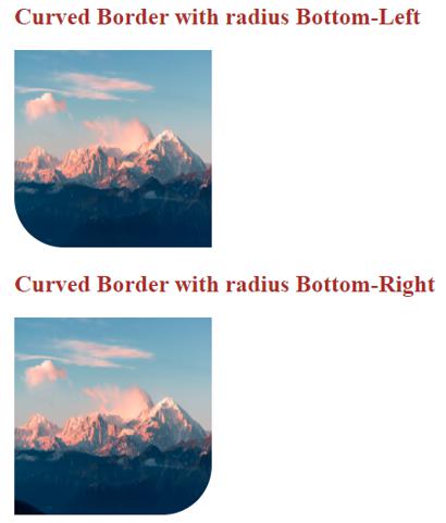
Explanation: In the above code, border-radius applied bottom-left and bottom-right values for images after using the curved radius output above.
Example #5
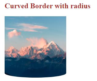
Curved Border with a radius for image:
Code:
<!DOCTYPE html>
<html>
<head>
<title>Curved Border</title>
</head>
<style>
.tl {
height: 200px;
width: 200px;
border-radius: 100%/0 0 30px 30px;
background-color: gray;
}
</style>
<body>
<font color="brown" style=""><h2>Curved Border with radius</h2></font>
<div>
<img src="m1.jpg" class="tl">
</div>
</body>
</html>
Output:
Explanation: In the above code, border-radius is applied for an image after applying the curved radius output.
Recommended Articles
We hope that this EDUCBA information on “CSS Curved Border” was beneficial to you. You can view EDUCBA’s recommended articles for more information.
