Updated June 9, 2023
Introduction to CSS Filter
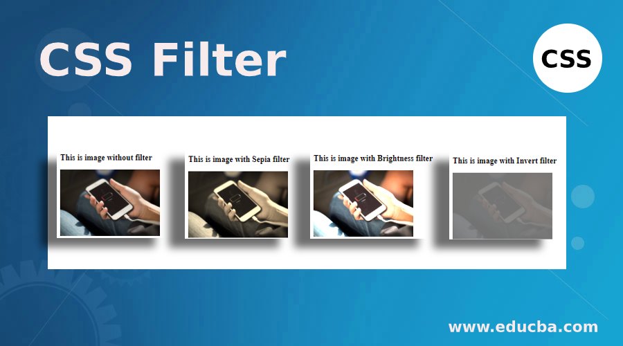
The filter is a feature that is in hand on every application nowadays. Whether on Instagram or Facebook, editing the image and applying filters has become easy. Cascading style sheet also offers a Filter feature to apply graphical effects of choice on a particular element. Various types of filters are available in this property and can be helpful in the rendering of images, backgrounds, or any element. This is a valuable property as we can customize our element through styling, i.e., suppose we need an image displayed on our page in sepia effect. We can edit the image separately and then use the edited image on our page. Or we can use the filter property and customize how the image appears on the page. In this topic, we will learn about CSS Filter; let’s look at how this property works.
CSS Filter Syntax and Working
The syntax for filter property in CSS is as follows:
filter: option (percentage/value)Here, the option can be the choice of filter needed. CSS offers blur, brightness, contrast, hue-rotate, invert, drop-shadow, opacity, and sepia. Each one of them behaves by their respective names. And the amount of filter needed depends on the value provided and the property. This value can be given in percentages, decimals, pixels, etc. In addition to these filters, this property offers a peculiar feature. Using the parameter url, a developer can call for a feature available in an SVG or XML file.
Let us take a look at some of the examples to understand how CSS filter works.
1. Demonstrating a single filter through external CSS
- For this example, we will create an external CSS file first, and then while coding for the HTML part, we will call the CSS file in our code.
- In the CSS file, we will define several classes with different parameters of filter property, such that they can be used for the same element to see the effects of each filter distinctively.
- The code for the CSS file for the filter property should be like this:
.imgFilter1{
filter: sepia(75%);
}
.imgFilter2{
filter: brightness(200%);
}
.imgFilter3{
filter: invert(0.45);
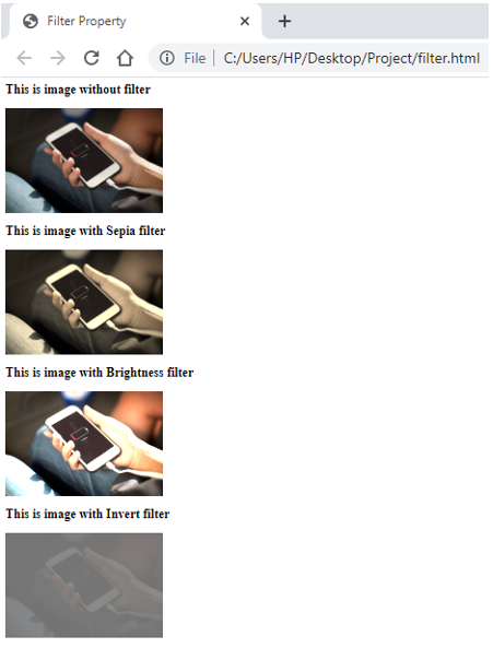
}- Next, we will create an HTML file called the CSS file we created in the previous step. Following this, we will take an image and use different CSS classes to see the effects of filters on the image. The HTML code for this should be as below:
<html>
<head>
<title>Filter Property</title>
<link rel = "stylesheet" href = "filter.css">
</head>
<body>
<h2>This is image without filter</h2>
<img src = "image.jpeg" height="200px" width="300px">
<h2>This is image with Sepia filter</h2>
<img src = "image.jpeg" height="200px" width="300px" class="imgFilter1">
<h2>This is image with Brightness filter</h2>
<img src = "image.jpeg" height="200px" width="300px" class="imgFilter2">
<h2>This is image with Invert filter</h2>
<img src = "image.jpeg" height="200px" width="300px" class="imgFilter3">
</body>
</html>- Save this html file and open it through any browser to get the desired result. The outcome should be like this:
2. Demonstrating multiple filters using External CSS
- Like the previous example, for this example as well, we will use the external CSS file and call it in the HTML code.
- In the CSS code, we will define classes, which we will call the filter property. Instead of defining the filter for just one effect, we will use multiple effects for one filter. The CSS code for the same is as follows:
.imgFilter1{
filter: brightness(100%) contrast(60%) blur(50%);
}
.imgFilter2{
filter: drop-shadow(60%) opacity(90%);
}
.imgFilter3{
filter: invert(0.45) sepia(0.60);
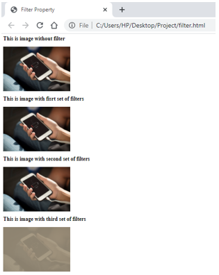
}- Now, we will code for the HTML, where we will call the CSS file first and then use the image element <img> and call all three classes defined in the CSS file. The coding for the HTML should look like this:
<html>
<head>
<title>Filter Property</title>
<link rel = "stylesheet" href = "filter.css">
</head>
<body>
<h2>This is image without filter</h2>
<img src = "image.jpeg" height="200px" width="300px">
<h2>This is image with fisrt set of filters</h2>
<img src = "image.jpeg" height="200px" width="300px" class="imgFilter1">
<h2>This is image with second set of filters</h2>
<img src = "image.jpeg" height="200px" width="300px" class="imgFilter2">
<h2>This is image with third set of filters</h2>
<img src = "image.jpeg" height="200px" width="300px" class="imgFilter3">
</body>
</html>- To get the output, save and open the file through the browser. The output should be like this:
3. Demonstrating CSS filter using inline CSS
- We will directly code for the HTML file since we are using Internal CSS for this example.
- We will include the styling within the Style tag, which will be included in the page’s head section. We can define the filter we want for the image (or any other element). The style tag will look like this:
<style>
img{
filter: grayscale(100%) ;
}
h2{
font-style: italic;
background-color: darkolivegreen;
}
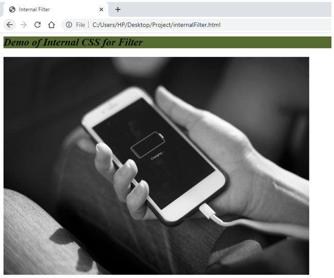
</style>- Now, we will code for the HTML body where we will include the image element, i.e., <img>, to demonstrate the grayscale filter. The final code for the HTML page will look like this:
<html>
<head>
<title>Internal Filter</title>
<style>
img{
filter: grayscale(100%) ;
}
h2{
font-style: italic;
background-color: darkolivegreen;
}
</style>
</head>
<body>
<h2>Demo of Internal CSS for Filter</h2>
<img src = "image.jpeg" height="500px" width="700px">
</body>
</html>- Save this file and open it in a browser to get the following output:
In the examples above, we demonstrated some basic uses of CSS filters. However, this property has a wider scope and can be used with other elements. Also, one can try combinations other than those in the example. Please note, if you want to try the filter with url, you will have to know the basics of the SVG file or XML file and then call it through the CSS filter to implement that. Nevertheless, try to utilize this feature in your code and see how it works wonders for the presentations! Of course, the more presentable your output is, the better the number of audiences it will get.
Recommended Articles
We hope that this EDUCBA information on “CSS Filter” was beneficial to you. You can view EDUCBA’s recommended articles for more information.


