Updated June 14, 2023
Introduction to CSS flex-direction
CSS flex-direction property defines how the flex items are placed or ordered in the flex container or in other ways it specifies the direct path of the flexible items inside the container. This flex-direction property has no impact if flex items are not defined. Also, they are the sub-property of Flexible Box Layout. And their directions are specified from left to right and from top to bottom.
Syntax:
The general syntax of the flex direction is very simple, and let’s see with the possible choice of values.
..flex-container
{
Flex-direction : values;
}
Flex-direction : row |column | row-reverse | column-reverse
How does the flex-direction Property work in CSS?
The initial step is to create a flexbox layout again to create a flex container. To establish it, we have to set the display property of CSS to flex. Flex are
the children of a flex container mounted along with a main and cross-axis level.
Therefore, the simple container looks like this:
We can place it if we need text to include in the container. Throughout the article, we will use the term main-axis, which means they are the primary axis where the flexbox is laid.
1. So, the initial step is to create a flexbox.
And the code goes on like this :
.container
{
Display : flex;
}
2. The Next Step is to create a flex-direction that helps add elements.
Flex direction: row ;You can arrange flex items in various ways, as follows:
a. Flex-row: This is the default value, and all the items are placed along the main axis. The direction text is laid out in a line. The main start and endpoint are the same as the direction content. It means positioning the flex items horizontally by which the items flow into a row.
Flex-direction : row ;b. Flex-column: To have a vertical orientation column is preferred. The cross-axis determines the order of the flexbox items.
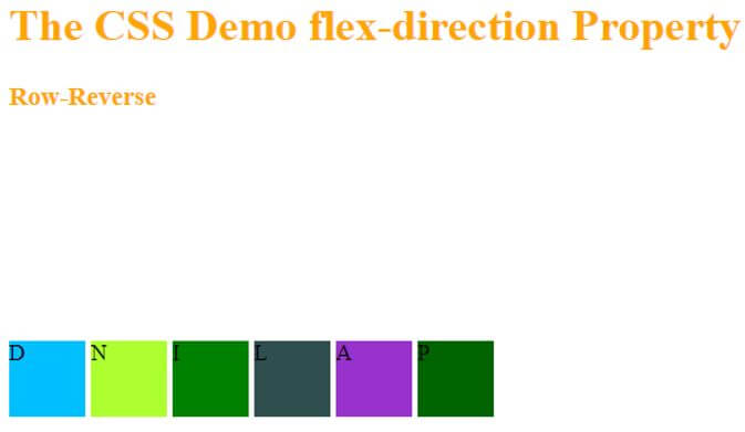
Flex-direction : column;c. Flex-row-reverse: The flex items are ordered oppositely along the main axis.
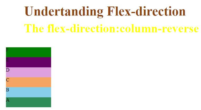
Flex-direction : row-reverse;d. Flex- column reverse: It makes the row as a column and makes to bottom-up strategy.
Flex-direction : column-reverse;We can also align flex items to either justify the end or center the content. Moreover, you can achieve item wrapping by incorporating the directions and wrap properties into a flex-flow module, allowing for more precise control.
Examples of CSS flex-direction
Given below are the example to view the usage of property values:
Example #1
CSS Flex – direction property using row values.
Code:
<!DOCTYPE html>
<html>
<head>
<style>
#fix {
width: 300px;
height: 300px;
border: 2px semi-solid light brown;
display: flex;
flex-direction: row;
}
#fix div {
width: 50px;
height: 50px;
}
</style>
</head>
<body>
<h1>The CSS Demo flex-direction Property</h1>
<div id="fix">
<div style="background-color:DarkGreen;">C</div>
<div style="background-color:DarkOrchid;">C++</div>
<div style="background-color:DarkSlateGray;">Java</div>
<div style="background-color:Green;">Python</div>
<div style="background-color:GreenYellow;">R-Lang</div>
<div style="background-color:DeepSkyBlue;">PHP</div>
</div>
</body>
</html>
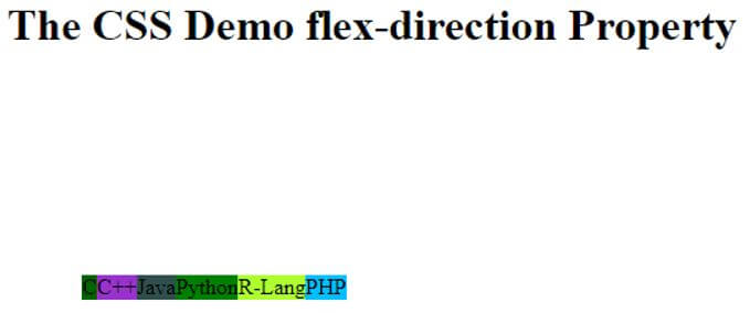
Here we have a container div containing six flex items specified in class items, and their width and height are 50px, and each is differentiated with each color. And the border here helps to distinguish between flex and the containers.
Output:
You can utilize the center justify and align properties to achieve this direction. Adding a few lines to the above code will accomplish this.
Code:
#fix {
width: 300px;
height: 300px;
border: 2px semi-solid light brown;
display: flex;
flex-direction: row;
align-items: center;
justify-content: center;
}
And now the output looks like this:
Example #2
Using column value.
Code:
<!doctype html>
<title>Example on Flex</title>
<style>
.box {
display: flex;
}
.flex1 {
background: orangered;
display: flex;
flex-direction: column;
}
.flex2 {
background: red;
}
.flex3 {
background: steelblue;
}
.box div {
font-size: 4vw;
padding: 0.4em;
color:  yellowgreen;
flex: 2;
}
h1
{ color: purple; }
</style>
<h1> Flex direction using Column </h1>
<div class="box">
<div class="flex1">title
<div class="flex2">head</div>
<div class="flex3">body</div>
</div>
<div class="flex2">content</div>
<div class="flex3">header</div>
</div>
</body>
</html>
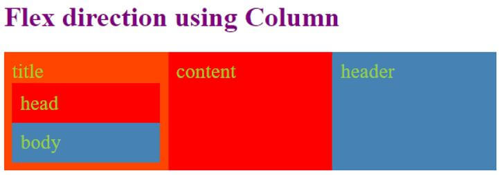
In the above code, we have applied flex to both containers. But with the flex1 container, we have used their direction to the column, making the flex items stack vertically. And the default – Keeping the value set to row aligns the other flex items horizontally.
Output:
Example #3
Example of flex-direction using ‘row-reverse’.
Code:
<!DOCTYPE html>
<html>
<head>
<style>
#rev {
width: 350px;
height: 350px;
border: 1px semi-solid light green;
display: flex;
flex-direction: row-reverse;
align-items: center;
justify-content: space-between;
}
#rev div {
width: 55px;
height: 55px;
}
h3,h1{ color : Orange;
}
</style>
</head>
<body>
<h1>The CSS Demo flex-direction Property</h1>
<h3> Row-Reverse </h3>
<div id="rev">
<div style="background-color:DarkGreen;">P</div>
<div style="background-color:DarkOrchid;">A</div>
<div style="background-color:DarkSlateGray;">L</div>
<div style="background-color:Green;">I</div>
<div style="background-color:GreenYellow;">N</div>
<div style="background-color:DeepSkyBlue;">D</div>
</div>
</body>
</html>
Output:
Example #4
Example of flex-direction using ‘column-reverse’.
Code:
<!DOCTYPE html>
<head>
<title> Demo on flex-direction property</title>
<style>
#value {
width: 300px;
height: 200px;
border: 1px semi-solid black;
display: flex;
flex-direction: column-reverse;
}
#value div {
width: 150px;
height: 100px;
}
h1 {
color: SaddleBrown;
font-size: 44px;
margin-left: 60px;
}
h3 {   color : yellow;
font-size: 40px;
margin-top: -22px;
margin-left: 60px;
}
</style>
</head>
<body>
<h1>Undertanding Flex-direction</h1>
<h3>The flex-direction:column-reverse</h3>
<div id="value">
<div style="background-color:SeaGreen;">A</div>
<div style="background-color:SkyBlue;">B</div>
<div style="background-color:SandyBrown;">C</div>
<div style="background-color:Plum;">D</div>
<div style="background-color:#660066;">E</div>
<div style="background-color:green;">F</div>
</div>
</body>
</html>
Output:
Example #5
By using the DOM Style Property, you can embed flex items.
Code:
<!DOCTYPE html>
<html>
<head>
<style>
#pic {
box-shadow: 0 0 1 4px Teal;
display: flex;
flex-direction: column-reverse;
}
#pic div {
margin: auto;
border: solid green;
}
</style>
<script>
function change1() {
document.getElementById("pic").style.flexDirection="row-reverse";
document.getElementById("examp").innerHTML="The flex direction is assigned to row-reverse";
}
</script>
</head>
<body>
<div id="pic">
<div>1a  <img src="sketch.png"></div>
<div>2b  <img src="edu.jpg"></div>
<div>3c  <img src="background.jpg"></div>
<div>4d  <img src="floral1.png"></div>
</div>
<p>Press the button to change the axis</p>
<button onclick="change1()">Show Flex Direction</button>
<p id="examp"></p>
</body>
</html>
When you press the button, the grid layout arranges the images and changes the axis. Initially, the flexbox sets the axis as column-reverse. However, when you press the change button, it updates the style to row-reverse.
Output:
Conclusion
As we all know, CSS is becoming stronger in making a layout or display layout. It covers the Flex-direction property, which could render elements in various order. Still, more experiments are being done to expand the flexbox web world.
Recommended Articles
We hope that this EDUCBA information on “CSS flex-direction” was beneficial to you. You can view EDUCBA’s recommended articles for more information.


