Updated June 29, 2023
Introduction to CSS Masking
CSS Masking masks images or elements by completely hiding them or making certain portions of the image invisible, using various levels of opacity. In CSS, you can achieve masking by using the mask-image property, which applies a mask to the text content and background. Masking is a graphical operation that conceals a specific part of an image, allowing the background to show through the mask. It applies to both HTML and SVG images, as well as elements with multiple layers.
Syntax:
The General syntax is as follows:
With this CSS, the mask is find using #mask Id.
mask-image: <mask-reference>Where mask – reference is img or mask source, the # tag states any number of mask references separated by a comma. Multiple images follow the Stack property rule.
How Does Masking Work in CSS?
You can use a masked image to apply a color blur or mask the properties of an element by utilizing the filter. This Masking partially conceals the visual elements. Files like PNG, CSS gradient and a few SVG utilize masking to hide specific parts of an image or another element on the page. The CSS mask property achieves this masking effect.
This masking technique makes web design interesting and flexible, eliminating the need for manual image alterations when creating new ones. We use a few properties here, like mask image, mask mode, mask repeat, mask position, mask clip, mask origin, and mask size. So this mask is applied either to an entire element or sometimes excluding border padding.
1. mask-image Property: This sets a layer in the image element by setting this with a URL value. So this can be referenced as a path of the image file to be masked. We need an image link file that is going to be masked. Any number of mask image layers can be added, and commas separate it. Example: The below example references the PNG file.
masked-element {
mask-image: url(pic.png);
}
We need two URL values to set more than one mask image layer. Here, we observe the process of combining two masks.
.double mask {
mask-image: url(pic.png),url(pic.png);
}
Next, using Gradient-image, which is well suited for this property
. masked-element {
mask-image: linear-gradient (black 0%, white 0%,transparent 100%);
}
2. mask-size: This sets the pixel value over here. This is an important case to create the effect.
3. mask-repeat: This has different effects like space, round to spread across the area. This has only one mask with it.
Types of CSS Masking
There are two types of masks. They are:
- luminance
- alpha
Luminance Masking: In this type, an image is transformed into a Grayscale type. If a portion of a mask is lighter, the more of the mask is visible. Black indicates Full Transparent, and Gray specifies partial transparency.
Alpha Masking: Alpha is the Default mask. This is the same as Luminance Masking except in the Opaque portion of an element. In both cases, Transparency matters.
Examples to Implement CSS Masking
In this section, we shall discuss how to show CSS masking capabilities. Using the Chrome browser is highly recommended.
Example #1
Demo showing an example for Gradient along with text masking
mas.css
body {
color: yellow;
font-size: 1.2em;
font-family: 'calibri', Helvetica, Arial, sans-serif;
}
p {
padding: 1.2em;
color: white;
}
.advent {
margin: 21px auto;
max-width: 660px;
height: 300px;
margin: 32px auto;
overflow-y: scroll;
background: url(floral1.png) no-repeat;
-webkit-mask-image: linear-gradient(black, transparent);
mask-image: linear-gradient (black, transparent);
}
Code:
<html>
<head>
<link rel="stylesheet" href="mas.css">
</head>
<body>
<div class="advent">
<p>
Russia has natural beauty on nature which has a list of travel destinations around them. They too celebrate a nature protection day. Russia has majestic lakes, mountains and rivers.
</p>
<p>
Russia has natural beauty on nature which has a list of travel destinations around them. They too celebrate a nature protection day. Russia has majestic lakes, mountains and rivers.
<p>
Russia has natural beauty on nature which has a list of travel destinations around them. They too celebrate a nature protection day. Russia has majestic lakes , mountains and rivers.
</p>
<p>
Russia has natural beauty on nature which has a list of travel destinations around them.They too celebrate a nature protection day. Russia has majestic lakes , mountains and rivers.
</p>
</div>
</body>
</html>
Output:
Example #2
Masking with the help of borders.
Code:
<html>
<head>
<link rel="stylesheet" href="mas.css">
</head>
<body>
HTML CSSResult
EDIT ON
<img src="https://www.lifeinnorway.net/wp-content/uploads/2019/01/green-capital-city-oslo.jpg" alt="" class="normask" />
<img src="https://www.lifeinnorway.net/wp-content/uploads/2019/01/green-capital-city-oslo.jpg" alt="" class="bordmask" />
</body>
</html>
mas.css
img {
width: 300px;
margin: 30px;
}
.normask {
mask: url("floral1.png");
}
.bordmask {
-webkit-mask-box-image: url("floral1.png") 20 repeat;
mask-border: url("floral1.png") 20 repeat;
}
body {
transform-origin: top right;
transform: scale(0.8);
white-space: nowrap;
overflow: hidden;
}
The left side is the original image. The right side shows how the two images masked.
Output:
Example #3
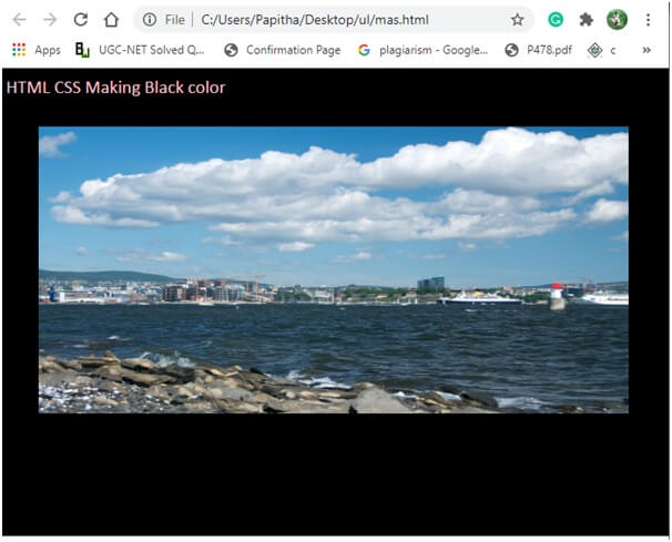
This implementation shows applying a mask to an image. The mask used here is alpha. The image fills the black area.
Code:
body {
background-color: black;
color: pink;
font-size: 1.2em;
font-family: 'Calibri', Helvetica, Arial, sans-serif;
}
img {
margin: 30px auto;
display: block;
width: 90%;
height: 300px;
-webkit-mask-image: url(https://images.pexels.com/photos/1040499/pexels-photo-1040499.jpeg?auto=compress&cs=tinysrgb&dpr=2&h=650&w=940);
mask-image: url(https://images.pexels.com/photos/1040499/pexels-photo-1040499.jpeg?auto=compress&cs=tinysrgb&dpr=2&h=650&w=940);
-webkit-mask-position: centercenter;
mask-position: centercenter;
-webkit-mask-repeat: no-repeat;
mask-repeat: no-repeat;
}
mask2.html
<html>
<head>
<link rel="stylesheet" href="mas.css">
</head>
<body>
HTML CSS Making Black color
<img src="https://www.fjords.com/wp-content/uploads/2019/05/DSC_4937-2000x1200.jpg" alt="">
</body>
</html>
Output:
Example #4
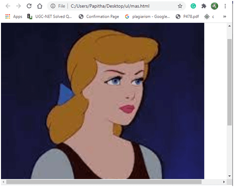
Image Stretches using a mask.
ppp.html
<html>
<head>
<link rel="stylesheet" href="mas.css">
</head>
<body>
<h1> CSS MASK demo </h1>
<div class="stretch">
<div class="exmask">
<span class="title">CSS MASK demo</span>
</div>
</div>
<div class="para"></div>
</body>
</html>
mas.css
body {
width:100%;
margin:0;
}
.stretch {
width: 90%;
height:100vh;
background: url("cind.png");
background-size: cover;
position: absolute;
}
.para {
width: 110%;
height: 150vh;
}
.title {
font-family: Impact, 'Arial Narrow Bold', sans-serif;
font-size: 300px;
color: white;
position: fixed;
top:21vh;
width:100%;
text-align: center;
text-shadow: 2px 2px 12px rgba(0,0.1,0,0.1);
}
.exmask {
mask:url("sketch.png");
mask-size: cover;
-webkit-mask:url("sketch.png");
-webkit-mask-size:cover;
width:100%;
height:100%;
}
Output:
Conclusion
Coming to the final thoughts, this article has covered approaches to masking objects in CSS and depends on the purpose. Also, we have seen their properties and demo of them. And when building masks, their border property and multiple backgrounds have the power.
Recommended Articles
We hope that this EDUCBA information on “CSS Masking” was beneficial to you. You can view EDUCBA’s recommended articles for more information.


