Updated June 29, 2023
Introduction to CSS Matrix
The CSS function matrix() describes a homogeneous matrix for 2D transformation. The function would be used to integrate all of these transformations into one. It is like transform shorthand, i.e., it can integrate a group of transforms into a single declaration matrix. The designers can place and structure their transformations exactly wherever they want with the matrix() function.
The transform property converts an element’s coordinate system, transforming the element in space. A transformed item does not impact the surrounding elements but may overlap them, much like the elements in an absolute position. With the transform function, we can perform simple transform manipulations on elements in a two-dimensional space, such as moving, rotating, scaling, and skewing.
How Does Matrix Work in CSS?
The matrix() function merges two transforms into one matrix. The working of the matrix() function can be defined with six values as shown below:
matrix (a, b, c, d, tx, ty)- a, b, c, d: These are the linear transformation defined in < number >s.
- tx: This parameter specifies linear x-axis translations.
- ty: This parameter specifies linear y-axis translations.
Examples to Implement CSS Matrix
Below are the examples of CSS Matrix:
Example #1
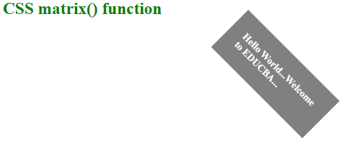
In this example, .matrix_class displays matrix elements using the transform property. It includes all the CSS styles for the matrix element.
Code:
<!DOCTYPE html>
<html lang="en">
<head>
<meta charset="utf-8">
<title> CSS Matrix Example </title>
<style>
h2 {
color: green;
}
.matrix_class {
transform-origin: 0 0;
transform: matrix(0.5, 0.5, -0.5, 0.5, 350, -50);
font-size: 20px;
font-weight: bold;
width: 200px;
padding: 30px;
background: grey;
color: white;
}
</style>
</head>
<body>
<h2>CSS matrix() function</h2><br>
<div class="matrix_class">
Hello World...Welcome to EDUCBA...
</div>
</body>
</html>
Output:
Example #2
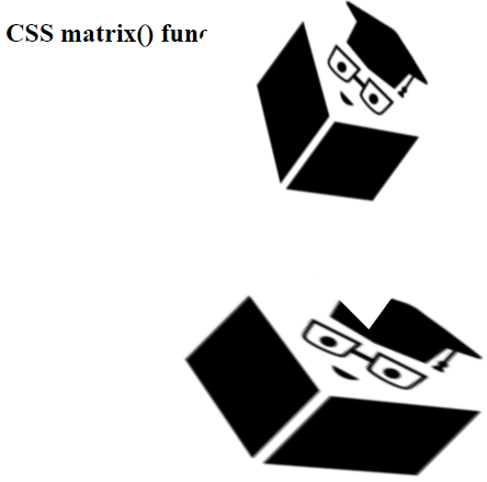
In the example, we have used two classes, i.e., matrix_class and skew_class. The skew() function transforms an element in a 2D plane, which means we can pick a point and push or pull it in diverse directions.
Code:
<!DOCTYPE html>
<html lang="en">
<head>
<meta charset="utf-8">
<title> CSS Matrix Example </title>
<style>
.matrix_class {
transform: matrix(2, 1, -1, 1, 200, 150);
}
.skew_class {
transform-origin: right;
transform: skew(-0.10turn, 45deg);
}
</style>
</head>
<body>
<h2>CSS matrix() function</h2><br><br>
<img class="matrix_class" src="https://media-exp1.licdn.com/dms/image/C4E0BAQG1578pP8Uvpg/company-logo_200_200/0?e=2159024400&v=beta&t=YN5_sse_NcqIhGzgShohlvBokFuuQ8oXpLNct9bLNA4" alt="logo">
<img class="skew_class" src="https://media-exp1.licdn.com/dms/image/C4E0BAQG1578pP8Uvpg/company-logo_200_200/0?e=2159024400&v=beta&t=YN5_sse_NcqIhGzgShohlvBokFuuQ8oXpLNct9bLNA4" alt="logo">
</body>
</html>
Output:
Example #3
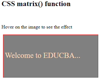
In the example, matrix translation (1, 0, 0, 1, 150, 50) translates the element when the user hovers the mouse on the element.
Code:
<!DOCTYPE html>
<html lang="en">
<head>
<meta charset="utf-8">
<title> CSS Matrix Example </title>
<style>
div{
width:300px;
height:130px;
color:#FFDAB9;
background:grey;
margin:5px;
border:1px solid red;
transition-duration:2s;
padding:5px;
-webkit-transition-duration:3s;
line-height:5em;
font-size:25px;
}
.matrix_class:hover{
transform:matrix(1, 0, 0, 1, 150, 50);
-ms-transform:matrix(1, 0, 0, 1, 200, 30); /* It is is used for internet explorer 9*/
-webkit-transform:matrix(1, 0, 0, 1, 150, 50); /* It is used for Safari and Chrome */
}
</style>
</head>
<body>
<h2>CSS matrix() function</h2><br>
<p>Hover on the image to see the effect</p>
<div class="matrix_class"> Welcome to EDUCBA... </div><br>
</body>
</html>
Output:
Example #4
In the example, we are using the matrix for flipping the elements. The matrix (-1, 0, 0, 1, 1, 1) is used to flip the image when the user hovers on it.
Code:
<!DOCTYPE html>
<html lang="en">
<head>
<meta charset="utf-8">
<title> CSS Matrix Example </title>
<style>
img{
box-shadow:3px 3px 3px #F0E68C;
width:250px;
margin:5px;
transition-duration:3s;
-webkit-transition-duration:3s;
}
#matrix_img:hover{
transform:matrix(-1, 0, 0, 1, 1, 1);
-ms-transform:matrix(-1, 0, 0, 1, 1, 1); /* It is is used for internet explorer 9 */
-webkit-transform:matrix(-1, 0, 0, 1, 1, 1); /* It is used for Safari and Chrome */
}
</style>
</head>
<body>
<h2>CSS matrix() function</h2><br>
<p> Hover on the image to see the effect </p>
<img class="matrix_class" src="https://media-exp1.licdn.com/dms/image/C4E0BAQG1578pP8Uvpg/company-logo_200_200/0?e=2159024400&v=beta&t=YN5_sse_NcqIhGzgShohlvBokFuuQ8oXpLNct9bLNA4" alt="logo" id="matrix_img">
</body>
</html>
Output:
Example #5
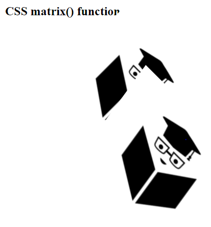
In the example, we have used two classes, i.e., matrix_class and skew_class. The skew() function transforms an element in a 2D plane, where we push or pull it in diverse directions with 45 degrees, as specified in the above code. The transform origin specifies the point at which the element stacks to be transformed. Here, it nails the element at the left side.
Code:
<!DOCTYPE html>
<html lang="en">
<head>
<meta charset="utf-8">
<title> CSS Matrix Example </title>
<style>
.matrix_class {
transform: matrix(0.9, 0.9, -0.8, 0.8, 150, -50);
}
.skew_class {
transform-origin: left;
transform: skew(-0.10turn, 45deg);
}
</style>
</head>
<body>
<h2>CSS matrix() function</h2><br><br><br><br>
<img class="matrix_class" src="https://media-exp1.licdn.com/dms/image/C4E0BAQG1578pP8Uvpg/company-logo_200_200/0?e=2159024400&v=beta&t=YN5_sse_NcqIhGzgShohlvBokFuuQ8oXpLNct9bLNA4" alt="logo">
<img class="skew_class" src="https://media-exp1.licdn.com/dms/image/C4E0BAQG1578pP8Uvpg/company-logo_200_200/0?e=2159024400&v=beta&t=YN5_sse_NcqIhGzgShohlvBokFuuQ8oXpLNct9bLNA4" alt="logo">
</body>
</html>
Output:
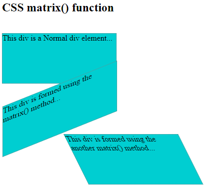
Example #6
Code:
<!DOCTYPE html>
<html lang="en">
<head>
<meta charset="utf-8">
<title> CSS Matrix Example </title>
<style>
div {
width: 230px;
height: 100px;
background-color: #00CED1;
border: 1px dotted grey;
}
div#matrix_class {
-ms-transform: matrix(1, -0.4, 0, 1, 1, 0); /* It is is used for internet explorer 9 */
-webkit-transform: matrix(1, -0.4, 0, 1, 1, 0); /* It is is used for Safari */
transform: matrix(1, -0.4, 0, 1, 1, 0); /* This is standard syntax */
}
div#matrix_class1 {
-ms-transform: matrix(1, 1, 0.5, 1, 120, 0); /* It is is used for internet explorer 9 */
-webkit-transform: matrix(1, 0, 0.5, 1, 150, 0); /* It is is used for Safari */
transform: matrix(1, 0, 0.5, 1, 150, 0); /* This is standard syntax */
}
</style>
</head>
<body>
<h2> CSS matrix() function </h2><br>
<div>
This div is a Normal div element...
</div>
<div id="matrix_class">
This div is formed using the matrix() method...
</div>
<div id="matrix_class1">
This div is formed using the another matrix() method...
</div>
</body>
</html>
Output:
Conclusion
This article presents an overview of CSS transforms and describes how they can be replaced with a single CSS matrix transform. It demonstrates where the numbers originate from in matrix CSS, the outcome of matrix multiplication. The transform is a transition in an object’s shape or size. The designers can scale, skew, rotate, or translate the object.
Recommended Articles
We hope that this EDUCBA information on the “CSS Matrix” was beneficial to you. You can view EDUCBA’s recommended articles for more information.
