Updated May 12, 2023

Introduction to CSS skew()
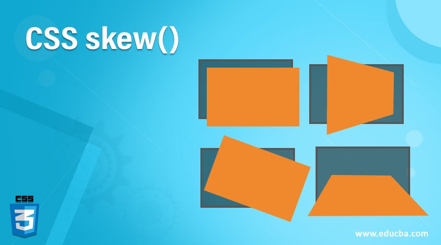
CSS skew() function is defined as the Transform property of CSS3 with a built-in function that allows skewing an element in the 2-dimensional Plane with some parameters; it picks a point in any axis and pulls it in different directions (it tilts an aspect). In other terms, skew or shear transformation allows changing the appearance of an element by tilting it (changing or bending the respective element with the x and y-axis). This CSS3 Transform uses a 4 * 4 matrix for representation. This skew() drags its line alone any side to distort an element.
Syntax
The syntax goes well like this since there is no specific declaration on the directions. The general syntax is given below :
skew(ax, ay)With Transform Property the Syntax looks like:
Transform: skew (<angle degree> [, <angle>]?);For example, if the sample is like this:
.class
{skew(-45 deg, 20 deg);
}
So this statement says it skews the element -45 degrees horizontally, which is the x-axis angle, and 20 degrees vertically along the Y-axis in the plane.
The Skew() function takes two angle values as arguments, ax and ay. The default value for ax is set for the Y-axis, and if no value is provided, it is assumed to be zero. This 2D skew effect distorts an element in either direction, with the distance value calculated in degrees. Other measurements such as percentages and pixels are not used in this calculation.
- Ax: This parameter skews the element along X-axis means along the sides.
- Ay: This parameter skews the element along Y-axis points vertically in the opposite direction.
The Skew() function assigns values in degrees, with positive values shifting the element to the left and negative values shifting it to the right. This function allows for tilting of an original image through skewing. It looks like a mirror image in the background.
How does the skew() method work in CSS?
So far, in the previous articles, we have seen the concept of CSS, which allows applying text color, etc. And CSS also has transformed a collection of functions that helps to shape an element. One type of transformation Property is skew(). This skew() process helps in tilting a given text or a feature concerning some degree. There are two axis X and Y-axis. Here Skew X is the default, and skewY is set to Y-axis with some degree given. To skew in both directions, we must use the skewX \() and skewY() functions in the transform property.
| Sr. no | Skew function Example | Description |
| 1. | Transform: skewY(-20deg); | Tilt the value in the negative Y-direction. |
| 2. | Transform: skewX(-20deg); | Tilt the value in the positive X-direction. |
| 3. | Transform: skew (30deg, 30deg); | It tilts in both directions. It says the first value represents ‘x’ value, and the second value represents ‘ Y-axis’. |
| 4. | Transform: skew(45deg); | Here we have one value, so it is considered as x- value, and y-value is set to default zero |
Note: skew() function can take negative and more significant values with the angle degree. The critical thing to be noted is if it is set to 90 degrees, an element vanishes its appearance as its two parallel sides touch together and become an extended image. And 190 deg and 10 deg are of same. The value greater than 90 deg less than 180 deg appears as a mirror image.
Examples to Implement CSS Skew ()
In this section, we shall see this function examples.
Example #1
See, I have tilted the element negatively using the property Transform in this example.
Code:
<!DOCTYPE html>
<html>
<head>
<style>
.original_pic {
transform: translate(10px, 12%);
}
.after_skew {
transform-origin: top right;
transform: skew(-0.11turn, 30deg);
}
</style>
</head>
<body>
<h1>Top - Courses</h1>
<img class="original_pic" src="pythonimg.png" alt="Python">
<img class="after_skew" src="sas-img.png" alt="Sas- web">
</body>
</html>
Output:
Example #2 – Rotation with the skew
a)new.html
<html>
<section class="content">
<div class="bgm">
<h1> <b>Check this Page with lot of Fun Games!!!</b></h1>
<p>If You are interested join us in all adventures. Free to play with no limits.</p>
</div>
</section>
</html>
b)new.css
content {
background-image: linear-gradient(150deg, yellow, red);
padding: 6rem;
transform: rotate(-6deg) skew(-6deg);
margin-top: 6rem;
}
.bgm {
transform: skew(6deg);
}
Output:
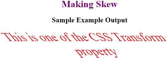
Example #3 – Skewing a text
<!DOCTYPE html>
<html>
<head>
<title> skew()function with text</title>
<style>
body {
text-align:center;
}
h1 {
color:purple;
}
.Text {
font-size:40px;
font-weight:italic;
color:red;
transform: skew(40deg);
}
</style>
</head>
<body>
<h1> Making Skew</h1>
<h2> Sample Example Output</h2>
<div class="Text">This is one of the CSS Transform property</div>
</body>
</html>
Output:
Example #4 – Skew on one side- with Pseudo Elements
a)oneside.css
a {
color: yellow;
}
.oneside {
position: absolute;
width: 130px;
padding: 12px 30px 12px 12px;
font-size: 15px;
position: relative;
color: #e300ff;
background: #00ff00;
}
.oneside:after {
content: " ";
position: absolute;
display: block;
width: 120%;
height: 120%;
top: 1;
left: 1;
z-index: -1;
background: #FF0000;
transform-origin: left bottom;
-ms-transform: skew(-35deg, 0deg);
-webkit-transform: skew(-35deg, 0deg);
transform: skew(-35deg, 0deg);
}
b)oneside.html
<html>
<div class="oneside">
<a href="#">Scandivian Country</a>
</div>
</html>
Output:
Conclusion
So, this is all about the CSS transform skew function. Web developers can use the Skew() function in CSS to introduce angled designs without adding unnecessary whitespace. This function is a useful trick that allows developers to achieve a desired design effect while maintaining the integrity of the page layout. And, of course, this CSS Skew() function has some exciting and cool stuff to work with.
Recommended Articles
We hope that this EDUCBA information on “ReactJs Interview Questions” was beneficial to you. You can view EDUCBA’s recommended articles for more information.


