Updated June 22, 2023

Introduction to CSS translate() Function
CSS is a style sheet language that describes HTML elements to display on a screen or in other media, and it stands for cascading style sheet. CSS can control your document’s style –page layouts, colors, fonts, etc of web pages. This article discusses CSS translate, which is included in CSS transform, a powerful transformation property characterized by a two-dimensional vector. The coordinates allow you to know how many elements can move in each direction, and there are other functions like scale, rotate, skew, or translate HTML elements. The most commonly used function is CSS translate() which is the function that helps move HTML elements.
Working of CSS translate() Function
This CSS translate() function, as discussed above, is a function used for aligning the elements in different directions ( horizontally and vertically or up and down), and it outputs a <transform – function> data type. This function can have three axes, namely x, y, and z, which can be declared independently or two-axis with 2D or 3 axes with 3D.
Let us see the syntax for the single-axis and its example:
Syntax :
translate(translation value x)The above defines the values for only the x-axis.
or
translate(translation value y)The above defines the values for only the y-axis.
or
translate(translation value z)We use the above when using a 3D version and defining solely for the z-axis.
Examples to Implement of CSS translate() Function
Below are the examples of CSS translate() Functions:
Example #1
Code:
<!DOCTYPE html>
<html>
<head>
<Title> Educba Training </Title>
<style>
div {
width: 300px;
height: 100px;
background-color: red;
border: 1px solid black;
transform: translate(50px);
}
</style>
</head>
<body>
<h1>The CSS translate() function</h1>
<div>
This is Educba training with CSS translate() function.
</div>
</body>
</html>
Output:
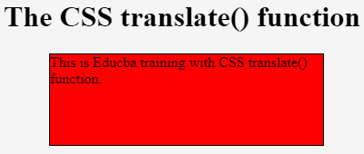
In the above example, the CSS code is for a single axis. In the above, we have observed that the translate() function declares only 50 px, which by default takes the x-axis and moves to the right side of the value is positive and to the left side if the value is negative.
Let us see the Syntax for the two-axis and its example:
Syntax:
translate(translation value tx, translation value ty)Parameters:
- tx: This holds the transformation length corresponding to the x-axis.
- ty: This holds the transformation length corresponding to the y-axis. It takes 0 as the default value.
Example #2
Below is an example of two axis
Code:
<!DOCTYPE html>
<html>
<head>
<Title> Educba Training </Title>
<style>
div {
width: 300px;
height: 100px;
background-color: red;
border: 1px solid black;
-ms-transform: translate(50px,100px);
transform: translate(50px,100px);
}
</style>
</head>
<body>
<h1>The CSS translate() function</h1>
<div>
This is Educba training with CSS translate() function.
</div>
</body>
</html>
Output:
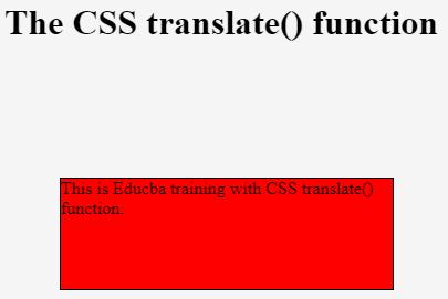
In the above CSS code, we specified the translate function to shift the red box in both the x and y-axis. The translate function in CSS usually moves the element with pixels related to the original position in which the x value is horizontal, and y is vertical. In the above program, we have to shift to 50 pixels on the x-axis, which means the right side and 100 pixels on the y-axis mean 100px down from the current position.
These x-axis and y-axis values would be of any length of pixels. The values usually move right if it’s in the x-axis and is the positive value, whereas if it is negative, it will move to the left. Therefore, for the y-axis, if values are positive, they move down; if the values are negative, they move upwards. This function can move elements in the z-axis also.
There is another function known as the matrix transformation function, which is a function that is used to combine all other transformation functions such as rotate(), skew(), scale(), and translate(). This means the matrix function converts a group of transformation functions into a single matrix.
Example #3
Code:
rotate(75 deg) translate( 50px, 100px)You can represent the 3D version of this translate() function below.
Translate3d(x, y, z)Where in the above has another value similar to x and y, that is, z, which moves the element towards the viewer if the values of z are positive, and if they are negative values, then they move away from the viewer.
This article discusses the transform function in which we are provided four other functions: scale, skew, rotate, and translate. The CSS property is the transform, and the CSS value attached to that property is translate(). Therefore, translate() is the inbuilt function mainly used to align the elements in the HTML layout.
The translation of a single element makes no difference from its origin because it has twice zero as translation values.
Conclusion
In this article, we conclude that the translate() function is a function of the CSS transform function, where the CSS transform function is the property of the CSS, and the translate() function is the value attached to the transform function. This translate() function is a function that allows you to shift or align or move the elements horizontally or vertical or up or downwards. This article shows that the translate() function takes the x-axis as the parameter by default. There are mainly 3-dimensional values provided x, y, and z-axis. People commonly use the 2D translate() function with horizontal and vertical values.
Recommended Articles
We hope that this EDUCBA information on “CSS translate” was beneficial to you. You can view EDUCBA’s recommended articles for more information.


