Introduction to Data Visualization
Data visualization helps handle and analyze complex information using the data visualization tools such as matplotlib, tableau, fusion charts, QlikView, high charts, plotly, D3.js, etc., as these tools help in getting the graphical representation of the data and information in the form of charts, graph, and maps, using this the data visualization designers can easily create the visual representation of the large dataset which in turn helps in making the practical decision by getting insight from the large dataset.
What is Data Visualization?
Numerous data visualization tools exist, such as Tableau, QlikView, FusionCharts, HighCharts, Datawrapper, Ploty, D3.js, etc. Though there are humungous data visualization tools used in day-to-day life in Data visualization, one of the most popular plotting tools is matplot. pyplot.
Reasons why Matplotlib from data visualization tools is the most widely used:
- Matplotlib is one of the essential plotting libraries in Python.
- The developers drew inspiration from the tools available in Matlab when creating the entire plotting module.
- Many people from the areas of Mathematics, Physics, Astronomy, and Statistics, as well as many Engineers and Researchers, are accustomed to using Matlab.
- Matlab is a popular scientific computing toolbox, especially for scientific computing. When individuals began developing Python-specific plotting libraries for machine learning, data science, and artificial intelligence, they drew inspiration from MATLAB and created a library known as matplotlib.
matplotlib.pyplot: matplotlib. pyplot is used widely in creating figures with an area and plotting the lines, and we can visualize the plots attractively.
Examples of Data Visualization Tools
Below are the examples mentioned:
Code:
import matplotlib.pyplot as plt.
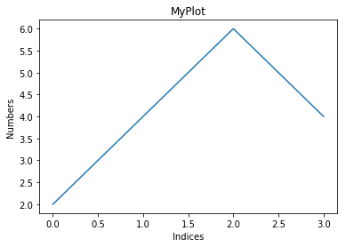
plt.plot([2,4, 6, 4])
The above is a list, plt.plot will plot these list elements of the Y-axis, which is indexed at 0,1,2,3 as their corresponding X-axis.
Code:
plt.ylabel("Numbers")
plt.xlabel('Indices')
If we look at the above 2 lines of code, it labels the Y-axis and X-axis, respectively. (i.e, naming both axis.)
Code:
('MyPlot')The above line of code will give the title to the plot. The title tells us what the plot is all about.
Code:
plt.show()Output:
There is one problem with the above plot(screenshot 1); if you have noticed, we don’t see a grid-like structure. A grid helps you to read the values from the plot much easier. Now let’s see how to get the grid.
Code:
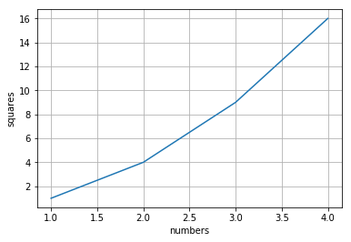
plt.plot([1, 2, 3, 4], [1, 4, 9, 16])Look at the above line of code; instead of giving one array, we have two lists which become our X-axis and Y-axis. Here you can notice is if our x-axis value is 2, its corresponding y-axis value is 4, i.e., y-axis values are the squares of x-axis values.
Code:
plt.ylabel('squares')
plt.xlabel('numbers')
plt.grid() # grid on
The moment you give this, it will give a plot with a grid embedded in it.
Code:
plt.show()Output:
Now instead of a line plot, We plot a different plot with a different example.
Code:
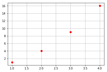
plt.plot([1, 2, 3, 4], [1, 4, 9, 16], ‘ro’)Every X, Y pair has an associated parameter like the color and the shape, which we can give accordingly using the functionality of the Python keyword pair argument.
In this case, ‘ro’ indicates r – red color and o – circle shaped dots.
Code:
plt.grid()
plt.show()
Output:
Let’s say matplot lib works only with the list. Then, we can’t use it widely in the processing of numbers. We can use the NumPy package. Internally, all data is converted to NumPy arrays.
Let’s look slightly at the different plots:
Below are the different plots:
Code:
import numpy as np
t = np.arange(0., 5., 0.2)
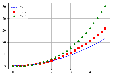
Above line creates values from 0 to 5 with an interval of 0.2.
plt.plot(t, t**2, 'b--', label='^2')#   'rs',   'g^')
plt.plot(t,t**2.2, 'rs', label='^2.2')
plt.plot(t, t**2.5, 'g^', label=‘^2.5')
In the above lines of code, ‘b – – ‘ indicates Blue dashes, ‘rs’ indicates Red squares, and ‘g^’ indicates Green triangles.
Code:
plt.grid()
plt.legend()
The above line of code adds a legends-based online label. Legends make the plot extremely readable.
Code:
plt.show()Output:
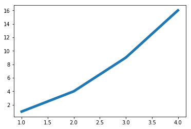
If we want the line width to be more, then a simple parameter called linewidth can do it.
Code:
x = [1, 2, 3, 4]
y = [1, 4, 9, 16]
plt.plot(x, y, linewidth=5.0)
plt.show()
Output:
There are many other various parameters available that you can have in the documentation of the plot function in matplotlib.pyplot(https://matplotlib.org/api/pyplot_api.html).
The other interesting thing is set properties:
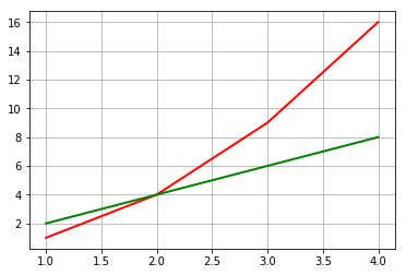
- x1 = [1, 2, 3, 4] y1 = [1, 4, 9, 16]
Y1 values are squares of X1 values.
- x2 = [1, 2, 3, 4] y2 = [2, 4, 6, 8]
Y2 values are just twice of X2 values.
- lines = plt.plot(x1, y1, x2, y2)
Using the above line, we can plot these values in a single line. So what happens here is it will plot X1 vs Y1 and X2 vs Y2, and we are storing these in a variable called lines. Also, we can change the properties of those lines using keyword arguments.
- plt.setp(lines[0], color=’r’, linewidth=2.0)
Here setp is called as set properties, lines[0] corresponding to X1, Y1 respectively, color and linewidth are the arguments. The above line of code utilizes keyword arguments, as shown in screenshot 6.
- plt.setp(lines[1], ‘color’, ‘g’, ‘linewidth’, 2.0)
The above line of code represents the Matlab syntax.
Here lines[1] corresponds to X2, Y2 respectively. We also have two pairs of arguments, ‘colour’,’g’, and ‘linewidth’,’2.0’.
Either way, we can plot the line:
- The first way is the native way of how we use Python.
- People from a Matlab background preferably use the second way.
Code:
plt.grid()
put.show()
Output:
Conclusion
In this data visualization tools post, we have discovered the introduction to visualizing the data in Python. To be more specific, we have seen how to chart data with line plots and how to summarise the relationship between variables with scatter plots.
Recommended Articles
We hope that this EDUCBA information on “Data Visualization Examples” was beneficial to you. You can view EDUCBA’s recommended articles for more information.
