Updated December 19, 2023
Demand Curve in Economics – Definition
A demand curve in economics is a graph that visually represents how a product’s price influences the quantity consumers are willing to buy at that price. It basically shows the relationship between product price and consumer demand at a given time.
The law of demand forms the basis for this curve. This curve typically slopes downwards from left to right on the graph. This means that as the price of a product decreases, the amount demanded by consumers generally increases and vice-versa.
Factors such as changes in consumer taste, preferences, income levels, prices of related products, and economic conditions affect the demand and prices of products.
Table of Contents
- What is it?
- Demand Schedule
- How to Draw it on a Graph?
- Types
- Elasticity
- Shift in Demand Curve
- Factors that Shift the Curve
- Movement along the Demand Curve
- Demand Curve for Monopoly
- Demand Curve in Perfect Competition
- Demand vs. Supply Curve
What is the Demand Schedule?
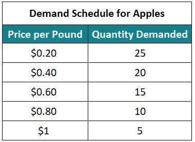
A demand schedule is a table format data showing the quantity of products at various price levels during a specific period. It consists of two columns. The first column represents the prices of a product, and the second column represents the demanded quantity, i.e., the quantity of products the customers will purchase at that price level. Therefore, a demand curve is a graphical presentation of a demand schedule where the curve is plotted against price on the vertical (x) axis and quantity on the horizontal (y) axis.
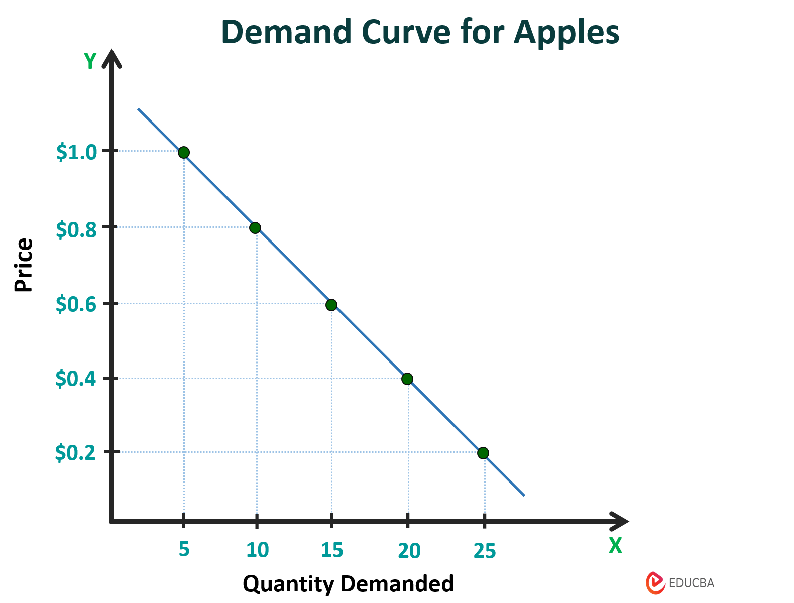
Example: An apple seller sells apples at various prices and has observed a difference in the number of consumers buying at those prices. Based on his observation, he has made a demand schedule table that shows the number of customers willing to purchase apples at each price level.
Demand Curve Example – How to Draw it?
Let’s understand how to draw a demand curve using the following steps.
#1: Make a Demand Schedule
You can create a demand schedule that provides information on the quantity of a product demanded at different price points.
Let’s take the above data of the demand schedule to a curve.
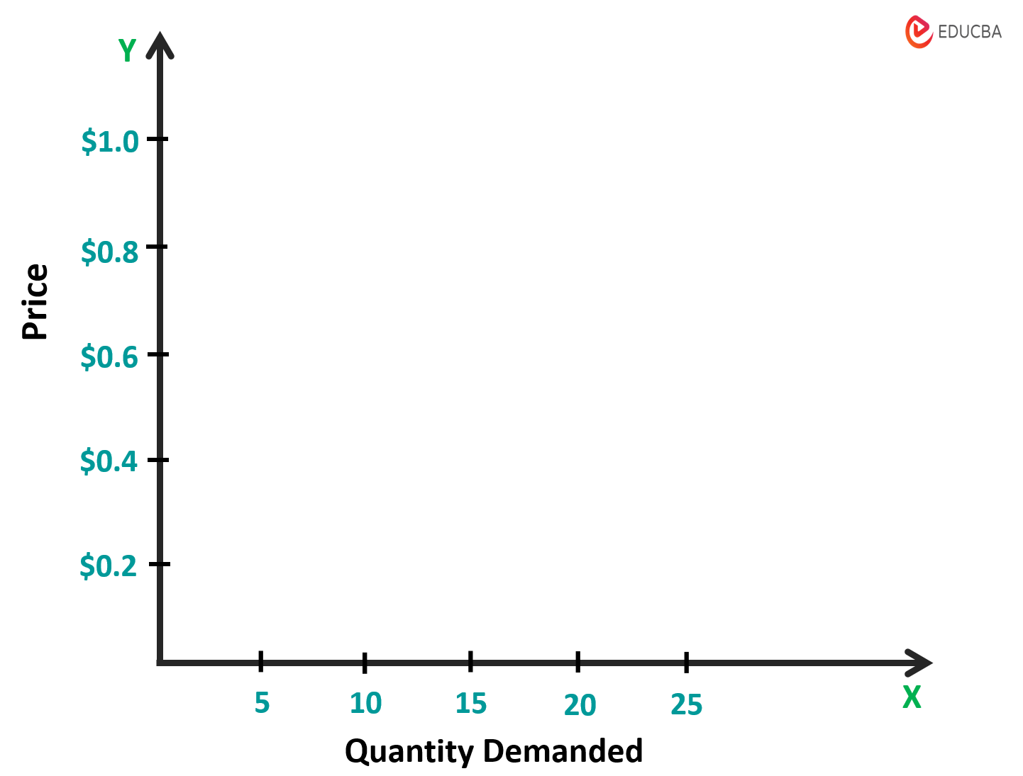
#2: Draw X and Y axes
Draw a vertical line (y-axis) and label it as “Price” and a horizontal line (x-axis) and mark it as “Quantity Demanded”. On the x-axis, start from the lowest quantity at the left end and move to the highest quantity at the right end of the line. Similarly, on the y-axis, begin with the lowest price at the 0 intersection and continue till the highest price.
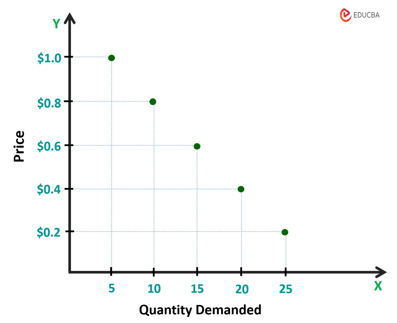
#3: Plot the Points
Now, plot all the points from the demand schedule table. Suppose for $0.2, the quantity demanded is 25, then mark a point where the $0.2 on the y-axis intersects with the 25 on the x-axis.
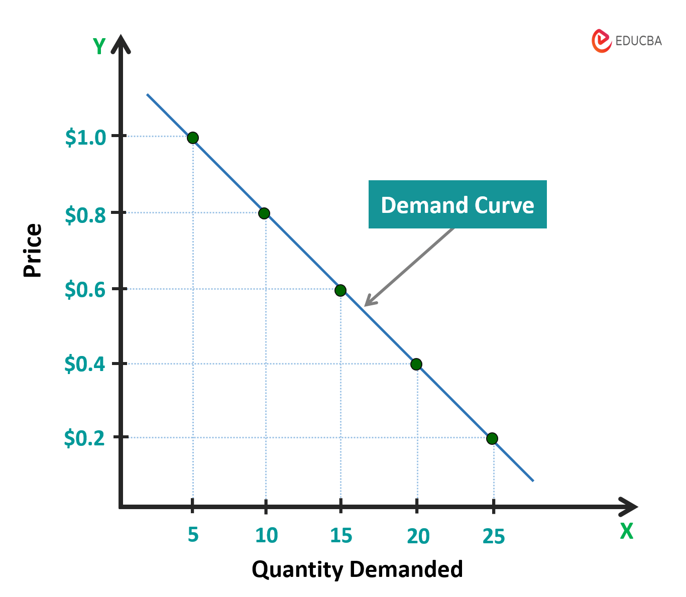
#4: Connect all Dots
Once you have plotted all points, connect them to create a curve.
The resulting curve shows the relationship between an apple’s price and the quantity demanded.
Types
The two main types of demand curves are as follows.
1. Individual
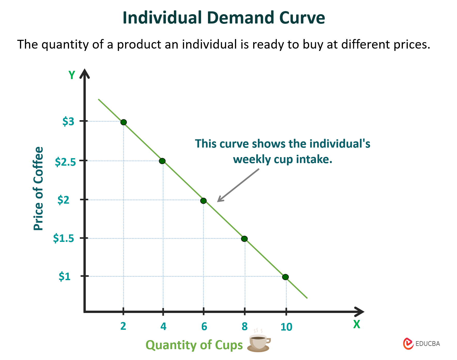
The individual demand curve shows the quantity of a product a specific consumer is ready to buy at different prices. For example, let’s say a person loves to drink coffee. Their individual curve would show how much coffee they would buy at different prices. If the price of coffee is low, they might buy a lot of it. But if the price goes up, they might buy less coffee. This curve represents an individual’s buying behavior based on their preferences, income, and other factors. This curve differs from person to person.
Example: The graph below shows the relationship between the price of coffee and the number of cups an individual consumes per week.
2. Market
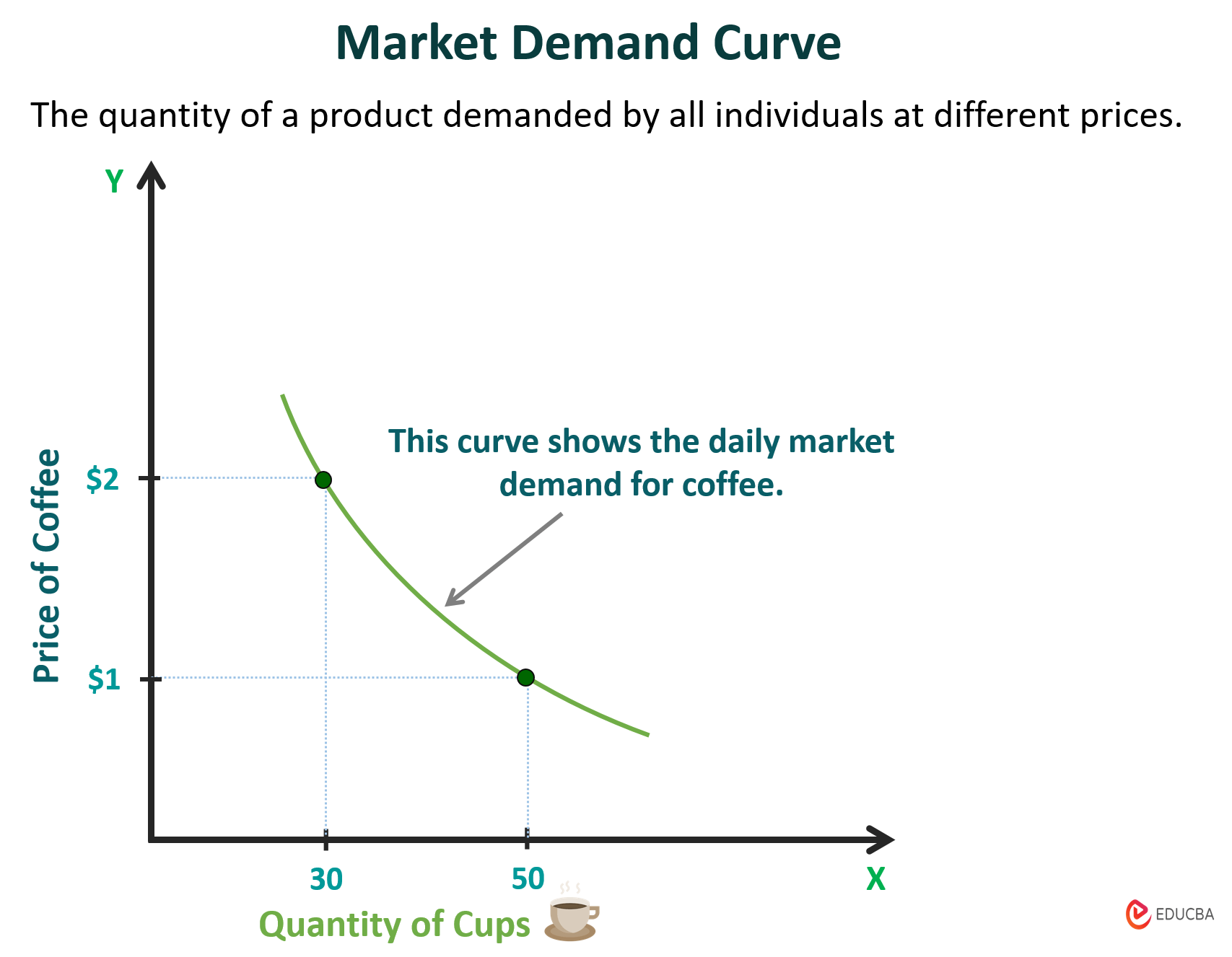
The market demand curve shows how much people want to buy a product at different prices. It’s created by combining the individual curves of everyone who wants to buy that product. So, if many people want to buy something at a low price, then the demand will be high at that price. But if the cost increases, fewer people will want to buy it, so the demand will also decrease.
Assume ten people want to buy coffee. Each has its own demand curve due to varying preferences and incomes. Combining their curves gives us the market demand curve for coffee.
Example: The graph below shows the market curve for coffee. When the coffee price is $1, the total quantity demanded daily is 50 cups. But if the price rises to $2, the total quantity demanded drops to 30 cups per day, as some customers choose not to buy.
Concept of Demand Curve Elasticity
The degree of elasticity in this curve measures how a product’s demand changes with its price. Different products show different relationships between the demand levels and their associated prices. The following are the types of curves depending on the degree of elasticity.
1. Elastic Demand Curve
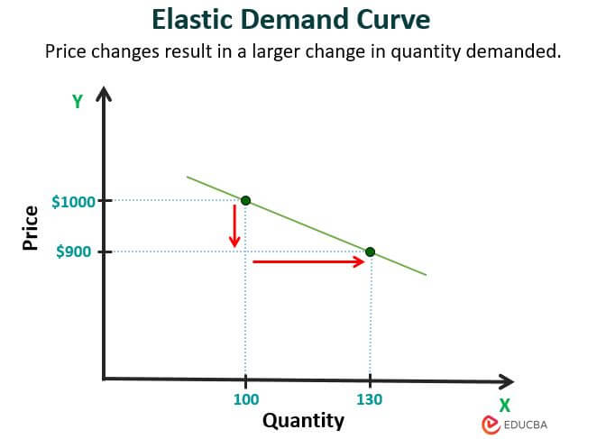
If a small change in price leads to a proportionally larger change in the quantity that people demand, we call that an elastic demand curve. This shows that consumers are highly sensitive to price changes. A perfectly elastic curve appears as a horizontal flat line.
For example, if the price of luxury watches goes down by 10%, and the number of people buying them goes up by 30%, that means the demand for luxury watches is elastic.
2. Inelastic Demand Curve
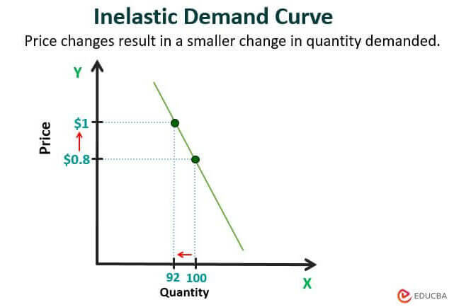
In an inelastic demand curve, price changes do not affect the quantity demanded. It means that if the product or goods prices increase or decrease, consumers will purchase at that price, and there might be smaller changes in the quantity demanded. Here, consumers are less sensitive to price changes. The curve is a vertical straight line in the perfectly inelastic demand.
For example, if petrol increases by $1 from $0.8, there are fewer changes in the number of people buying petrol as it is a necessary fuel for transportation. This is inelastic demand.
What Causes Shift in Demand Curve?
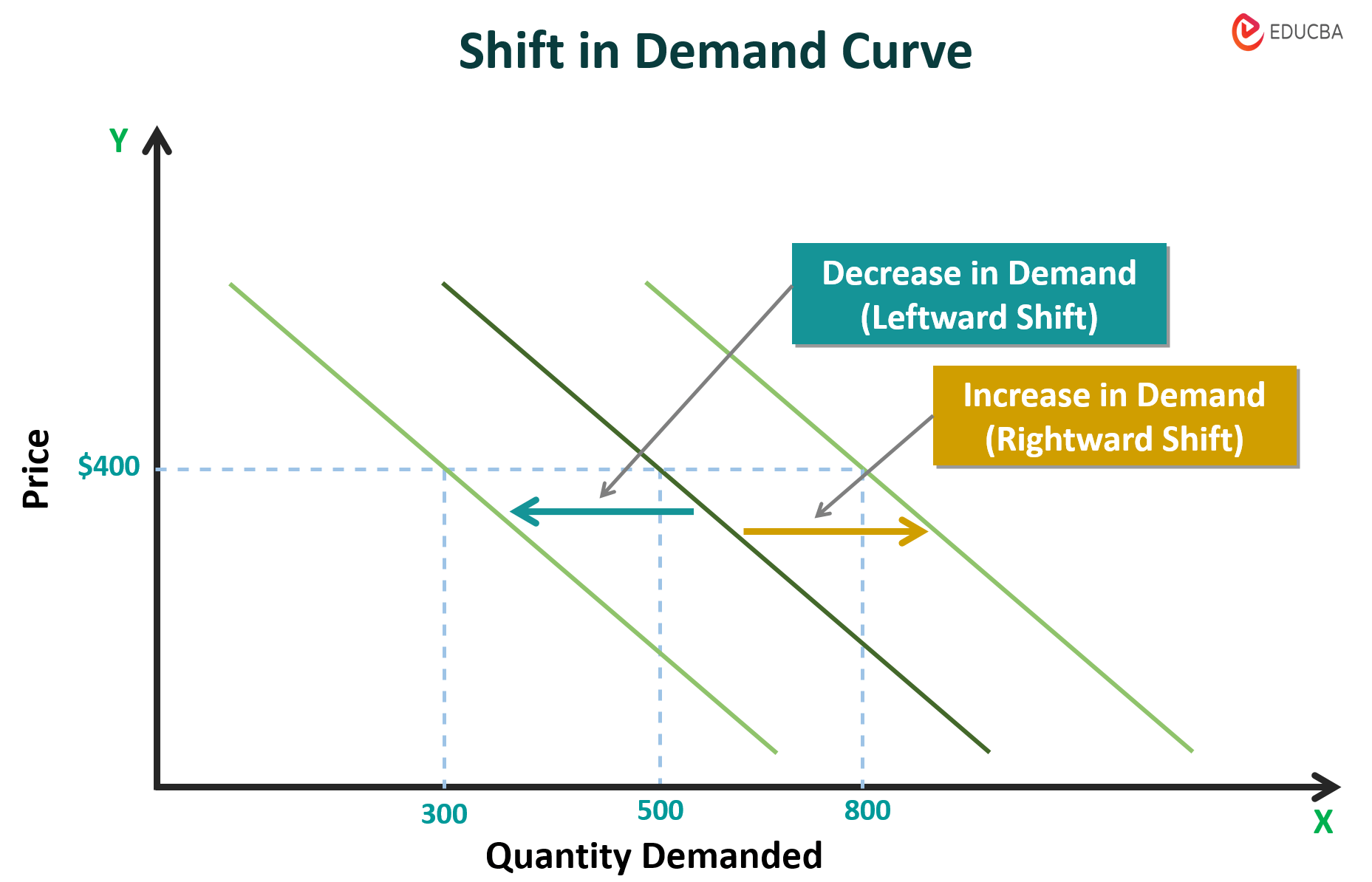
A shift in the demand curve happens when a change in any factor other than the product’s own price affects the quantity demanded of that product. These factors are non-price determinants that cause changes in the quantity of product demanded even when its price remains unchanged.
Rightward shift:
When the demand for a product increases, the curve shifts towards the right. This means consumers will purchase more products at a given price.
For instance, if the demand for smartphones suddenly increases due to new features, the curve will shift towards the right.
Leftward shift:
When the demand for a product decreases, the curve shifts towards the left. It happens because consumers will buy fewer products.
For instance, if a new study reveals that consuming a particular soft drink harms health, the demand for that brand will decrease, shifting the curve towards the left.
Example of Rightward and Leftward Shift:
Suppose Company A manufactures smartphones with new facial recognition technology for security. The smartphone price is $400, and the company sold 500 smartphones at its initial launch. Now, the demand has increased, and more customers are willing to buy the quantity sold, which was 800.
Suppose there was a technology problem after a while, and the demand for that product decreased; say, the total amount sold came down to 300 at the same price.
Factors that Shift Demand Curve
The following factors shift the demand curve towards the right or left side.
1. Consumer income
When consumers’ income level increases, they spend more on buying normal goods, and the demand for those goods increases, leading to a rightward shift. Conversely, if there is a decrease in consumer income, the demand for those goods decreases, and consumers will buy inferior or cheaper goods. This decrease in demand will shift the curve towards the left.
2. Population
When there is an increase in the current population of an area, the demand for products and services will increase in those areas. This will also increase the market size, and the curve will move to the right side when the population decreases. The curve shifts towards the left side.
3. Consumer preferences
Consumer preferences, like taste and style, also affect the demand for a product. If a new product becomes popular, the demand for that product may increase, causing a shift in the curve to the right. On the other hand, if the existing product becomes less desirable or out of fashion, the demand for this product will decrease, causing a shift in the curve to the left.
4. Price of related goods
Substitute goods and complementary goods are two main types of related goods. The substitute goods are products we can use instead of the actual product. If the price of an actual product increases, the demand for substitute goods and the demand for the actual product may decrease, causing a shift in the curve to the left and vice versa.
Complementary goods are those which are used or consumed together. If the price of the complementary goods increases, the curve shifts inwards and vice versa. For example, bread and butter are complementary; if the cost of butter increases, people will buy less bread.
5. Change in season and weather
The demand for products increases or decreases during a particular season and weather conditions; accordingly, the prices will change and cause shifts in the curve.
6. Expectation of price in the future
If consumers expect that the price of particular products will increase in the future, they will buy more products in the current market, increasing the demand for those products. This will shift the curve towards the right even if the price remains unchanged. In contrast, if they predict that prices will go down in the future, they will buy those products later, and the demand will decrease at present.
7. Demographics
An increase in the population of certain age groups will increase the demand for certain products suitable for them. The need for dietary supplements, wellness products, and senior-friendly electronics will increase if there is an older population.
Movement Along the Demand Curve
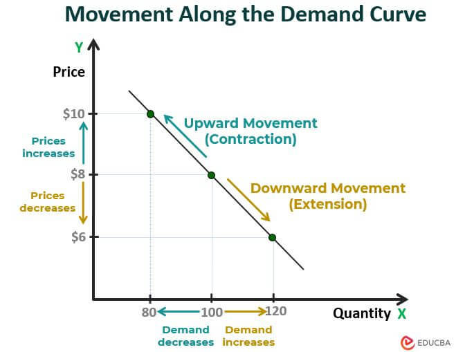
A movement along this curve happens when the quantity demanded of a product changes with the product’s price, when all other factors, such as consumer income, preferences, and the price of substitute goods, remain constant. This movement is either upward or downward along the same curve. This curve shows how much consumers desire a certain product at different prices.
Upward Movement (Contraction):
When a product price increases, the quantity demanded for that product decreases. Here, the curve moves in an upward direction.
Downward Movement (Extension):
When the price of a product decreases, the quantity demanded for that product Increases. Here, the curve moves in a downward direction.
Example: The current price of product A is $8, and the quantity demanded is 100. Suppose the price of product A increases from $8 to $10; the quantity demanded decreases from 100 to 80. Due to the decline in demand, the manufacturer has decreased the price to $6. Now, the number of consumers required has increased to 120.
Demand Curve for Monopoly
In a monopoly, there is a single seller for a particular product who controls the market price due to dominance and lack of competition. Therefore, the company can set the price based on the quantity it produces and sells. The demand curve for a monopoly usually slopes downward. It indicates an inverse relationship between the price and quantity demanded of a product. It means as the prices decrease, the quantity demanded increases and vice versa.
Here, the firm’s curve is the same as the market demand curve. However, monopoly firms can choose any price based on their profit-maximizing strategy.
Demand Curve in Perfect Competition
In perfect competition, many firms produce identical products without power over price. Here, the market forces, i.e., supply and demand of the product, determine its price. In this competition, every firm is a price taker, meaning it cannot influence the cost of its product and has to sell its product at the market-determined price. Therefore, the demand curve for a firm in perfect competition is a horizontal line, whereas, for the market, it slopes downward. This indicates that the quantity demanded depends entirely on the product’s price.
Demand Curve vs Supply Curve
The following are the differences between the demand curve and the supply curve.
| Particulars | Demand Curve | Supply Curve |
| Meaning | It is a graphical representation of the quantity demanded. | It is a graphical representation of the quantity supplied. |
| Slope | Downward (Negative)-sloping, i.e., moving downward from left to right. | Upward (Positive)-sloping, i.e., moving upward from left to right. |
| Relationship | It shows an inverse relationship between price and quantity. | It shows a direct relationship between price and quantity. |
| Factors affecting | Customers preferences, income, prices of related goods | Production cost, number of suppliers, and more. |
Final Thoughts
A demand curve is an important market tool to understand how price changes affect the quantity demanded. This curve slopes downward because as prices increase, fewer potential buyers are willing to buy at those higher prices. This curve measures how much the product price changes its demand, which is important to calculate a certain product’s total cost and profit.
Frequently Asked Questions (FAQs)
Q1. Why does the demand curve slope downward?
Answer: The demand curve slopes downwards because as the prices of products increase, the quantity demanded of those products decreases. This is because consumers will buy fewer products when the prices are high. In such a situation, consumers may look for cheaper alternatives. These economic principles result in a downward slope, demonstrating how prices influence customers’ willingness to buy a product.
Q2. Why is a demand curve important?
Answer: The demand curve provides insights into consumer behavior and market dynamics. It is important because:
- It helps understand how consumers react to changes in prices.
- It allows businesses and policymakers to plan product prices, forecast sales, and make production and marketing strategies.
- Additionally, it helps identify the equilibrium point and understand market stability.
Q3. What is the kinked demand curve?
Answer: A kinked demand curve explains the behavior of firms in oligopolistic markets, where small firms dominate the market. Here, the curve changes according to the competitor’s prices. For example, when a firm increases its product price, its demand decreases, and the other firms take advantage and do not change their prices. On the other hand, if a firm lowers its cost, the other firms also reduce their price to stay in the competition.
Recommended Articles
We hope this “Demand Curve” article was informative and beneficial. To learn more, check out the following article.
