Updated April 6, 2023
Introduction to Flutter Layout
Layout in Flutter defines how the content expands in a given area as the application is used on different areas like the web, mobile devices having different screen sizes, so the content which changes dynamically should be displayed properly to the user. In Flutter, the core of the layout is widgets. Everything in Flutter, like image, icon, text, etc., is a widget; even the layout models are widgets. It allows us to create the layouts by composing multiple widgets. Some special widgets like Center, Align, Container, etc., are also provided in Flutter for laying out the user interface.
Types of Flutter Layout
As shown above, Layout in Flutter is created by adding the multiple widgets together to compose the complex widgets.
Basic steps that need to be followed by the programmer to create the Layout in Flutter are given below:
- Selecting the desired layout widget.
- Second yet the important step is creating a visible widget.
- Adding the visible widget to the above created visible layout.
- The last and final step is adding the layout widget to the page where we want to display it.
Based on its child, the Layout widget in Flutter are divided into 2 broad categories:
1. Single Child Widget
Single Child Widget is a type of widget that has only a single or one widget inside the parent widget. These single child widgets are very simple to use and make the code readable for the programmer. Many single child widgets are provided by the flutter for the programmer to make the UI attractive and yet very easily.
Some of the widgets of Single Child which are used commonly are described below:
- Container: It is one of the simple, popular, and box-based widgets rich with styling and customizable features. It first surrounds the child with its child with padding and itself with the empty space called margin. It applies the additional constraints to the padded child.
- Center: This widget is used to center the child in itself. This widget is inherited from the Align class. It is one of the simple yet very useful widgets used in Flutter.
- Align: As the name suggests, this widget aligns its child within itself using the alignment property. It can also optionally size itself on the basis of its child’s size. The alignment property uses the FractionalOffset in order to pass the values to align the component according to the specific requirements. The FractionalOffset class in Flutter defines the offset of the components in terms of distance from the top left.
- Padding: This is one of the most commonly used widgets in order to provide the padding to the child widgets to fit into the layout widget. Padding in Flutter can be provided using the EdgeInserts for the required sides.
- BaseLine: This widget is used to position the child widget according to the baseline.
2. Multiple Child Widget
Multiple Child Widgets are the type of widgets that have more than one child widget, and the layout of each child widget is unique. For example, to create a table with rows and columns, a row widget is used, which lays its child object in the horizontal direction, and a column widget, on the other hand, lays its child object in the vertical direction. Composing this will create a whole new level of a complex widget. There are several Multiple Child widgets provided to the programmer by Flutter.
Some of them are given below:
- Column: Like a normal column, this widget allows to display its child widget in the vertical direction. The Column widget in the Flutter does not scroll as it is considered to be an error to have more than one children than the available space in the room.
- Row: Unlike Column, row widget allows to display its child widget in the horizontal direction. The Row widget in the Flutter also does not scroll as it is considered an error to have more than one child in the row.
- ListView: It is one of the most commonly used widgets in the Flutter by the programmer. It allows its children to display one after the other in the scroll direction. Flutter provides many options to the programmer to create the ListView.
- Stack: This widget allows the programmer to overlap the various child widgets one above the other relative to its box’s edge. It is one of the most useful yet simple ways used by the programmers to overlap the child widgets in Flutter.
- GridView: This widget allows the programmer to create a scrollable, 2D array of widgets. It allows the cells of repeated patterns to be arrayed in the horizontal and vertical layout.
Examples of Flutter Layout
Given below are the examples of Flutter Layout:
Example #1
Single Child Widget.
Code:
import 'package:flutter/material.dart';
void main() => runApp(MyApp());
class MyApp extends StatelessWidget {
// Root widget of the application
@override
Widget build(BuildContext context) {
return MaterialApp(
title: 'Example of Single Layout',
debugShowCheckedModeBanner: false,
theme: ThemeData(
// Theme of the application
primarySwatch: Colors.indigo,
),
home: SingleWidget(),
);
}
}
class SingleWidget extends StatelessWidget {
@override
Widget build(BuildContext context) {
return Scaffold(
appBar: AppBar(
title: Text("Hello Overflow widget.."),
),
body: Center(
child: Container(
height: 70.0,
width: 60.0,
color: Colors.blue,
child: OverflowBox(
minHeight: 90.0,
minWidth: 90.0,
child: Container(
height: 60.0,
width: 60.0,
color: Colors.red,
child: Align(
alignment: Alignment.topRight,
)
),
),
),
),
);
}
}
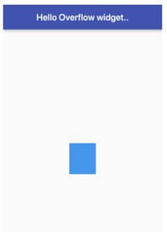
Output:
Example #2
Multiple Child Widget.
Code:
import 'package:flutter/material.dart';
void main() => runApp(MyApp());
class MyApp extends StatelessWidget {
//Root widget of application
@override
Widget build(BuildContext context) {
return MaterialApp(
title: 'Example of multiple Child',
debugShowCheckedModeBanner: false,
theme: ThemeData(
// Defining the application theme
primarySwatch: Colors.red,
),
home: MultiChild(),
);
}
}
class MultiChild extends StatelessWidget {
@override
Widget build(BuildContext context) {
return Scaffold(
appBar: AppBar(
title: Text("Use of row and column in Flutter"),
),
body: Row(
mainAxisAlignment: MainAxisAlignment.spaceEvenly,
children:<Widget>[
Container(
margin: EdgeInsets.all(10.0),
padding: EdgeInsets.all(6.0),
decoration:BoxDecoration(
borderRadius:BorderRadius.circular(5),
color:Colors.blue
),
child: Text("Part 1",style: TextStyle(color:Colors.red,fontSize:32),),
),
Container(
margin: EdgeInsets.all(20.0),
padding: EdgeInsets.all(6.0),
decoration:BoxDecoration(
borderRadius:BorderRadius.circular(5),
color:Colors.blue
),
child: Text("Part 2",style: TextStyle(color:Colors.greenAccent,fontSize:32),),
)
]
),
);
}
}
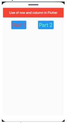
Output:
Conclusion
The above description clearly explains what Flutter Layout and its broad categories on the basis of its child is. Flutter is somewhat a different framework, and Widgets are the building blocks in the Flutter layout. To compose anything in Flutter, one needs to make use of widgets, so it is important for the programmer to understand each widget properly in order to create the layout and perform different tasks properly.
Recommended Articles
We hope that this EDUCBA information on “Flutter Layout” was beneficial to you. You can view EDUCBA’s recommended articles for more information.


