Updated June 29, 2023
Introduction to GridView CSS
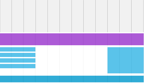
Nowadays, all web pages are designed based on grid view. Grid view means the page is going too divided into some columns. Using a grid view is really handy while we are designing real-time web pages. We can place each element at a fixed position with these grids. A responsive grid view generally has 12 columns, and the total width is 100%. This width will decrease or increase while minimizing or maximizing the browser window. We can box-sizing property to set border boxes for all grids.
You can observe different grid structures below:
How Does GridView Work in CSS?
Grid view works based on dividing the page into a number of grids. Each web page has 12 column grids. Based on our requirements, we can also take sub-grids within grids.
Syntax:
.col-1
{
width: value;
}
.col-2
{
width: value;
}
.col-3
{
width: value;
}
.col-4
{
width: value;
}
.col-5
{
width: value;
}
.col-6
{
width: value;
}
.col-7
{
width: value;
}
.col-8
{
width: value;
}
.col-9
{
width: value;
}
.col-10
{
width: value;
}
.col-11
{
width: value;
}
.col-12
{
width: value;
}
Explanation:
- First, we have calculated the % for a single column that is 100% /12 =8.33%.
- Then we have taken a separate class for every one of the 12 columns that are class= “col-number”.
Examples to Implement GridView CSS
Below are the examples of GridView:
Example #1
Code:
<!DOCTYPE html>
<html>
<head>
<meta name="viewport" content="width=device-width, initial-scale=1.0">
<style>
* {
box-sizing: border-box;
}
.main {
border: 3px ridge blue;
padding: 13px;
}
h1
{
color: green;
text-align: center;
}
.rows::after {
content: "";
clear: both;
display: table;
}
p
{
font-size: 20px;
color: brown;
}
li
{
font-size: 20px;
color: orange;
}
[class*="column-"] {
float: left;
padding: 13px;
border: 3px ridge blue;
}
.column-1 {width: 8.33%;}
.column-2 {width: 16.66%;}
.column-8 {width: 66.66%;}
.column-9 {width: 75%;}
.column-4 {width: 33.33%;}
.column-5 {width: 41.66%;}
.column-6 {width: 50%;}
.column-7 {width: 58.33%;}
.column-10 {width: 83.33%;}
.column-11 {width: 91.66%;}
.column-12 {width: 100%;}
.column-3 {width: 25%;}
</style>
</head>
<body>
<div class="main">
<h1>Chapter 1: Grid View</h1>
</div>
<div class="rows">
<div class="column-3">
<ul>
<li>First Lesson</li>
<li>Second Lesson</li>
<li>Third Lesson</li>
<li>Fourth Lesson</li>
</ul>
</div>
<div class="column-9">
<h1>Grid View Description</h1>
<p>Now a days all web pages are designed based on grid view. Grid view means the page is going too divided into some columns. Using a grid view is really handy while we are designing real time web pages. We can place each element at fixed position with this grids. A responsive grid-view in general has 12 columns and total width is 100%. This width will decrease or increase while minimize or maximize the browser window. We can box-sizing property to set border box for all grids.</p>
</div>
</div>
</body>
</html>
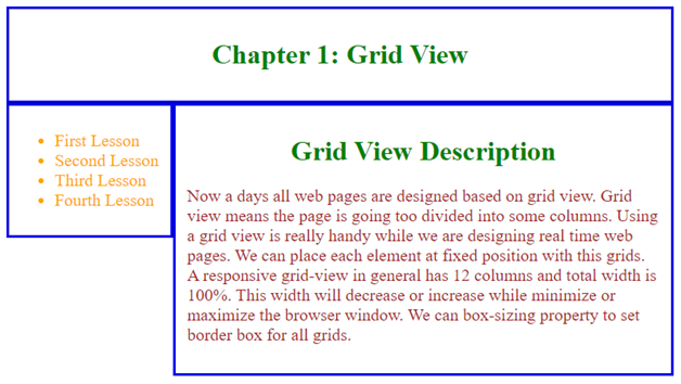
Output:
Example #2
Code:
<!DOCTYPE html>
<html>
<head>
<style>
.a1 { grid-area: header; }
.a2 { grid-area: menu; }
.a4 { grid-area: right; }
.a5 { grid-area: footer; }
.a3 { grid-area: main; }
h1
{
color: green;
text-align: center;
}
.gridView {
display: grid;
grid-gap: 11px;
background-color: pink;
padding: 8px;
grid-template-areas:
'header header header header header header'
'menu main main main right right'
'menu footer footer footer footer footer';
}
.gridView > div {
padding: 21px 0;
font-size: 28px;
background-color: rgba(253, 254, 254, 0.7);
text-align: center;
}
</style>
</head>
<body>
<h1>Grid Layout Different Portions Demo</h1>
<div class="gridView">
<div class="a1">You can write your heading</div>
<div class="a2">Menu Items, Drop-down list etc.</div>
<div class="a3">Body area for description</div>
<div class="a4">Photos or Signature etc.</div>
<div class="a5">Conclusion part area</div>
</div>
</body>
</html>
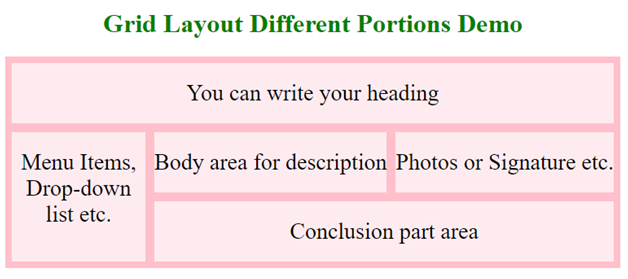
Output:
Example #3
Code:
<!DOCTYPE html>
<html>
<head>
<style>
.gridView {
display: grid;
background-color: purple;
padding: 12px;
grid-template-columns: auto auto auto;
}
.g {
background-color: gray;
padding: 22px;
font-size: 25px;
text-align: center;
border: 1px solid red;
}
p
{
color: brown;
border: 2px solid red;
font-size: 20px;
}
h1
{
color: green;
text-align: center;
}
</style>
</head>
<body>
<h1>Grid View Introduction</h1>
<p>Now a days all web pages are designed based on grid view. Grid view means the page is going too divided into some columns. Using a grid view is really handy while we are designing real time web pages. We can place each element at fixed position with this grids. A responsive grid-view in general has 12 columns and total width is 100%. This width will decrease or increase while minimize or maximize the browser window. We can box-sizing property to set border box for all grids.</p>
<div class="gridView">
<div class="g">Gird-1</div>
<div class="g">Grid-2</div>
<div class="g">Grid-3</div>
<div class="g">Grid-4</div>
<div class="g">Grid-5</div>
<div class="g">Grid-6</div>
<div class="g">Grid-7</div>
<div class="g">Grid-8</div>
<div class="g">Grid-9</div>
</div>
</body>
</html>
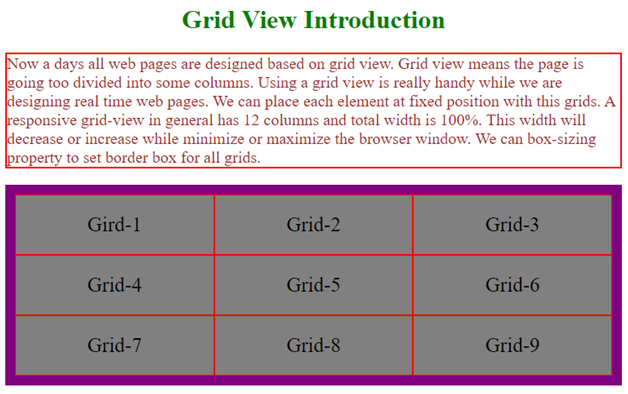
Output:
Conclusion
Grid view is used to divide the page into different columns. Each grid aligns the elements in an accurate position. All real-time web pages are designed based on a grid view.
Recommended Articles
We hope that this EDUCBA information on “Gridview CSS” was beneficial to you. You can view EDUCBA’s recommended articles for more information.
