Updated June 9, 2023
Introduction to Hover in CSS
Dynamic pages are the requirement of time. The more user-friendly and specific a web page, the more likely it will be used or viewed by end-users. Cascading Style Sheet offers many features when providing dynamic properties to a web page. The hover feature is one of them. Using this property in styling any element, we can ensure we get the desired effect when we hover over that part of the page. It is simple to use while providing the page with a decorative and animated touch, which can always be treated as a plus point. Let us explore this property and its uses. We will study about Hover in CSS in this topic.
Syntax and Uses of Hover in CSS
For creating any hover effect in CSS, we create a pseudo-class for that element, describing what effect must be hovering over that element. The syntax for the hover property is:
p:hover{
background-color: green;
}
This pseudo-class can have properties similar to a normal class. These properties will come into effect when that element has hovered over. This way, we can create various kinds of hover effects as required by the overall design or requirement of the page.
Examples of Hover in CSS
Let us take a look at some of the examples of the hover feature in CSS.
Example #1
Demonstrating over-effect on one HTML element using external CSS
- We will use external CSS in this example, so we will create the CSS page first as the process goes on.
- We will first define the styling for the paragraph element <p> in the CSS page. Next, we will create a pseudo-class and define the hovering effect for the same element.
- The CSS code for this example should look like this as given below:
p{
font-size: 25px;
font-style: italic;
text-decoration: double;
background-color: lightpink;
color: green;
}
P:hover{
background-color: yellow;
font-style: normal;
color: black;
}- Next, we will create an HTML page. In the header section, we will first call for the external Style Sheet. Then, in the body section, we will use paragraph element <p> to demonstrate the hover effect.
- The HTML code for the page can be similar to the below code snippet:
<html>
<head>
<title>Hover in CSS</title>
<link rel = "stylesheet" href = "hover.css">
</head>
<body>
<h2>Demo of Hover Feature in CSS</h2>
<p>The effect of this text will change when you hover over it!</p>
</body>
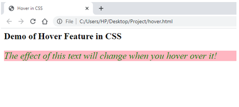
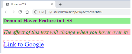
</html>- Now, when one opens this page, it will look like this:
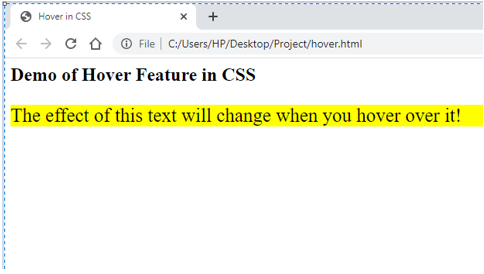
- And once you hover over the pink area, it will transform like this:
Example #2
Demonstrating over-effect on multiple HTML elements using external CSS
- Like the previous example, we will create an external style sheet first.
- We will define styling for several elements and pseudo-classes to define each element’s hover behavior.
- The CSS code should look similar to the code snippet below:
p{
font-size: 25px;
font-style: italic;
text-decoration: double;
background-color: lightpink;
color: green;
}
P:hover{
background-color: yellow;
font-style: normal;
color: black;
}
a{
color: red;
font-style: italic;
font-size: 30px;
font-weight: 14px;
border: lightpink dotted;
}
a:hover{
color: blue;
font-style: normal;
font-weight: unset;
}
h2{
color: purple;
background-color: lightgreen;
font-weight: 16px;
}
h2:hover{
color: palevioletred;
background-color: white;
}- Next, we will code for the HTML page, where the header section will call the external style sheet being used.
- In the body section, we will use all three elements that we styled on the CSS page.
- The HTML code should be similar to the code shared below:
<html>
<head>
<title>Hover in CSS</title>
<link rel = "stylesheet" href = "hover.css">
</head>
<body>
<h2>Demo of Hover Feature in CSS</h2>
<p>The effect of this text will change when you hover over it!</p>
<a href="https://www.google.com/">Link to Google</a>
</body>
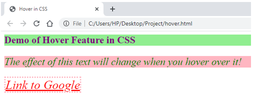
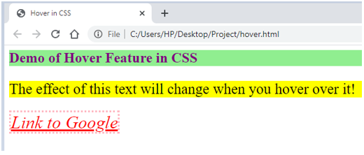
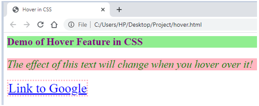
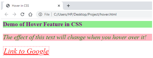
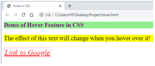
</html>- The output should look similar to the following screenshot:
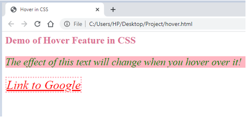
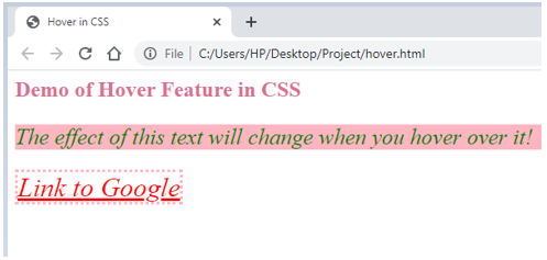
- Hovering over each will give the following outputs:
Example #3
Demonstration of hover feature using internal CSS
- Since we are using internal CSS in this example, we will directly code the styling in the header section of the HTML page.
- The header section of the HTML page should be as follows:
<head>
<title>Hover in CSS</title>
<style>
p{
font-size: 25px;
font-style: italic;
text-decoration: double;
background-color: lightpink;
color: green;
}
P:hover{
background-color: yellow;
font-style: normal;
color: black;
}
a{
color: red;
font-style: italic;
font-size: 30px;
font-weight: 14px;
border: lightpink dotted;
}
a:hover{
color: blue;
font-style: normal;
font-weight: unset;
}
h2{
color: purple;
background-color: lightgreen;
font-weight: 16px;
}
h2:hover{
color: palevioletred;
background-color: white;
}
</style>
</head>
First, we will code for the body, such that all three elements are used, for which the style has been defined in the header.
- The HTML code should be somewhat similar to the snippet below:
<html>
<head>
<title>Hover in CSS</title>
<style>
p{
font-size: 25px;
font-style: italic;
text-decoration: double;
background-color: lightpink;
color: green;
}
P:hover{
background-color: yellow;
font-style: normal;
color: black;
}
a{
color: red;
font-style: italic;
font-size: 30px;
font-weight: 14px;
border: lightpink dotted;
}
a:hover{
color: blue;
font-style: normal;
font-weight: unset;
}
h2{
color: purple;
background-color: lightgreen;
font-weight: 16px;
}
h2:hover{
color: palevioletred;
background-color: white;
}
</style>
</head>
<body>
<h2>Demo of Hover Feature in CSS</h2>
<p>The effect of this text will change when you hover over it!</p>
<a href="https://www.google.com/">Link to Google</a>
</body>
</html>- Saving this page and opening it through a browser will fetch the following output:
- Hovering over each will give the following outputs:
- The examples above explain how the Hover property can be used in CSS. One can experiment with different features for the hover pseudo-class and design according to the design scheme.
Recommended Articles
We hope that this EDUCBA information on “Hover in CSS” was beneficial to you. You can view EDUCBA’s recommended articles for more information.
